Module 16 Machine Learning 101
Data is not information, information is not knowledge, knowledge is not understanding, understanding is not wisdom. [C. Stoll (attributed), Nothing to Hide: Privacy in the 21st Century, 2006]
One of the challenges of working in the data science (DS), machine learning (ML) and artificial intelligence (AI) fields is that nearly all quantitative work can be described with some combination of the terms DS/ML/AI (often to a ridiculous extent).
Robinson [74] suggests that their relationships follow an inclusive hierarchical structure:
in a first stage, DS provides “insights” via visualization and (manual) inferential analysis;
in a second stage, ML yields “predictions” (or “advice”), while reducing the operator’s analytical, inferential and decisional workload (although it is still present to some extent), and
in the final stage, AI removes the need for oversight, allowing for automatic “actions” to be taken by a completely unattended system.
The goals of artificial intelligence are laudable in an academic setting, but in practice, we believe that stakeholders should not seek to abdicate all of their agency in the decision-making process; as such, we follow the lead of various thinkers and suggest further splitting AI into “general AI” (which we will not be pursuing) and “augmented intelligence” (which can be viewed as ML “on steroids”).
With this in mind, our definition of the DS/ML/AI approach is that it consists of quantitative processes (what H. Mason has called “the working intersection of statistics, engineering, computer science, domain expertise, and”hacking" [75]) that can help users learn actionable insights about their situation without completely abdicating their decision-making responsibility.
In this module, we will take a brief look at:
the fundamentals of data science;
supervised learning and classification, with a focus on decision trees and naïve Bayes classifiers;
unsupervised learning and clustering, with a focus on \(k-\)means and hierarchical clustering, and
some of the common issues and challenges encountered during the data science and machine learning process.
Later modules will discuss other technical aspects of machine learning. The interested reader can obtain more information from [76], [85], [87], [128], [129].
16.1 Statistical Learning
We learn from failure, not from success! [B. Stoker, Dracula]
As humans, we learn (at all stages) by first taking in our environment, and then by:
answering questions about it;
testing hypotheses;
creating concepts;
making predictions;
creating categories, and
classifying and grouping its various objects and attributes.
In a way, the main concept of DS/ML/AI is to try to teach our machines (and thus, ultimately, ourselves) to gleam insight from data, and how to do this properly and efficiently, free of biases and pre-conceived notions – in other words, can we design algorithms that can learn?51
In that context, the simplest DS/ML/AI method is exploring the data (or a representative sample) to:
provide a summary through basic statistics – mean, mode, histograms, etc.;
make its multi-dimensional structure evident through data data visualization; and
look for consistency, considering what is in there and what is missing.
16.1.1 Types of Learning
In the data science context, more sophisticated approaches traditionally fall into a supervised or an unsupervised learning framework.
Supervised Learning
Supervised learning is akin to “learning with a teacher.” Typical tasks include classification, regression, rankings, and recommendations.
In supervised learning, algorithms use labeled training data to build (or train) a predictive model (i.e. “students give an answer to each exam question based on what they learned from worked-out examples provided by the teacher/textbook”); each algorithm’s performance is evaluated using test data for which the label is known but not used in the prediction (i.e. “the teacher provides the correct answers and marks the exam questions using the key”.)
In supervised learning, there are fixed targets against which to train the model (such as age categories, or plant species) – the categories (and their number) are known prior to the analysis.
Unsupervised Learning
Unsupervised learning, on the other hand, is akin to “self-learning by grouping similar exercises together as a study guide.” Typical tasks include clustering, association rules discovery, link profiling, and anomaly detection. Unsupervised algorithms use unlabeled data to find natural patterns in the data (i.e. “the teacher is not involved in the discovery process”); the drawback is that accuracy cannot be evaluated with the same degree of satisfaction (i.e. “students might end up with different groupings”).
In unsupervised learning, we don’t know what the target is, or even if there is one – we are simply looking for natural groups in the data (such as junior students who like literature, have longish hair, and know how to cook vs. students who are on a sports team and have siblings vs. financial professionals with a penchant for superhero movies, craft beer and Hello Kitty backpack vs. … ).
Other Learning Frameworks
Some data science techniques fit into both camps; others can be either supervised or unsupervised, depending on how they are applied, but there are other conceptual approaches, especially for AI tasks:
semi-supervised learning in which some data points have labels but most do not, which often occurs when acquiring data is costly (“the teacher provides worked-out examples and a list of unsolved problems to try out; the students try to find similar groups of unsolved problems and compare them with the solved problems to find close matches”), and
reinforcement learning, where an agent attempts to collect as much (short-term) reward as possible while minimizing (long-term) regret (“embarking on a Ph.D. with an advisor… with all the highs and the lows and maybe a diploma at the end of the process?”).
16.1.2 Data Science and Machine Learning Tasks
Outside of academia, DS/ML/AI methods are only really interesting when they help users ask and answer useful questions. Compare, for instance:
Analytics – “How many clicks did this link get?”
Data Science – “Based on the previous history of clicks on links of this publisher’s site, can I predict how many people from Manitoba will read this specific page in the next three hours?” or “Is there a relationship between the history of clicks on links and the number of people from Manitoba who will read this specific page?”
Quantitative Methods – “We have no similar pages whose history could be consulted to make a prediction, but we have reasons to believe that the number of hits will be strongly correlated with the temperature in Winnipeg. Using the weather forecast over the next week, can we predict how many people will access the specific page during that period?”
Data science and machine learning models are usually predictive (not explanatory): they show connections, and exploit correlations to make predictions, but they don’t reveal why such connections exist.
Quantitative methods, on the other hand, usually assume a certain level of causal understanding based on various first principles. That distinction is not always understood properly by clients and consultants alike. Common data science tasks (with representative questions) include [77]:
classification and probability estimation – which undergraduates are likely to succeed at the graduate level?
value estimation – how much is a given client going to spend at a restaurant?
similarity matching – which prospective clients are most similar to a company’s establishes best clients?
clustering – do signals from a sensor form natural groups?
association rules discovery – what books are commonly purchased together at an online retailer?
profiling and behaviour description – what is the typical cell phone usage of a certain customer’s segment?
link prediction – J. and K. have 20 friends in common: perhaps they’d be great friends?
A classic example is provided by the UCI Machine Learning Repository Mushroom Dataset [130]. Consider Amanita muscaria (commonly known as the fly agaric), a specimen of which is shown below.

Figure 16.1: Amanita muscaria (fly agaric), in the wild. Does it look dangerous to you?
Is it edible, or poisonous? There is a simple way to get an answer – eat it, wait, and see: if you do not die or get sick upon ingestion, it was edible; otherwise it was poisonous.
This test in unappealing for various reasons, however. Apart from the obvious risk of death, we might not learn much from the experiment; it is possible that this specific specimen was poisonous due to some mutation or some other factor (or that you had a pre-existing condition which combined with the fungus to cause you discomfort, etc.), and that fly agaric is actually edible in general (unlikely, but not impossible).
A predictive model, which would use features of a vast collection of mushroom species and specimens (including whether they were poisonous or edible) could help shed light on the matter: what do poisonous mushrooms have in common? What properties do edible mushrooms share?52
For instance, let’s say that Amanita muscaria has the following features:
habitat: woods;
gill size: narrow;
spores: white;
odor: none;
cap color: red.
We do not know a priori whether it is poisonous or edible. Is the available information sufficient to answer the question? Not on its own, no.53
But we could use past data, with correct edible or poisonous labels and the same set of predictors to build various supervised classification models to attempt to answer the question. A simple such model, a decision tree, is shown on the left in Figure @(fig:DT-mushroom1).
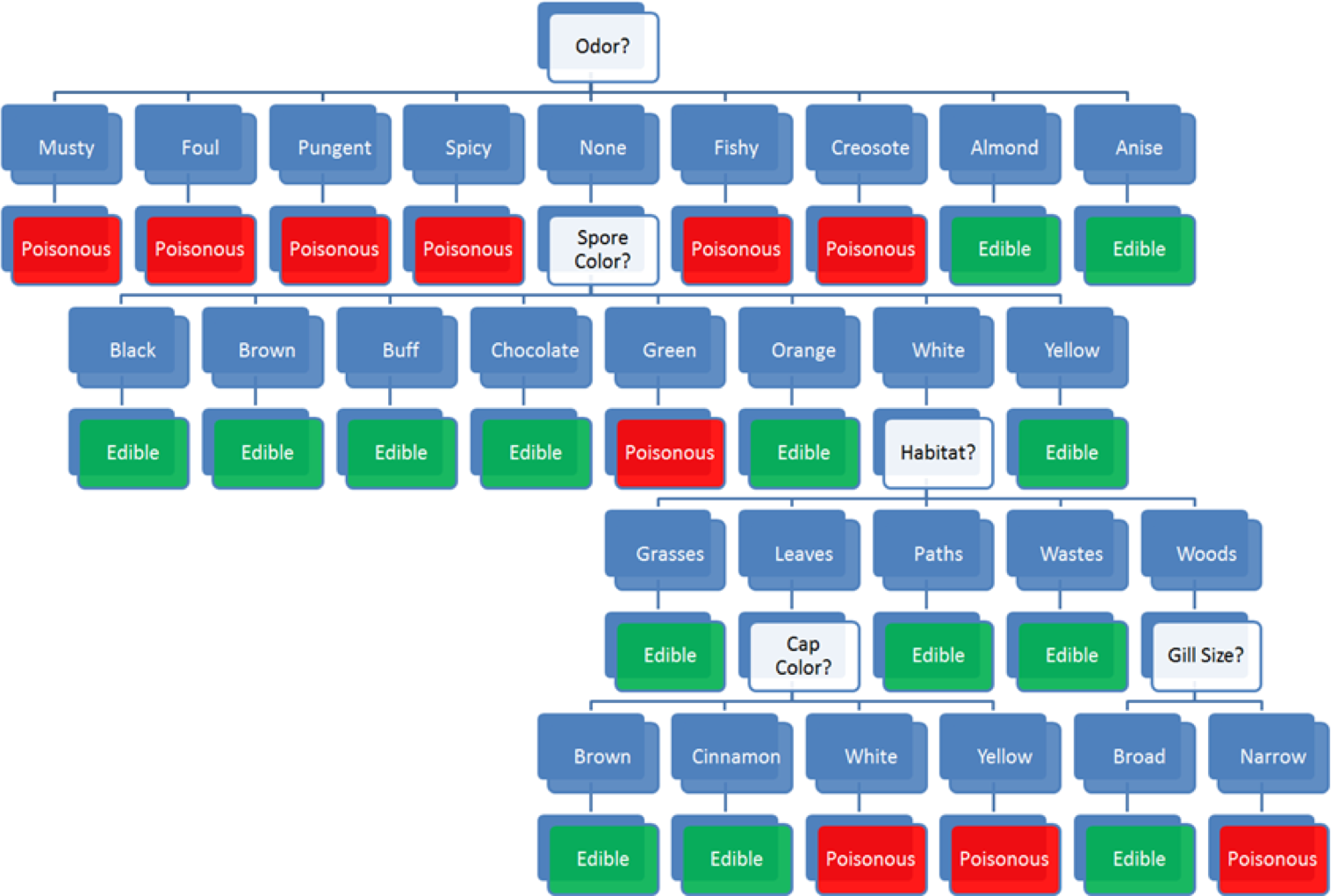
Figure 16.2: Decision tree for the mushroom classification problem [author unknown].
The model prediction for Amanita muscaria follows the decision path shown in Figure 16.3:
some mushroom odors (musty, spicy, etc.) are associated with poisonous mushrooms, some (almond, anise) with edible mushrooms, but there are mushrooms with no specific odor in either category – for mushroom with ‘no odor’ (as it he case with Amanita muscaria), odor does not provide enough information for proper classification and we need to incorporate additional features into the decision path;
among mushrooms with no specific odor, some spore colours (black, etc.) are associated with edible mushrooms, some (almond, anise) with poisonous mushrooms, but there are mushrooms with ‘white’ spores in either category – the combination ‘no odor and white spores’ does not provide enough information to classify Amanita muscaria and we need to incorporate additional features into the decision path;
among mushrooms of no specific odor with white spores, some habitats (grasses, paths, wastes) are associated with edible mushrooms, but there are mushrooms in either category that are found in the ‘woods’ – the combination ‘no odor, white spores, found in the woods’ does not provide enough information to classify Amanita muscaria and we need to incorporate additional features into the decision path;
among white-spored forest mushroom with no specific odor, a broad gill size is associated with edible mushrooms, whereas a ‘narrow’ gill size is associated with poisonous mushrooms – as Amanita muscaria is a narrow-gilled, white-spored forest mushroom with no specific odor, the decision path predicts that it is poisonous.
Note that the cap color does not affect the decision path, however.54
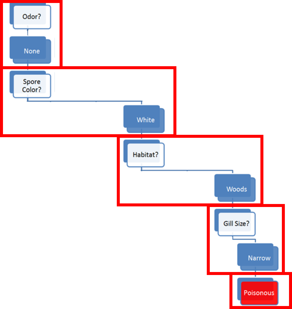
Figure 16.3: Decision path for Amanita muscaria.
The decision tree model does not explain why this particular combinations of features is associated with poisonous mushrooms – the decision path is not causal.
At this point, a number of questions naturally arise:
Would you have trusted an edible prediction?
How are the features measured?
What is the true cost of making a mistake?
Is the data on which the model is built representative?
What data is required to build trustworthy models?
What do we need to know about the model in order to trust it?
16.2 Association Rules Mining
Correlation isn’t causation. But it’s a big hint. [E. Tufte]
16.2.1 Overview
Association rules discovery is a type of unsupervised learning that finds connections among the attributes and levels (and combinations thereof) of a dataset’s observations. For instance, we might analyze a (hypothetical) dataset on the physical activities and purchasing habits of North Americans and discover that
runners who are also triathletes (the premise) tend to drive Subarus, drink microbrews, and use smart phones (the conclusion), or
individuals who have purchased home gym equipment are unlikely to be using it 1 year later, say.
But the presence of a correlation between the premise and the conclusion does not necessarily imply the existence of a causal relationship between them. It is rather difficult to “demonstrate” causation via data analysis; in practice, decision-makers pragmatically (and often erroneously) focus on the second half of Tufte’s rejoinder, which basically asserts that “there’s no smoke without fire.”
Case in point, while being a triathlete does not cause one to drive a Subaru, Subaru Canada thinks that the connection is strong enough to offer to reimburse the registration fee at an IRONMAN 70.3 competition (since at least 2018)! [131]
Market Basket Analysis
Association rules discovery is also known as market basket analysis after its original application, in which supermarkets record the contents of shopping carts (the baskets) at check-outs to determine which items are frequently purchased together.
For instance, while bread and milk might often be purchased together, that is unlikely to be of interest to supermarkets given the frequency of market baskets containing milk or bread (in the mathematical sense of “or”).
Knowing that a customer has purchased bread does provide some information regarding whether they also purchased milk, but the individual probability that each item is found, separately, in the basket is so high to begin with that this insight is unlikely to be useful.
If 70% of baskets contain milk and 90% contain bread, say, we would expect at least \[90\%\times 70\%=63\%\] of all baskets to contain milk and bread, should the presence of one in the basket be totally independent of the presence of the other.
If we then observe that 72% of baskets contain both items (a 1.15-fold increase on the expected proportion, assuming there is no link), we would conclude that there was at best a weak correlation between the purchase of milk and the purchase of bread.
Sausages and hot dog buns, on the other hand, which we might suspect are not purchased as frequently as milk and bread, might still be purchased as a pair more often than one would expect given the frequency of baskets containing sausages or buns.
If 10% of baskets contain sausages, and 5% contain buns, say, we would expect that \[10\% \times 5\% = 0.5\%\] of all baskets would contain sausages and buns, should the presence of one in the basket be totally independent of the presence of the other.
If we then observe that 4% of baskets contain both items (an 8-fold increase on the expected proportion, assuming there is no link), we would obviously conclude that there is a strong correlation between the purchase of sausages and the purchase of hot dog buns.
It is not too difficult to see how this information could potentially be used to help supermarkets turn a profit: announcing or advertising a sale on sausages while simultaneously (and quietly) raising the price of buns could have the effect of bringing in a higher number of customers into the store, increasing the sale volume for both items while keeping the combined price of the two items constant.55
A (possibly) apocryphal story shows the limitations of association rules: a supermarket found an association rule linking the purchase of beer and diapers and consequently moved its beer display closer to its diapers display, having confused correlation and causation.
Purchasing diapers does not cause one to purchase beer (or vice-versa); it could simply be that parents of newborns have little time to visit public houses and bars, and whatever drinking they do will be done at home. Who knows? Whatever the case, rumour has it that the experiment was neither popular nor successful.
Applications
Typical uses include:
finding related concepts in text documents – looking for pairs (triplets, etc) of words that represent a joint concept: {San Jose, Sharks}, {Michelle, Obama}, etc.;
detecting plagiarism – looking for specific sentences that appear in multiple documents, or for documents that share specific sentences;
identifying biomarkers – searching for diseases that are frequently associated with a set of biomarkers;
making predictions and decisions based on association rules (there are pitfalls here);
altering circumstances or environment to take advantage of these correlations (suspected causal effect);
using connections to modify the likelihood of certain outcomes (see immediately above);
imputing missing data,
text autofill and autocorrect, etc.
Causation and Correlation
Association rules can automate hypothesis discovery, but one must remain correlation-savvy (which is less prevalent among quantitative specialists than one might hope, in our experience).
If attributes \(A\) and \(B\) are shown to be correlated in a dataset, there are four possibilities:
\(A\) and \(B\) are correlated entirely by chance in this particular dataset;
\(A\) is a relabeling of \(B\) (or vice-versa);
\(A\) causes \(B\) (or vice-versa), or
some combination of attributes \(C_1,\ldots,C_n\) (which may not be available in the dataset) cause both \(A\) and \(B\).
Siegel [132] illustrates the confusion that can arise with a number of real-life examples:
Walmart has found that sales of strawberry Pop-Tarts increase about seven-fold in the days preceding the arrival of a hurricane;
Xerox employees engaged in front-line service and sales-based positions who use Chrome and Firefox browsers perform better on employment assessment metrics and tend to stay with the company longer, or
University of Cambridge researchers found that liking “Curly Fries” on Facebook is predictive of high intelligence.
It can be tempting to try to explain these results (again, from [132]): perhaps
when faced with a coming disaster, people stock up on comfort or nonperishable foods;
the fact that an employee takes the time to install another browser shows that they are an informed individual and that they care about their productivity, or
an intelligent person liked this Facebook page first, and her friends saw it, and liked it too, and since intelligent people have intelligent friends (?), the likes spread among people who are intelligent.
While these explanations might very well be the right ones (although probably not in the last case), there is nothing in the data that supports them. Association rules discovery finds interesting rules, but it does not explain them. The point cannot be over-emphasized: correlation does not imply causation.
Analysts and consultants might not have much control over the matter, but they should do whatever is in their power so that the following headlines do not see the light of day:
“Pop-Tarts” get hurricane victims back on their feet;
Using Chrome of Firefox improves employee performance, or
Eating curly fries makes you more intelligent.
Definitions
A rule \(X\to Y\) is a statement of the form “if \(X\) (the premise) then \(Y\) (the conclusion)” built from any logical combinations of a dataset attributes.
In practice, a rule does not need to be true for all observations in the dataset – there could be instances where the premise is satisfied but the conclusion is not.
In fact, some of the “best” rules are those which are only accurate 10% of the time, as opposed to rules which are only accurate is only 5% of the time, say. As always, it depends on the context. To determine a rule’s strength, we compute various rule metrics, such as the:
support, which measures the frequency at which a rule occurs in a dataset – low coverage values indicate rules that rarely occur;
confidence, which measures the reliability of the rule: how often does the conclusion occur in the data given that the premises have occurred – rules with high confidence are “truer”, in some sense;
interest, which measures the difference between its confidence and the relative frequency of its conclusion – rules with high absolute interest are … more interesting than rules with small absolute interest;
lift, which measures the increase in the frequency of the conclusion which can be explained by the premises – in a rule with a high lift (\(>1\)), the conclusion occurs more frequently than it would if it was independent of the premises;
conviction [134], all-confidence [135], leverage [136], collective strength [137], and many others [138], [139].
In a dataset with \(N\) observations, let \(\textrm{Freq}(A)\in \{0,1,\ldots,N\}\) represent the count of the dataset’s observations for which property \(A\) holds. This is all the information that is required to compute a rule’s evaluation metrics: \[\begin{aligned} \textrm{Support}(X\to Y)&=\frac{\textrm{Freq}(X\cap Y)}{N}\in[0,1] \\ \textrm{Confidence}(X\to Y)&=\frac{\textrm{Freq}(X\cap Y)}{\textrm{Freq}(X)}\in[0,1] \\ \textrm{Interest}(X\to Y)&=\textrm{Confidence}(X\to Y) - \frac{\textrm{Freq}(Y)}{N} \in [-1,1] \\ \textrm{Lift}(X\to Y) &=\frac{N^2\cdot \textrm{Support}(X\to Y)}{\textrm{Freq}(X)\cdot \textrm{Freq}(Y)} \in (0,N^2) \\ \textrm{Conviction}(X\to Y)&=\frac{1-\textrm{Freq(Y)}/N}{1-\textrm{Confidence}(X\to Y)}\geq 0\end{aligned}\]
Music Dataset
A simple example will serve to illustrate these concepts. Consider a (hypothetical) music dataset containing data for \(N=15,356\) Chinese music lovers and a candidate rule RM:
“If an individual is born before 1986 (\(X\)), then they own a copy of Teresa Teng’s The Moon Represents My Heart, in some format (\(Y\))”.
Let’s assume further that
\(\textrm{Freq}(X)=3888\) individuals were born before 1986;
\(\textrm{Freq}(Y)=9092\) individuals own a copy of The Moon Represents My Heart, and
\(\textrm{Freq}(X\cap Y)=2720\) individuals were born before 1986 and own a copy of The Moon Represents My Heart.
We can easily compute the 5 metrics for RM: \[\begin{aligned} \textrm{Support}(\textrm{RM})&=\frac{2720}{15,536}\approx 18\% \\ \textrm{Confidence}(\textrm{RM})&=\frac{2720}{3888}\approx 70\% \\ \textrm{Interest}(\textrm{RM})&=\frac{2720}{3888}-\frac{9092}{15,356}\approx 0.11 \\ \textrm{Lift}(\textrm{RM}) &=\frac{15,356^2\cdot 0.18}{3888\cdot 9092} \approx 1.2 \\ \textrm{Conviction}(\textrm{RM}) &=\frac{1-9092/15,356}{1-2720/3888} \approx 1.36\end{aligned}\] These values are easy to interpret: RM occurs in 18% of the dataset’s instances, and it holds true in 70% of the instances where the individual was born prior to 1986.
This would seem to make RM a meaningful rule about the dataset – being older and owning that song are linked properties. But if being younger and not owning that song are not also linked properties, the statement is actually weaker than it would appear at a first glance.
As it happens, RM’s lift is 1.2, which can be rewritten as \[1.2\approx \frac{0.70}{0.56},\] i.e. 56% of younger individuals also own the song.
The ownership rates between the two age categories are different, but perhaps not as significantly as one would deduce using the confidence and support alone, which is reflected by the rule’s “low” interest, whose value is 0.11.
Finally, the rule’s conviction is 1.36, which means that the rule would be incorrect 36% more often if \(X\) and \(Y\) were completely independent.
All this seems to point to the rule RM being not entirely devoid of meaning, but to what extent, exactly? This is a difficult question to answer.56
It is nearly impossible to provide hard and fast thresholds: it always depends on the context, and on comparing evaluation metric values for a rule with the values obtained for some other of the dataset’s rules. In short, evaluation of a lone rule is meaningless.
In general, it is recommended to conduct a preliminary exploration of the space of association rules (using domain expertise when appropriate) in order to determine reasonable threshold ranges for the specific situation; candidate rules would then be discarded or retained depending on these metric thresholds.
This requires the ability to “easily” generate potentially meaningful candidate rules.
16.2.2 Generating Rules
Given association rules, it is straightforward to evaluate them using various metrics, as discussed in the previous section.
The real challenge of association rules discovery lies in generating a set of candidate rules which are likely to be retained, without wasting time generating rules which are likely to be discarded.
An itemset (or instance set) for a dataset is a list of attributes and values. A set of rules can be created from the itemset by adding “IF … THEN” blocks to the instances.
As an example, from the instance set
\[\{ \textrm{membership} = \textrm{True}, \textrm{age} = \textrm{Youth}, \textrm{purchasing} = \textrm{Typical} \},\]
we can create the 7 following \(3-\)item rules:
IF \((\textrm{membership} = \textrm{True}\) AND \(\textrm{age} = \textrm{Youth}\)) THEN \(\textrm{purchasing} = \textrm{Typical}\);
IF \((\textrm{age} = \textrm{Youth}\) AND \(\textrm{purchasing} = \textrm{Typical}\)) THEN \(\textrm{membership} = \textrm{True}\);
IF \((\textrm{purchasing} = \textrm{Typical}\) AND \(\textrm{membership} = \textrm{True})\) THEN \(\textrm{age} = \textrm{Youth}\);
IF \(\textrm{membership} = \textrm{True}\) THEN (\(\textrm{age} = \textrm{Youth}\) AND \(\textrm{purchasing} = \textrm{Typical}\));
IF \(\textrm{age} = \textrm{Youth}\) THEN \((\textrm{purchasing} = \textrm{Typical}\) AND \(\textrm{membership} = \textrm{True})\);
IF \(\textrm{purchasing} = \textrm{Typical}\) THEN \((\textrm{membership} = \textrm{True})\) AND \(\textrm{age} = \textrm{Youth})\);
IF \(\varnothing\) THEN (\(\textrm{membership} = \textrm{True}\) AND \(\textrm{age} = \textrm{Youth}\) AND \(\textrm{purchasing} = \textrm{Typical}\));
the 6 following \(2-\)item rules:
IF \(\textrm{membership} = \textrm{True}\) THEN \(\textrm{purchasing} = \textrm{Typical}\);
IF \(\textrm{age} = \textrm{Youth}\) THEN \(\textrm{membership} = \textrm{True}\);
IF \(\textrm{purchasing} = \textrm{Typical}\) THEN \(\textrm{age} = \textrm{Youth}\);
IF \(\varnothing\) THEN (\(\textrm{age} = \textrm{Youth}\) AND \(\textrm{purchasing} = \textrm{Typical}\));
IF \(\varnothing\) THEN \((\textrm{purchasing} = \textrm{Typical}\) AND \(\textrm{membership} = \textrm{True})\);
IF \(\varnothing\) THEN \((\textrm{membership} = \textrm{True})\) AND \(\textrm{age} = \textrm{Youth})\);
and the 3 following \(1-\)item rules:
IF \(\varnothing\) THEN \(\textrm{age} = \textrm{Youth}\);
IF \(\varnothing\) THEN \(\textrm{purchasing} = \textrm{Typical}\);
IF \(\varnothing\) THEN \(\textrm{membership} = \textrm{True}\).
In practice, we usually only consider rules with the same number of items as there are members in the itemset: in the example above, for instance, the \(2-\)item rules could be interpreted as emerging from the 3separate itemsets
\[\begin{align*}\{\textrm{membership} &= \textrm{True}, \textrm{age} = \textrm{Youth}\} \\ \{\textrm{age} &= \textrm{Youth}, \textrm{purchasing} = \textrm{Typical}\} \\ \{\textrm{purchasing} &= \textrm{Typical}, \textrm{membership} = \textrm{True}\}\end{align*}\]
and the \(1-\)item rules as arising from the 3 separate itemsets
\[\{\textrm{membership} = \textrm{True}\},\{\textrm{age} = \textrm{Youth}\}, \{\textrm{purchasing} = \textrm{Typical}\}.\]
Note that rules of the form \(\varnothing \to X\) (or IF \(\varnothing\) THEN \(X\)) are typically denoted simply by \(X\).
Now, consider an itemset \(\mathcal{C}_n\) with \(n\) members (that is to say, \(n\) attribute/level pairs). In an \(n-\)item rule derived from \(\mathcal{C}\), each of the \(n\) members appears either in the premise or in the conclusion; there are thus \(2^n\) such rules, in principle.
The rule where each member is part of the premise (i.e., the rule without a conclusion) is nonsensical and is not allowed; we can derive exactly \(2^n-1\) \(n-\)item rules from \(\mathcal{C}_n\). Thus, the number of rules increases exponentially when the number of features increases linearly.
This combinatorial explosion is a problem – it instantly disqualifies the brute force approach (simply listing all possible itemsets in the data and generating all rules from those itemsets) for any dataset with a realistic number of attributes.
How can we then generate a small number of promising candidate rules, in general?
16.2.3 The A Priori Algorithm
The a priori algorithm is an early attempt to overcome that difficulty. Initially, it was developed to work for transaction data (i.e. goods as columns, customer purchases as rows), but every reasonable dataset can be transformed into a transaction dataset using dummy variables.
The algorithm attempts to find frequent itemsets from which to build candidate rules, instead of building rules from all possible itemsets.
It starts by identifying frequent individual items in the database and extends those that are retained into larger and larger item supersets, who are themselves retained only if they occur frequently enough in the data.
The main idea is that “all non-empty subsets of a frequent itemset must also be frequent” [140], or equivalently, that all supersets of an infrequent itemset must also be infrequent (see Figure 16.4).
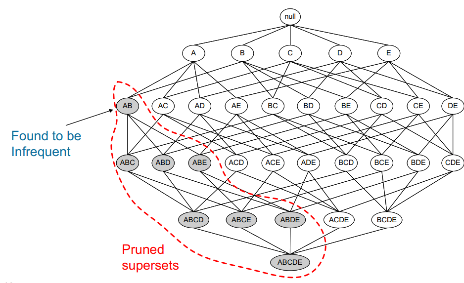
Figure 16.4: Pruned supersets of an infrequent itemset in the a priori network of a dataset with 5 items [140]; no rule would be generated from the grey itemsets.
In the technical jargon of machine learning, we say that a priori uses a bottom-up approach and the downward closure property of support.
The memory savings arise from the fact that the algorithm prunes candidates with infrequent sub-patterns and removes them from consideration for any future itemset: if a \(1-\)itemset is not considered to be frequent enough, any \(2-\)itemset containing it is also infrequent (see Figure 16.5 for another illustration).
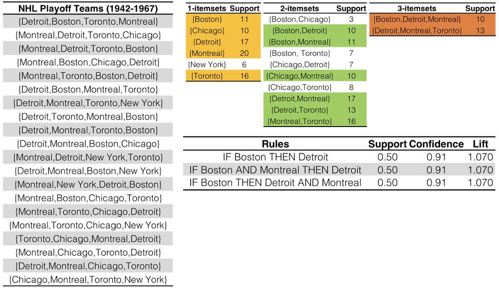
Figure 16.5: Association rules for NHL playoff teams (1942-1967).
A list of the 4 teams making the playoffs each year is shown on the left (\(N=20\)). Frequent itemsets are generated using the a priori algorithms, with a support threshold of 10. We see that there are \(5\) frequent \(1-\)itemsets, top row, in yellow (New York made the playoffs \(6<10\) times – no larger frequent itemset can contain New York). 6 frequent \(2-\)itemsets are found in the subsequent list of ten \(2-\)itemsets, top row, in green (note the absence of New York). Only 2 frequent \(3-\)itemsets are found, top row, in orange. Candidate rules are generated from the shaded itemsets; the rules retained by the thresholds \[\textrm{Support}\geq 0.5,\ \textrm{Confidence}\geq 0.7, \text{ and }\textrm{Lift}>1\ \text{(barely)},\] are shown in the table on the bottom row – the main result is that when Boston made the playoffs, it was not surprising to see Detroit also make the playoffs (the presence or absence of Montreal in a rule is a red herring, as Montreal made the playoffs every year in the data. Are these rules meaningful at all?
Of course, this process requires a support threshold input, for which there there is no guaranteed way to pick a “good” value; it has to be set sufficiently high to minimize the number of frequent itemsets that are being considered, but not so high that it removes too many candidates from the output list; as ever, optimal threshold values are dataset-specific.
The algorithm terminates when no further itemsets extensions are retained, which always occurs given the finite number of levels in categorical datasets.
Strengths: easy to implement and to parallelize [141];
Limitations: slow, requires frequent data set scans, not ideal for finding rules for infrequent and rare itemsets.
More efficient algorithms have since displaced it in practice (although the a priori algorithm retains historical value):
Max-Miner tries to identify frequent itemsets without enumerating them – it performs jumps in itemset space instead of using a bottom-up approach;
Eclat is faster and uses depth-first search, but requires extensive memory storage (a priori and eclat are both implemented in the
Rpackagearules[135]).
16.2.4 Validation
How reliable are association rules? What is the likelihood that they occur entirely by chance? How relevant are they? Can they be generalised outside the dataset, or to new data streaming in?
These questions are notoriously difficult to solve for association rules discovery, but statistically sound association discovery can help reduce the risk of finding spurious associations to a user-specified significance level [138], [139]. We end this section with a few comments:
Since frequent rules correspond to instances that occur repeatedly in the dataset, algorithms that generate itemsets often try to maximize coverage. When rare events are more meaningful (such as detection of a rare disease or a threat), we need algorithms that can generate rare itemsets. This is not a trivial problem.
Continuous data has to be binned into categorical data to generate rules. As there are many ways to accomplish that task, the same dataset can give rise to completely different rules. This could create some credibility issues with clients and stakeholders.
Other popular algorithms include: AIS, SETM, aprioriTid, aprioriHybrid, PCY, Multistage, Multihash, etc.
Additional evaluation metrics can be found in the
arulesdocumentation [135].
16.2.5 Case Study: Danish Medical Data
In temporal disease trajectories condensed from population wide registry data covering 6.2 million patients [62], A.B. Jensen et al. study diagnoses in the Danish population, with the help of association rules mining and clustering methods.
Objectives
Estimating disease progression (trajectories) from current patient state is a crucial notion in medical studies. Such trajectories had (at the time of publication) only been analyzed for a small number of diseases, or using large-scale approaches without consideration for time exceeding a few years. Using data from the Danish National Patient Registry (an extensive, long-term data collection effort by Denmark), the authors sought connections between different diagnoses: how does the presence of a diagnosis at some point in time allow for the prediction of another diagnosis at a later point in time?
Methodology
The authors took the following methodological steps:
compute the strength of correlation for pairs of diagnoses over a 5 year interval (on a representative subset of the data);
test diagnoses pairs for directionality (one diagnosis repeatedly occurring before the other);
determine reasonable diagnosis trajectories (thoroughfares) by combining smaller (but frequent) trajectories with overlapping diagnoses;
validate the trajectories by comparison with non-Danish data;
cluster the thoroughfares to identify a small number of central medical conditions (key diagnoses) around which disease progression is organized.
Data
The Danish National Patient Registry is an electronic health registry containing administrative information and diagnoses, covering the whole population of Denmark, including private and public hospital visits of all types: inpatient (overnight stay), outpatient (no overnight stay) and emergency. The data set covers 15 years, from January ’96 to November ’10 and consists of 68 million records for 6.2 million patients.
Challenges and Pitfalls
Access to the Patient Registry is protected and could only be granted after approval by the Danish Data Registration Agency the National Board of Health.
Gender-specific differences in diagnostic trends are clearly identifiable (pregnancy and testicular cancer do not have much cross-appeal), but many diagnoses were found to be made exclusively (or at least, predominantly) in different sites (inpatient, outpatient, emergency ward), which suggests the importance of stratifying by site as well as by gender.
In the process of forming small diagnoses chains, it became necessary to compute the correlations using large groups for each pair of diagnoses. For close to 1 million diagnosis pairs, more than 80 million samples would have been required to obtain significant \(p-\)values while compensating for multiple testing, which would have translated to a few thousand years’ worth of computer running time. A pre-filtering step was included to avoid this pitfall.57
Project Summaries and Results
The dataset was reduced to 1,171 significant trajectories. These thoroughfares were clustered into patterns centred on 5 key diagnoses central to disease progression:
diabetes;
chronic obstructive pulmonary disease (COPD);
cancer;
arthritis, and
cerebrovascular disease.
Early diagnoses for these central factors can help reduce the risk of adverse outcome linked to future diagnoses of other conditions.
Two author quotes illustrate the importance of these results:
“The sooner a health risk pattern is identified, the better we can prevent and treat critical diseases.” [S. Brunak]
“Instead of looking at each disease in isolation, you can talk about a complex system with many different interacting factors. By looking at the order in which different diseases appear, you can start to draw patterns and see complex correlations outlining the direction for each individual person.” [L.J. Jensen]
Among the specific results, the following “surprising” insights were found:
a diagnosis of anemia is typically followed months later by the discovery of colon cancer;
gout was identified as a step on the path toward cardiovascular disease, and
COPD is under-diagnosed and under-treated.
The disease trajectories cluster for COPD, for instance, is shown in Figure 16.6.
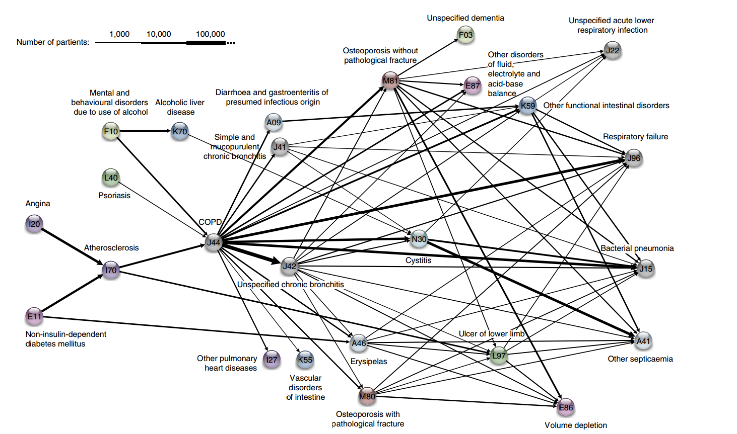
Figure 16.6: The COPD cluster showing five preceding diagnoses leading to COPD and some of the possible outcomes [62].
16.2.6 Toy Example: Titanic Dataset
Compiled by Robert Dawson in 1995, the Titanic dataset consists of 4 categorical attributes for each of the 2201 people aboard the Titanic when it sank in 1912 (some issues with the dataset have been documented, but we will ignore them for now):
class (1st class, 2nd class, 3rd class, crewmember)
age (adult, child)
sex (male, female)
survival (yes, no)
The natural question of interest for this dataset is:
“How does survival relate to the other attributes?”
This is not, strictly speaking, an unsupervised task (as the interesting rules’ structure is fixed to conclusions of the form \(\textrm{survival} = \textrm{Yes}\) or \(\textrm{survival} = \textrm{No}\)).
For the purpose of this example, we elect not to treat the problem as a predictive task, since the situation on the Titanic has little bearing on survival for new data – as such, we use fixed-structure association rules to describe and explore survival conditions on the Titanic (compare with [142]).
We use the arules implementation of the a priori algorithm in R to generate and prune candidate rules, eventually leading to 8 rules (the results are visualized in Figure 16.7). Who survived? Who didn’t?58
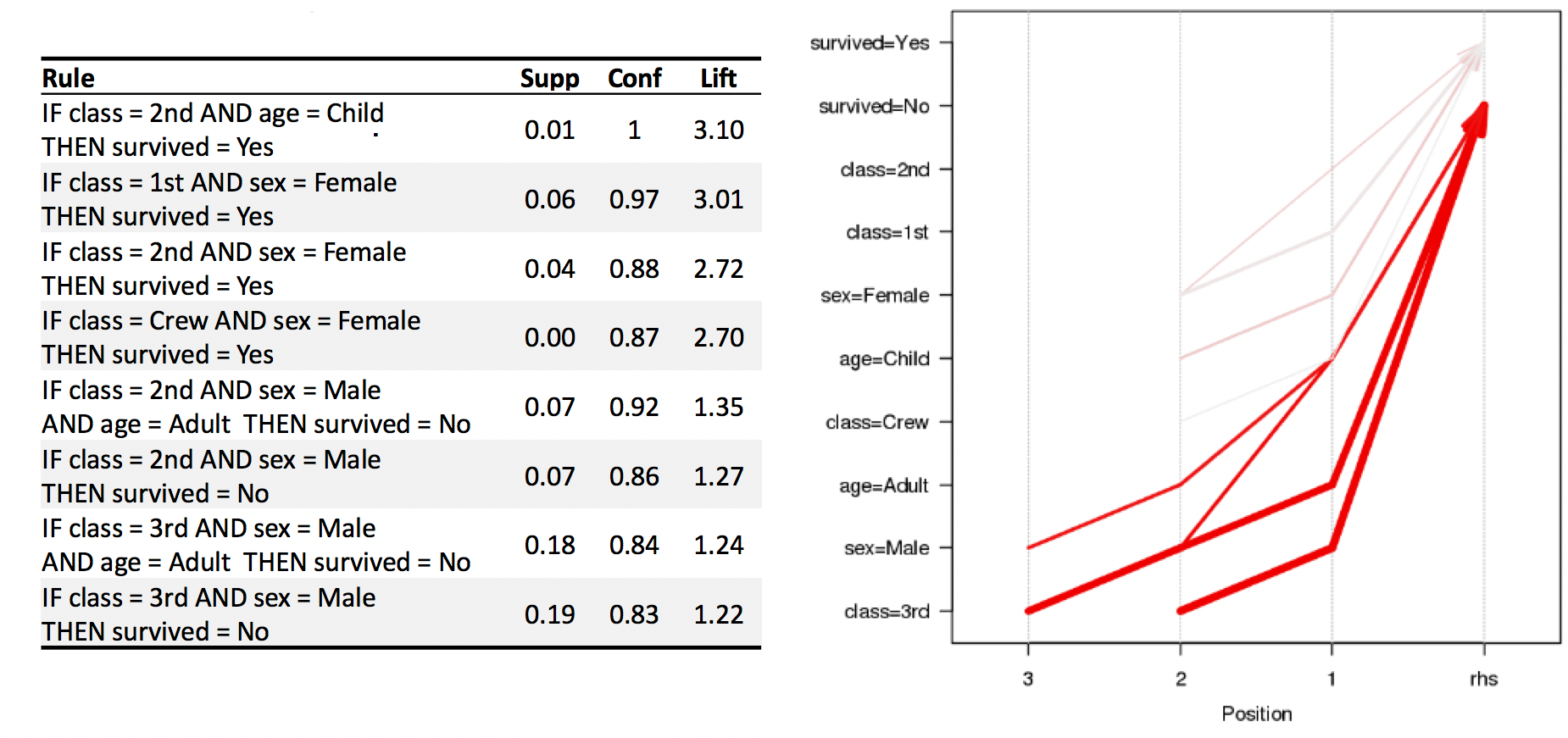
Figure 16.7: Visualization of the 8 Titanic association rules with parallel coordinates.
We show how to obtain these rules via R in Association Rules Mining: Titanic Dataset.
16.3 Classification and Value Estimation
The diversity of problems that can be addressed by classification algorithms is significant, and covers many domains. It is difficult to comprehensively discuss all the methods in a single book. [C.C. Aggarwal [86]]
16.3.1 Overview
The principles underlying classification, regression and class probability estimation are well-known and straightforward. Classification is a supervised learning endeavour in which a sample set of data (the training set) is used to determine rules and patterns that divide the data into predetermined groups, or classes. The training data usually consists of a randomly selected subset of the labeled data.59
In the testing phase, the model is used to assign a class to observations in the testing set, in which the label is hidden, in spite of being actually known.
The performance of the predictive model is then evaluated by comparing the predicted and the values for the testing set observations (but never using the training set observations). A number of technical issues need to be addressed in order to achieve optimal performance, among them: determining which features to select for inclusion in the model and, perhaps more importantly, which algorithm tochoose.
The mushroom (classification) model from Data Science and Machine Learning Tasks provides a clean example of a classification model, albeit one for which no detail regarding the training data and choice of algorithm were made available.
Applications
Classification and value estimation models are among the most frequently used of the data science models, and form the backbone of what is also known as predictive analytics. There are applications and uses in just about every field of human endeavour, such as:
medicine and health science – predicting which patient is at risk of suffering a second, and this time fatal, heart attack within 30 days based on health factors (blood pressure, age, sinus problems, etc.);
social policies – predicting the likelihood of required assisting housing in old age based on demographic information/survey answers;
marketing/business – predicting which customers are likely to cancel their membership to a gym based on demographics and usage;
in general, predicting that an object belongs to a particular class, or organizing and grouping instances into categories, or
enhancing the detection of relevant objects:
avoidance – “this object is an incoming vehicle”;
pursuit – “this borrower is unlikely to default on her mortgage”;
degree – “this dog is 90% likely to live until it’s 7 years old”;
economics – predicting the inflation rate for the coming two years based on a number of economic indicators.
Concrete Examples
Some concrete examples may provide a clearer picture of the types of supervised learning problems that quantitative consultants may be called upon to solve.
A motor insurance company has a fraud investigation department that studies up to 20% of all claims made, yet money is still getting lost on fraudulent claims. To help better direct the investigators, management would like to determine, using past data, if it is possible to predict
whether a claim is likely to be fraudulent?
whether a customer is likely to commit fraud in the near future?
whether an application for a policy is likely to result in a fraudulent claim?
the amount by which a claim will be reduced if it is fraudulent?
Customers who make a large number of calls to a mobile phone company’s customer service number have been identified as churn risks. The company is interested in reducing said churn. Can they predict
the overall lifetime value of a customer?
which customers are more likely to churn in the near future?
what retention offer a particular customer will best respond to?
In every classification scenario, the following questions must be answered before embarking on analysis:
What kind of data is required?
How much of it?
What would constitute a predictive success?
What are the risks associated with a predictive modeling approach?
These have no one-size-fits-all answers. In the absence of testing data, classification models cannot be used for predictive tasks, but may still be useful for descriptive tasks.
When testing data exists, the process is often quite similar, independently of the choice of the algorithm (see the classification pipeline shown in Figure 16.8).
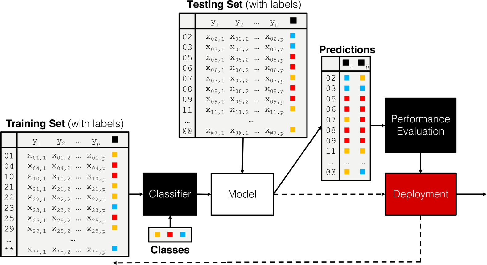
Figure 16.8: A classification pipeline, including training set, testing set, performance evaluation, and (eventual) deployment.
16.3.2 Classification Algorithms
The number of classification algorithms is truly staggering – it often seems as though new algorithms and variants are put forward on a monthly basis, depending on the task and on the type of data [86].
While some of them tend to be rather esoteric, there is a fairly small number of commonly-used workhorse algorithms/approaches that data scientists and consultants should at least have at their command (full descriptions are available in [77], [85], [147]):
logistic regression and linear regression are classical models which are often used by statisticians but rarely in a classification setting (the estimated coefficients are often used to determine the features’ importance); one of their strengths is that the machinery of standard statistical theory (hypothesis testing, confidence intervals, etc.) is still available to the analyst, but they are easily affected by variance inflation in the presence of predictor multi-colinearity, and the stepwise variable selection process that is typically used is problematic – regularization methods would be better suited in general [148] (see Figure (fig:class3) for illustrations);
neural networks have become popular recently due to the advent of deep learning; they might provide the prototypical example of a black box algorithm as they are hard to interpret; another issue is that they require a fair amount of data to train properly – we will have more to say on the topic in a later chapter;
decision trees are perhaps the most commons of all data science algorithms, but they tend to overfit the data when they are not pruned correctly, a process which often has to be done manually (see Figure (fig:class3) for an illustration) – we shall discuss the pros an cons of decision trees in general in Decision Trees;
naı̈ve Bayes classifiers have known quite a lot of success in text mining applications (more specifically as the basis of powerful spam filters), but, embarrassingly, no one is quite sure why they should work as well as they do given that one of their required assumptions (independence of priors) is rarely met in practice (see Figure (fig:class3) for an illustration);
support vector machines attempt to separate the dataset by “fitting” as wide of a “tube” as possible through the classes (subjected to a number of penalty constraints); they have also known successes, most notably in the field of digital handwriting recognition, but their decision boundaries (the tubes in question) tend to be non-linear and quite difficult to interpret; nevertheless, they may help mitigate some of the difficulties associated with big data (see Figure (fig:class2) for an illustration);
nearest neighbours classifiers basically implement a voting procedure and require very little assumptions about the data, but they are not very stable as adding training points may substantially modify the boundary (see Figures (fig:class3) and (fig:class2) for illustrations);
Boosting methods [129], [149] and Bayesian methods ([5], [150], [151]) are also becoming more popular.
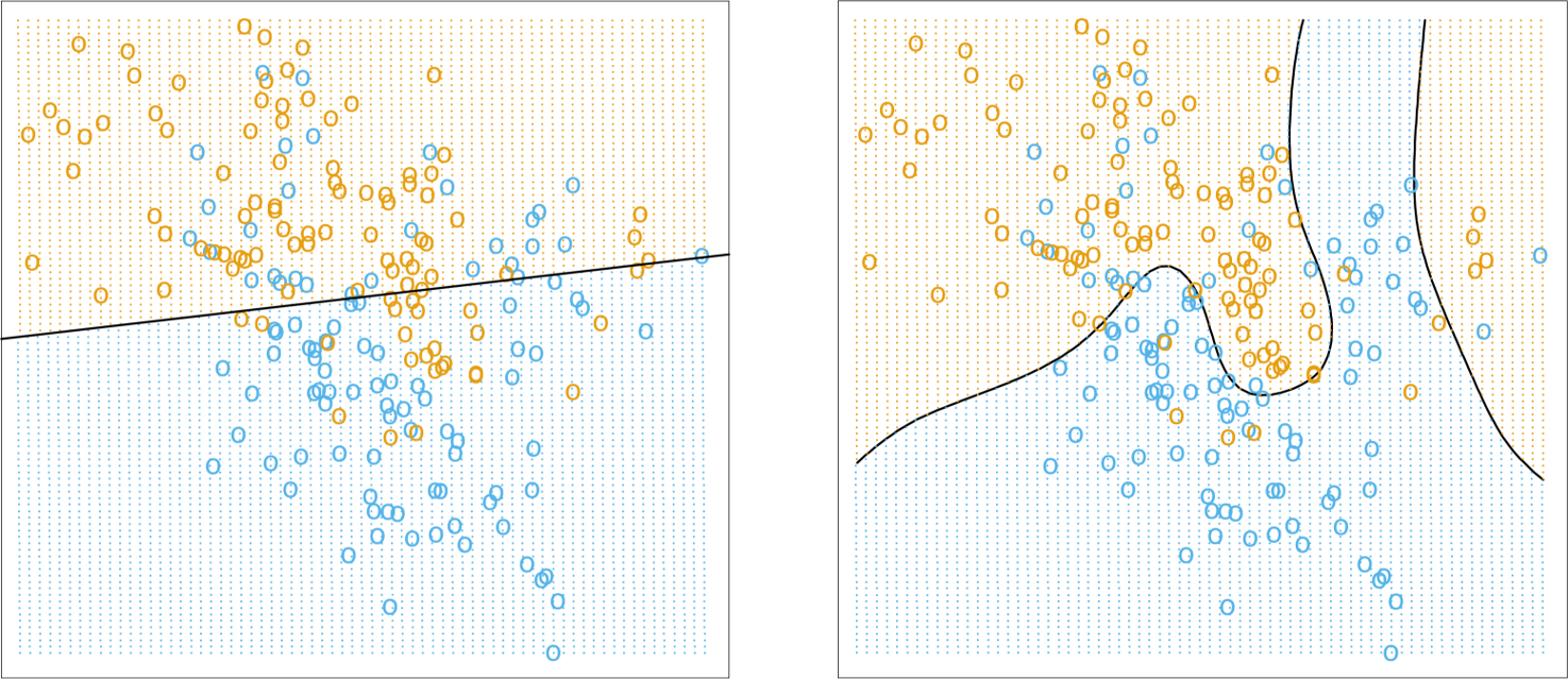
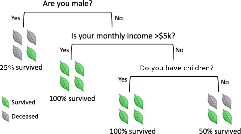
Figure 16.9: Illustrations of various classifiers (linear regression, top left; optimal Bayes, top right; 1NN and 15NN, middle left and right, respectively, on an artificial dataset (from [85]); decision tree depicting the chances of survival for various disasters (fictional, based on [152]). Note that linear regression is more stable, simpler to describe, but less accurate than \(k\)NN and optimal Bayes.
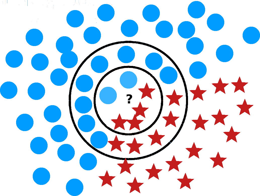
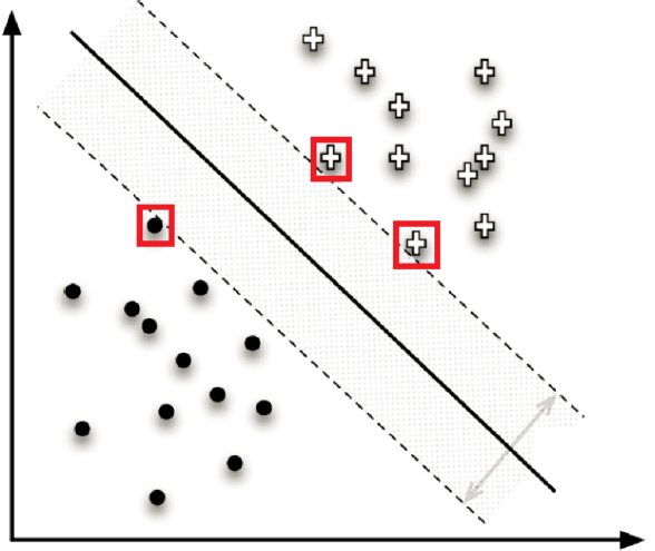
Figure 16.10: Illustration of a \(k\) nearest neighbour (left) and a support vector machines classifier (right, based on [77]). What is the 6NN prediction for the location marked by a question mark? What about the 19NN prediction?
16.3.3 Decision Trees
In order to highlight the relative simplicity of most classification algorithms, we will discuss the workings of ID3, a historically significant decision tree algorithm.60
Classification trees are perhaps the most intuitive of all supervised methods: classification is achieved by following a path up the tree, from its root, through its branches, and ending at its leaves (alghough typically the tree is depicted with its root at the top and its leaves at the bottom).
To make a prediction for a new instance, it suffices to follow the path down the tree, reading the prediction directly once a leaf is reached. It sounds simple enough in theory, but in practice, creating the tree and traversing it might be time-consuming if there are too many variables in the dataset (due to the criterion that is used to determine how the branches split).
Prediction accuracy can be a concern in trees whose growth is unchecked. In practice, the criterion of purity at the leaf-level (that is to say, all instances in a leaf belong to the same leaf) is linked to bad prediction rates for new instances. Other criteria are often used to prune trees, which may lead to impure leaves.
How do we grow such trees?
For predictive purposes, we need a training set and a testing set upon which to evaluate the tree’s performance. Ross Quinlan’s Iterative Dichotomizer 3 (a precursor to the widely-used C4.5 and C5.0) follows a simple procedure:
split the training data (parent) set into (children) subsets, using the different levels of a particular attribute;
compute the information gain for each subset;
select the most advantageous split, and
repeat for each node until some leaf criterion is met.
Entropy is a measure of disorder in a set \(S\). Let \(p_i\) be the proportion of observations in \(S\) belonging to category \(i\), for \(i=1,\ldots, n\). The entropy of \(S\) is given by \[E(S)=-\sum_{i=1}^n p_i\log p_i.\] If the parent set \(S\) consisting of \(m\) records is split into \(k\) children sets \(C_1,\ldots, C_k\) containing \(q_1, \ldots, q_k\) records, respectively, then the information gained from the split is \[I(S:C_1,\ldots,C_k)=E(S)-\frac{1}{m}\sum_{j=1}^kq_jE(C_j).\] The sum term in the information gain equation is a weighted average of the entropy of the children sets.
If the split leads to little disorder in the children, then \(\textrm{IG}(S;C_1,\ldots,C_k)\) is high; if the split leads to similar disorder in both children and parent, then \(\textrm{IG}(S;C_1,\ldots,C_k)\) is low.
Consider, as in Figure 16.11, two splits shown for a parent set with 30 observations separated into 2 classes: \(\circ\) and \(\star\).
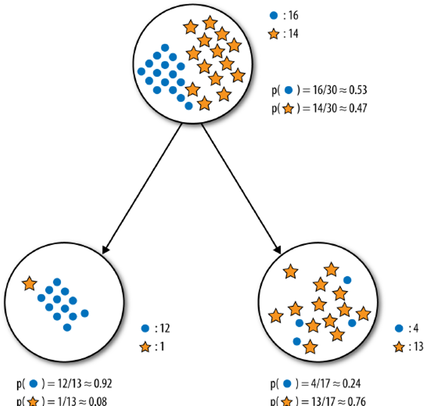
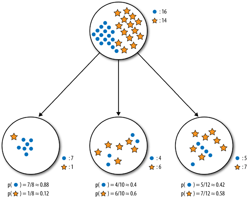
Visually, it appears as though the binary split does a better job of separating the classes. Numerically, the entropy of the parent set \(S\) is \[\begin{aligned} E(S)&=-p_{\circ}\log p_{\circ} - p_{\star}\log p_{\star}\\&=-\frac{16}{30}\log \frac{16}{30} - \frac{14}{30}\log \frac{14}{30} \approx 0.99.\end{aligned}\] For the binary split (on the left), leading to the children set \(L\) (left) and \(R\) (right), the respective entropies are \[E(L)=-\frac{12}{13}\log \frac{12}{13} - \frac{1}{13}\log \frac{1}{13} \approx 0.39\] and \[E(R)=-\frac{4}{17}\log \frac{4}{17} - \frac{13}{17}\log \frac{13}{17} \approx 0.79,\] so that the information gained by that split is \[\textrm{IG}(S;C_L,C_R)\approx 0.99-\frac{1}{30}\left[13\cdot 0.39+17\cdot 0.79\right]=0.37.\]
On its own, this value is not substantially meaningful – it is only in comparison to the information gained from other splits that it becomes useful.
A similar computation for the ternary split leads to \(\textrm{IG}(S;C_1,C_2,C_3)\approx 0.13\), which is indeed smaller than the information gained by the binary split – of these two options, ID3 would select the first as being most advantageous.
Decision trees have numerous strengths: they
are easy to interpret, providing, as they do, a white box model – predictions can always be explained by following the appropriate paths;
can handle numerical and categorical data simultaneously, without first having to “binarise” the data;
can be used with incomplete datasets, if needed (although there is still some value in imputing missing observations);
allow for built-in feature selection as less relevant features do not tend to be used as splitting features;
make no assumption about independence of observations, underlying distributions, multi-colinearity, etc., and can thus be used without the need to verify assumptions;
lend themselves to statistical validation (in the form of cross-validation), and
are in line with human decision-making approaches, especially when such decisions are taken deliberately.
On the other hand, they are
not usually as accurate as other more complex algorithms, nor as robust, as small changes in the training data can lead to a completely different tree, with a completely different set of predictions;[This can become problematic when presenting the results to a client whose understanding of these matters is slight.]
particularly vulnerable to overfitting in the absence of pruning — and pruning procedures are typically fairly convoluted (some algorithms automate this process, using statistical tests to determine when a tree’s “full” growth has been achieved), and
biased towards categorical features with high number of levels, which may give such variables undue importance in the classification process.
Information gain tends to grow small trees in its puruit of pure leaves, but it is not the only splitting metric in use (Gini impurity, variance reduction, etc.).
Notes
ID3 is a precursor of C4.5, perhaps the most popular decision tree algorithm on the market. There are other tree algorithms, such as C5.0, CHAID, MARS, conditional inference trees, CART, etc., each grown using algorithms with their own strengths and weaknesses.
Regression trees are grown in a similar fashion, but with a numerical response variable (predicted inflation rate, say), which introduces some complications [85], [129].
Decision trees can also be combined together using boosting algorithms (such as AdaBoost) or random forests, providing a type of voting procedure also known as ensemble learning – an individual tree might make middling predictions, but a large number of judiciously selected trees are likely to make good predictions, on average [85], [129], [149] – we will re-visit these concepts in a later chapter.
Additionally:
since classification is linked to probability estimation, approaches that extend the basic ideas of regression models could prove fruitful;
rare occurrences are often more interesting and more difficult to predict and identify than regular instances – historical data at Fukushima’s nuclear reactor prior to the 2011 meltdown could not have been used to learn about meltdowns, for obvious reasons;61
with big datasets, algorithms must also consider efficiency – thankfully, decision trees are easily parallelizable.
16.3.4 Performance Evaluation
As a consequence of the (so-called) No-Free-Lunch Theorem, no single classifier can be the best performer for every problem. Model selection must take into account:
the nature of the available data;
the relative frequencies of the classification sub-groups;
the stated classification goals;
how easily the model lends itself to interpretation and statistical analysis;
how much data preparation is required;
whether it can accommodate various data types and missing observations;
whether it performs well with large datasets, and
whether it is robust against small data departures from theoretical assumptions.
Past success is not a guarantee of future success – it is the analyst’s responsibility to try a variety of models. But how can the “best” model be selected?
When a classifier attempts to determine what kind of music a new customer would prefer, there is next to no cost in making a mistake; if, on the other hand, the classifier attempts to determine the presence or absence of cancerous cells in lung tissue, mistakes are more consequential. Several metrics can be used to assess a classifier’s performance, depending on the context.
Binary classifiers (presented in the abstract in Figure 16.12) are simpler and have been studied far longer than multi-level classifiers; consequently, a larger body of evaluation metrics is available for these classifiers.
In the medical literature, for instance, \(\textrm{TP}\), \(\textrm{TN}\), \(\textrm{FP}\) and \(\textrm{FN}\) stand for True Positives, True Negatives, False Positives, and False Negatives, respectively.
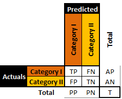
Figure 16.12: A general binary classifier.
A perfect classifier would be one for which both \(\textrm{\textrm{FP}},\textrm{FN}=0\), but in practice, that rarely ever happens (if at all).
Traditional performance metrics include:
sensitivity: \(\textrm{TP}/\textrm{AP}\)
specificity: \(\textrm{TN}/\textrm{AN}\)
precision: \(\textrm{TP}/\textrm{PP}\)
negative predictive value: \(\textrm{TN}/\textrm{PN}\)
false positive rate: \(\textrm{FP}/\textrm{AN}\)
false discovery rate: \(1-\textrm{TP}/\textrm{PP}\)
false negative rate: \(\textrm{FN}/\textrm{AP}\)
accuracy: \((\textrm{TP}+\textrm{TN})/\textrm{T}\)
\(F_1-\)score: \(2\textrm{TP}/(2\textrm{TP}+\textrm{FP}+\textrm{FN})\)
MCC: \(\frac{\textrm{TP}\cdot \textrm{TN}-\textrm{FP}\cdot \textrm{FN}}{\sqrt{\textrm{AP}\cdot \textrm{AN}\cdot \textrm{PP} \cdot \textrm{PN}}}\)
informedness/ROC: \(\textrm{TP}/\textrm{AP}+\textrm{TN}/\textrm{AN}-1\)
markedness: \(\textrm{TP}/\textrm{PP}+\textrm{TN}/\textrm{PN}-1\)
The confusion matrices of two artificial binary classifers for a testing set are shown in 16.13.
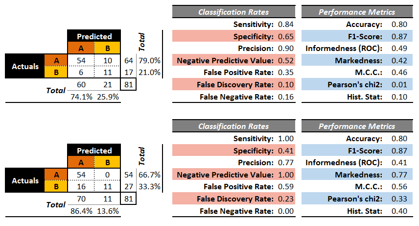
Figure 16.13: Performance metrics for two (artificial) binary classifiers.
Both classifiers have an accuracy of \(80\%\), but while the second classifier sometimes makes a wrong prediction for \(A\), it never does so for \(B\), whereas the first classifier makes erroneous predictions for both \(A\) and \(B\).
On the other hand, the second classifier mistakenly predicts occurrence \(A\) as \(B\) 16 times while the first one only does so 6 times. So which one is best?
The performance metrics alone do not suffice to answer the question: the cost associated with making a mistake must also be factored in. Furthermore, it could be preferable to select performance evaluation metrics that generalize more readily to multi-level classifiers (see Figure 16.14 for examples of associated confusion matrices).
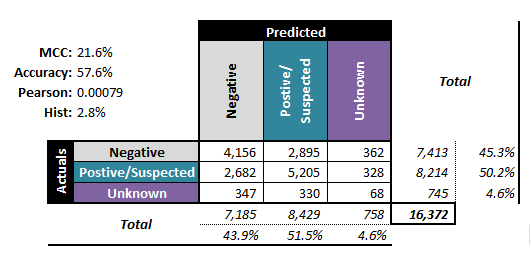
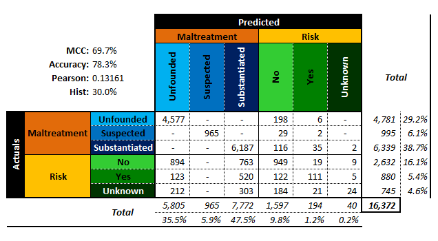
Figure 16.14: Performance metrics for (artificial) multi-level classifiers: ternary - left; senary - right (personal files).
The accuracy is the proportion of correct predictions amid all the observations; its value ranges from 0% to 100%. The higher the accuracy, the better the match, and yet, a predictive model with high accuracy may nevertheless be useless thanks to the Accuracy Paradox (see rare occurrence footnote).
The Matthews Correlation Coefficient (MCC), on the other hand, is a statistic which is of use even when the classes are of very different sizes. As a correlation coefficient between the actual and predicted classifications, its range varies from \(−1\) to \(1\).
If \(\textrm{MCC}=1\), the predicted and actual responses are identical,while if \(\textrm{MCC}=0\), the classifier performs no better than arandom prediction (“flip of a coin”).
It is also possible to introduce two non-traditional performance metrics (which are nevertheless well-known statistical quantities) to describe how accurately a classifier preserves the classification distribution (rather than how it behaves on an observation-by-observation basis):
Pearson’s \(\chi^2\): \(\frac{1}{\textrm{T}}\left((\textrm{PP}-\textrm{AP})^2/\textrm{PP} + (\textrm{PN}-\textrm{AN})^2/\textrm{PN}\right)\)
Hist: \(\frac{1}{\textrm{T}}\left(\left|\textrm{PP}-\textrm{AP}\right|+\left|\textrm{PN}-\textrm{AN}\right|\right)\)
Note, however, that these are non-standard performance metrics. For a given number of levels, the smaller these quantities, the more similar the actual and predicted distributions.
For numerical targets \(y\) with predictions \(\hat{y}\), the confusion matrix is not defined, but a number of classical performance evaluation metrics can be used on the testing set: the
mean squared and mean absolute errors \[\textrm{MSE}=\textrm{mean}\left\{(y_i-\hat{y}_i)^2\right\}, \quad \textrm{MAE}=\textrm{mean}\{|y_i-\hat{y}_i|\};\]
normalized mean squared/mean absolute errors \[\begin{aligned} \textrm{NMSE}&=\frac{\textrm{mean}\left\{(y_i-\hat{y}_i)^2\right\}}{\textrm{mean}\left\{(y_i-\overline{y})^2\right\}}, \\ \textrm{NMAE}&=\frac{\textrm{mean}\left\{|y_i-\hat{y}_i|\right\}}{\textrm{mean}\left\{|y_i-\overline{y}|\right\}};\end{aligned}\]
mean average percentage error \[\textrm{MAPE}=\textrm{mean}\left\{\frac{|y_i-\hat{y}_i|}{y_i}\right\};\]
correlation \(\rho_{y,\hat{y}}\), which is based on the notion that for good models, the predicted values and the actual values should congregate around the lines \(y=\hat{y}\) (see Figure @ref(fig:predictions for an illustration).
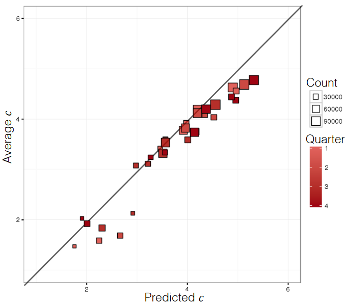
Figure 16.15: Predicted and actual numerical responses (personal file).
As is the case for classification, an isolated value estimation performance metric does not provide enough of a rationale for model validation/selection. One possible exception: normalized evaluation metrics do provide some information about the relative quality of performance (see [85], [129]).
16.3.5 Case Study: Minnesota Tax Audit
Large gaps between revenue owed (in theory) and revenue collected (in practice) are problematic for governments. Revenue agencies implement various fraud detection strategies (such as audit reviews) to bridge that gap.
Since business audits are rather costly, there is a definite need for algorithms that can predict whether an audit is likely to be successful or a waste of resources.
In Data Mining Based Tax Audit Selection: A Case Study of a Pilot Project at the Minnesota Department of Revenue [63], Hsu et al. study the Minnesota Department of Revenue’s (DOR) tax audit selection process with the help of classification algorithms.
Objective
The U.S. Internal Revenue Service (IRS) estimated that there were large gaps between revenue owed and revenue collected for 2001 and for 2006. Using DOR data, the authors sought to increase efficiency in the audit selection process and to reduce the gap between revenue owed and revenue collected.
Methodology
The authors took the following steps:
data selection and separation: experts selected several hundred cases to audit and divided them into training, testing and validating sets;
classification modeling using MultiBoosting, Naïve Bayes, C4.5 decision trees, multilayer perceptrons, support vector machines, etc;
evaluation of all models was achieved by testing the model on the testing set – models originally performed poorly on the testing set until the size of the business being audited was recognized to have an effect, leading to two separate tasks (large and small businesses);
model selection and validation was done by comparing the estimated accuracy between different classification model predictions and the actual field audits. Ultimately, MultiBoosting with Naïve Bayes was selected as the final model; the combination also suggested some improvements to increase audit efficiency.
Data
The data consisted of selected tax audit cases from 2004 to 2007, collected by the audit experts, which were split into training, testing and validation sets:
the training data set consisted of Audit Plan General (APGEN) Use Tax audits and their results for the years 2004-2006;
the testing data consisted of APGEN Use Tax audits conducted in 2007 and was used to test or evaluate models (for Large and Smaller businesses) built on the training dataset,
while validation was assessed by actually conducting field audits on predictions made by models built on 2007 Use Tax return data processed in 2008.
None of the sets had records in common (see Figure 16.16).
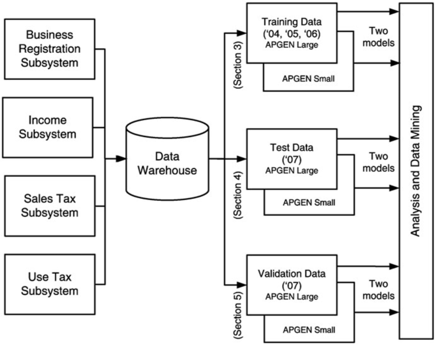
Figure 16.16: Data sources for APGEN mining [63]. Note the 6 final sets which feed the Data Analysis component.
Strengths and Limitations of Algorithms
The Naïve Bayes classification scheme assumes independence of the features, which rarely occurs in real-world situations. This approach is also known to potentially introduce bias to classification schemes. In spite of this, classification models built using Naïve Bayes have a successfully track record.
MultiBoosting is an ensemble technique that uses committee (i.e. groups of classification models) and “group wisdom” to make predictions; unlike other ensemble techniques, it is different from other ensemble techniques in the sense that it forms a committee of sub-committees (i.e., a group of groups of classification models), which has a tendency to reduce both bias and variance of predictions (see [86], [149] for more information on these topics).
Procedures
Classification schemes need a response variable for prediction: audits which yielded more than $500 per year in revenues during the audit period were classified as Good; the others were Bad. The various models were tested and evaluated by comparing the performances of the manual audits (which yield the actual revenue) and the classification models (the predicted classification).
The procedure for manual audit selection in the early stages of the study required:
DOR experts selecting several thousand potential cases through a query;
DOR experts further selecting several hundreds of these cases to audit;
DOR auditors actually auditing the cases, and
calculating audit accuracy and return on investment (ROI) using the audits results.
Once the ROIs were available, data mining started in earnest. The steps involved were:
Splitting the data into training, testing, and validating sets.
Cleaning the training data by removing “bad” cases.
Building (and revising) classification models on the training dataset. The first iteration of this step introduced a separation of models for larger businesses and relatively smaller businesses according to their average annual withholding amounts (the threshold value that was used is not revealed in [63]).
Selecting separate modeling features for the APGEN Large and Small training sets. The feature selection process is shown in Figure 16.17.
Building classification models on the training dataset for the two separate class of business (using C4.5, Naïve Bayes, multilayer perceptron, support vector machines, etc.), and assessing the classifiers using precision and recall with improved estimated ROI: \[\text{Efficiency} = \text{ROI} = \frac{\text{Total revenue generated}}{\text{Total collection cost}}\]
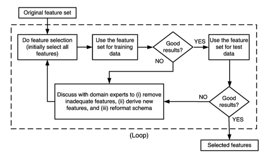
Figure 16.17: Feature selection process [63]. Note the involvement of domain experts.
Results, Evaluation and Validation
The models that were eventually selected were combinations of MultiBoosting and Naïve Bayes (C4.5 produced interpretable results, but its performance was shaky). For APGEN Large (2007), experts had put forward 878 cases for audit (495 of which proved successful), while the classification model suggested 534 audits (386 of which proved successful). The theoretical best process would find 495 successful audits in 495 audits performed, while the manual audit selection process needed 878 audits in order to reach the same number of successful audits.
For APGEN Small (2007), 473 cases were recommended for audit by experts (only 99 of which proved successful); in contrast, 47 out of the 140 cases selected by the classification model were successful. The theoretical best process would find 99 successful audits in 99 audits performed, while the manual audit selection process needed 473 audits in order to reach the same number of successful audits.
In both cases, the classification model improves on the manual audit process: roughly 685 data mining audits to reach 495 successful audits of APGEN Large (2007), and 295 would be required to reach 99 successful audits for APGEN Small (2007), as can be seen in Figure 16.18.
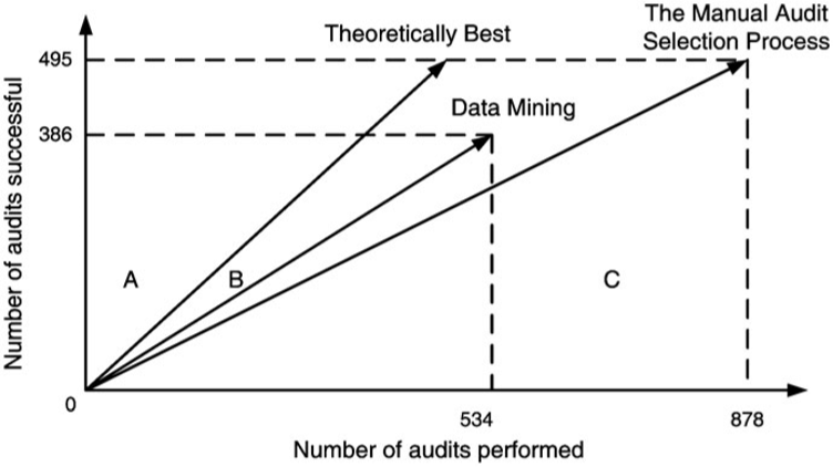
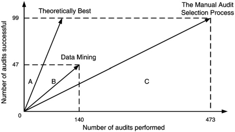
Figure 16.18: Audit resource deployment efficiency [63]. Top: APGEN Large (2007). Bottom: APGEN Small (2007). In both cases, the Data Mining approach was more efficient (the slope of the Data Mining vector is ‘closer’ to the Theoretical Best vector than is the Manual Audit vector).
Figure 16.19 presents the confusion matrices for the classification model on both the APGEN Large and Small 2007 datasets.
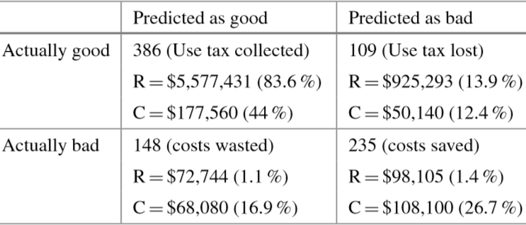
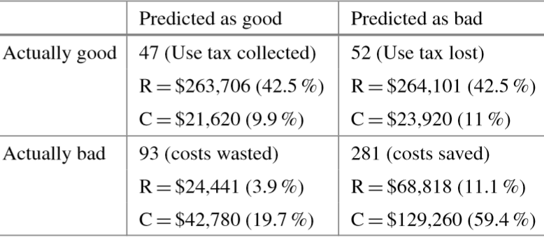
Figure 16.19: Confusion matrices for audit evaluation [63]. Top: APGEN Large (2007). Bottom: APGEN Small (2007). \(R\) stands for revenues, \(C\) for collection costs.
The revenue \(R\) and collection cost \(C\) entries can be read as follows: the 47 successful audits which were correctly identified by the model for APGEN Small (2007) correspond to cases consuming 9.9% of collection costs but generating 42.5% of the revenues. Similarly, the 281 bad audits correctly predicted by the model represent notable collection cost savings. These are associated with 59.4% of collection costs but they generate only 11.1% of the revenues.
Once the testing phase of the study was conpleted, the DOR validated the data mining-based approach by using the models to select cases for actual field audits in a real audit project. The prior success rate of audits for APGEN Use tax data was 39% while the model was predicting a success rate of 56%; the actual field success rate was 51%.
Take-Aways
A substantial number of models were churned out before the team made a final selection. Past performance of a model family in a previous project can be used as a guide, but it provides no guarantee regarding its performance on the current data – remember the No Free Lunch (NFL) Theorem [153]: nothing works best all the time!
There is a definite iterative feel to this project: the feature selection process could very well require a number of visits to domain experts before the feature set yields promising results. This is a valuable reminder that the data analysis team should seek out individuals with a good understand of both data and context. Another consequence of the NFL is that domain-specific knowledge has to be integrated in the model in order to beat random classifiers, on average [154].
Finally, this project provides an excellent illustration that even slight improvements over the current approach can find a useful place in an organization – data science is not solely about Big Data and disruption!
16.3.6 Toy Example: Kyphosis Dataset
As a basic illustration of these concepts, consider the following example. Kyphosis is a medical condition related to an excessive convex curvature of the spine. Corrective spinal surgery is at times performed on children.
A dataset of 81 observations and 4 attributes has been collected (we have no information on how the data was collected and how representative it is likely to be, but those details can be gathered from [155]).
The attributes are:
kyphosis (absent or present after presentation)
age (at time of operation, in months)
number (of vertebrae involved)
start (topmost vertebra operated on)
The natural question of interest for this dataset is:
“how do the three explanatory attributes impact the operation’s success?”
We use the rpart implementation of Classification and Regression Tree (CART) in R to generate a decision tree. Strictly speaking, this is not a predictive supervised task as we treat the entire dataset as a training set for the time being – there are no hold-out testing observations.
The results are shown in Figure 16.20. Interestingly, it would appear that the variable number does not play a role in determining the success of the operation (for the observations in the dataset).
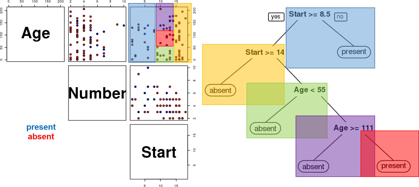
Figure 16.20: Kyphosis decision tree visualization. Only two features are used to construct the tree. We also note that the leaves are not pure – there are blue and red instances in 3 of the 5 classification regions.
Furthermore, the decision tree visualization certainly indicates that its leaves are not pure (see Figure 16.21). Some additional work suggests that the tree is somewhat overgrown and that it could benefit from being pruned after the first branching point.
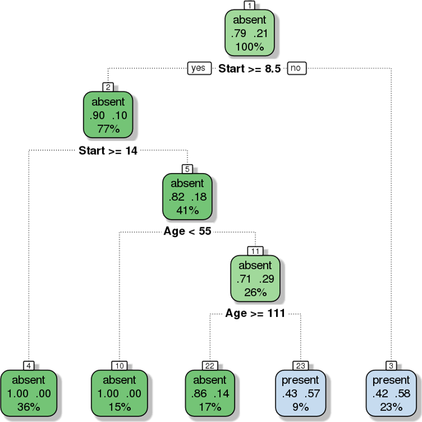
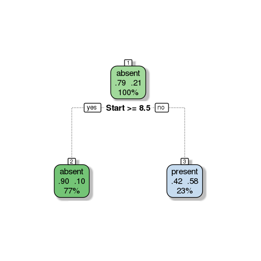
Figure 16.21: Pruning a decision tree – the original tree (left) is more accurate/more complex than the pruned tree (right).
At any rate, it remains meangingless to discuss the performance of the tree for predictive purposes if we are not using a holdout testing sample (not to say anything about the hope of generalizing to a larger population).
To that end, we trained a model on 50 randomly selected observations and evaluated the performance on the remaining 31 observations (the structure of the tree is not really important at this stage). The results are shown in Figure 16.22. Is the model “good”?
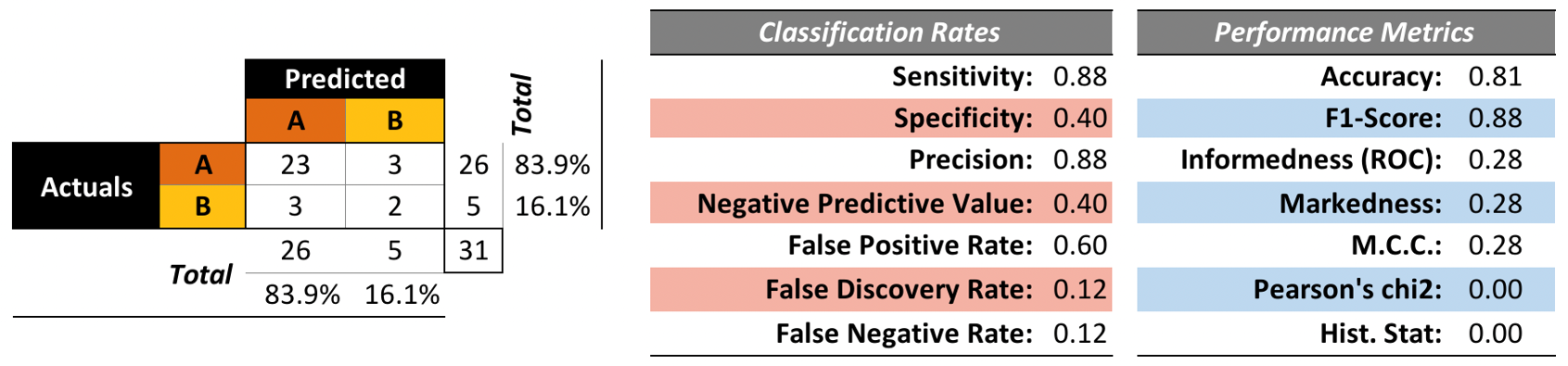
Figure 16.22: Kyphosis decision tree – performance evaluation. The accuracy and \(F1\) score are good, but the false discovery rate and false negative rate are not so great. This tree is good at predicting successful surgeries, but not fantastic at predicting failed surgeries. Is it still useful?
It is difficult to answer this question in the machine learning sense without being able to compare its performance metrics with those of other models (or families of models).62
In Model Selection, we will briefly discuss how estimate a model’s true predictive error rate through cross-validation. We will also discuss a number of other issues that can arise when ML/AI methods are not used correctly.
We show how to obtain these decision trees via R in Classification: Kyphosis Dataset.
16.4 Clustering
Clustering is in the eye of the beholder, and as such, researchers have proposed many induction principles and models whose corresponding optimisation problem can only be approximately solved by an even larger number of algorithms. [V. Estivill-Castro, Why So Many Clustering Algorithms?]
16.4.1 Overview
We can make a variety of quantitative statements about a dataset, at the univariate level. For instance, we can
compute frequency counts for the variables, and
identify measures of centrality (mean, mode, median), and
dispersal (range, standard deviation), among others.
At the multivariate level, the various options include \(n-\)way tabulations, correlation analysis, and data visualization, among others.
While these might provide insights in simple situations, datasets with a large number of variables or with mixed types (categorical and numerical) might not yield to such an approach. Instead, insights might come in the form of aggregation or clustering of similar observations.
A successful clustering scheme is one that tightly joins together any number of similarity profiles (“tight” in this context refers to small variability within the cluster, see 16.23 for an illustration).
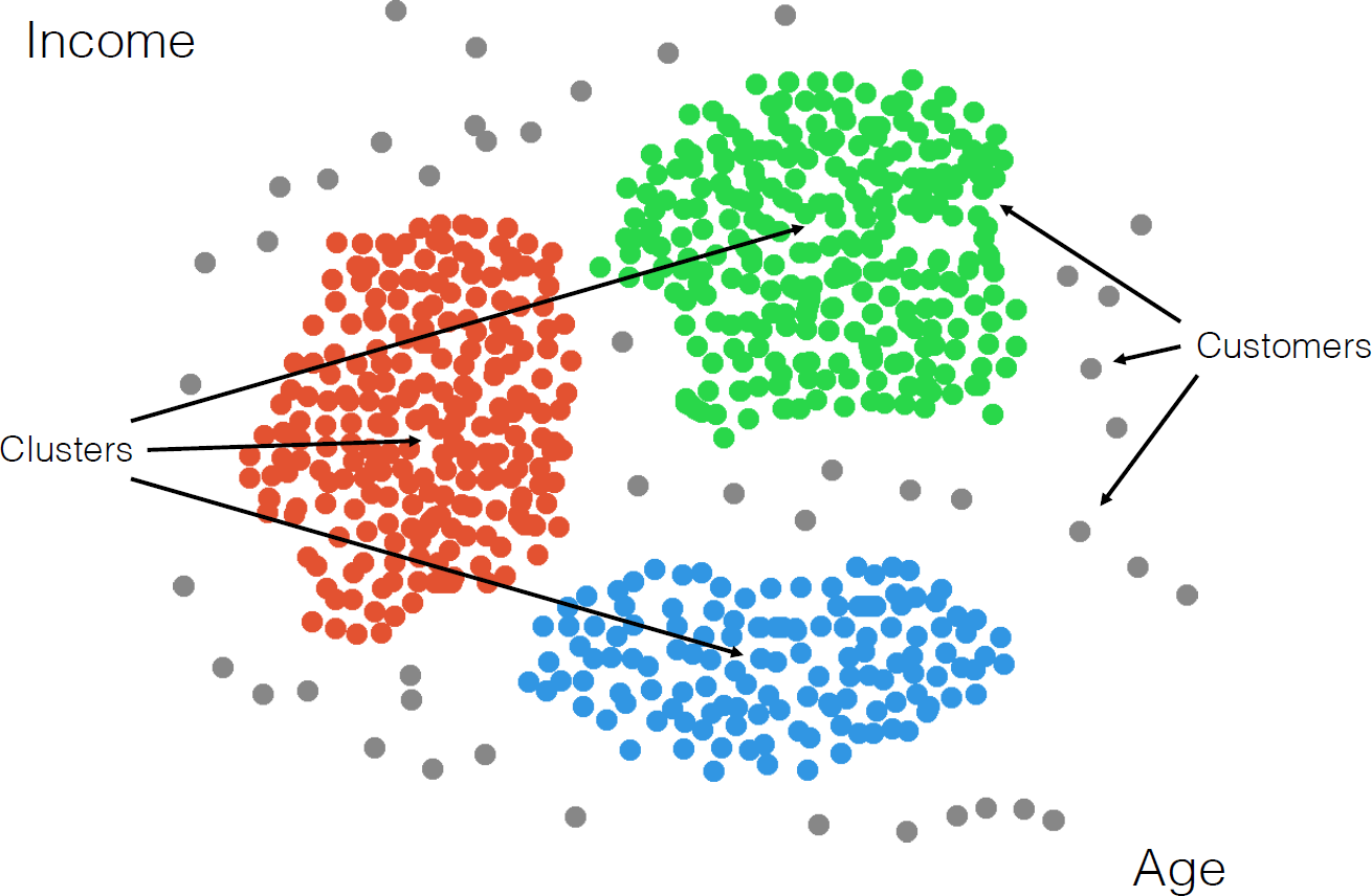
Figure 16.23: Clusters and outliers in an artificial dataset [personal file].
A typical application is one found in search engines, where the listed search results are the nearest similar objects (relevant webpages) clustered around the search item.
Dissimilar objects (irrelevant webpages) should not appear in the list, being “far” from the search item. Left undefined in this example is the crucial notion of closeness: what does it mean for one observation to be near another one? Various metrics can be used (see 16.24 for some simple examples), and not all of them lead to the same results.
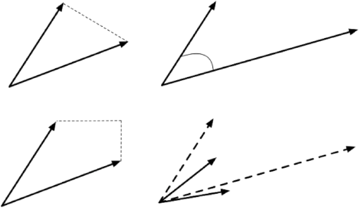
Figure 16.24: Distance metrics between observations: Euclidean (as the crow flies, top left); cosine (direction from a vantage point, top right); Manhattan (taxi-cab, bottom left). Observations should be transformed (scaled, translated) before distance computations (bottom right).
Clustering is a form of unsupervised learning since the cluster labels (and possibly their number) are not determined ahead of the analysis.
The algorithms can be complex and non-intuitive, based on varying notions of similarities between observations, and yet, the temptation to provide a simple a posteriori explanation for the groupings remains strong – we really, really want to reason with the data.63
The algorithms are also (typically) non-deterministic – the same routine, applied twice (or more) to the same dataset, can discover completely different clusters.64
This (potential) non-replicability is not just problematic for validation – it can also leads to client dissatisfaction. If the analyst is tasked with finding customer clusters for marketing purposes and the clusters change every time the client or the stakeholder asks for a report, they will be very confused (and doubtful) unless the stochastic nature of the process has already been explained.
Another interesting aspect of clustering algorithms is that they often find clusters even when there are no natural ways to break down a dataset into constituent parts.
When there is no natural way to break up the data into clusters, the results may be arbitrary and fail to represent any underlying reality of the dataset. On the other hand, it could be that while there was no recognized way of naturally breaking up the data into clusters, the algorithm discovered such a grouping – clustering is sometimes called automated classification as a result.
The aim of clustering, then, is to divide into naturally occurring groups. Within each group, observations are similar; between groups, they are dissimilar (see Figure 16.25 for an illustration).
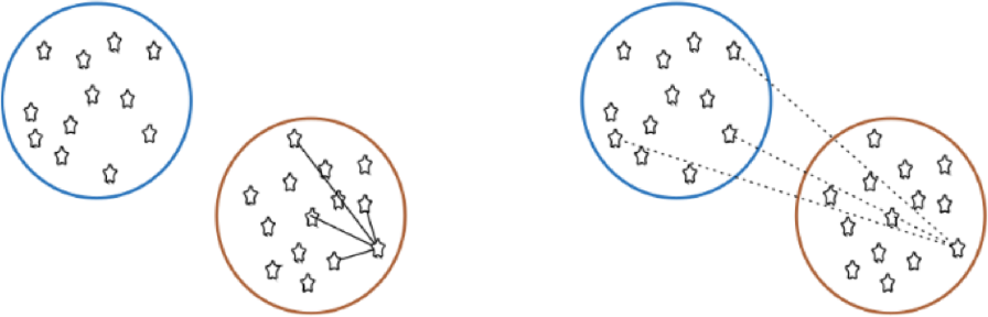
Figure 16.25: Distance to points in own clusters (left, smaller is better) and to points in other clusters (right, larger is better).
As a learning process, clustering is fairly intuitive for human beings – our brains unconsciously search for patterns and they can generally handle messy data with the same relative ease as clean data.
Computers have a harder time of it, however; part of the challenge is that there is no agreed-upon definition of what constitutes a cluster, and so we cannot easily code their recognition into algorithms – to paraphrase Justice Potter Stewart,
“I may not be able to define what a cluster is, but I know one when I see one.”
All clustering algorithms rely on the notion of similarity \(w\)between observations; in many instances, similarity is obtained via a distance (or metric) \(d\), with \(w\to 1\) as \(d\to 0\), and \(w\to 0\) as \(d\to\infty\). However, there are similarity measures which are not derived from a distance metric.
One additional clustering challenge is that there is no such thing as the distance or the similarity measure between observations – observations which are similar using a specific measure may not be similar at all using another. Commonly-used metrics include:
euclidean,
Manhattan,
cosine,
Canberra,
Haming,
Jaccard,
Pearson,
and so on.
Note, however, that no matter which similarity measure is selected, the data must first be transformed: scaled, centered, etc. (see Figure 16.24). This introduces another layer of arbitrary choices, as there are multiple available options and no canonical way to perform this.
Applications
Frequently, we use clustering and other unsupervised learning tasks as preliminary steps in supervised learning problems, but there exist stand-alone applications as well:
text analysis – grouping similar documents according to their topics, based on the patterns of common and unusual terms;
product recommendations – grouping online purchasers based on the products they have viewed, purchased, liked, or disliked, or grouping products based on customer reviews;
marketing – grouping client profiles based on their demographics and preferences;
social network analysis – recognising communities within large groups of people;
medical imaging – differentiating between different tissue types in a 3D voxel;
genetics – inferring structures in populations;
dividing a larger group (or area, or category) into smaller groups, with members of the smaller groups having similarities of some kind, as analytical tasks may then be solved separately for each of the smaller groups, which may lead to increased accuracy once the separate results are aggregated, or
creating (new) taxonomies on the fly, as new items are added to a group of items, which could allow for easier product navigation on a website like Netflix, for instance.
Plenty of other applications may be found in [61], [64]–[67], [76], [156]–[162].
When all is said and done, the clustering process is quite standard, notwithstanding the choice of scaling strategy, similarity measure, and algorithm and parameters (see the pipeline shown in Figure 16.26).
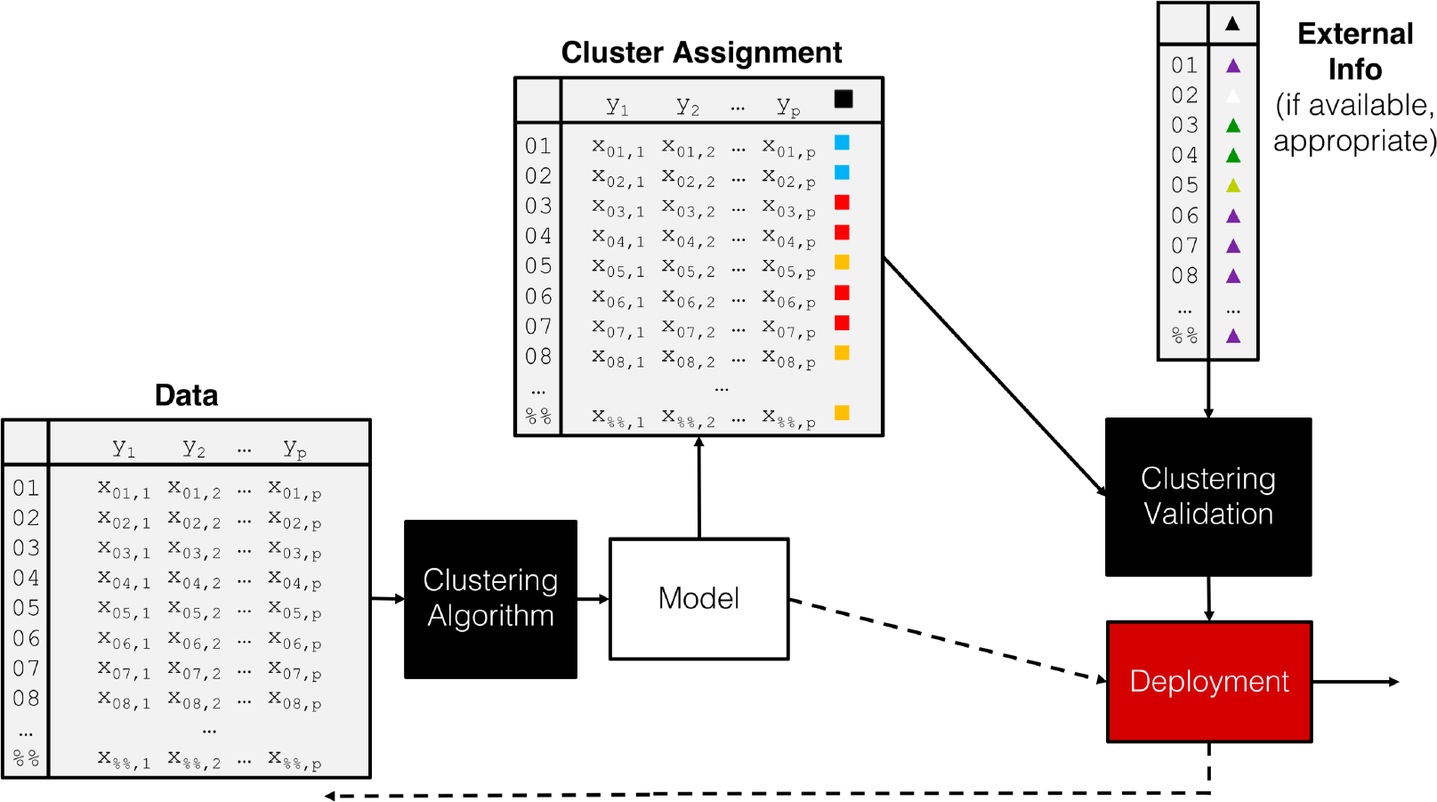
Figure 16.26: A clustering pipeline, including validation and (eventual) deployment.
16.4.2 Clustering Algorithms
As is the case with classification, the number of clustering algorithms is quite high; the Wikipedia page lists 40+ such algorithms as of August 2018 [88]. The choice of algorithms (and associated parameters) is as much an art as it is a science, although domain expertise can come in handy [76]. There is a smaller list of common algorithms thatdata scientists and consultants should have in their toolbox (full descriptions available in [76], [77], [147]):
\(k-\)means, close on the heels of decision trees for the title of “most-used data science algorithm”, is a partition clustering method which tends to produce equal-sized clusters; when clients ask for their data to be clustered, they are typically envisioning \(k-\)means with the Euclidean metric; variants include \(k-\)mode (for categorical data), \(k-\)medians (for data with outliers), and \(k-\)means\(||\) and \(k-\)means\(++\) for large data sets; the number of clusters \(k\) (and the similarity measure/distance metric) must be provided by the user; works fairly well for “blob”-like data;
hierarchical clustering is one of the few deterministic algorithms on the market, with divisive (DIANA) and agglomerative (AGNES) versions; no parameters need to be inputted, but the users must select a linkage strategy (roughly speaking, a metric that computes the distance between clusters) and a level at which to read off the clusters (see Figure 16.27 for an an illustration);
density-based spatial clustering (DBSCAN) is a graph-based approach which attempts to identify densely-packed regions in the dataset; its most obvious advantages (and of its variants OPTICS and DENCLUE) are robustness to outliers and not needing to input a number of clusters to search for in the data; the main disadvantage is that the optimal input parameters (neighbourhood radius and minimum number of points to be considered dense) are not easy to derive (see Figure 16.27 for an an illustration);
affinity propagation is another algorithm which selects the optimal number of clusters directly from the data, but it does so by trying and evaluating various scenarios, which may end up being time-consuming;
spectral clustering can be used to recognize non-globular clusters (see Figure 16.27 for an an illustration); these are found by computing eigenvalues of an associated Laplacian matrix – consequently, spectral clustering is fast.
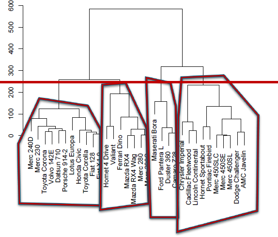
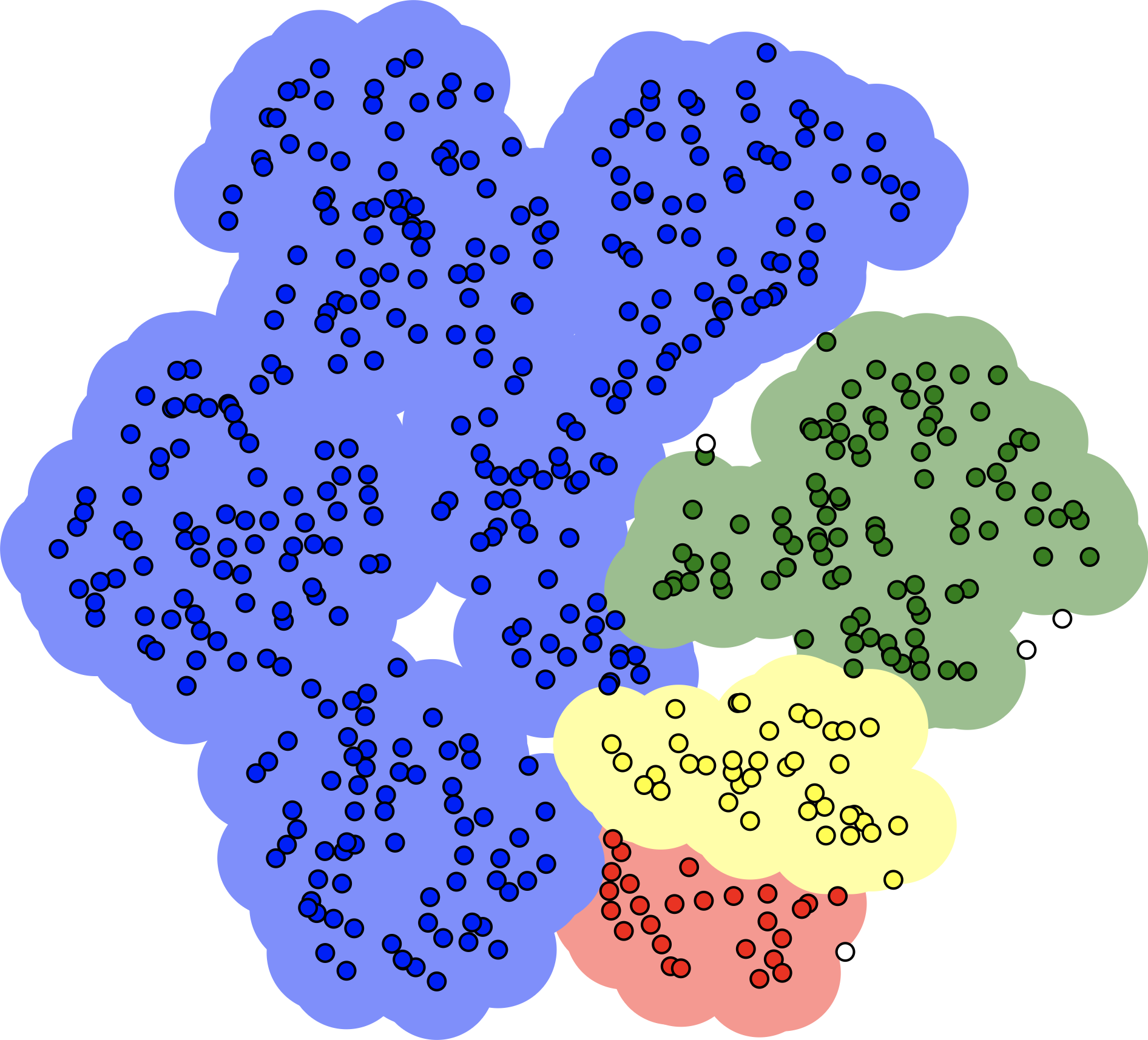
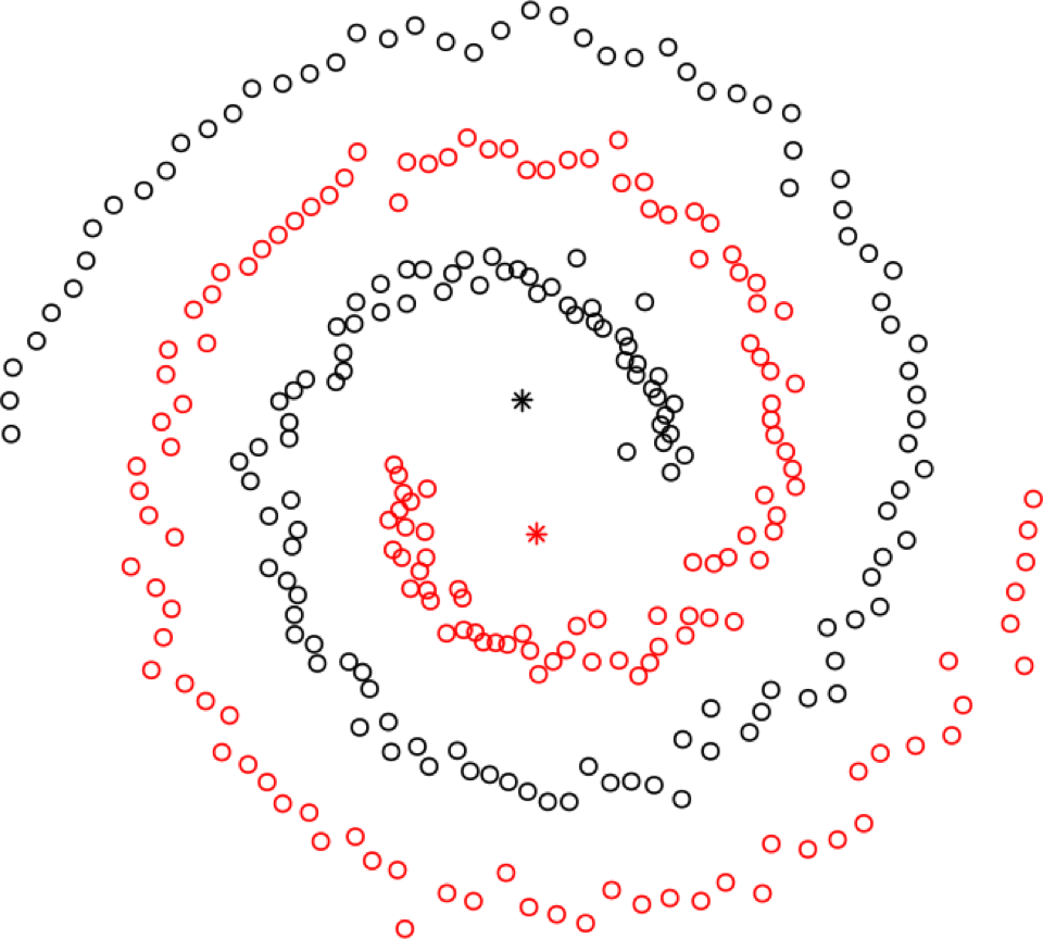
Figure 16.27: Illustration of hierarchical clustering (left), DBSCAN (middle, based on [163]), and spectral clustering (right).
Other methods include latent Dirichlet allocation (used in topics modeling), expectation-maximisation (particularly useful to find gaussian clusters), BIRCH (a local method which does not require the entire dataset to be scanned) and fuzzy clustering (a soft clustering scheme in which the observations have a degree of belonging to each cluster).
16.4.3 k-Means
As mentioned previously, \(k-\)means is a very natural way to group observations together (formally, \(k-\)means is linked to Voronoi tilings). \(k-\)means clustering is achieved by:
selecting a distance metric \(d\) (based on the data type and domain expertise);
selecting a number of clusters \(k\);
randomly choosing \(k\) data instances as initial cluster centres;
calculating the distance from each observation to each centre;
placing each instance in the cluster whose centre it is nearest to;
computing/updating the centroid for each cluster (see Figure 16.28 for an illustration);
repeating steps 4-6 until the clusters are “stable”.
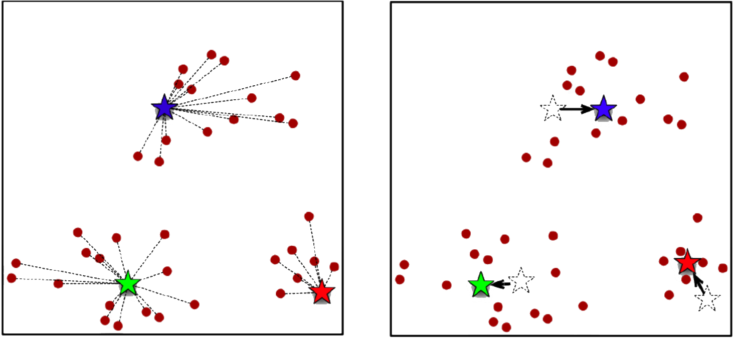
Figure 16.28: \(k-\)means cluster allocation (left) and updated centres (right) [author unknown].
For \(k-\)means, cluster centroids are obtained by averaging all points in the cluster. For \(k-\)medians and \(k-\)mode, the centrality measure is replaced by the obvious candidate.
This simple algorithm has numerous strengths:
it is elegant and easy to implement (without actually having to compute pairwise distances), and so is extremely common as a result;
in many contexts, it is a natural way to look at grouping observations, and
it helps provide a first-pass basic understanding of the data structure.
On the other hand,
it can only assign an instance to one cluster, which can lead to overfitting – a more robust solution would be to compute the probability of belonging to each cluster, perhaps based on the distance to the centroid;
it requires the “true” underlying clusters to be gaussian- or blob-shaped, and it will fail to to produce useful clusters if that assumption is not met in practice,
it does not allow for overlapping or hierarchical groupings.
Notes
Let us now return to some issues relating to clustering in general (and not just to \(k-\)means):
No matter the choice of algorithm, clustering rests on the assumption that nearness of observations (in whatever metric) is linked with object similarity similarity, and that large distances are linked with dissimilarity. While there are plenty of situations where this is an appropriate assumption to make (temperature readings on a map, for instance), there are others where it is unlikely to be the case (chocolate bars and sensationalist tabloids at a grocery’s checkout, say).
The lack of a clear-cut definition of what a cluster actually is (see Figure 16.29 for an example) makes it difficult to validate clustering results. Much more can be said on the topic [76].
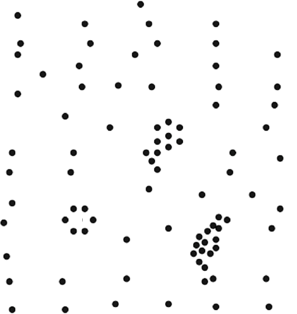
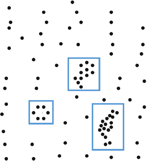
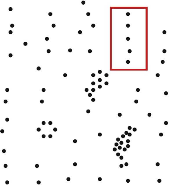
Figure 16.29: Cluster suggestions in an artificial dataset: suggested (blue), rejected (red).
The fact that various algorithms are non-deterministic is also problematic – clustering schemes should never be obtained using only one algorithmic pass, as the outcome could be different depending on the location of random starting positions and the distance/similarity metric in use.
But this apparent fickleness is not necessarily a problem: essential patterns may emerge if the algorithms are implemented multiple times, with different starting positions and re-ordered data (see cluster ensembles [76]). For those algorithms that require the number of clusters as an input, it may be difficult to determine what the optimal number should be (see Figure 16.30 for an illustration).
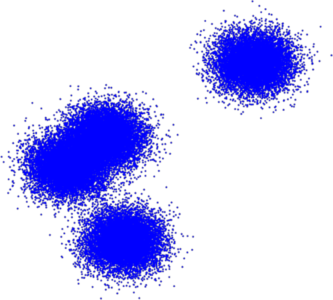
Figure 16.30: The number of clusters in a dataset is ambiguous: are there 2, 3, 4+ clusters in this example?
This number obviously depends on the choice of algorithm/metric, the underlying data, and the use that will be made of the resulting clusters – a dataset could have 3 natural groups when seen through the lens of \(k-\)means, but only 2 clusters for a specific choice of parameter values in DBSCAN, and so on.
This problem could be overcome by producing clustering schemes (from the same family of algorithms) with an increasing number of clusters and to plot the average distance of a cluster member to its cluster representative (centroid) against the number of clusters. Any kink in the plot represents a number of clusters at which an increase does not provide an in-step increase in clustering “resolution”, so to speak (see Figure 16.35 in Toy Example: Iris Dataset for an illustration).
And even when a cluster scheme has been accepted as valid, a cluster description might be difficult to come by – should clusters be described using representative instances or average values or some combination of its’ members most salient features? Although there are exceptions, the ease with which clusters can bedescribed often provides an indication about how natural the groups really are.
One of the most frustrating aspects of the process is that most methods will find clusters in the data even if there are none – although DBSCAN is exempt from this ghost clustering phenomenon (see Figure 16.31 for a \(k-\)means example).
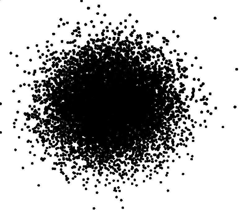
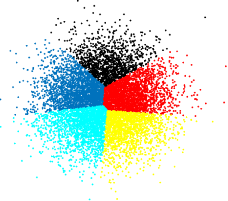
Figure 16.31: An illustration of ghost clustering with \(k-\)means, for \(k=5\).
Finally, analysts should beware (andresist) the temptation of a posteriori rationalisation – once clusters have been found, it is tempting to try to “explain” them; why are the groups as they have been found? But that is a job for domain experts, at best, and a waste of time and resources, at worst. Thread carefully.
16.4.4 Clustering Validation
What does it mean for a clustering scheme to be better than another? What does it mean for a clustering scheme to be valid? What does it mean for a single cluster to be good? How many clusters are there in the data, really?
These are not easy questions to answer. In general, asking if a clustering scheme is the right one or a good one is meaningless – much better to ask if it is optimal or sub-optimal, potentially in comparison to other schemes.
An optimal clustering scheme is one which
maximizes separation between clusters;
maximizes similarity within groups;
agrees with the human eye test, and
is useful at achieving its goals.
There are 3 families of clustering validation approaches:
external, which use additional information (but the labels in question might have very little to do with the similarity of the observations);
internal, which use only the clustering results (shape and size of clusters, etc), and
relative, which compare across a number of clustering attempts.
In order to illustrate some of the possibilities, consider a dataset with clustering scheme \(\mathcal{C}=\{\mathcal{C}_1,\ldots,\mathcal{C}_N\}\), where \(\mathcal{C}_m\)’s centroid is denoted by \(c_m\), and the average distance of \(\mathcal{C}_m\)’s members to \(c_m\) is denoted by \(s_m\). The Davies-Bouldin Index is defined as \[\textrm{DB}_{\mathcal{C}}=\frac{1}{N}=\sum_{i=1}^N \max_{j\neq i}\left\{\frac{s_i+s_j}{d(c_i,c_j)}\right\},\] where \(d\) is the selected distance metric. Since \(\textrm{DB}_{\mathcal{C}}\) is only defined using the clustering results, it is an internal validation method.
Heuristically, if the cluster separation is small, we might expect \(d(c_i,c_j)\) to be (relatively) small, and so \(\textrm{DB}_{\mathcal{C}}\) should be (relatively) large.
In the same vein, if the clusters are heterogeneous, we might expect \(s_i+s_j\) to be (relatively) large, and so \(\textrm{DB}_{\mathcal{C}}\) should be (relatively) large.
In short, when the clustering scheme is sub-optimal, \(\textrm{DB}_{\mathcal{C}}\) is “large”. This suggests another way to determine the optimal number of clusters – pick the scheme with minimal \(\textrm{DB}_{\mathcal{C}}\) (see Figure 16.35 in Toy Example: Iris Dataset, which uses a modified version of the index, for an illustration).
Other cluster quality metrics exist, including SSE, Dunn’s Index, the Silhouette Metric, etc. [76], [164].
16.4.5 Case Study: Livehoods
When we think of similarity at the urban level, we typically think in terms of neighbourhoods. Is there some other way to identify similar parts of a city?
In The Livehoods Project: Utilizing Social Media to Understand the Dynamics of a City [61], Cranshaw et al. study the social dynamics of urban living spaces with the help of clustering algorithms.
Objective
The researchers aims to draw the boundaries of livehoods, areas of similar character within a city, by using clustering models. Unlike static administrative neighborhoods, the livehoods are defined based on the habits of people who live there.
Methodology
The case study introduces spectral clustering to discover the distinct geographic areas of the city based on its inhabitants’ collective movement patterns. Semi-structured interviews are also used to explore, label, and validate the resulting clusters, as well as the urban dynamics that shape them.
Livehood clusters are built and defined using the following methodology:
a geographic distance is computed based on pairs of check-in venues’ coordinates;
social similarity between each pair of venues is computed using cosine measurements;
spectral clustering produces candidate livehoods clusters;
interviews are conducted with residents in order to validate the clusters discovered by the algorithm.
Data
The data comes from two sources, combining approximately 11 million (a recommendation site for venues based on users’ experiences) check-ins from the dataset of Chen et al. [165] and a new dataset of 7 million Twitter check-ins downloaded between June and December of 2011.
For each check-in, the data consists of the user ID, the time, the latitude and longitude, the name of the venue, and its category.
In this case study, it is livehood clusters from the city of Pittsburgh, Pennsylvania, that are examined via 42,787 check-ins of 3840 users at 5349 venues.
16.4.5.1 Strengths and Limitations of the Approach
The technique used in this study is agnostic towards the particular source of the data: it is not dependent on meta-knowledge about the data.
The algorithm may be prone to “majority” bias, consequently misrepresenting/hiding minority behaviours.
The dataset is built from a limited sample of check-ins shared on Twitter and are therefore biased towards the types of visits/locations that people typically want to share publicly.
Tuning the clusters is non-trivial: experimenter bias may combine with “confirmation bias” of the interviewees in the validation stage – if the researchers are themselves residents of Pittsburgh, will they see clusters when there are none?
Procedures
The Livehoods project uses a spectral clustering model to provide structure for local urban areas (UAs), grouping close Foursquare venues into clusters based on both the spatial proximity between venues and the social proximity which is derived from the distribution of people that check-in to them.
The guiding principle of the model is that the “character” of an UA is defined both by the types of venues it contains and by the people frequent them as part of their daily activities. These clusters are referred to as Livehoods, by analogy with more traditional neighbourhoods.
Let \(V\) be a list of Foursquare venues, \(A\) the associated affinity matrix representing a measure of similarity between each venue, and \(G_m(A)\) be the graph obtained from the \(A\) by linking each venue to its nearest \(m\) neighbours.
Spectral clustering is implemented as follows:
Compute the diagonal degree matrix \(D_{ii} = \sum_{j} A_{ij}\);
Set the Laplacian matrix \(L=D-A\) and \[L_{\text{norm}}=D^{-1/2}LD^{-1/2};\]
Find the k smallest eigenvalues of \(L_{\text{norm}}\), where \(k\) is the index which provides the biggest jump in successive eigenvalues of eigenvalues of \(L_{\text{norm}}\), in increasing order;
Find the eigenvectors \(e_1, ...e_k\) of \(L\) corresponding to the \(k\) smallest eigenvalues;
Construct the matrix \(E\) with the eigenvectors \(e_1, ...e_k\) as columns;
Denote the rows of \(E\) by \(y_1,...,y_{n}\), and cluster them into \(k\) clusters \(C_1,...,C_k\) using \(k\)-means. This induces a clustering \(\{A_1,...,A_k\}\) defined by \[A_i =\{j\mid y_j \in C_i\}.\]
For each \(A_i\), let \(G(A_i)\) be the subgraph of \(G_m(A)\) induced by vertex \(A_i\). Split \(G(A_i)\) into connected components. Add each component as a new cluster to the list of clusters, and remove the subgraph \(G(A_i)\) from the list.
Let \(b\) be the area of bounding box containing coordinates in the set of venues \(V\), and \(b_i\) be the area of the box containing \(A_i\). If \(\frac{b_i} {b} > \tau\), delete cluster \(A_i\), and redistribute each of its venues \(v \in A_i\) to the closest \(A_j\) under the distance measurement.
Results, Evaluation and Validation
The parameters used for the clustering were \(m = 10\), \(k_{\text{min}} = 30\), \(k_{\text{max}} = 45\), and \(\tau = 0.4\). The results for three areas of the city are shown in Figure 16.32. In total, 9 livehoods have been identified and validated by 27 Pittsburgh residents; the article has more information on this process).
Municipal Neighborhoods Borders: livehoods are dynamic, and evolve as people’s behaviours change, unlike the fixed neighbourhood borders set by the city government.
Demographics: the interviews displayed strong evidence that the demographics of the residents and visitors of an area often play a strong role in explaining the divisions between livehoods.
Development and Resources: economic development can affect the character of an area. Similarly, the resources (or lack there of) provided by a region has a strong influence on the people that visit it, and hence its resulting character. This is assumed to be reflected in the livehoods.
Geography and Architecture: the movements of people through a certain area is presumably shaped by its geography and architecture; livehoods can reveal this influence and the effects it has over visiting patterns.
Figure 16.32: Some livehoods in metropolitan Pittsburgh, PA: Shadyside/East Liberty, Lawrenceville/Polish Hill, and South Side. Municipal borders are shown in black.
Take-Away
While this is a neat example of practical clustering, its main take-away, from our perspective, is to remind everyone that \(k-\)means is not the sole clustering algorithm in applications!
16.4.6 Toy Example: Iris Dataset
Iris is a genus of plants with showy flowers. The iris dataset contains 150 observations of 5 attributes for specimens collected by Anderson, mostly from a Gaspé peninsula’s pasture in the 1930s [166].
The attributes are
petal width
petal length
sepal width
sepal length
species (virginica, versicolor, setosa)
A “description” of these features is provided by the picture in the picture below:
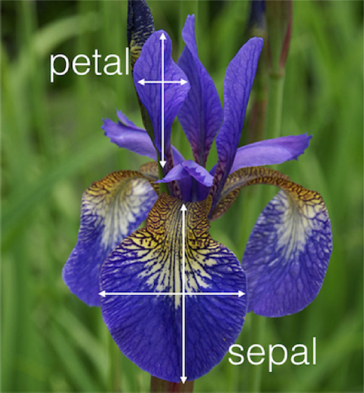
This dataset has become synonymous with data analysis,65 being used to showcase just about every algorithm under the sun. That is, sadly, also what we are going to do in this section.66
A principal component projection of the dataset, with species indicated by colours, is shown in Figure 16.33.
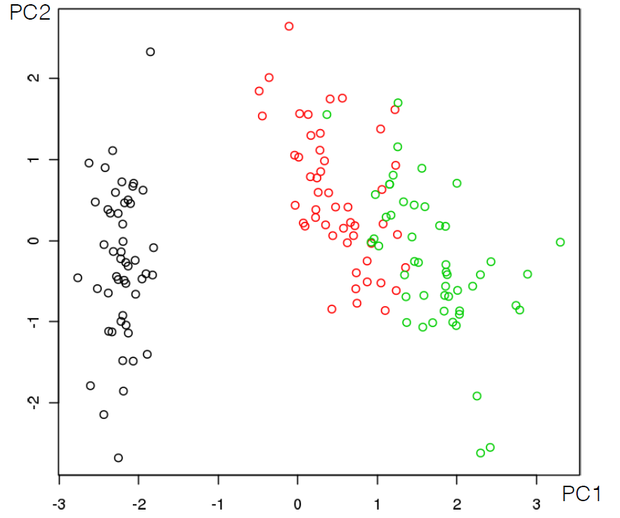
Figure 16.33: Classification of the iris dataset’s 3 species, projected on the first 2 principal components.
From an unsupervised learning point of view, one question of interest is whether the observations form natural groupings, and, if so, whether these groupings correspond to the (known) species.
We use the \(k-\)means algorithm with Euclidean distance to resolve the problem. Since we do not know how many clusters there should be in the data (the fact that there are 3 species does not mean that there should be 3 clusters), we run 40 replicates for \(k=2, \ldots, 15\). The resulting clustering scheme for \(k=2,3,4,15\) (for one of the replicates in each case) are shown in Figure 16.34.
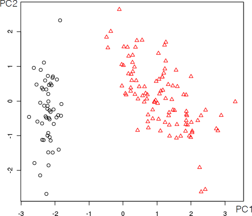
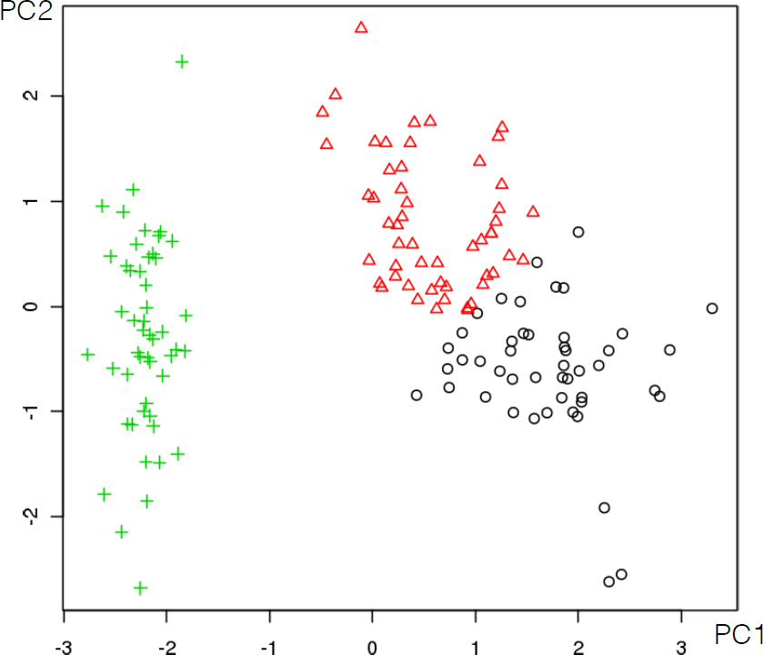
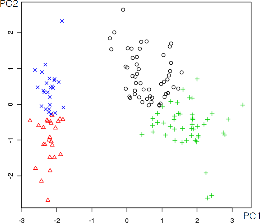
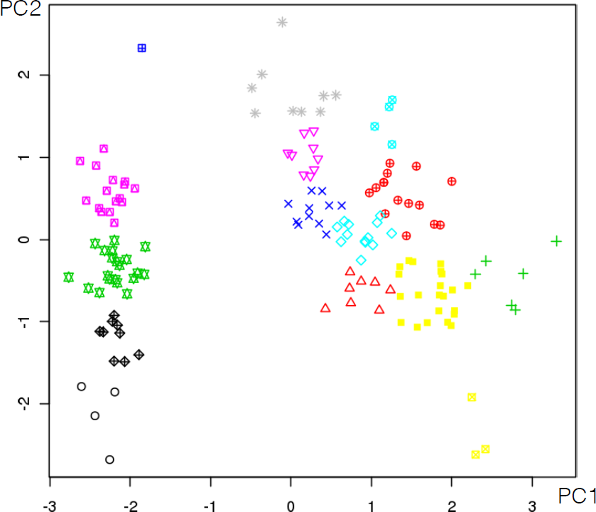
Figure 16.34: Clustering results on the iris dataset with \(k-\)means, for \(k=2,3,4,15\) (from top left to bottom right, by row).
For each replicate, we compute a (modified) Davies-Bouldin Index and the Sum of Squared Errors of the associated clustering schemes (see Figure 16.35 for the output) – the validation curves seem to indicate that there could be either \(3\) of \(5\) natural \(k-\)means clusters in the data. Is this a surprising outcome?
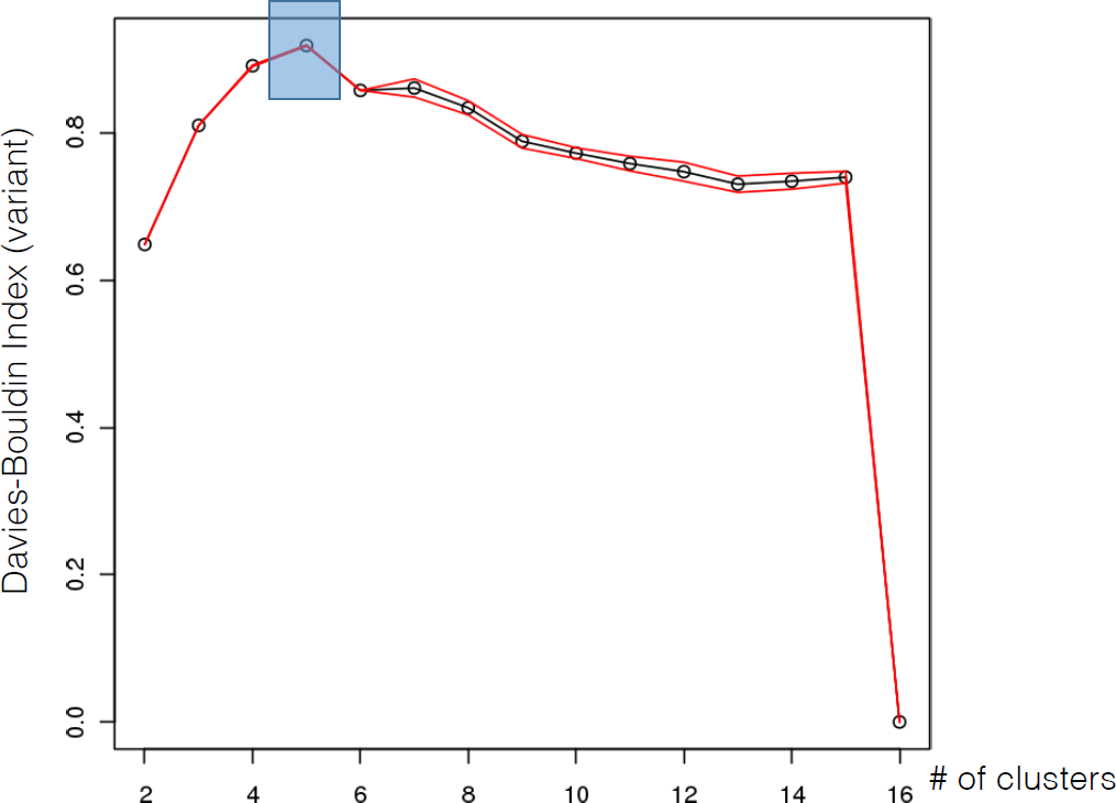
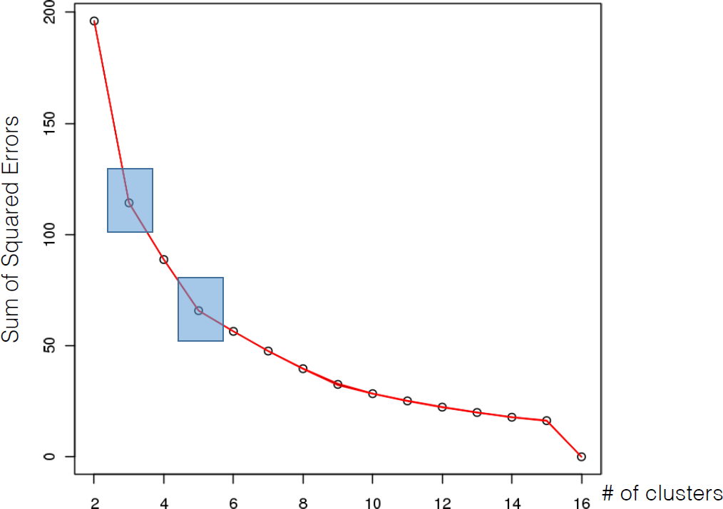
Figure 16.35: Optimal clustering results for the iris dataset: 5 clusters using (modified) Davies-Bouldin index and Sum of Squared Errors.
A single replicate with \(k=5\) is shown in Figure 16.36.
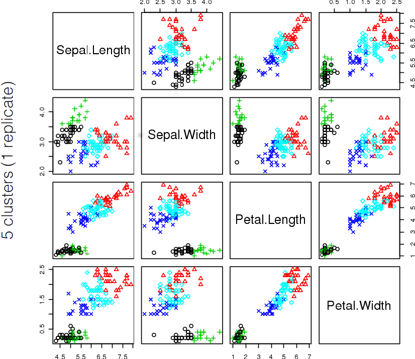
Figure 16.36: Optimal clustering results for the iris dataset (one replicate, \(k=5\)).
Would you consider this representative final clustering scheme to be meaningful?
16.5 Issues and Challenges
We all say we like data, but we don’t. We like getting insight out of data. That’s not quite the same as liking data itself. In fact, I dare say that I don’t quite care for data, and it sounds like I’m not alone. [Q.E. McCallum, Bad Data Handbook, [168]]
The data science landscape is littered with issues and challenges. We shall briefly discuss some of them in this section.
16.5.1 Bad Data
The main difficulties with data is that it is not always representative of the situation that we would like to model and that it might not be consistent (the collection and collation methods may have changed over time, say).There are other potential data issues [168]:
the data might be formatted for human consumption, not machine readability;
the data might contain lies and mistakes;
the data might not reflect reality, and
there might be additional sources of bias and errors (not only imputation bias, but replacing extreme values with average values, proxy reporting, etc.).
Seeking perfection in the data beyond a “reasonable” threshold67 can hamper the efforts of analysts: different quality requirements exist for academic data, professional data, economic data, government data, military data, service data, commercial data, etc. It can be helpful to remember the engineering dictum: “close enough is good enough” (in terms of completeness, coherence, correctness, and accountability). The challenge lies in defining what is “close enough” for the application under consideration.
Even when all (most?) data issues have been mitigated, there remains a number of common data analysis pitfalls:
analyzing data without understanding the context;
using one and only one tool (by choice or by fiat) – neither the “cloud”, nor Big Data, nor Deep Learning, nor Artificial Intelligence will solve all of an organization’s problems;
analyzing data just for the sake of analysis;
having unrealistic expectations of data analysis/DS/ML/AI – in order to optimize the production of actionable insights from data, we must first recognize the methods’ domains of application and their limitations.
16.5.2 Overfitting/Underfitting
In a traditional statistical model, \(p-\)values and goodness-of-fit statistics are used to validate the model. But such statistics cannot always be computed for predictive data science models. We recognise a “good” model based on how well it performs on unseen data.
In practice, training sets and ML methods are used to search for rules and models that are generalizable to new data (or validation/testing sets).
Problems arise when knowledge that is gained from supervised learning does not generalize properly to the data. Ironically, this may occur if the rules or models fit the training set too well – in other words, the results are too specific to the training set (see Figure 16.37 for an illustration of overfitting and underfitting).
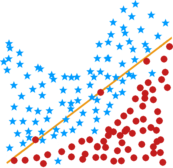
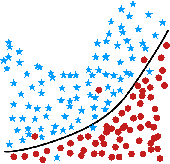
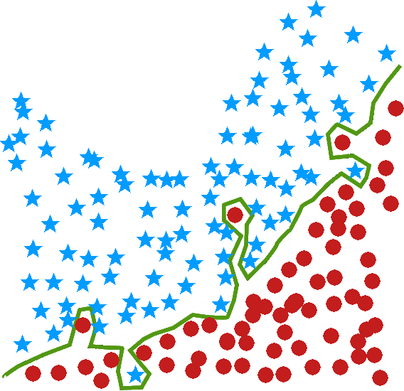
Figure 16.37: Illustration of underfitting (left) and overfitting (right) for a classification task – the optimal classifier reaches a compromise between accuracy and simplicty.
A simple example may elucidate further. Consider the following set of rules regarding hair colour among humans:
vague rule – some people have black hair, some have brown hair, some blond, and some red (this is obviously “true”, but too general to be useful for predictions);
reasonable rule – in populations of European descent, approximately 45% have black hair, 45% brown hair, 7% blond and 3% red;
overly specific rule – in every 10,000 individuals of European descent, we predict there are 46.32% with black hair, 47.27% with brown hair, 6.51% with blond hair, and 0.00% with red hair (this rule presumably emerges from redhead-free training data).
With the overly specific rule, we would predict that there are no redheads in populations of European descent, which is blatantly false. This rule is too specific to the particular training subset that was used to produce it.68
More formally, underfitting and overfitting can be viewed as resulting from the level of model complexity (see Figure @(fig:uomc)).
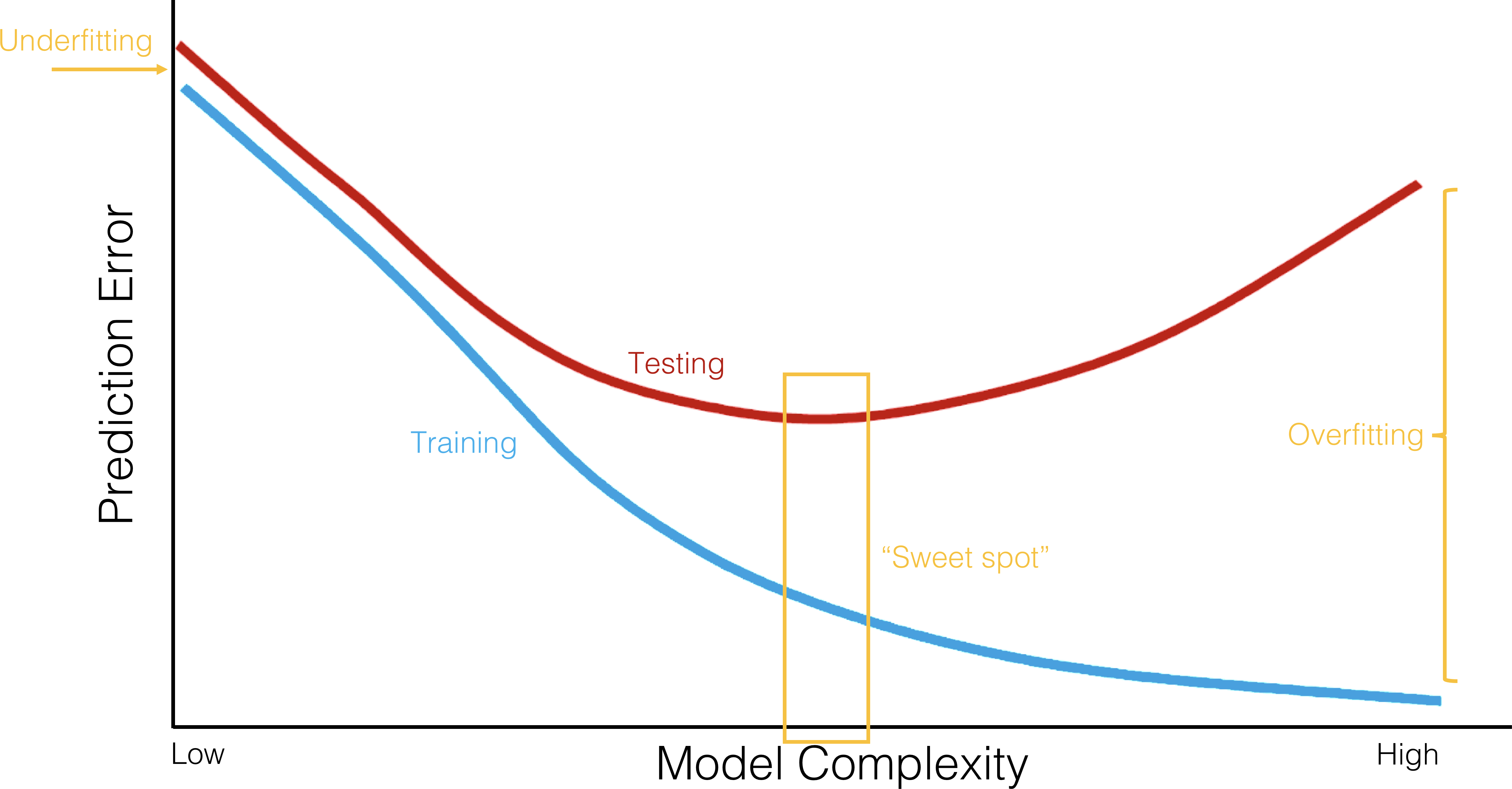
Figure 16.38: Underfitting and overfitting as a function of model complexity; error prediction on training sample (blue) and testing sample (red). High error prediction rates for simple models are a manifestation of underfitting; large difference between error prediction rates on training and testing samples for complex models are a manifestation of overfitting. Ideally, model complexity would be chosen to reach the situation’s ‘sweet spot’, but fishing for the ideal scenario might diminish explanatory power (based on [85]).
Underfitting can be overcome by using more complex models (or models that use more of a dataset’s variables). Overfitting, on the other hand, can be overcome in several ways:
using multiple training sets (ensemble learning approaches), with overlap being allowed – this has the effect of reducing the odds of finding spurious patterns based on quirks of the training data;
using larger training sets may also remove signal which is too specific to a small training set – a 70% - 33% split is often suggested, and
using simpler models (or models that use a dataset with a reduced number of variables as input).
When using multiple training sets, the size of the dataset may also affect the suggested strategy: when faced with
small datasets (less than a few hundred observations, say, but that depends on numerous factors such as computer power and number of tasks), use 100-200 repetitions of a bootstrap procedure [129];
average-sized datasets (less than a few thousand observations), use a few repetitions of 10-fold cross-validation [129], [147] (see Figure 16.39 for an illustration);
large datasets, use a few repetitions of a holdout split (70%-33%, say).
No matter which strategy is eventually selected, the machine learning approach requires ALL models to be evaluated on unseen data.
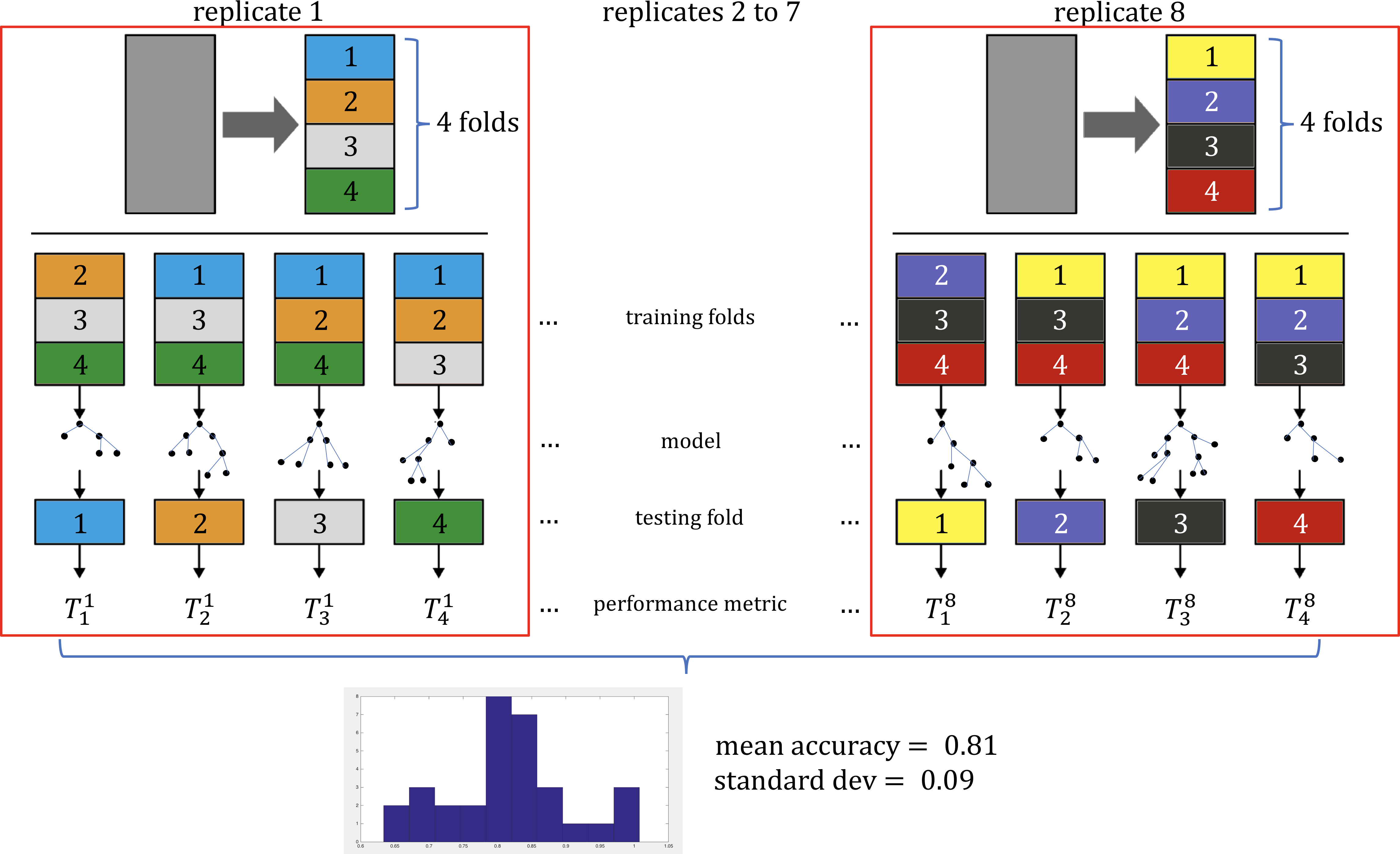
Figure 16.39: Schematic illustration of cross-fold validation, for 8 replicates and 4 folds; \(8(4)=32\) models from a given family are built on various training sets (consisting of \(3/4\) of the available data – the training folds). Model family performance is evaluated on the respective holdout folds; the distribution of the performance metrics (in practice, some combination of the mean/median and standard deviation) can be used to compare various model families (based on [77]).
These issues will be revisited in Regression and Value Estimation and in Spotlight on Classification.
16.5.3 Appropriateness and Transferability
Data science models will continue to be used heavily in the near future; while there are pros and cons to their use on ethical and other non-technical grounds, their applicability is also driven by technical considerations. DS/ML/AI methods are not appropriate if:
existing (legacy) datasets absolutely must be used instead of ideal/appropriate datasets;69
the dataset has attributes that usefully predict a value of interest, but these attributes are not available when a prediction is required (e.g. the total time spent on a website may be predictive of a visitor’s future purchases, but the prediction must be made before the total time spent on the website is known);
class membership or numerical outcome is going to be predicted using an unsupervised learning algorithm (e.g. clustering loan default data might lead to a cluster contains many defaulters – if new instances get added to this cluster, should they automatically be viewed as loan defaulters?).
Every model makes certain assumptions about what is and is not relevant to its workings, but there is a tendency to only gather data which is assumed to be relevant to a particular situation.
If the data is used in other contexts, or to make predictions depending on attributes for which no data is available, then there might be no way to validate the results.70
This is not as esoteric a consideration as it might seem: over-generalizations and inaccurate predictions can lead to harmful results.
16.5.4 Myths and Mistakes
We end this chapter by briefly repeating various data science myths, originally found in[169]):
DS is about algorithms
DS is about predictive accuracy
DS requires a data warehouse
DS requires a large quantity of data
DS requires only technical experts
as well as common data analysis mistakes [same source]:
selecting the wrong problem
getting by without metadata understanding.
not planning the data analysis process
insufficient business/domain knowledge
using incompatible data analysis tools
using tools that are too specific
favouring aggregates over individual results
running out of time
measuring results differently than the client
naı̈vely believing what one is told about the data
It remains the analyst’s/consultant’s responsibility to address these issues with the stakeholders/clients, and the earlier, the better. We cannot assume that everyone is on the same page – prod and ask, early and often.
16.6 R Examples
16.6.1 Association Rules Mining: Titanic Dataset
This example refers to Toy Example: Titanic Dataset.
The very first step in programming with R is to import data. Then we perform a few routines to explore the structure of data.
# load and explore data
class=as.factor(c(rep("3rd",52),rep("1st",118),rep("2nd",154),rep("3rd",387),rep("Crew",670),rep("1st",4),rep("2nd",13.01),rep("3rd",89),rep("Crew",3),rep("1st",5),rep("2nd",11),rep("3rd",13),rep("1st",1),rep("2nd",13),rep("3rd",14),rep("1st",57),rep("2nd",14),rep("3rd",75),rep("Crew",192),rep("1st",140),rep("2nd",80),rep("3rd",76),rep("Crew",20)))
sex=as.factor(c(rep("Male",35),rep("Female",17),rep("Male",1329),rep("Female",109),rep("Male",29),rep("Female",28),rep("Male",338),rep("Female",316)))
age=as.factor(c(rep("Child",52),rep("Adult",1438),rep("Child",57),rep("Adult",654)))
survived=as.factor(c(rep("No",1490),rep("Yes",711)))
titanic=data.frame(class,sex,age,survived)

knitr::kable(summary(titanic))
knitr::kable(table(titanic$age,titanic$survived))
knitr::kable(table(titanic$class,titanic$survived))| class | sex | age | survived | |
|---|---|---|---|---|
| 1st :325 | Female: 470 | Adult:2092 | No :1490 | |
| 2nd :285 | Male :1731 | Child: 109 | Yes: 711 | |
| 3rd :706 | NA | NA | NA | |
| Crew:885 | NA | NA | NA |
| No | Yes | |
|---|---|---|
| Adult | 1438 | 654 |
| Child | 52 | 57 |
| No | Yes | |
|---|---|---|
| 1st | 122 | 203 |
| 2nd | 167 | 118 |
| 3rd | 528 | 178 |
| Crew | 673 | 212 |
Then we use the arules package apriori(), which returns all possible rules. By default, apriori() creates rules with minimum support of 0.1, minimum confidence of 0.8, and maximum of 10
Loading required package: Matrix
Attaching package: 'arules'The following objects are masked from 'package:base':
abbreviate, writeApriori
Parameter specification:
confidence minval smax arem aval originalSupport maxtime support minlen
0.8 0.1 1 none FALSE TRUE 5 0.1 1
maxlen target ext
10 rules TRUE
Algorithmic control:
filter tree heap memopt load sort verbose
0.1 TRUE TRUE FALSE TRUE 2 TRUE
Absolute minimum support count: 220
set item appearances ...[0 item(s)] done [0.00s].
set transactions ...[10 item(s), 2201 transaction(s)] done [0.00s].
sorting and recoding items ... [9 item(s)] done [0.00s].
creating transaction tree ... done [0.00s].
checking subsets of size 1 2 3 4 done [0.00s].
writing ... [27 rule(s)] done [0.00s].
creating S4 object ... done [0.00s].For a rule \(X\to Y\), arules() evaluates a number of default metrics. We can extract the rules using the function inspect(): there are 27 in total.
     lhs                                     rhs           support   confidence
[1]  {}                                   => {age=Adult}   0.9504771 0.9504771
[2]  {class=2nd}                          => {age=Adult}   0.1185825 0.9157895
[3]  {class=1st}                          => {age=Adult}   0.1449341 0.9815385
[4]  {sex=Female}                         => {age=Adult}   0.1930940 0.9042553
[5]  {class=3rd}                          => {age=Adult}   0.2848705 0.8881020
[6]  {survived=Yes}                       => {age=Adult}   0.2971377 0.9198312
[7]  {class=Crew}                         => {sex=Male}    0.3916402 0.9740113
[8]  {class=Crew}                         => {age=Adult}   0.4020900 1.0000000
[9]  {survived=No}                        => {sex=Male}    0.6197183 0.9154362
[10] {survived=No}                        => {age=Adult}   0.6533394 0.9651007
[11] {sex=Male}                           => {age=Adult}   0.7573830 0.9630272
[12] {sex=Female, survived=Yes}           => {age=Adult}   0.1435711 0.9186047
[13] {class=3rd, sex=Male}                => {survived=No} 0.1917310 0.8274510
[14] {class=3rd, survived=No}             => {age=Adult}   0.2162653 0.9015152
[15] {class=3rd, sex=Male}                => {age=Adult}   0.2099046 0.9058824
[16] {sex=Male, survived=Yes}             => {age=Adult}   0.1535666 0.9209809
[17] {class=Crew, survived=No}            => {sex=Male}    0.3044071 0.9955423
[18] {class=Crew, survived=No}            => {age=Adult}   0.3057701 1.0000000
[19] {class=Crew, sex=Male}               => {age=Adult}   0.3916402 1.0000000
[20] {class=Crew, age=Adult}              => {sex=Male}    0.3916402 0.9740113
[21] {sex=Male, survived=No}              => {age=Adult}   0.6038164 0.9743402
[22] {age=Adult, survived=No}             => {sex=Male}    0.6038164 0.9242003
[23] {class=3rd, sex=Male, survived=No}   => {age=Adult}   0.1758292 0.9170616
[24] {class=3rd, age=Adult, survived=No}  => {sex=Male}    0.1758292 0.8130252
[25] {class=3rd, sex=Male, age=Adult}     => {survived=No} 0.1758292 0.8376623
[26] {class=Crew, sex=Male, survived=No}  => {age=Adult}   0.3044071 1.0000000
[27] {class=Crew, age=Adult, survived=No} => {sex=Male}    0.3044071 0.9955423
     coverage  lift      count
[1]  1.0000000 1.0000000 2092
[2]  0.1294866 0.9635051  261
[3]  0.1476602 1.0326798  319
[4]  0.2135393 0.9513700  425
[5]  0.3207633 0.9343750  627
[6]  0.3230350 0.9677574  654
[7]  0.4020900 1.2384742  862
[8]  0.4020900 1.0521033  885
[9]  0.6769650 1.1639949 1364
[10] 0.6769650 1.0153856 1438
[11] 0.7864607 1.0132040 1667
[12] 0.1562926 0.9664669  316
[13] 0.2317129 1.2222950  422
[14] 0.2398910 0.9484870  476
[15] 0.2317129 0.9530818  462
[16] 0.1667424 0.9689670  338
[17] 0.3057701 1.2658514  670
[18] 0.3057701 1.0521033  673
[19] 0.3916402 1.0521033  862
[20] 0.4020900 1.2384742  862
[21] 0.6197183 1.0251065 1329
[22] 0.6533394 1.1751385 1329
[23] 0.1917310 0.9648435  387
[24] 0.2162653 1.0337773  387
[25] 0.2099046 1.2373791  387
[26] 0.3044071 1.0521033  670
[27] 0.3057701 1.2658514 670 | lhs | rhs | support | confidence | coverage | lift | count | ||
|---|---|---|---|---|---|---|---|---|
| [1] | {} | => | {age=Adult} | 0.9504771 | 0.9504771 | 1.0000000 | 1.0000000 | 2092 |
| [2] | {class=2nd} | => | {age=Adult} | 0.1185825 | 0.9157895 | 0.1294866 | 0.9635051 | 261 |
| [3] | {class=1st} | => | {age=Adult} | 0.1449341 | 0.9815385 | 0.1476602 | 1.0326798 | 319 |
| [4] | {sex=Female} | => | {age=Adult} | 0.1930940 | 0.9042553 | 0.2135393 | 0.9513700 | 425 |
| [5] | {class=3rd} | => | {age=Adult} | 0.2848705 | 0.8881020 | 0.3207633 | 0.9343750 | 627 |
| [6] | {survived=Yes} | => | {age=Adult} | 0.2971377 | 0.9198312 | 0.3230350 | 0.9677574 | 654 |
| [7] | {class=Crew} | => | {sex=Male} | 0.3916402 | 0.9740113 | 0.4020900 | 1.2384742 | 862 |
| [8] | {class=Crew} | => | {age=Adult} | 0.4020900 | 1.0000000 | 0.4020900 | 1.0521033 | 885 |
| [9] | {survived=No} | => | {sex=Male} | 0.6197183 | 0.9154362 | 0.6769650 | 1.1639949 | 1364 |
| [10] | {survived=No} | => | {age=Adult} | 0.6533394 | 0.9651007 | 0.6769650 | 1.0153856 | 1438 |
| [11] | {sex=Male} | => | {age=Adult} | 0.7573830 | 0.9630272 | 0.7864607 | 1.0132040 | 1667 |
| [12] | {sex=Female, survived=Yes} | => | {age=Adult} | 0.1435711 | 0.9186047 | 0.1562926 | 0.9664669 | 316 |
| [13] | {class=3rd, sex=Male} | => | {survived=No} | 0.1917310 | 0.8274510 | 0.2317129 | 1.2222950 | 422 |
| [14] | {class=3rd, survived=No} | => | {age=Adult} | 0.2162653 | 0.9015152 | 0.2398910 | 0.9484870 | 476 |
| [15] | {class=3rd, sex=Male} | => | {age=Adult} | 0.2099046 | 0.9058824 | 0.2317129 | 0.9530818 | 462 |
| [16] | {sex=Male, survived=Yes} | => | {age=Adult} | 0.1535666 | 0.9209809 | 0.1667424 | 0.9689670 | 338 |
| [17] | {class=Crew, survived=No} | => | {sex=Male} | 0.3044071 | 0.9955423 | 0.3057701 | 1.2658514 | 670 |
| [18] | {class=Crew, survived=No} | => | {age=Adult} | 0.3057701 | 1.0000000 | 0.3057701 | 1.0521033 | 673 |
| [19] | {class=Crew, sex=Male} | => | {age=Adult} | 0.3916402 | 1.0000000 | 0.3916402 | 1.0521033 | 862 |
| [20] | {class=Crew, age=Adult} | => | {sex=Male} | 0.3916402 | 0.9740113 | 0.4020900 | 1.2384742 | 862 |
| [21] | {sex=Male, survived=No} | => | {age=Adult} | 0.6038164 | 0.9743402 | 0.6197183 | 1.0251065 | 1329 |
| [22] | {age=Adult, survived=No} | => | {sex=Male} | 0.6038164 | 0.9242003 | 0.6533394 | 1.1751385 | 1329 |
| [23] | {class=3rd, sex=Male, survived=No} | => | {age=Adult} | 0.1758292 | 0.9170616 | 0.1917310 | 0.9648435 | 387 |
| [24] | {class=3rd, age=Adult, survived=No} | => | {sex=Male} | 0.1758292 | 0.8130252 | 0.2162653 | 1.0337773 | 387 |
| [25] | {class=3rd, sex=Male, age=Adult} | => | {survived=No} | 0.1758292 | 0.8376623 | 0.2099046 | 1.2373791 | 387 |
| [26] | {class=Crew, sex=Male, survived=No} | => | {age=Adult} | 0.3044071 | 1.0000000 | 0.3044071 | 1.0521033 | 670 |
| [27] | {class=Crew, age=Adult, survived=No} | => | {sex=Male} | 0.3044071 | 0.9955423 | 0.3057701 | 1.2658514 | 670 |
We set our own parameters to create a new list of rules, with minimum support of 0.005 and minimum confidence of 0.8. As we are naturally interested in finding combinations of attributes associated with survival (either Yes or No), we only retain rule for which the conclusion is {survived=No} or {survived=Yes}.
There are 12 such rules.
rules.titanic.2 <- apriori(titanic,parameter = list(minlen=2, supp=0.005, conf=0.8),appearance = list(rhs=c("survived=No", "survived=Yes"),default="lhs"),control = list(verbose=F))

rules.titanic.2 <- sort(rules.titanic.2, by=c("lift"), decreasing=TRUE) # sort the list by lift (in descending order)
knitr::kable(inspect(rules.titanic.2)) # print out the results
lhs rhs support
[1] {class=2nd, age=Child} => {survived=Yes} 0.010904134
[2] {class=2nd, sex=Female, age=Child} => {survived=Yes} 0.005906406
[3] {class=1st, sex=Female} => {survived=Yes} 0.064061790
[4] {class=1st, sex=Female, age=Adult} => {survived=Yes} 0.063607451
[5] {class=2nd, sex=Female} => {survived=Yes} 0.042253521
[6] {class=Crew, sex=Female} => {survived=Yes} 0.009086779
[7] {class=Crew, sex=Female, age=Adult} => {survived=Yes} 0.009086779
[8] {class=2nd, sex=Female, age=Adult} => {survived=Yes} 0.036347115
[9] {class=2nd, sex=Male, age=Adult} => {survived=No} 0.069968196
[10] {class=2nd, sex=Male} => {survived=No} 0.069968196
[11] {class=3rd, sex=Male, age=Adult} => {survived=No} 0.175829169
[12] {class=3rd, sex=Male} => {survived=No} 0.191731031
confidence coverage lift count
[1] 1.0000000 0.010904134 3.095640 24
[2] 1.0000000 0.005906406 3.095640 13
[3] 0.9724138 0.065879146 3.010243 141
[4] 0.9722222 0.065424807 3.009650 140
[5] 0.8773585 0.048159927 2.715986 93
[6] 0.8695652 0.010449796 2.691861 20
[7] 0.8695652 0.010449796 2.691861 20
[8] 0.8602151 0.042253521 2.662916 80
[9] 0.9166667 0.076328941 1.354083 154
[10] 0.8603352 0.081326670 1.270871 154
[11] 0.8376623 0.209904589 1.237379 387
[12] 0.8274510 0.231712858 1.222295 422 | lhs | rhs | support | confidence | coverage | lift | count | ||
|---|---|---|---|---|---|---|---|---|
| [1] | {class=2nd, age=Child} | => | {survived=Yes} | 0.0109041 | 1.0000000 | 0.0109041 | 3.095640 | 24 |
| [2] | {class=2nd, sex=Female, age=Child} | => | {survived=Yes} | 0.0059064 | 1.0000000 | 0.0059064 | 3.095640 | 13 |
| [3] | {class=1st, sex=Female} | => | {survived=Yes} | 0.0640618 | 0.9724138 | 0.0658791 | 3.010243 | 141 |
| [4] | {class=1st, sex=Female, age=Adult} | => | {survived=Yes} | 0.0636075 | 0.9722222 | 0.0654248 | 3.009650 | 140 |
| [5] | {class=2nd, sex=Female} | => | {survived=Yes} | 0.0422535 | 0.8773585 | 0.0481599 | 2.715986 | 93 |
| [6] | {class=Crew, sex=Female} | => | {survived=Yes} | 0.0090868 | 0.8695652 | 0.0104498 | 2.691861 | 20 |
| [7] | {class=Crew, sex=Female, age=Adult} | => | {survived=Yes} | 0.0090868 | 0.8695652 | 0.0104498 | 2.691861 | 20 |
| [8] | {class=2nd, sex=Female, age=Adult} | => | {survived=Yes} | 0.0363471 | 0.8602151 | 0.0422535 | 2.662916 | 80 |
| [9] | {class=2nd, sex=Male, age=Adult} | => | {survived=No} | 0.0699682 | 0.9166667 | 0.0763289 | 1.354083 | 154 |
| [10] | {class=2nd, sex=Male} | => | {survived=No} | 0.0699682 | 0.8603352 | 0.0813267 | 1.270871 | 154 |
| [11] | {class=3rd, sex=Male, age=Adult} | => | {survived=No} | 0.1758292 | 0.8376623 | 0.2099046 | 1.237379 | 387 |
| [12] | {class=3rd, sex=Male} | => | {survived=No} | 0.1917310 | 0.8274510 | 0.2317129 | 1.222295 | 422 |
Are all these rules independent? If we know that {class=3rd,sex=Male}=>{survived=No} is a rule, say, then we would not be surprised to find out that {class=3rd,sex=Male,age=Adult}=>{survived=No} is also a rule.
The following chunk of code identifies which rules have an antecedent which is a subset of another rule’s antecedent, marking one of them as redundant, and removing those from the set of rules, which brings us down to 8 rules.
    lhs                                 rhs            support     confidence
[1] {class=2nd, age=Child}           => {survived=Yes} 0.010904134 1.0000000
[2] {class=1st, sex=Female}          => {survived=Yes} 0.064061790 0.9724138
[3] {class=2nd, sex=Female}          => {survived=Yes} 0.042253521 0.8773585
[4] {class=Crew, sex=Female}         => {survived=Yes} 0.009086779 0.8695652
[5] {class=2nd, sex=Male, age=Adult} => {survived=No}  0.069968196 0.9166667
[6] {class=2nd, sex=Male}            => {survived=No}  0.069968196 0.8603352
[7] {class=3rd, sex=Male, age=Adult} => {survived=No}  0.175829169 0.8376623
[8] {class=3rd, sex=Male}            => {survived=No}  0.191731031 0.8274510
    coverage   lift     count
[1] 0.01090413 3.095640  24
[2] 0.06587915 3.010243 141
[3] 0.04815993 2.715986  93
[4] 0.01044980 2.691861  20
[5] 0.07632894 1.354083 154
[6] 0.08132667 1.270871 154
[7] 0.20990459 1.237379 387
[8] 0.23171286 1.222295 422 | lhs | rhs | support | confidence | coverage | lift | count | ||
|---|---|---|---|---|---|---|---|---|
| [1] | {class=2nd, age=Child} | => | {survived=Yes} | 0.0109041 | 1.0000000 | 0.0109041 | 3.095640 | 24 |
| [2] | {class=1st, sex=Female} | => | {survived=Yes} | 0.0640618 | 0.9724138 | 0.0658791 | 3.010243 | 141 |
| [3] | {class=2nd, sex=Female} | => | {survived=Yes} | 0.0422535 | 0.8773585 | 0.0481599 | 2.715986 | 93 |
| [4] | {class=Crew, sex=Female} | => | {survived=Yes} | 0.0090868 | 0.8695652 | 0.0104498 | 2.691861 | 20 |
| [5] | {class=2nd, sex=Male, age=Adult} | => | {survived=No} | 0.0699682 | 0.9166667 | 0.0763289 | 1.354083 | 154 |
| [6] | {class=2nd, sex=Male} | => | {survived=No} | 0.0699682 | 0.8603352 | 0.0813267 | 1.270871 | 154 |
| [7] | {class=3rd, sex=Male, age=Adult} | => | {survived=No} | 0.1758292 | 0.8376623 | 0.2099046 | 1.237379 | 387 |
| [8] | {class=3rd, sex=Male} | => | {survived=No} | 0.1917310 | 0.8274510 | 0.2317129 | 1.222295 | 422 |
We have presented the “interesting” associations in tabular format, but there are a variety of graphical representations as well (available in package arulesViz), such as:
a bubble chart;
a two-key plot (taking into account the rules’ lengths);
a graph structure, or
parallel coordinates (where the width of the arrows represents support and the intensity of the color represent confidence).
To reduce overplotting, jitter is added! Use jitter = 0 to prevent jitter.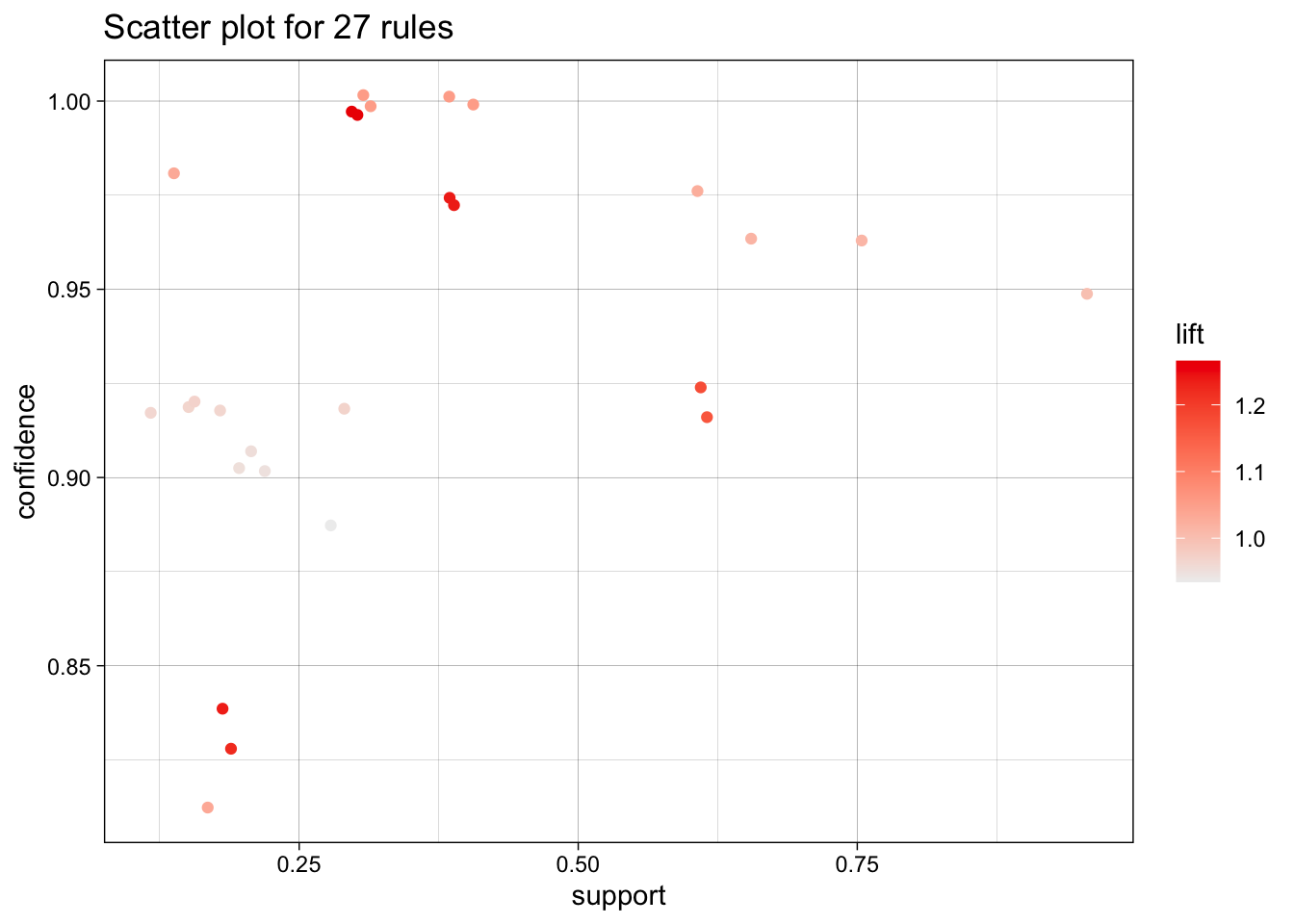
To reduce overplotting, jitter is added! Use jitter = 0 to prevent jitter.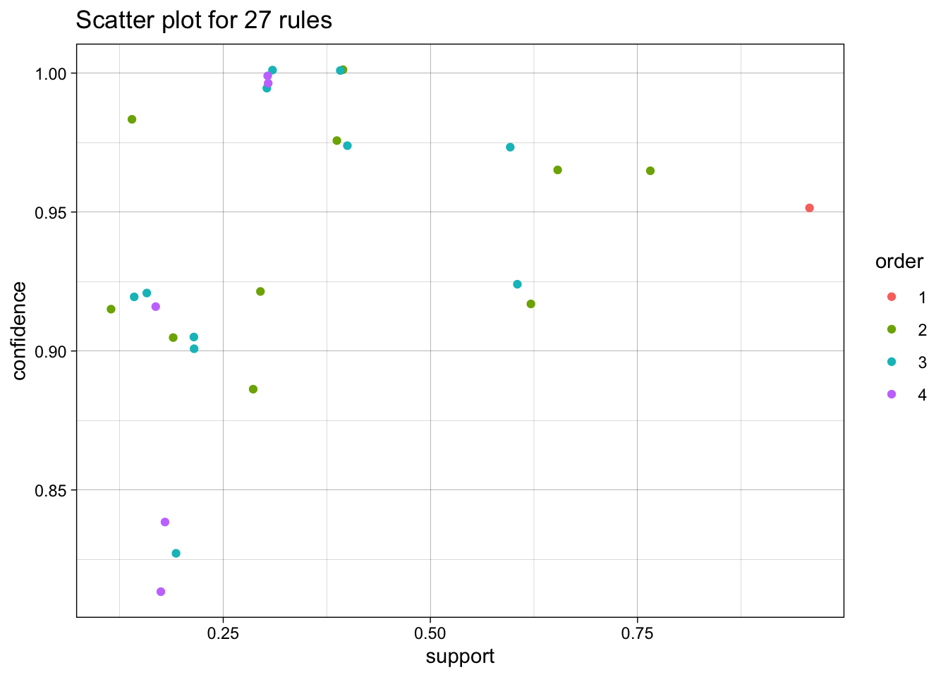
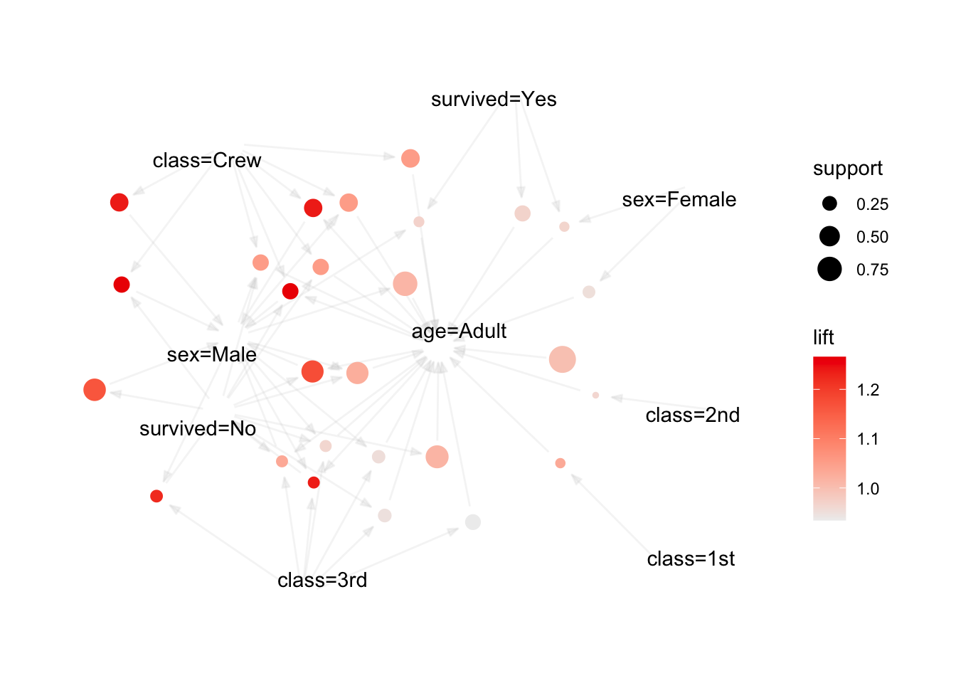
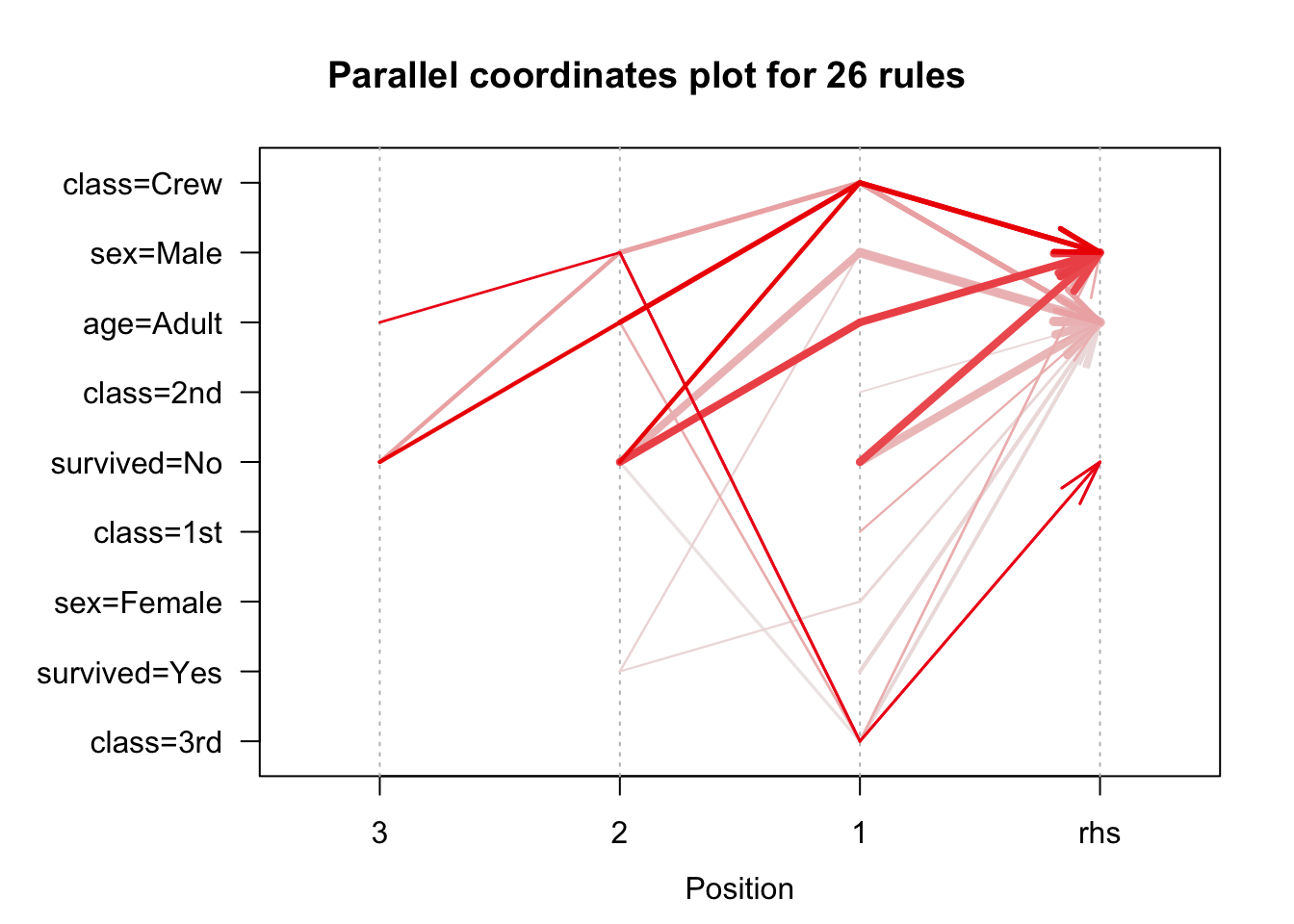
To reduce overplotting, jitter is added! Use jitter = 0 to prevent jitter.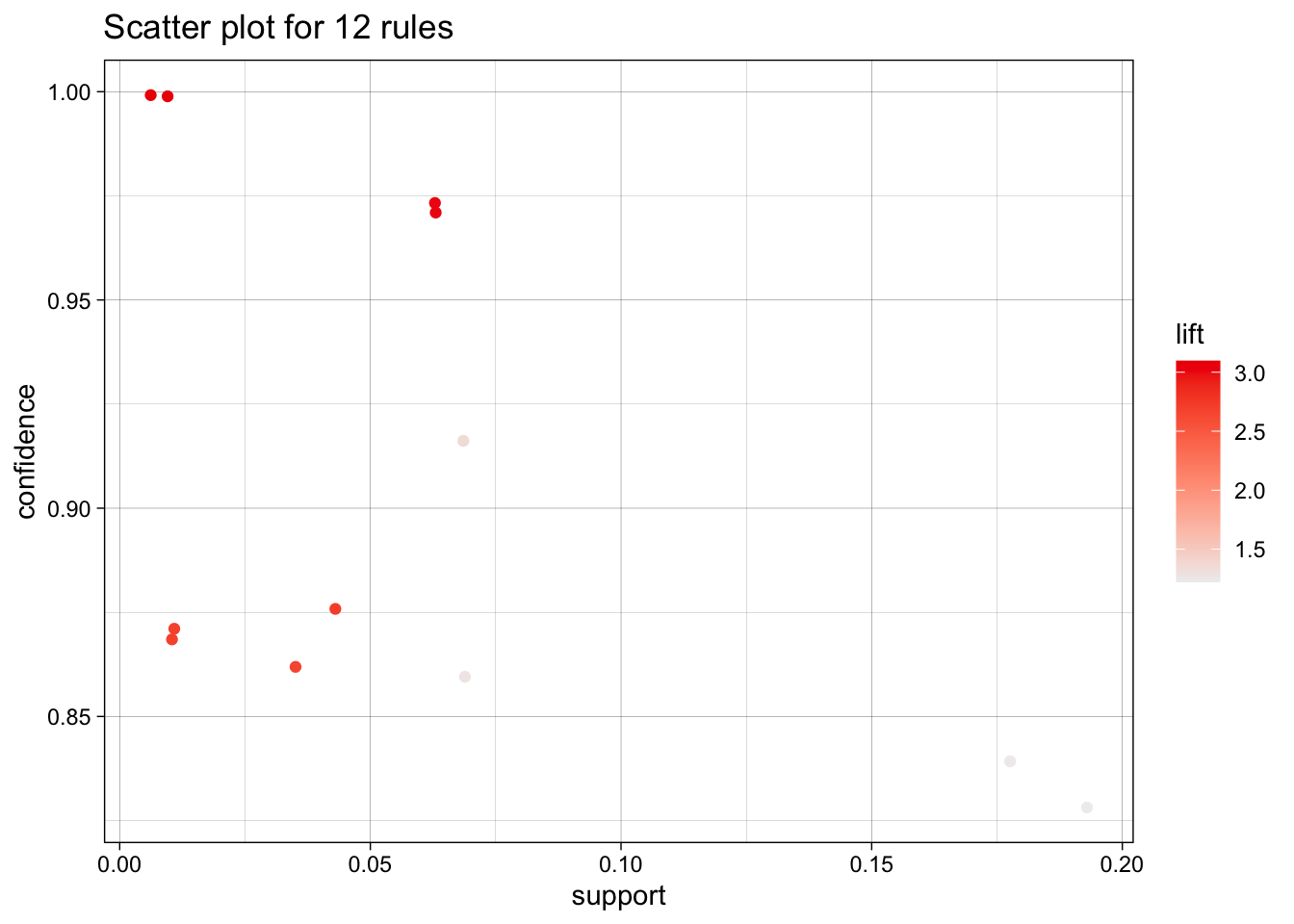
To reduce overplotting, jitter is added! Use jitter = 0 to prevent jitter.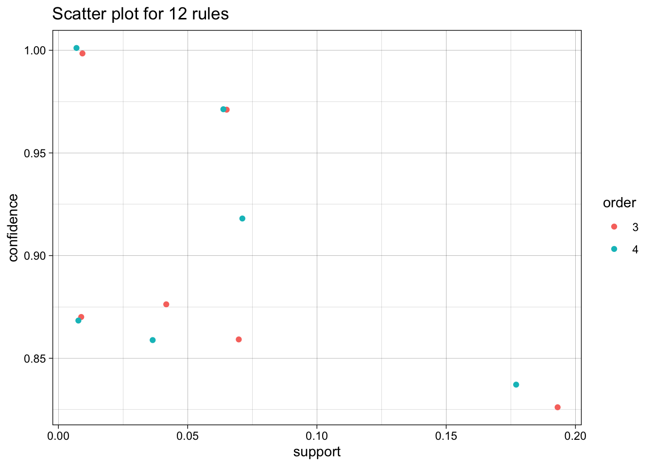
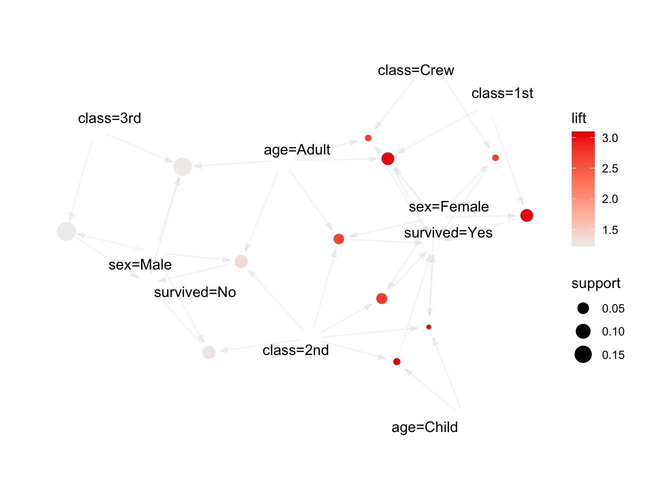
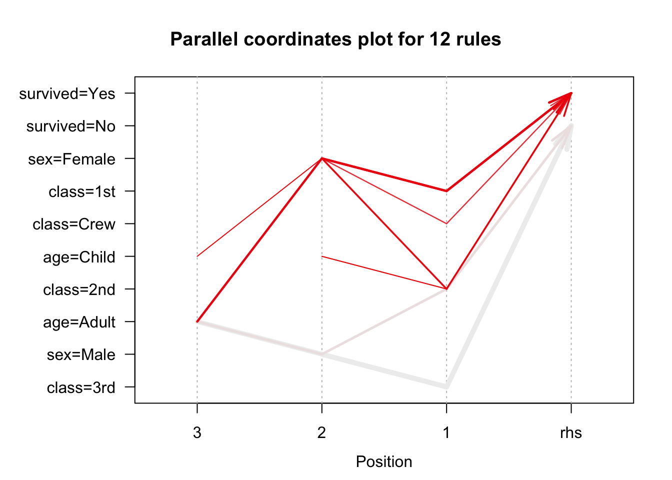
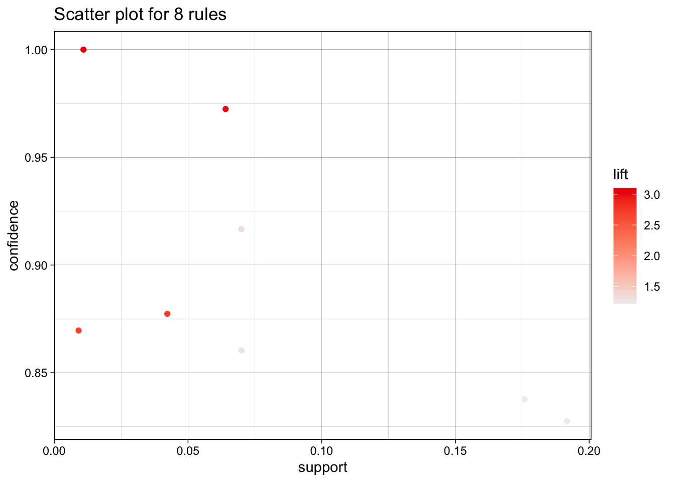
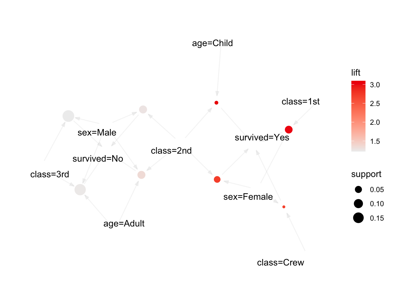
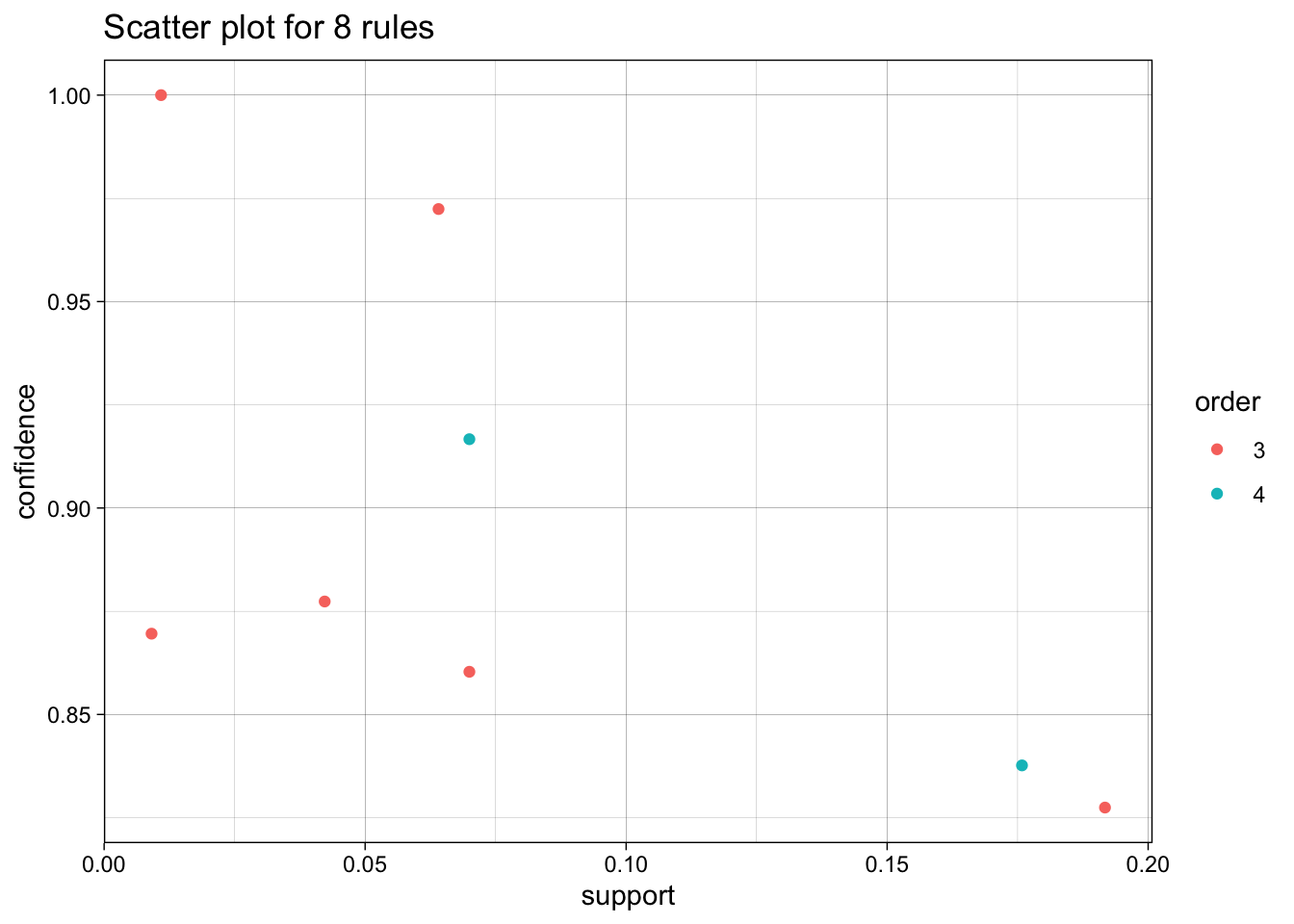
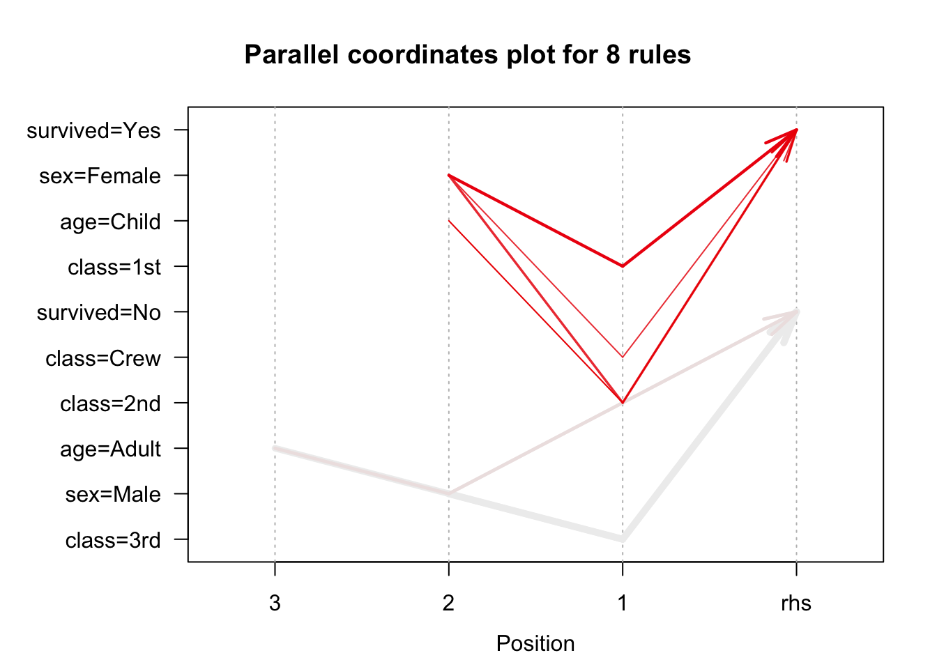
Is there anything surprising about these outcomes?
16.6.2 Classification: Kyphosis Dataset
This example refers to Toy Example: Kyphosis Dataset; we explore the built-in kyphosis dataset with two decision tree methods (rpart, ctree).
library(rpart) # Classification Tree with rpart
library(psych) # to be able to use "describe"
library(party) # Conditional inference tree (later)
Loading required package: gridLoading required package: mvtnormLoading required package: modeltoolsLoading required package: stats4
Attaching package: 'modeltools'The following object is masked from 'package:arules':
infoLoading required package: strucchangeLoading required package: zoo
Attaching package: 'zoo'The following objects are masked from 'package:base':
as.Date, as.Date.numericLoading required package: sandwichLoading required package: tibbleLoading required package: bitops
Attaching package: 'bitops'The following object is masked from 'package:Matrix':
%&%Rattle: A free graphical interface for data science with R.
Version 5.4.0 Copyright (c) 2006-2020 Togaware Pty Ltd.
Type 'rattle()' to shake, rattle, and roll your data.Now let’s get some information on the kyphosis dataset.
?kyphosis # calls-up the help file on the dataset

str(kyphosis) # provides the dataset structure
knitr::kable(head(kyphosis)) # shows the first 6 entries
knitr::kable(summary(kyphosis)) # provides a summary (quantiles statistics for each of the variables)
knitr::kable(describe(kyphosis)) # provides other statistics for each of the variables
As always, we should take the time to visualize the dataset. In this case, since there are 4 variables (one of which is categorical), a scatterplot matrix is probably a good approach.
pairs(kyphosis[,2:4], main = "Kyphosis Data", pch = 21,
      bg = c("red", "blue")[unclass(kyphosis[,1])], lower.panel=NULL,
      labels=c("Age","Number","Start"), font.labels=2, cex.labels=4.5)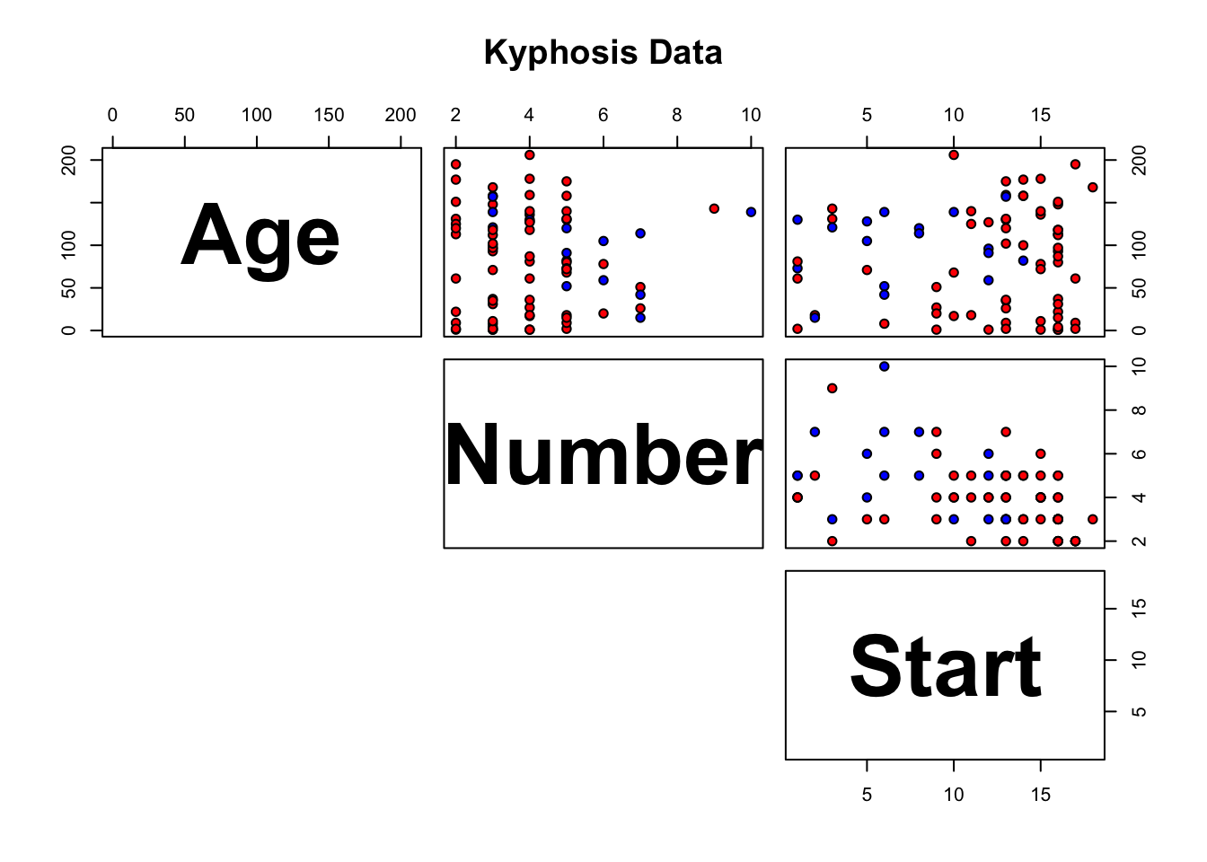
What should the legend of this scatterplot matrix be (red=??, blue=??)?
We build a tree using the recursive partitioning algorithm. For the time being, we’re assuming that the training set is the dataset as a whole (so there is no reason to expect that the decision trees should have predictive power, only descriptive power).
n= 81

node), split, n, loss, yval, (yprob)
      * denotes terminal node

 1) root 81 17 absent (0.79012346 0.20987654)
   2) Start>=8.5 62  6 absent (0.90322581 0.09677419)
     4) Start>=14.5 29  0 absent (1.00000000 0.00000000) *
     5) Start< 14.5 33  6 absent (0.81818182 0.18181818)
      10) Age< 55 12  0 absent (1.00000000 0.00000000) *
      11) Age>=55 21  6 absent (0.71428571 0.28571429)
        22) Age>=111 14  2 absent (0.85714286 0.14285714) *
        23) Age< 111 7  3 present (0.42857143 0.57142857) *
   3) Start< 8.5 19  8 present (0.42105263 0.57894737) *
We can access the method results by using printcp (although how informative this output will prove depends on the expectations…)
Classification tree:
rpart(formula = Kyphosis ~ Age + Number + Start, data = kyphosis,
    method = "class")

Variables actually used in tree construction:
[1] Age   Start

Root node error: 17/81 = 0.20988

n= 81

        CP nsplit rel error  xerror    xstd
1 0.176471      0   1.00000 1.00000 0.21559
2 0.019608      1   0.82353 0.94118 0.21078
3 0.010000      4   0.76471 0.94118 0.21078
Details on the nodes and the splits can be obtained using the summary function.
Call:
rpart(formula = Kyphosis ~ Age + Number + Start, data = kyphosis,
    method = "class")
  n= 81

          CP nsplit rel error    xerror      xstd
1 0.17647059      0 1.0000000 1.0000000 0.2155872
2 0.01960784      1 0.8235294 0.9411765 0.2107780
3 0.01000000      4 0.7647059 0.9411765 0.2107780

Variable importance
 Start    Age Number
    64     24     12

Node number 1: 81 observations,    complexity param=0.1764706
  predicted class=absent   expected loss=0.2098765  P(node) =1
    class counts:    64    17
   probabilities: 0.790 0.210
  left son=2 (62 obs) right son=3 (19 obs)
  Primary splits:
      Start  < 8.5  to the right, improve=6.762330, (0 missing)
      Number < 5.5  to the left,  improve=2.866795, (0 missing)
      Age    < 39.5 to the left,  improve=2.250212, (0 missing)
  Surrogate splits:
      Number < 6.5  to the left,  agree=0.802, adj=0.158, (0 split)

Node number 2: 62 observations,    complexity param=0.01960784
  predicted class=absent   expected loss=0.09677419  P(node) =0.7654321
    class counts:    56     6
   probabilities: 0.903 0.097
  left son=4 (29 obs) right son=5 (33 obs)
  Primary splits:
      Start  < 14.5 to the right, improve=1.0205280, (0 missing)
      Age    < 55   to the left,  improve=0.6848635, (0 missing)
      Number < 4.5  to the left,  improve=0.2975332, (0 missing)
  Surrogate splits:
      Number < 3.5  to the left,  agree=0.645, adj=0.241, (0 split)
      Age    < 16   to the left,  agree=0.597, adj=0.138, (0 split)

Node number 3: 19 observations
  predicted class=present  expected loss=0.4210526  P(node) =0.2345679
    class counts:     8    11
   probabilities: 0.421 0.579

Node number 4: 29 observations
  predicted class=absent   expected loss=0  P(node) =0.3580247
    class counts:    29     0
   probabilities: 1.000 0.000

Node number 5: 33 observations,    complexity param=0.01960784
  predicted class=absent   expected loss=0.1818182  P(node) =0.4074074
    class counts:    27     6
   probabilities: 0.818 0.182
  left son=10 (12 obs) right son=11 (21 obs)
  Primary splits:
      Age    < 55   to the left,  improve=1.2467530, (0 missing)
      Start  < 12.5 to the right, improve=0.2887701, (0 missing)
      Number < 3.5  to the right, improve=0.1753247, (0 missing)
  Surrogate splits:
      Start  < 9.5  to the left,  agree=0.758, adj=0.333, (0 split)
      Number < 5.5  to the right, agree=0.697, adj=0.167, (0 split)

Node number 10: 12 observations
  predicted class=absent   expected loss=0  P(node) =0.1481481
    class counts:    12     0
   probabilities: 1.000 0.000

Node number 11: 21 observations,    complexity param=0.01960784
  predicted class=absent   expected loss=0.2857143  P(node) =0.2592593
    class counts:    15     6
   probabilities: 0.714 0.286
  left son=22 (14 obs) right son=23 (7 obs)
  Primary splits:
      Age    < 111  to the right, improve=1.71428600, (0 missing)
      Start  < 12.5 to the right, improve=0.79365080, (0 missing)
      Number < 3.5  to the right, improve=0.07142857, (0 missing)

Node number 22: 14 observations
  predicted class=absent   expected loss=0.1428571  P(node) =0.1728395
    class counts:    12     2
   probabilities: 0.857 0.143

Node number 23: 7 observations
  predicted class=present  expected loss=0.4285714  P(node) =0.08641975
    class counts:     3     4
   probabilities: 0.429 0.571
What are these nodes that are being referred to? Plotting the tree provides more information.
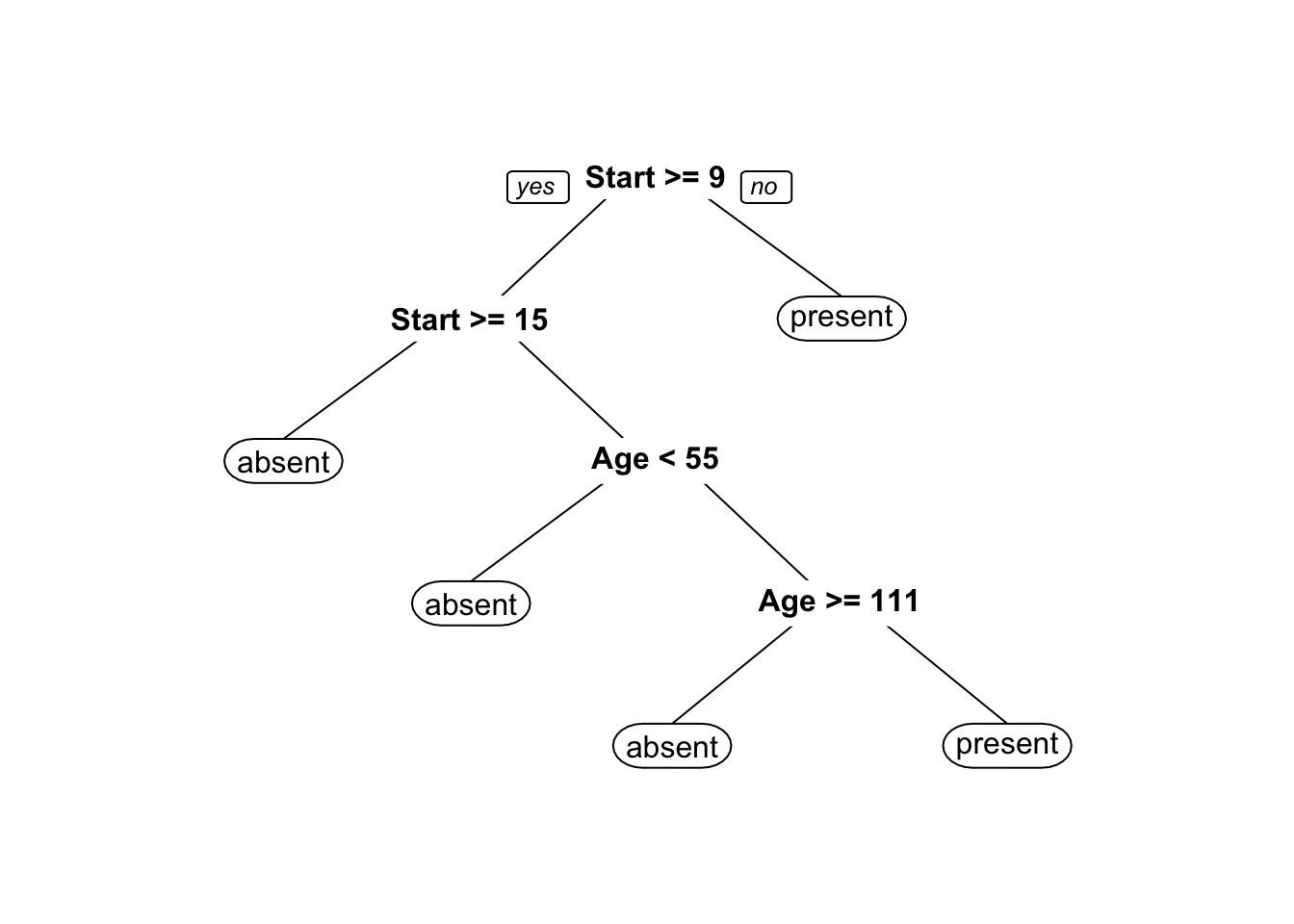
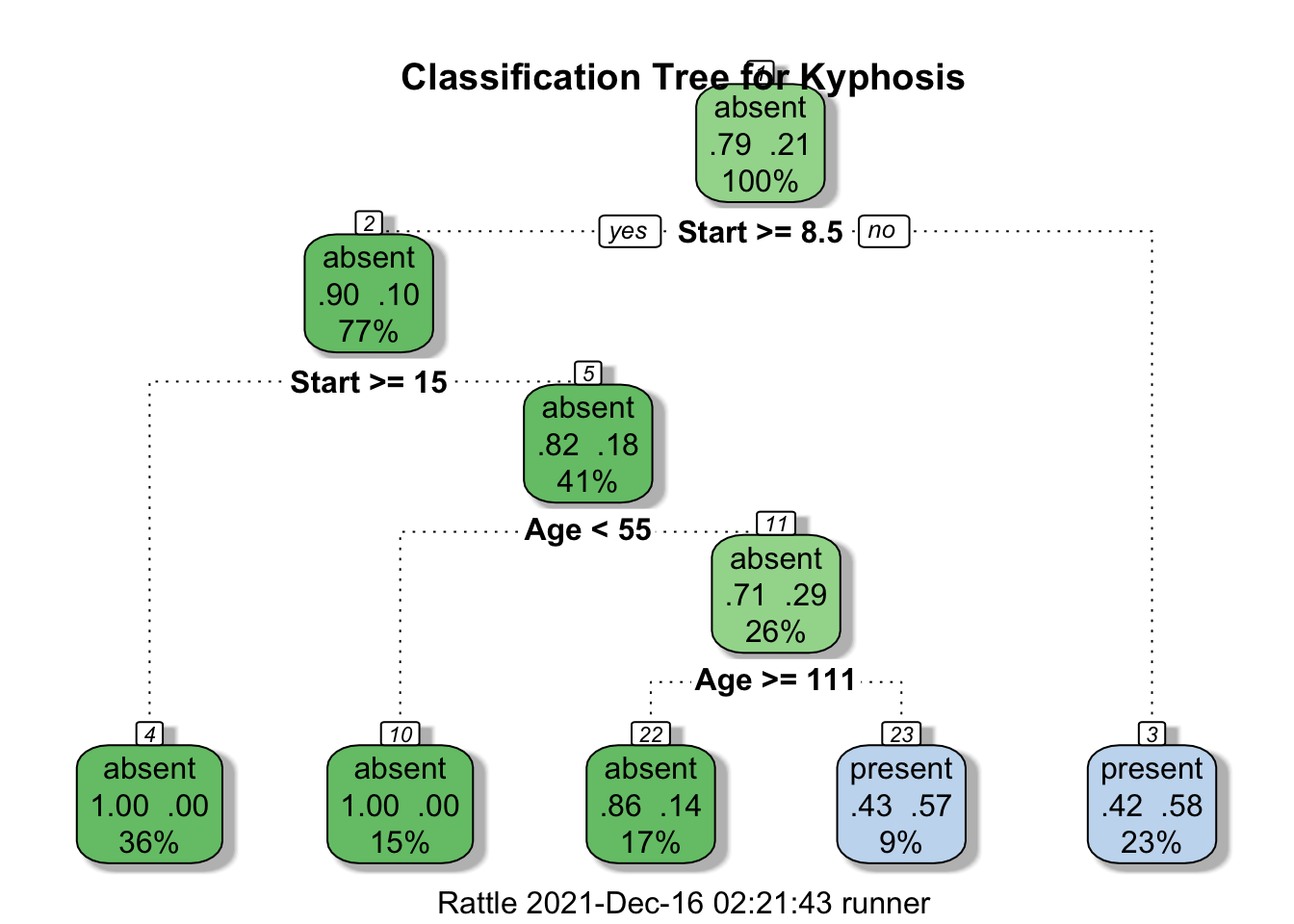
In the fancy plot, does the intensity of the colour play a role? What about the percentages? What about the decimals?
Unchecked tree growth usually leads to overfitting. This is typically a problem when a dataset contains too many variables (the corresponding decision tree will contain too many splits in that case). Overfitting is not going to be an issue in the case of the kyphosis dataset because it contains only three variables; nevertheless, the code below shows you how you would prune the growth of the tree in general.
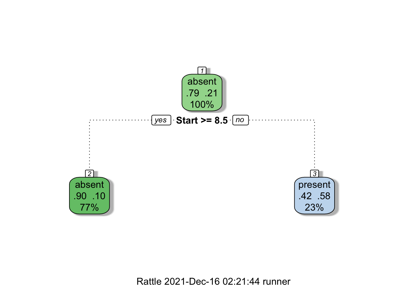
How good is the classification model provided by the tree? We don’t have access to \(p-\)values or confidence intervals – we need to rely on the model’s confusion matrix.
We can obtain the predictions made by the model on the object tree by using the predict function. This procedure takes each observation and feeds it to the model, outputting the likelihood of kyphosis being absent or present. Note that the probabilities are calibrated - compare with the Naive Bayes method which we will see later.
predictions1 = predict(tree, type = "prob")   # class probabilities (default)
knitr::kable(head(predictions1, 10)) # list the first 10 predictions| absent | present |
|---|---|
| 0.4210526 | 0.5789474 |
| 0.8571429 | 0.1428571 |
| 0.4210526 | 0.5789474 |
| 0.4210526 | 0.5789474 |
| 1.0000000 | 0.0000000 |
| 1.0000000 | 0.0000000 |
| 1.0000000 | 0.0000000 |
| 1.0000000 | 0.0000000 |
| 1.0000000 | 0.0000000 |
| 0.4285714 | 0.5714286 |
In general, the confusion matrix requires a specific prediction (absent or present), against which we compare the actual classification. Here, we have probabilities. How can we take the probabilities and transform them into specific predictions?
Here’s one way to do this.
random1 <- runif(81) # uniformly generate a random number (between 0 and 1)
                     # for each of the observations
real <- kyphosis$Kyphosis # extract the actual classification of the observations
test1 <- cbind(predictions1,random1,real) # join together the prediction probabilities,
                                          # the random numbers, and the actual classification
                                          # since we're joining together text and numbers,
                                          # cbind coerces the factors to numerical values
                                          # absent = 1, present = 2
pred1 <- 2-(test1[,3]<test1[,1])  # this code takes advantage of the numerical presentation
                                  # of the factors to output a specific prediction
                                  # if random1 < prob of absent, then
                                  # real = absent (1), otherwise real = present (2)
test1 <- cbind(test1,pred1) # add the specific predictions to the test1 dataset
knitr::kable(head(test1[,c(1,2,4,5)],10))| absent | present | real | pred1 |
|---|---|---|---|
| 0.4210526 | 0.5789474 | 1 | 1 |
| 0.8571429 | 0.1428571 | 1 | 1 |
| 0.4210526 | 0.5789474 | 2 | 2 |
| 0.4210526 | 0.5789474 | 1 | 1 |
| 1.0000000 | 0.0000000 | 1 | 1 |
| 1.0000000 | 0.0000000 | 1 | 1 |
| 1.0000000 | 0.0000000 | 1 | 1 |
| 1.0000000 | 0.0000000 | 1 | 1 |
| 1.0000000 | 0.0000000 | 1 | 1 |
| 0.4285714 | 0.5714286 | 2 | 2 |
We can now build the confusion matrix on the model predictions using real (actual classification) and pred1 (specific model prediction).
knitr::kable(table(test1[,4],test1[,5])) # the function table produces a joint distribution
                           # rows = first variable (real)
# columns = second variable (predicted)| 1 | 2 |
|---|---|
| 56 | 8 |
| 6 | 11 |
Note that the confusion matrix could be different every time a new set of predictions are made. Why would that be the case?
And in the final analysis, is this a good classification model or not?
In the previous example, we computed the confusion matrix using the entire dataset. In a sense, we shouldn’t have been surprised that the results were decent, because we’re using the same data to build the model and to evaluate it.
From a predictive perspective, classification models are built on a subset of the data (the training set) and evaluated on the remaining data (the testing set).
The idea is that if there IS a strong classification signal, it should be found in any representative subset. As a rule, we look for training sets making up between 70% and 80% of the data. They should be selected randomly.
sub <- c(sample(1:81, 50)) # create a training set with 50 instances
fit <- rpart(Kyphosis ~ ., data = kyphosis, subset = sub) # If we use all variables,
                                                          # we don't need to specify them
                                                          # (as above), we just use the "."
fit # what does the model look like?
n= 50
node), split, n, loss, yval, (yprob)
* denotes terminal node
1) root 50 10 absent (0.80000000 0.20000000)
2) Start>=8.5 39 3 absent (0.92307692 0.07692308) *
3) Start< 8.5 11 4 present (0.36363636 0.63636364) *The confusion matrix has to be built on the testing set (indicated here by -sub, that is, the opposite of the sub indices).
There are 2 ways to make a prediction: we either use the most likely outcome, or we generate a random vector of predictions using the probabilities for each class, as above.
# predict on class
knitr::kable(table(predict(fit, kyphosis[-sub,], type = "class"), kyphosis[-sub, "Kyphosis"]))| absent | present | |
|---|---|---|
| absent | 20 | 3 |
| present | 4 | 4 |
# predicting on probability
prob.fit<-predict(fit, kyphosis[-sub,], type = "prob")
random1 <- runif(31)
real <- kyphosis[-sub,"Kyphosis"]
test1 <- cbind(prob.fit,random1,real) # absent = 1, present = 2
pred1 <- 2-(test1[,3]<test1[,1])
test1 <- cbind(test1,pred1)
knitr::kable(table(test1[,4], test1[,5]))| 1 | 2 |
|---|---|
| 22 | 2 |
| 5 | 2 |
These are the confusion matrices that should be used to evaluate the decision’s tree performance.
Another way to build decision trees is via party’s ctree() function. Conditional inference trees have the property that they will automatically prune themselves once a statistical criterion is met by the tree as a whole. The downside is that they do not usually pick fully reasonable splits (they may not conform to contextual understanding).
kyphosis.ctree <- ctree(Kyphosis ~ ., data = kyphosis, subset = sub)
kyphosis.ctree

plot(kyphosis.ctree)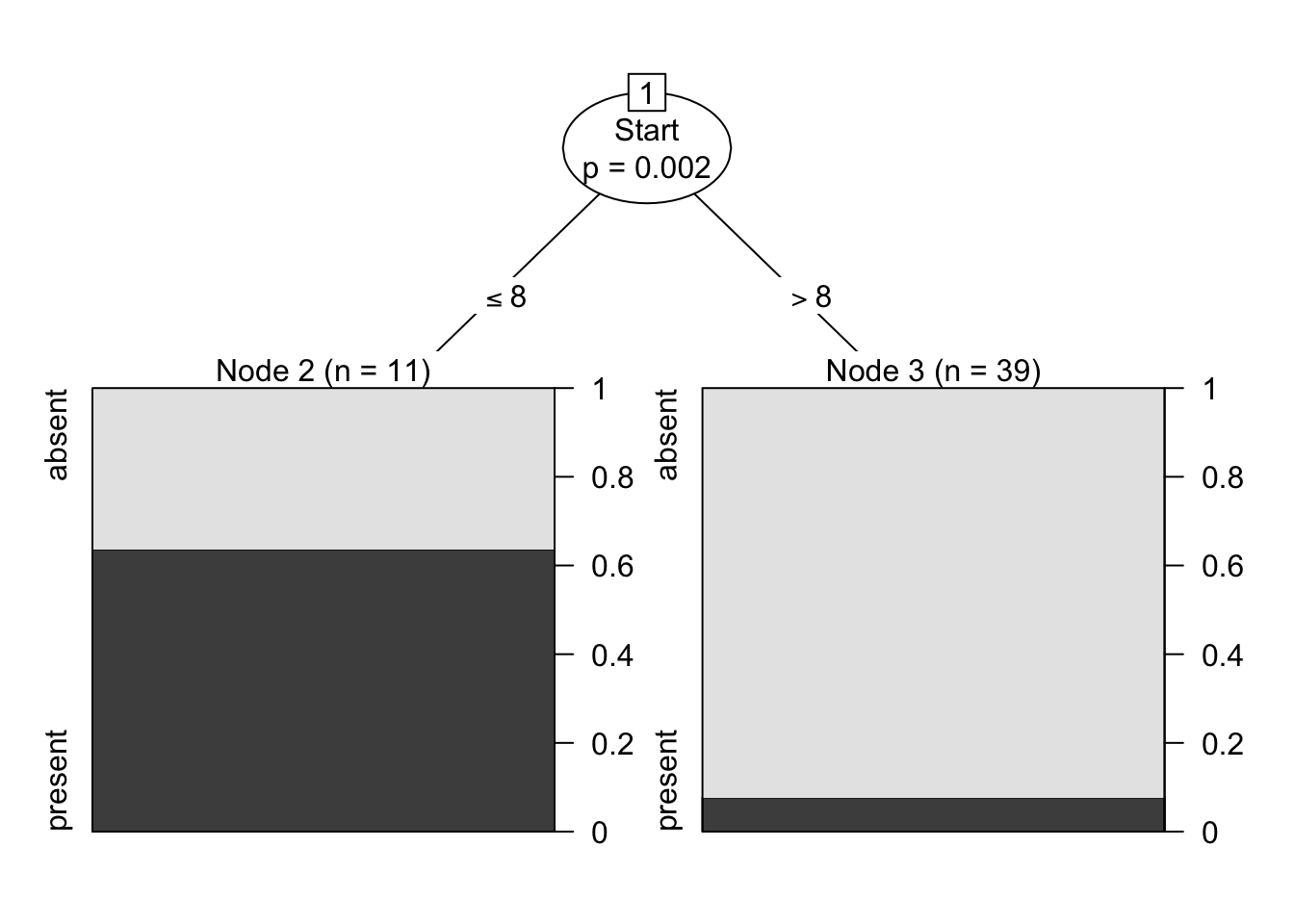
     Conditional inference tree with 2 terminal nodes

Response:  Kyphosis
Inputs:  Age, Number, Start
Number of observations:  50

1) Start <= 8; criterion = 0.998, statistic = 11.288
  2)*  weights = 11
1) Start > 8
  3)*  weights = 39
A very simple tree, as can be seen. It’s confusion matrix (on the testing set) is computed below.
table(predict(kyphosis.ctree, kyphosis[-sub,]),kyphosis[-sub,1]) # which method is used to
                                                                 # generate a specific
                                                                 # prediction on the testing set
          absent present
  absent      20       3
  present      4       4
How good of a model is this one? Which of the rpart or ctree model is preferable? Does this depend on the training set?
16.6.3 Clustering: Iris Dataset
This example refers to Toy Example: Iris Dataset; we cluster the ubiquitous (built-in) iris dataset, via \(k\)-means.
The procedure is straightforward:
cluster the on the first 2 principal components, with n = 2, 3, 4, 5,…, 15 clusters;
display the Within Sum of Squares curve, as a function of the number of clusters;
display the Davies-Bouldin curve, as a function of the number of clusters;
select the optimal number of clusters on the basis of these curves.
Let us load the data and take a look at the iris dataset (without the species labels, as this is an unsupervised problem).
  Sepal.Length Sepal.Width Petal.Length Petal.Width
1          5.1         3.5          1.4         0.2
2          4.9         3.0          1.4         0.2
3          4.7         3.2          1.3         0.2
4          4.6         3.1          1.5         0.2
5          5.0         3.6          1.4         0.2
6          5.4         3.9          1.7         0.4
The eye test would most likely identify 2 (or potentially 3 clusters).
In preparation for the cluster analysis, we will scale the data so that all the variables are represented on the same scale. This can be done using the scale() function.
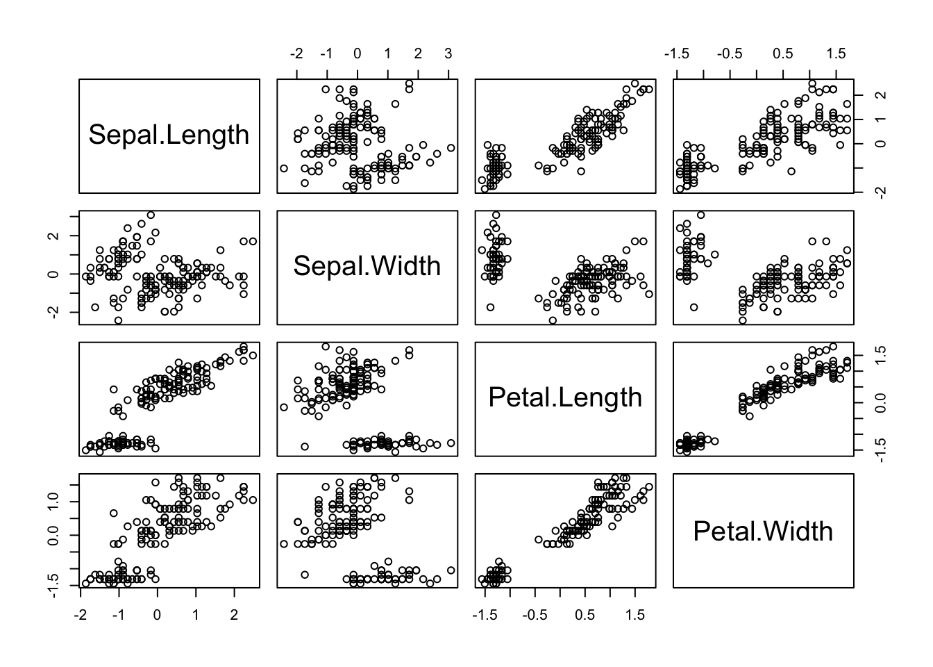
     Sepal.Length Sepal.Width Petal.Length Petal.Width
[1,]   -0.8976739  1.01560199    -1.335752   -1.311052
[2,]   -1.1392005 -0.13153881    -1.335752   -1.311052
[3,]   -1.3807271  0.32731751    -1.392399   -1.311052
[4,]   -1.5014904  0.09788935    -1.279104   -1.311052
[5,]   -1.0184372  1.24503015    -1.335752   -1.311052
[6,]   -0.5353840  1.93331463    -1.165809   -1.048667
The shape of the dataset is the same, but the axis ranges have changed.
One way to reduce the dimension of the problem is to work with the principal components. The hope is that most of the variability in the data can be explained by a smaller number of derived variables, expressed as linear combinations of the original variables.
This can be done in R with the princomp() function.
# this computes the principal component decomposition
pc.agg.data = princomp(my.data.scaled)  # IMPORTANT: use scaled data
summary(pc.agg.data)
Importance of components:
Comp.1 Comp.2 Comp.3 Comp.4
Standard deviation 1.7026571 0.9528572 0.38180950 0.143445939
Proportion of Variance 0.7296245 0.2285076 0.03668922 0.005178709
Cumulative Proportion 0.7296245 0.9581321 0.99482129 1.000000000This provides a summary of the “strength” of the signal in each component. The cumulative proportion of the variance is the value of interest. If 2 principal components are needed to explain 95% of the variance, we would expect that roughly 95% of the set is “2-dimensional”.
Since 2 components are enough to explain 95% of the variance in the data, we will cluster the data projected on only the first 2 components, which can be accessed via the scores attribute of pc.agg.data.
The plot below shows a 2D representation of the iris dataset obtained via PCA.
pc.df.agg.data = cbind(pc.agg.data$scores[,1], pc.agg.data$scores[,2])
plot(pc.df.agg.data,col=iris[,5])
title('PCA plot of Iris Data - 2 Main PCs') 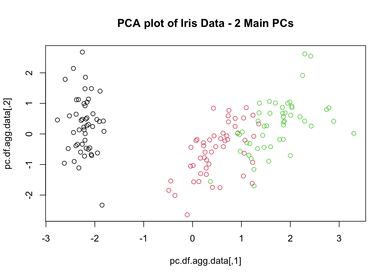
The Davies-Bouldin (DB) index is a measure that is used to determine the optimal number of clusters in the data. For a given dataset, the optimal number of clusters is obtained by maximizing the DB index (there are different versions of the DB index, all giving equivalent results).
## Index used to determine optimal number of clusters (source unknown)
Davies.Bouldin <- function(A, SS, m) {
  # A  - the centres of the clusters
  # SS - the within sum of squares
  # m  - the sizes of the clusters
  N <- nrow(A)   # number of clusters
  # intercluster distance
  S <- sqrt(SS/m)
  # Get the distances between centres
  M <- as.matrix(dist(A))
  # Get the ratio of intercluster/centre.dist
  R <- matrix(0, N, N)
  for (i in 1:(N-1)) {
    for (j in (i+1):N) {
      R[i,j] <- (S[i] + S[j])/M[i,j]
      R[j,i] <- R[i,j]
    }
  }
  return(mean(apply(R, 1, max)))
}
But we do not yet know how many clusters we will ultimately be using (although the visual inspection above suggested \(k=2\) or \(k=3\)), so we will construct \(k-\)means clusters for a variety of values \(k\).
We will in fact produce 40 replicates for each \(k=2,\ldots, 15\) and track both the DB index and the Within Sums of Squares (SS), which is a measure of how similar observations are within each cluster, and how different they are from observations in other clusters (the value for the SS can be found by calling the attribute withinss on a kmeans object).
If the DB index does not provide a clear-cut winner, the SS curve can be used: the optimal number of clusters is obtained when the slope of the SS curve flattens “drastically” (so that adding more clusters does not provide as big a decrease in SS).
We start by setting up the number of repetitions and the loop (2, 3, …, 15 clusters).
## setting up the repetitions and display options
oldpar <- par(mfrow = c(4, 4))

N = 40   # Number of repetitions
max.cluster = 15   # Number of maximum number of desired clusters

## initializing values
m.errs <- rep(0, max.cluster)
m.DBI <- rep(0, max.cluster)

s.errs <- rep(0, max.cluster)
s.DBI <- rep(0, max.cluster)
Now we run 40 replicates for each number of clusters (so 560 calls to the kmeans() clustering algorithm in total). For each clustering schemes, we compute the DB index and the SS, and store them in memory.
We also print one of the clustering schemes for each of the number of clusters in the iteration.
set.seed(0) # for replicability

## clustering and plotting
for (i in 2:max.cluster) {
  errs <- rep(0, max.cluster)
  DBI <- rep(0, max.cluster)

  for (j in 1:N) {
    KM <- kmeans(pc.df.agg.data, iter.max = 10,  i)
    # data, number of internal shifts of the cluster centres, number of clusters

    errs[j] <- sum(KM$withinss)
    DBI[j] <- Davies.Bouldin(KM$centers, KM$withinss, KM$size)
  }

  m.errs[i - 1] = mean(errs)
  s.errs[i - 1] = sd(errs)
  m.DBI[i - 1] = mean(DBI)
  s.DBI[i - 1] = sd(DBI)

  plot(pc.df.agg.data,col=KM$cluster, pch=KM$cluster,
       main=paste(i,"clusters - kmeans (euclidean)"))
}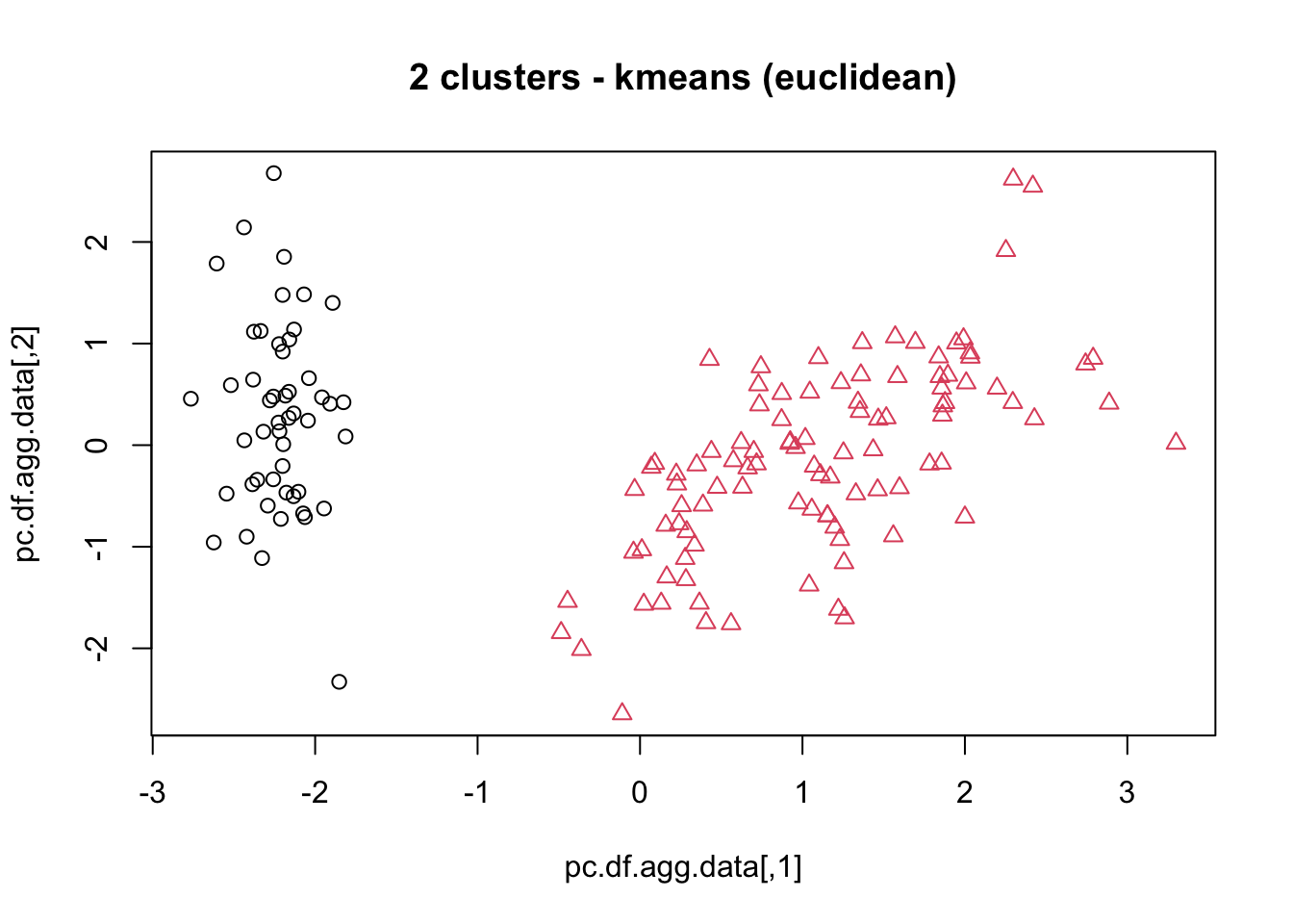
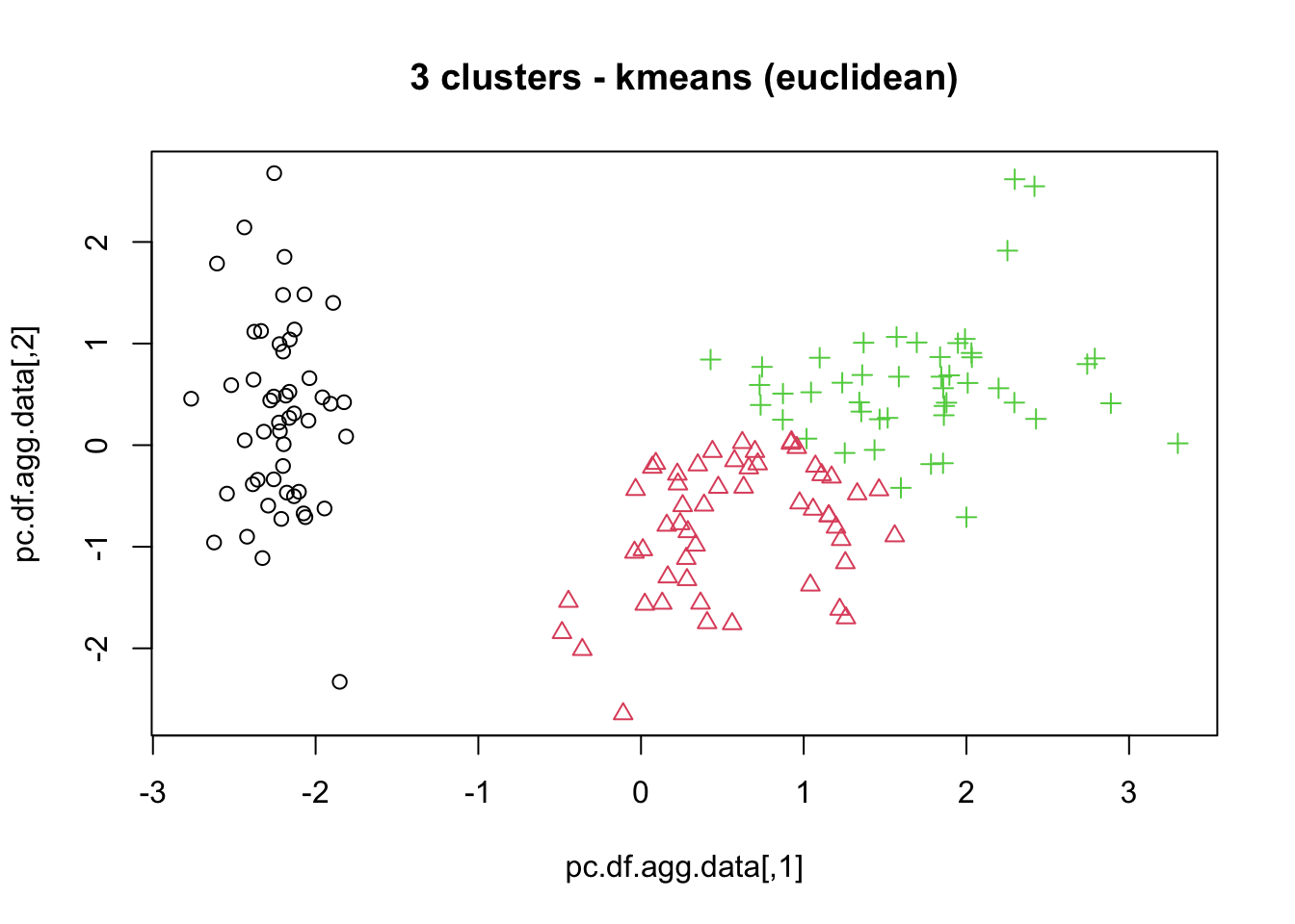
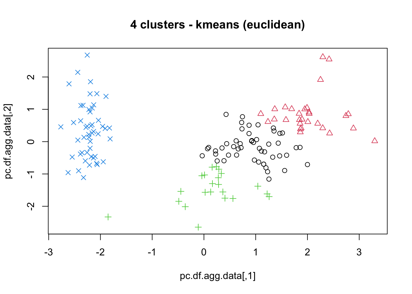
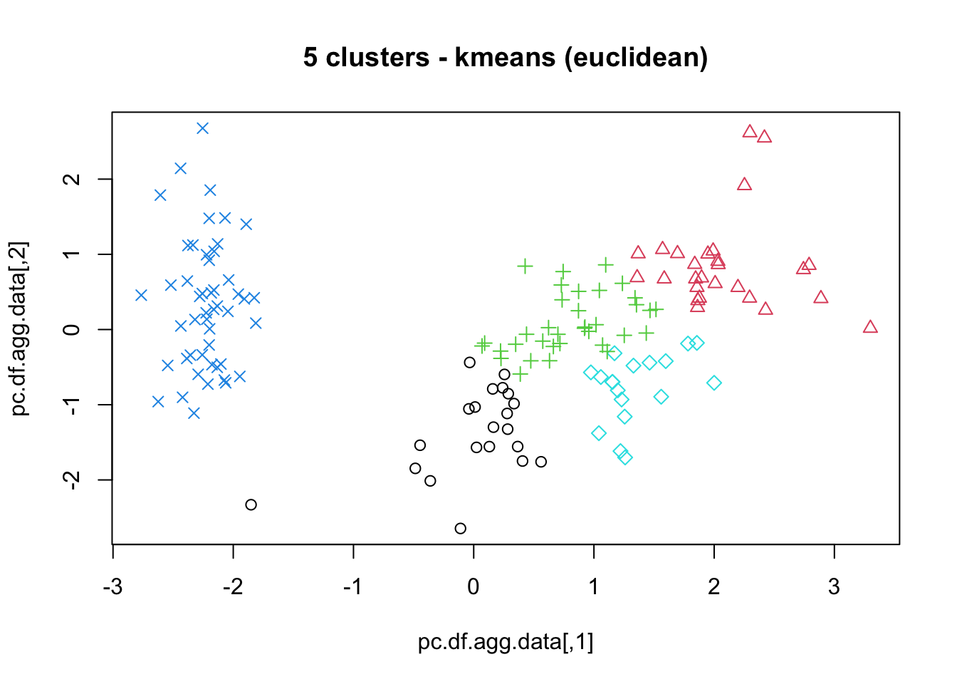
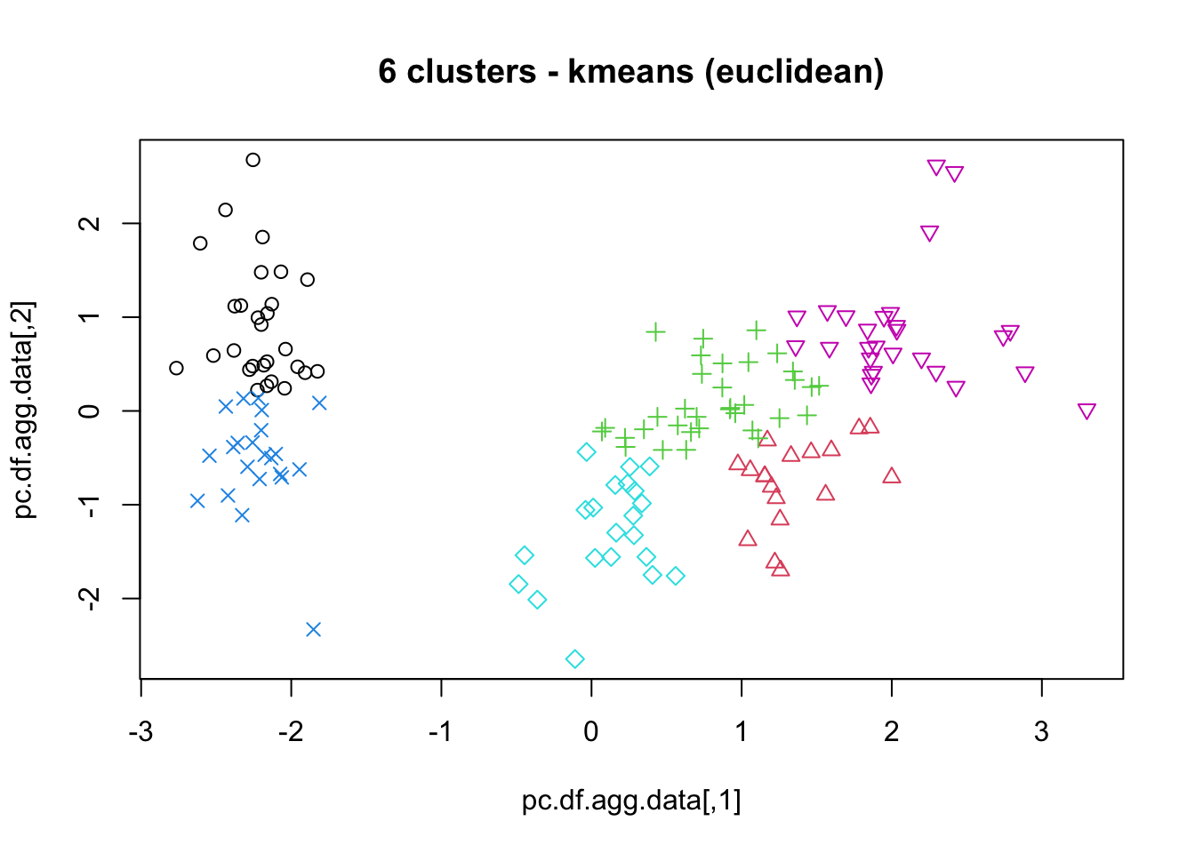
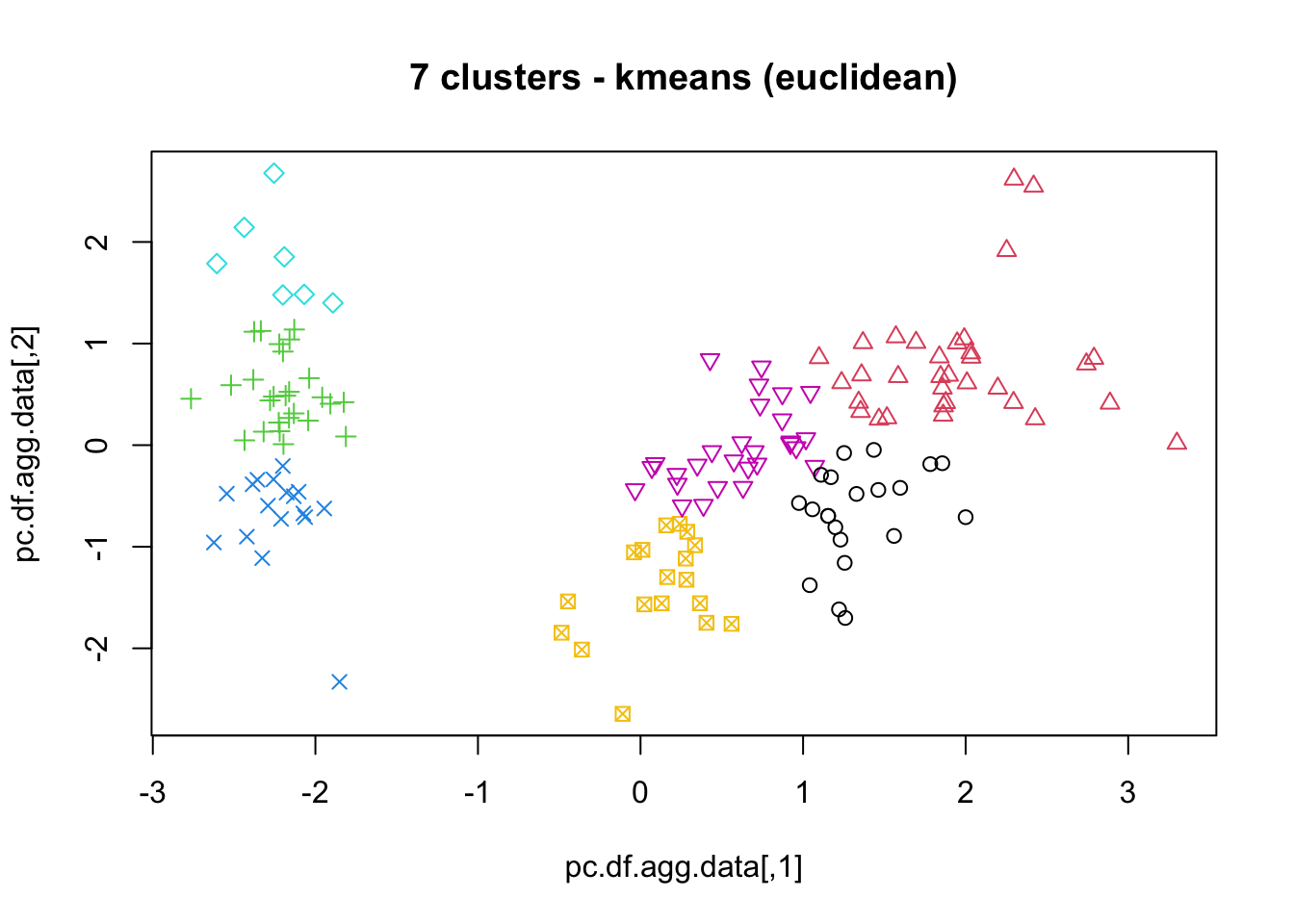
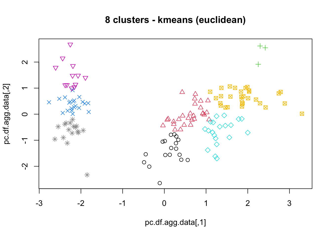
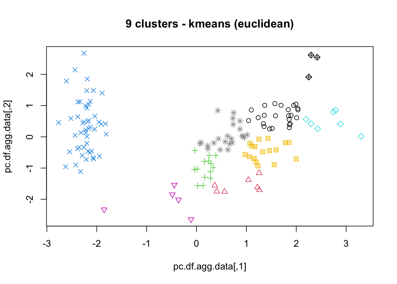
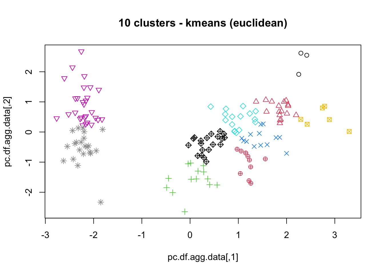
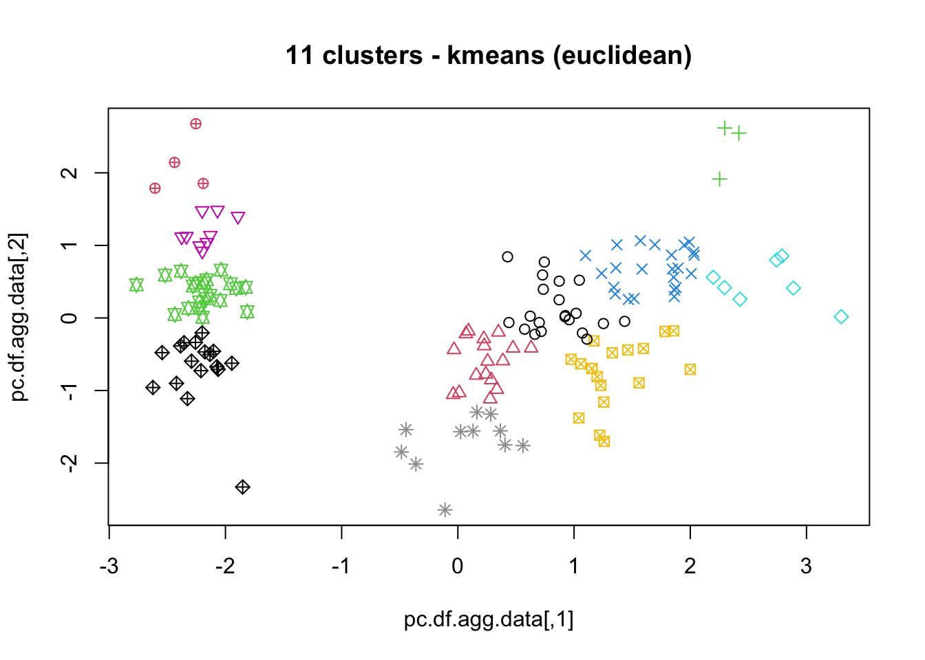
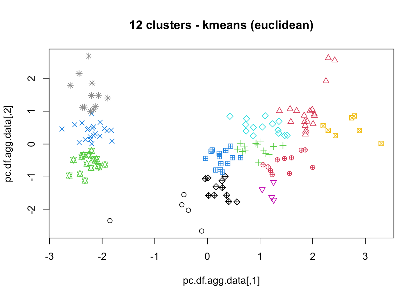
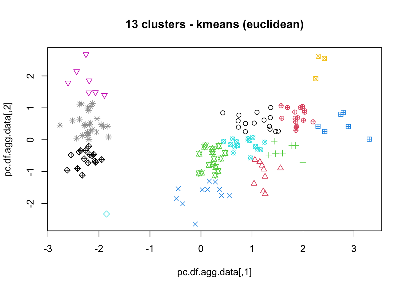
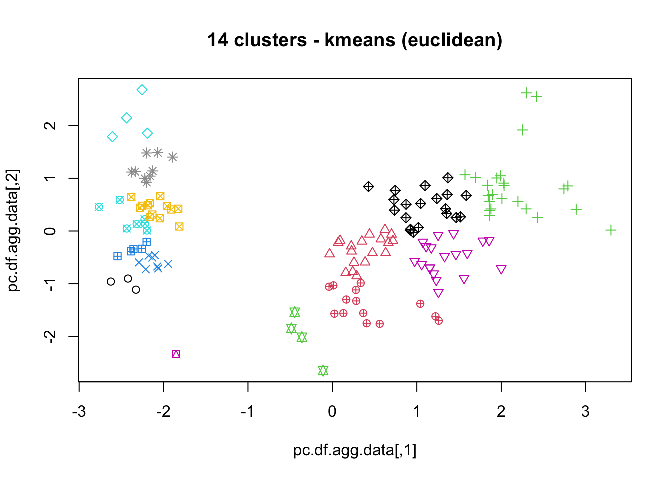
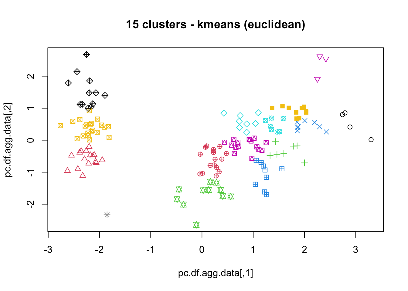
Since we have replicates, we can compute confidence bonds for both the average DB index and the average SS.
## Confidence bands
MSE.errs_up = m.errs + 1.96 * s.errs / sqrt(N)
MSE.errs_low = m.errs - 1.96 * s.errs / sqrt(N)

MSE.DBI_up = m.DBI + 1.96 * s.DBI / sqrt(N)
MSE.DBI_low = m.DBI - 1.96 * s.DBI / sqrt(N)


plot(2:(max.cluster+1), m.errs, main = "SS")
lines(2:(max.cluster+1), m.errs)
par(col = "red")
lines(2:(max.cluster+1), MSE.errs_up)
lines(2:(max.cluster+1), MSE.errs_low)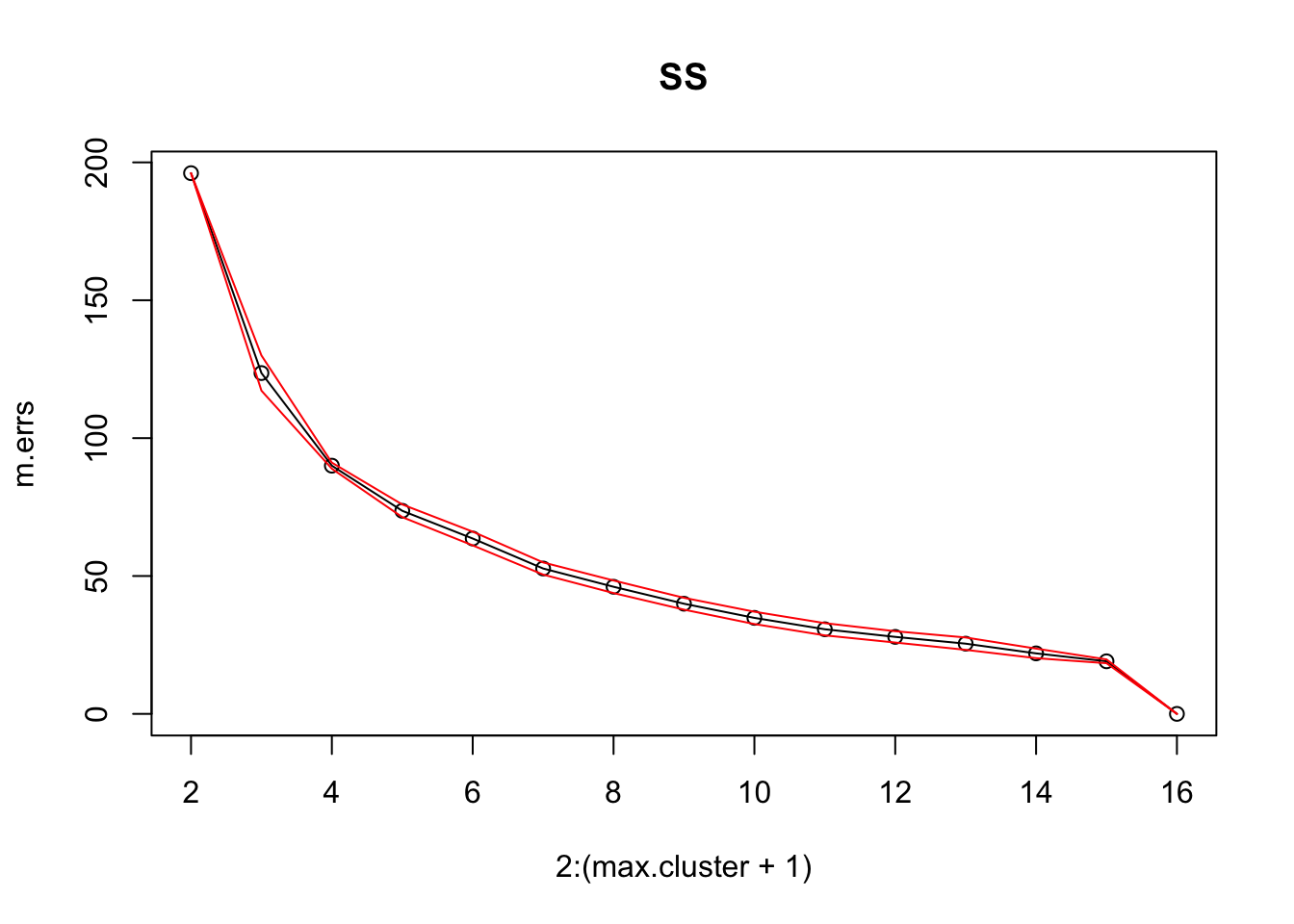
par(col = "black")
#
plot(2:(max.cluster+1), m.DBI, main = "Davies-Bouldin")
lines(2:(max.cluster+1), m.DBI)
par(col="red")
lines(2:(max.cluster+1), MSE.DBI_up)
lines(2:(max.cluster+1), MSE.DBI_low)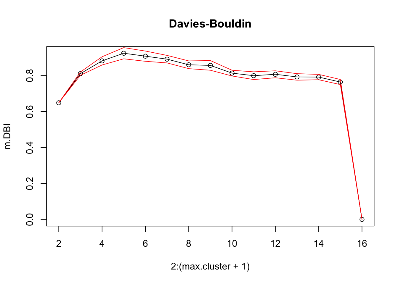
Where is the DB curve maximized? Does that match what the SS curve shows?
[1] 5Finally, let us plot a “final” clustering scheme based on the optimal choice. We cluster on the PCA reduced scaled data, but we plot the results in the original iris data.
## plot and save the final clustering schemes
KM <- kmeans(agg.data, iter.max = 10, i_choice)
plot(iris[,1:4],col=KM$cluster, pch=KM$cluster, main=paste(i_choice,"clusters - kmeans (euclidean)"))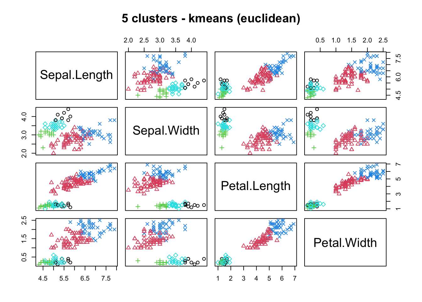
Do we get similar clustering schemes if we use a different distance measure (the default measure in kmeans() is the Euclidean metric)? Let us try the manhattan distance (\(k\)-medians) with the cclus() method (available with the flexclust package, which provides a more flexible clustering approach, including different algorithms and distances).
Loading required package: latticeKMed <- cclust(pc.df.agg.data, i_choice, dist="manhattan")
plot(iris[,1:4], col=predict(KMed), pch=predict(KMed),
main=paste(i_choice,"clusters - kmedians (manhattan)"))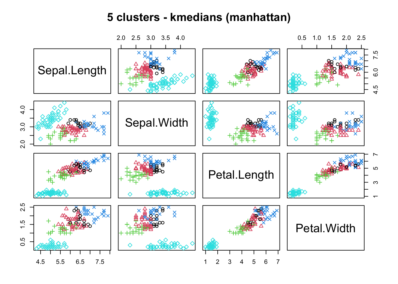
How do these compare?
References
[5] E. Ghashim and P. Boily, “A Soft Introduction to Bayesian Data Analysis,” Data Science Report Series, 2020.
[61] J. Cranshaw, R. Schwartz, J. I. Hong, and N. M. Sadeh, “The livehoods project: Utilizing social media to understand the dynamics of a city,” in ICWSM, 2012.Available: http://dblp.uni-trier.de/db/conf/icwsm/icwsm2012.html#CranshawSHS12
[62] A. Jensen et al., “Temporal disease trajectories condensed from population-wide registry data covering 6.2 million patients,” Nature Communications, vol. 5, 2014, doi: 10.1038/ncomms5022.
[63] K.-W. Hsu, N. Pathak, J. Srivastava, G. Tschida, and E. Bjorklund, “Data mining based tax audit selection: A case study of a pilot project at the minnesota department of revenue,” in Real world data mining applications, Cham: Springer International Publishing, 2015, pp. 221–245. doi: 10.1007/978-3-319-07812-0_12.
[64] F. R. Bach and M. I. Jordan, “Learning spectral clustering, with application to speech separation,” J. Mach. Learn. Res., vol. 7, pp. 1963–2001, Dec. 2006.
[67] C. Plant et al., “Automated detection of brain atrophy patterns based on mri for the prediction of alzheimer’s disease.” NeuroImage, vol. 50, no. 1, pp. 162–174, 2010,Available: http://dblp.uni-trier.de/db/journals/neuroimage/neuroimage50.html#PlantTOBMMBHE10
[68] S. E. Brossette, A. P. Sprague, J. M. Hardin, K. B. Waites, W. T. Jones, and S. A. Moser, “Association Rules and Data Mining in Hospital Infection Control and Public Health Surveillance,” Journal of the American Medical Informatics Association, vol. 5, no. 4, pp. 373–381, Jul. 1998, doi: 10.1136/jamia.1998.0050373.
[74] D. Robinson, “What’s the difference between data science, machine learning, and artificial intelligence?” Variance Explained, Jan. 2018,Available: http://varianceexplained.org/r/ds-ml-ai/
[75] D. Woods, “Bitly’s hilary mason on "what is a data scientist?",” Forbes, Mar. 2012,Available: https://www.forbes.com/sites/danwoods/2012/03/08/hilary-mason-what-is-a-data-scientist/#1189ca465502
[76] C. C. Aggarwal and C. K. Reddy, Eds., Data clustering: Algorithms and applications. CRC Press, 2014.Available: http://www.charuaggarwal.net/clusterbook.pdf
[77] F. Provost and T. Fawcett, Data science for business. O’Reilly, 2015.
[85] T. Hastie, R. Tibshirani, and J. Friedman, The elements of statistical learning: Data mining, inference, and prediction, 2nd ed. Springer, 2008.
[86] C. C. Aggarwal, Ed., Data classification: Algorithms and applications. CRC Press, 2015.
[87] C. C. Aggarwal, Data mining: The textbook. Cham: Springer, 2015. doi: 10.1007/978-3-319-14142-8.
[88] Wikipedia, “Cluster analysis algorithms.”
[128] D. Barber, Bayesian reasoning and machine learning. Cambridge Press, 2012.
[129] G. James, D. Witten, T. Hastie, and R. Tibshirani, An introduction to statistical learning: With applications in r. Springer, 2014.
[130] D. Dua and E. Karra Taniskidou, “UCI machine learning repository.” Irvine, CA: University of California, School of Information; Computer Science, 2017.Available: http://archive.ics.uci.edu/ml
[131] S. Canada, “Athlete rebate.”
[132] E. Siegel, Predictive analytics: The power to predict who will click, buy, lie or die. Predictive Analytics World, 2016.
[133] E. Garcia, C. Romero, S. Ventura, and T. Calders, “Drawbacks and solutions of applying association rule mining in learning management systems,” 2007.
[134] Wikipedia, “Association rule learning.” 2020.Available: https://en.wikipedia.org/wiki/Association\_rule\_learning
[135] E. R. Omiecinski, “Alternative interest measures for mining associations in databases,” IEEE Transactions on Knowledge and Data Engineering, vol. 15, no. 1, pp. 57–69, 2003, doi: 10.1109/TKDE.2003.1161582.
[136] G. Piatetsky-Shapiro, “Discovery, analysis, and presentation of strong rules,” 1991.
[137] C. C. Aggarwal and P. S. Yu, “A new framework for itemset generation,” in Proceedings of the seventeenth acm sigact-sigmod-sigart symposium on principles of database systems, 1998, pp. 18–24. doi: 10.1145/275487.275490.
[138] P.-N. Tan, V. Kumar, and J. Srivastava, “Selecting the right objective measure for association analysis,” Inf. Syst., vol. 29, no. 4, pp. 293–313, Jun. 2004, doi: 10.1016/S0306-4379(03)00072-3.
[139] M. Hahsler and K. Hornik, “New probabilistic interest measures for association rules,” CoRR, vol. abs/0803.0966, 2008,Available: http://arxiv.org/abs/0803.0966
[140] T. Chou, “Apriori: Association rule mining in-depth explanation and python implementation,” Towards Data Science, Oct. 2020,Available: https://towardsdatascience.com/apriori-association-rule-mining-explanation-and-python-implementation-290b42afdfc6
[141] J. Leskovec, A. Rajamaran, and J. D. Ullman, Mining of massive datasets. Cambridge Press, 2014.
[142] M. Risdal, “Exploring survival on the titanic,” Kaggle.com, 2016.
[143] B. Kitts et al., “Click fraud detection: Adversarial pattern recognition over 5 years at microsoft,” in Annals of information systems (special issue on data mining in real-world applications), Springer, 2015, pp. 181–201. doi: 10.1007/978-3-319-07812-0.
[146] B. Kitts, “Product targeting from rare events: Five years of one-to-one marketing at CPI,” Marketing Science Conference, 2005.
[147] L. Torgo, Data mining with r, 2nd ed. CRC Press, 2016.
[148] T. Hastie, T. Tibshirani, and M. Wainwright, Statistical learning with sparsity: The lasso and generalizations. CRC Press, 2015.
[149] O. Leduc and P. Boily, “Boosting with adaboost and gradient boosting,” Data Action Lab Blog, 2019,Available: https://www.data-action-lab.com/2019/07/31/boosting-with-adaboost-and-gradient-boosting/
[150] C. F. Robert, Le choix bayésien - principes et pratique. Springer-Verlag France, 2006.
[151] B. Efron, Large scale inference: Empirical bayes methods for estimation, testing, and prediction. Cambridge University Press, 2010.
[152] A. Ng and K. Soo, Eds., Surviving a disaster, in numsense! algobeans, 2016.
[153] D. H. Wolpert, “The lack of a priori distinctions between learning algorithms,” Neural Computation, vol. 8, no. 7, pp. 1341–1390, 1996, doi: 10.1162/neco.1996.8.7.1341.
[154] D. H. Wolpert and W. G. Macready, “Coevolutionary free lunches,” IEEE Transactions on Evolutionary Computation, vol. 9, no. 6, pp. 721–735, 2005, doi: 10.1109/TEVC.2005.856205.
[155] J. Chambers and T. Hastie, Statistical models in s. Wadsworth; Brooks/Cole, 1992.
[156] E. Schubert, J. Sander, M. Ester, H. P. Kriegel, and X. Xu, “DBSCAN revisited, revisited: Why and how you should (still) use dbscan,” ACM Trans. Database Syst., vol. 42, no. 3, Jul. 2017, doi: 10.1145/3068335.
[162] G. Schoier and G. Borruso, “Individual movements and geographical data mining. Clustering algorithms for highlighting hotspots in personal navigation routes,” in Computational science and its applications - iccsa 2011, 2011, pp. 454–465.
[163] N. Harris, “Visualizing dbscan clustering.”
[164] B. Desgraupes, ClusterCrit: Clustering indices. 2018.Available: https://CRAN.R-project.org/package=clusterCrit
[165] Z. Cheng, J. Caverlee, K. Lee, and D. Z. Sui, “Exploring millions of footprints in location sharing services.” in ICWSM, 2011.Available: http://dblp.uni-trier.de/db/conf/icwsm/icwsm2011.html#ChengCLS11
[166] R. A. Fisher, “The use of multiple measurements in taxonomic problems,” Annals of Eugenics, vol. 7, no. 7, pp. 179–188, 1936.
[167] A. M. Raja, “Penguins dataset overview - iris alternative,” Towards Data Science, Jun. 2020.
[168] Q. E. McCallum, Bad data handbook. O’Reilly, 2013.
[169] A. K. Maheshwari, Business intelligence and data mining. Business Expert Press, 2015.
Note that this is not the same thing as asking whether we should design such algorithms.↩︎
Note that this is not the same as understanding why a mushroom is poisonous or edible – the data alone cannot provide an answer to that question.↩︎
A mycologist could perhaps deduce the answer from these features alone, but she would be using her experience with fungi to make a prediction, and so would not be looking at the features in a vacuum.↩︎
It would have had Amanita muscaria’s habitat been ‘leaves’.↩︎
The marketing team is banking on the fact that customers are unlikely to shop around to get the best deal on hot dogs AND buns, which may or may not be a valid assumption.↩︎
There will be times when an interest of 0.11 in a rule would be considered a smashing success; a lift of 15 would not be considered that significant but a support of 2% would be, and so forth.↩︎
The final trajectories were validated using the full sampling procedure.↩︎
Again, with feeling: correlation does not imply causation.↩︎
Value estimation (regression) is similar to classification, except that the target variable is numerical instead of categorical.↩︎
ID3 would never be used in a deployment setting, but it will serve to illustrate a number of classification concepts.↩︎
Classical performance evaluation metrics can easily be fooled; if out of two classes one of the instances is only represented in 0.01% of the instances, predicting the non-rare class will yield correct predictions roughly 99.99% of the time, missing the point of the exercise altogether.↩︎
The relative small size of the dataset should give data analysts pause for thought, at the very least.↩︎
Is it possible to look at Figure 16.23 without assigning labels or trying to understand what type of customers were likely to be young and have medium income? Older and wealthier?↩︎
The order in which the data is presented can play a role, as can starting configurations.↩︎
To the point that the standard joke is that “it’s not necessary to be a gardener to become a data analyst, but it helps”.↩︎
Note that the iris dataset has started being phased out in favour of the penguin dataset [167], for reasons that do not solely have to do with its overuse (hint: take a look at the name of the journal that published Fisher’s paper).↩︎
This threshold is difficult to establish exactly, however.↩︎
We could argue that the data was simply not representative – using a training set with redheads would yield a rule that would make better predictions. But “over-reporting/overconfidence” (which manifest themselves with the use of significant digits) is also part of the problem.↩︎
“It’s the best data we have!” does not mean that it is the right data, or even good data.↩︎
For instance, can we use a model that predicts whether a borrower will default on a mortgage or not to also predict whether a borrower will default on a car loan or not? The problem is compounded by the fact that there might be some link between mortgage defaults and car loan defaults, but the original model does not necessarily takes this into account.↩︎