Module 15 Data Visualization
Why do we display evidence in a report, in a newspaper article, or online? What is the fundamental goal of our charts and graphs? Representation data properly, in a manner that will allow an audience to gain insight about the underlying situation, is, without a doubt, the most important skill a quantitative consultant must possess. In this chapter, we introduce some commonly-used charts, discuss the fundamental principles of analytical designs, give a brief overview of dashboards, and present the important notions of the grammar of graphics and its implementation in ggplot2.
15.1 Data and Charts
As data scientist Damian Mingle once put it, modern data analysis is a different beast:
“Discovery is no longer limited by the collection and processing of data, but rather management, analysis, and visualization. [103]”
What can be done with the data, once it has been collected/processed?
Two suggestions come to mind:
analysis is the process by which we extract actionable insights from the data (this process is discussed in later subsections), while
visualization is the process of presenting data and analysis outputs in a visual format; visualization of data prior to analysis can help simplify the analytical process; post-analysis, it allows for the results to be communicated to various stakeholders.
In this section, we focus on important visualization concepts and methods; we shall provide examples of data displays to illustrate the various possibilities that might be produced by the data presentation component of a data analysis system.
15.1.1 Pre-Analysis Uses
Even before the analytical stage is reached, data visualization can be used to set the stage for analysis by:
detecting invalid entries and outliers;
shaping the data transformations (binning, standardization, dimension reduction, etc.);
getting a sense for the data (data analysis as an art form, exploratory analysis), and
identifying hidden data structures (clustering, associations, patterns which may inform the next stage of analysis, etc.).
15.1.2 Presenting Results
The crucial element of data presentations is that they need to help convey the insight (or the message); they should be clear, engaging, and (more importantly) readable. Our ability to think of questions (and to answer them) is in some sense limited by what we can visualize.
There is always a risk that if certain types of visualization techniques dominate in evidence presentations, the kinds of questions that are particularly well-suited to providing data for these techniques will come to dominate the landscape, which will then affect data collection techniques, data availability, future interest, and so forth.
15.1.2.1 Generating Ideas and Insights
In Beautiful Evidence [104], E.explains that evidence is presented to assist our thinking processes. He further suggests that there is a symmetry to visual displays of evidence – that visualization consumers should be seeking exactly (and explicitly) what the visualization producers should be providing, namely:
meaningful comparisons;
causal networks and underlying structure;
multivariate links;
integrated and relevant data, and
a primary focus on content.
More details can be found in Fundamental Principles of Analytical Design.
15.1.2.2 Selecting a Chart Type
The choice of visualization methods is strongly dependent on the analysis objective, that is, on the questions that need to be answered. Presentation methods should not be selected randomly (or simply from a list of easily-produced templates) [83].
In Figure 15.1 below, F. Ruys suggests various types of visual displays that can be used, depending on the objective:
who is involved?
where is the situation taking place?
when is it happening?
what is it about?
how/why does it work?
how much?
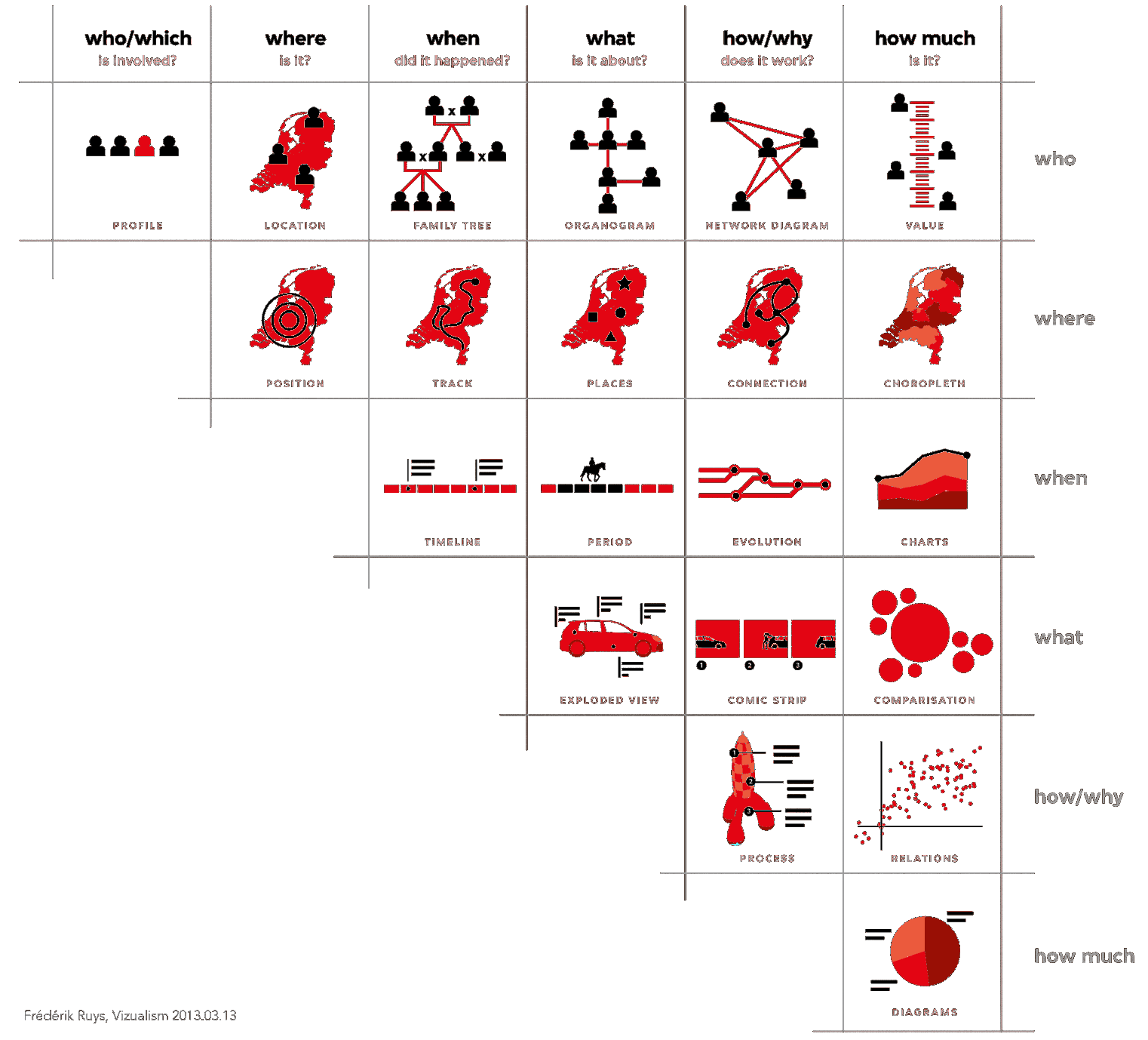
Figure 15.1: Data visualization suggestions, by type of question (F. Ruys, Vizualism.nl).
A general dashboard should at least be able to produce the following types of display:
charts – comparison and relation (scatterplots, bubble charts, parallel coordinate charts, decision trees, cluster plots, trend plots)
choropleth maps (heat maps, classification maps)
network diagrams and connection maps (association rule networks, phrase nets)
univariate diagrams (word clouds, box plots, histograms)
15.1.3 Multivariate Elements in Charts
At most two fields can be represented by position in the plane. How can we then represent other crucial elements on a flat computer screen?
Potential solutions include:
third dimension
marker size
marker colour
colour intensity and value
marker texture
line orientation
marker shape
motion/movie
These elements do not always mix well – efficient design is as much art as it is science.
The following examples, along with concise descriptions of key components and lists of questions that they could help answer, highlight charts’ strengths (and limitations). Some additional diagrams showcasing the four presentation types discussed above are also provided.
15.1.3.1 Bubble Chart
Example: Health and Wealth of Nations (see Figure 15.2)
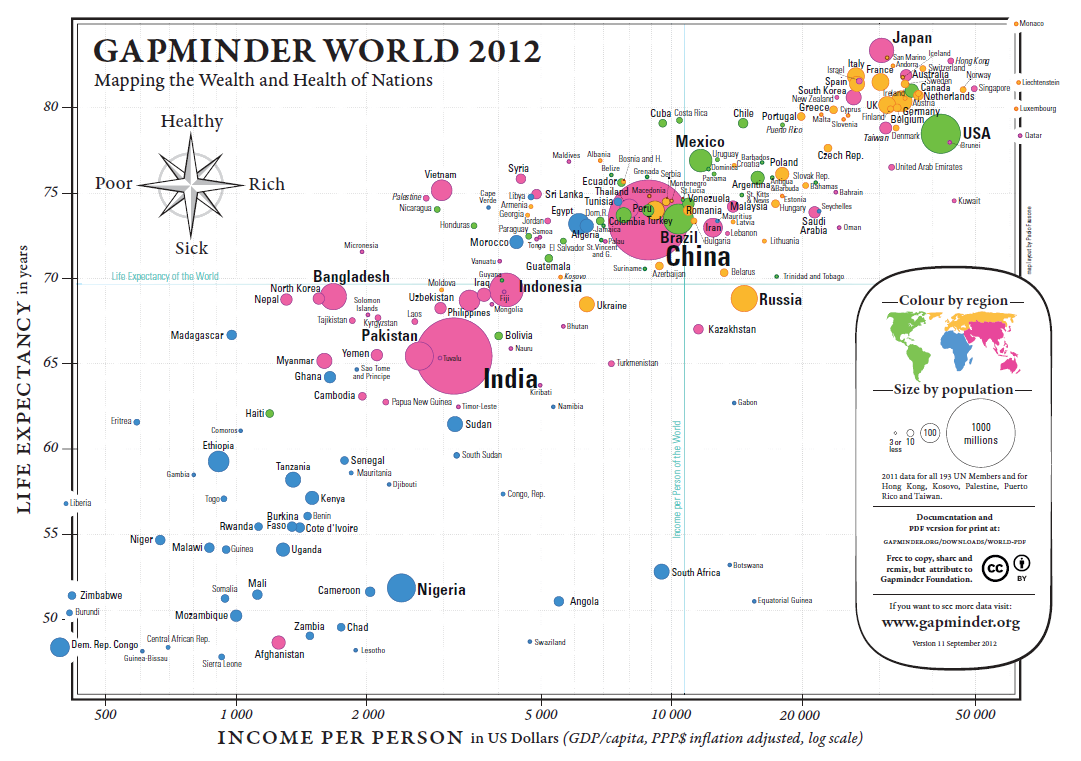
Figure 15.2: Health and Wealth of Nations, in 2012 (Gapminder Foundation).
Data:
2012 life expectancy in years
2012 inflation adjusted GDP/capita in USD
2012 population for 193 UN members and 5 other countries
Some Questions and Comparisons:
Can we predict the life expectancy of a nation given its GDP/capita?
(The trend is roughly linear: \(\mbox{Expectancy}\approx 6.8 \times \ln \mbox{GDP/capita} + 10.6\))Are there outlier countries? Botswana, South Africa, and Vietnam, at a glance.
Are countries with a smaller population healthier? Bubble size seems uncorrelated with the axes’ variates.
Is continental membership an indicator of health and wealth levels? There is a clear divide between Western Nations (and Japan), most of Asia, and Africa.
How do countries compare against world values for life expectancy and GDP per capita? The vast majority of countries fall in three of the quadrants. There are very few wealthy countries with low life expectancy. China sits near the world values, which is expected for life expectancy, but more surprising when it comes to GDP/capita – compare with India.
Multivariate Elements:
positions for health and wealth
bubble size for population
colour for continental membership
labels to identify the nations
Comments:
Are life expectancy and GDP/capita appropriate proxies for health and wealth?
A fifth element could also be added to a screen display: the passage of time. In this case, how do we deal with countries coming into existence (and ceasing to exist as political entities)?
15.1.3.2 Choropleth Map
Example: Mean Elevation by U.S. State (see Figure 15.3)
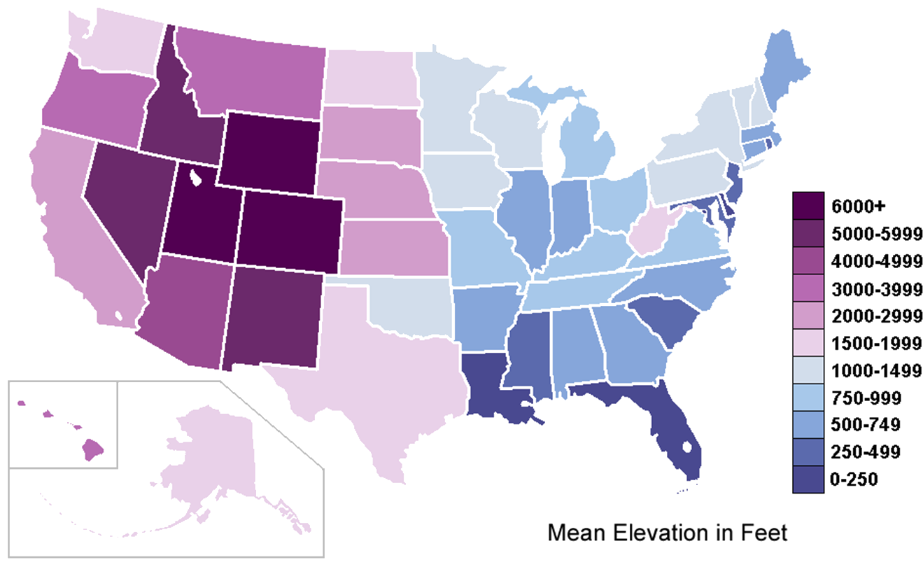
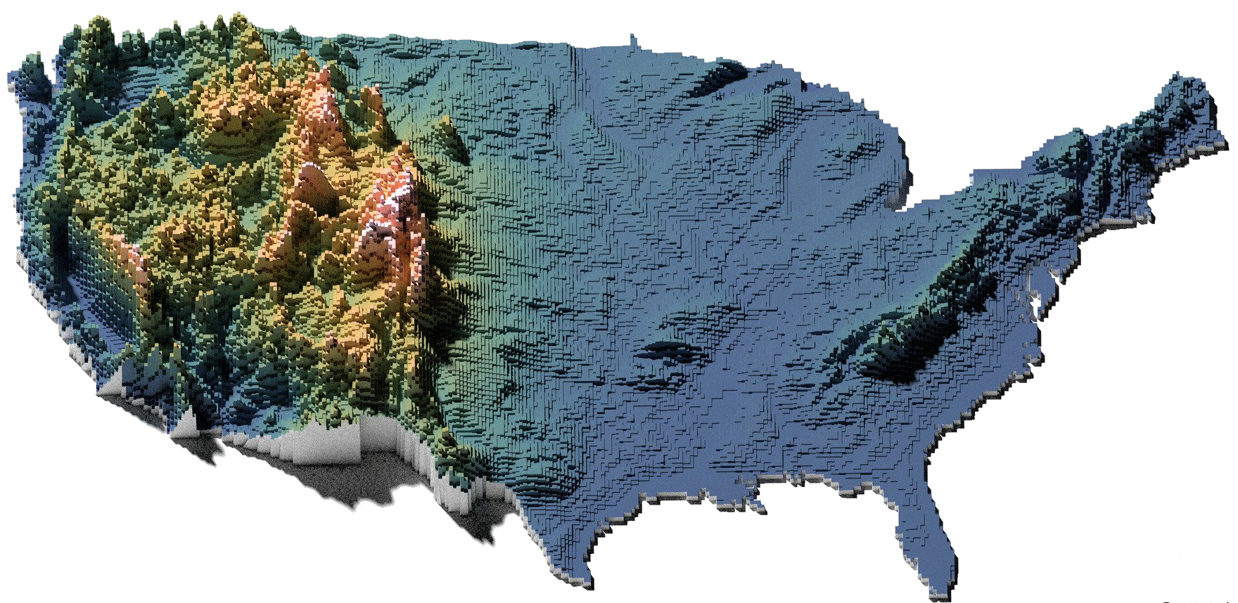
Figure 15.3: Mean elevation by U.S. state, in feet (source unknown); contrast with high resolution elevation map (by twitter user @cstats.)
Data: 50 observations, ranging from sea level (0-250) to (6000+)
Some Questions and Comparisons:
Can the mean elevation of the U.S. states tell us something about the global topography of the U.S.? West has higher mean elevation related to the presence of the Rockies; Eastern coastal states are more likely to suffer from rising water levels, for instance.
Are there any states that do not “belong” in their local neighbourhood, elevation-wise? West Virginia and Oklahoma seem to have the “wrong” shade – is that an artifact of the colour gradient and scale in use?
Multivariate Elements: geographical distribution and purple-blue colour gradient (as the marker for mean elevation)
Comments:
Is the ‘mean’ the right measurement to use for this map? It depends on the author’s purpose.
Would there be ways to include other variables in this chart? Population density with texture, for instance.
15.1.3.3 Network Diagram
Example: Lexical Distances (see Figure 15.4)
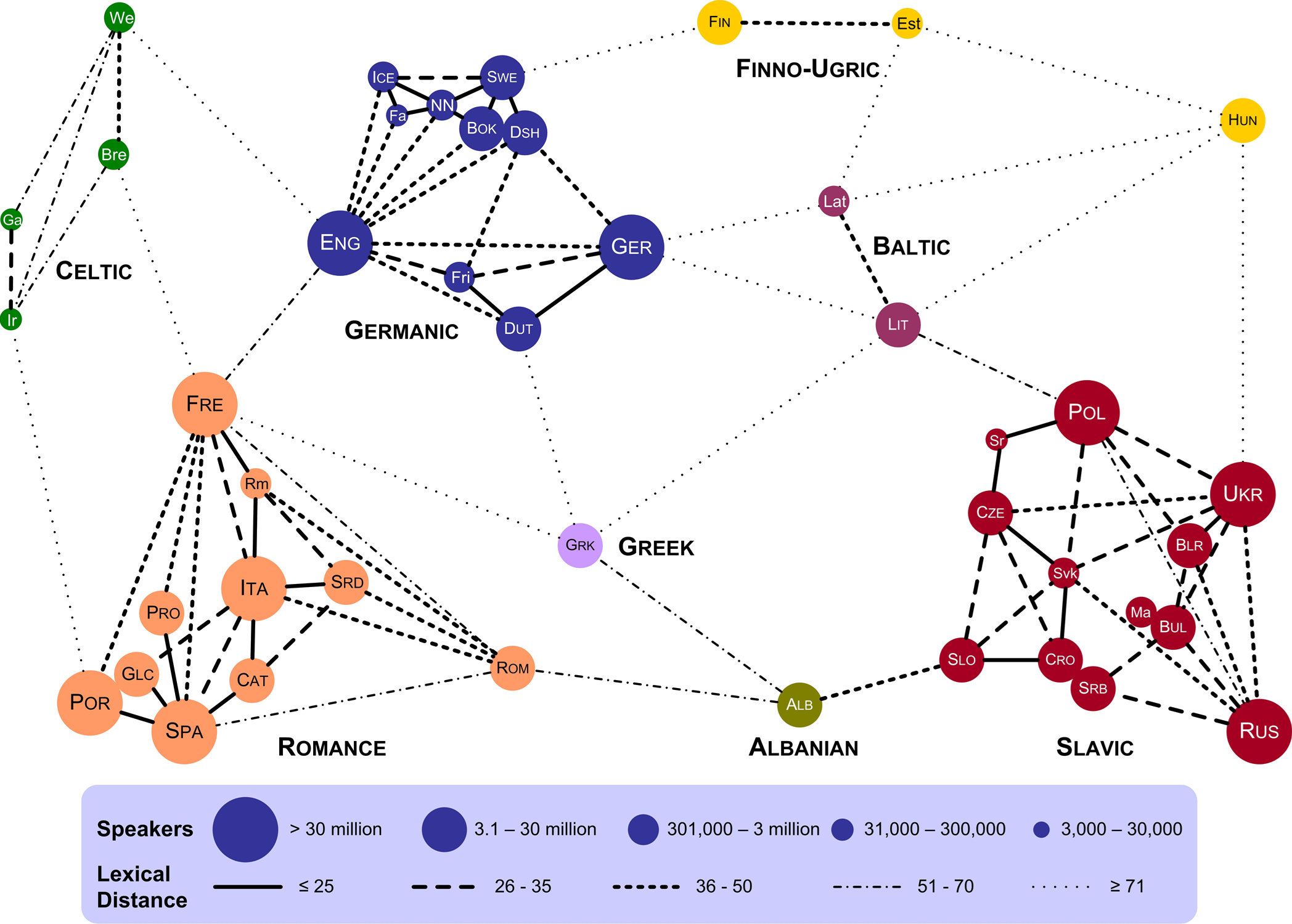
Figure 15.4: Lexical distance of European languages (T. Elms, [105).
Data:
speakers and language groups for 43 European languages
lexical distances between languages
Some Questions and Comparisons:
Are there languages that are lexically closer to languages in other lexical groups than to languages in their own groups? French is lexically closer to English than it is to Romanian, say.
Which language has the most links to other languages? English has 10 links.
Are there languages that are lexically close to multiple languages in other groups? Greek is lexically close to 5 groups.
Is there a correlation between the number of speakers and the number of languages in a language group? Language groups with more speakers tend to have more languages.
Does the bubble size refer only to European speakers? Portuguese is as large as French?
Multivariate Elements:
colour and cluster for language group
line style for lexical distance
bubble size for number of speakers
Comments:
How is lexical distance computed?
Some language pairs are not joined by links – does this mean that their lexical distance is large enough not to be rendered?
Are the actual geometrical distances meaningful? For instance, Estonian is closer to French in the chart than it is to Portuguese – is it also lexically closer?
15.1.4 Visualization Catalogue
Here are some examples of other types of visualizations; more comprehensive catalogues can be found in [83], [83], [106]–[109], among others.
Figure 15.5: Decision Tree: classification scheme for the kyphosis dataset (personal file).
Figure 15.6: Histogram of reported weekly work hours (personal file).
Figure 15.7: Decision tree bubble chart: estimated average project effort (in red) over-layed over product complexity, programmer capability, and product count in NASA’s COCOMO dataset (personal file).
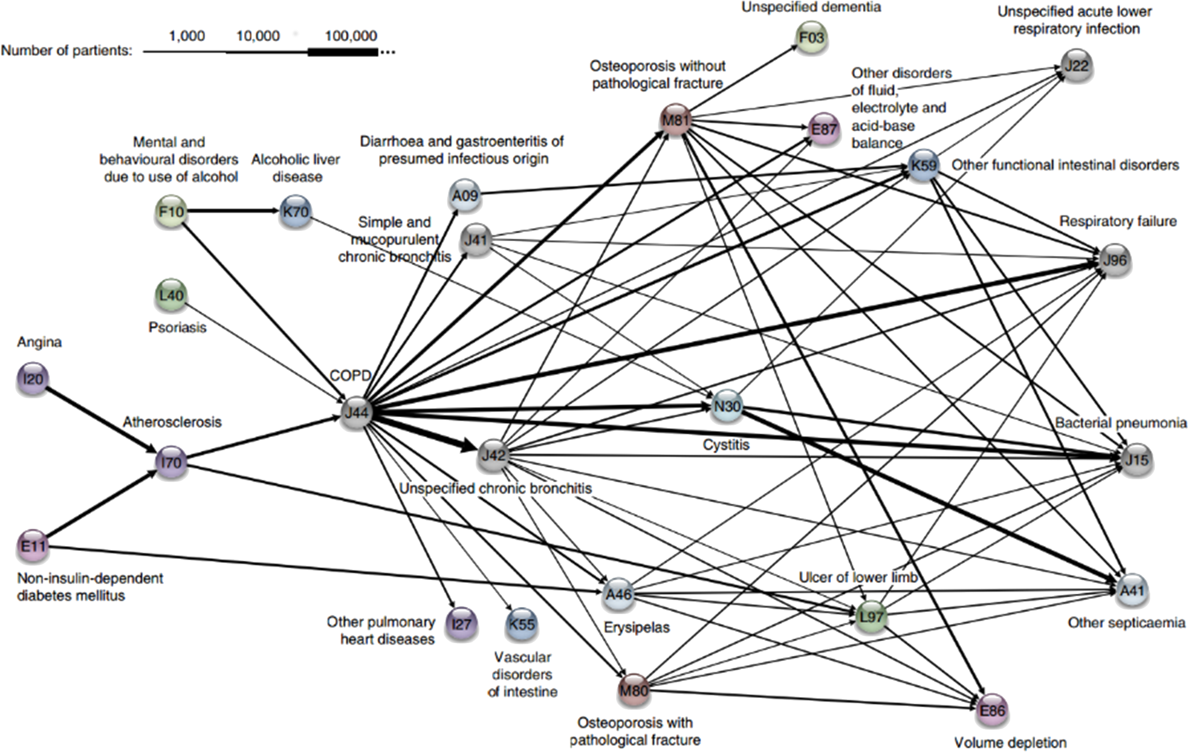
Figure 15.8: Association rules network: diagnosis network around COPD in the Danish Medical Dataset [62].
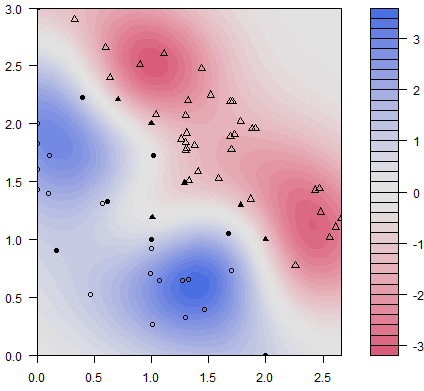
Figure 15.9: Classification scatterplot: artificial dataset (personal file).
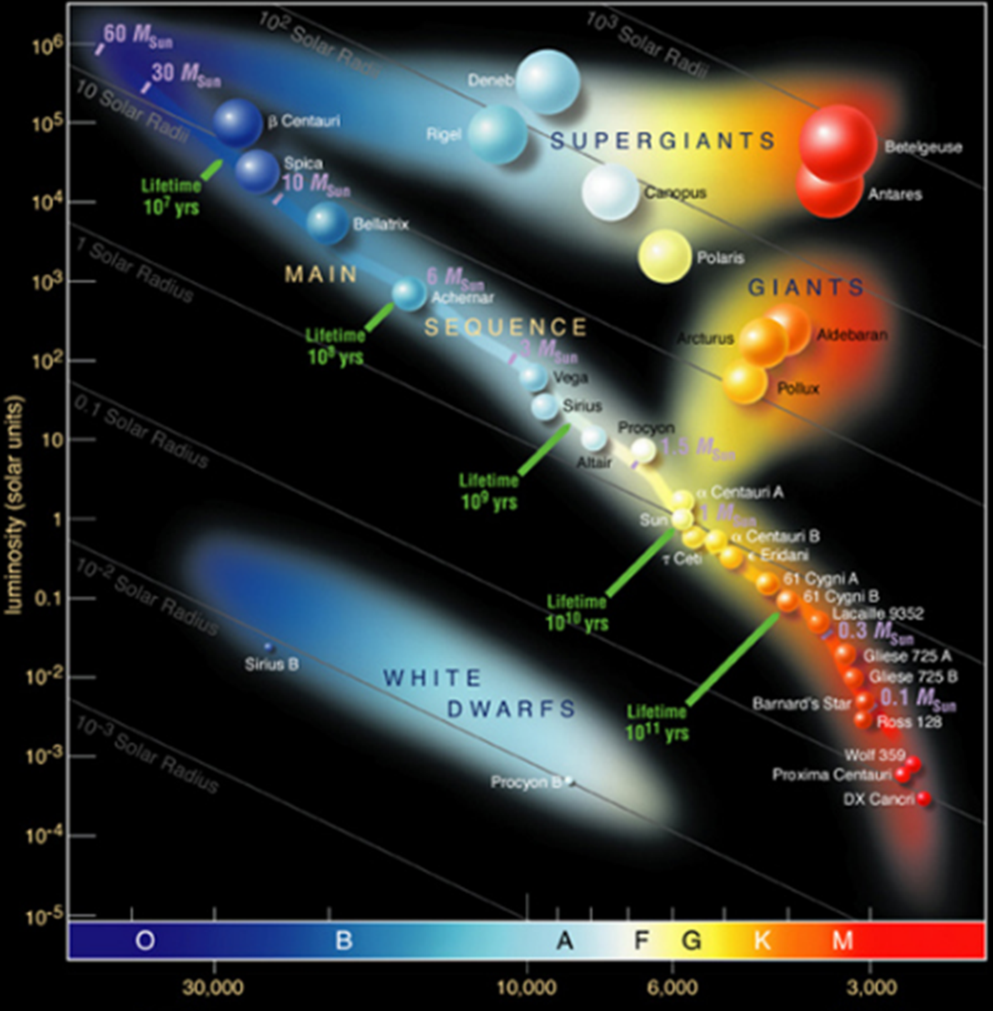
Figure 15.10: Classification bubble chart: Hertzsprung- Russell diagram of stellar evolution (European Southern Observatory).
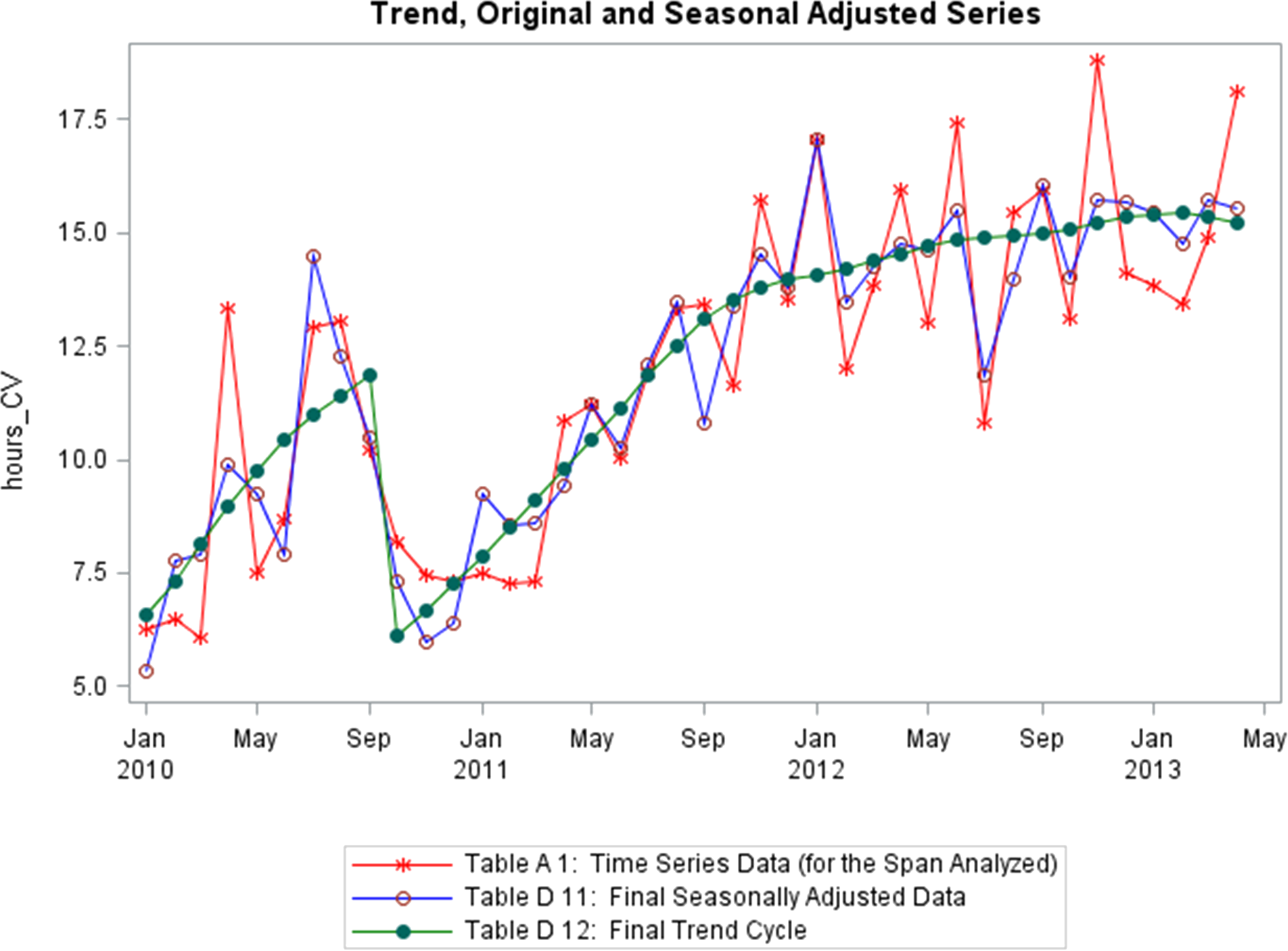
Figure 15.11: Time series: trend, seasonality, shifts of a supply chain metric (personal file).
15.2 A Word About Accessibility
While visual displays can help provide analysts with insight, some work remains to be done in regard to visual impairment – short of describing the features/emerging structures in a visualization, graphs can at best succeed in conveying relevant information to a subset of the population.
The onus remains on the analyst to not only produce clear and meaningful visualizations (through a clever use of contrast, say), but also to describe them and their features in a fashion that allows all to “see” the insights. One drawback is that in order for this description to be done properly, the analyst needs to have seen all the insights, which is not always possible. Examples of “data physicalizations” can be found in [110].
15.3 Fundamental Principles of Analytical Design
In his 2006 offering Beautiful Evidence, E. Tufte highlights what he calls the Fundamental Principles of Analytical Design [104]. Tufte suggests that we present evidence to assist our thinking processes [104, p. 137].
In this regard, his principles are universal – a strong argument can be made that they are dependent neither on technology nor on culture.
Reasoning (and communicating our thoughts) is intertwined with our lives in a causal and dynamic multivariate Universe (the 4 dimensions of space-time making up only a small subset of available variates); whatever cognitive skills allow us to live and evolve can also be brought to bear on the presentation of evidence. Tufte also highlights a particular symmetry to visual displays of evidence, being that consumers of charts should be seeking exactly what producers of charts should be providing (more on exactly what that is in a little bit).
Physical science displays tend to be less descriptive and verbal, and more visual and quantitative; up to now, these trends have tended to be reversed when dealing with evidence displays about human behaviour.
In spite of this, Tufte argues that his principles of analytical design can also be applied to social science and medicine. To demonstrate the universality of his principles, he describes in detail how they are applied to Minard’s celebrated March to Moscow.
His lengthy analysis of the image is well worth the read [104, pp. 122–139] – it will not be repeated here (we discuss the chart in [111], [112]). Rather, we will illustrate the principles with the help of the Gapminder’s Foundation 2012 Health and Wealth of Nations data visualization (see Figure 15.2), a bubble chart plotting 2012 life expectancy, adjusted income per person in USD (log-scaled), population, and continental membership for 193 UN members and 5 other countries, using the latest available data (a high-resolution version of the image is available on the Gapminder website.)
Tufte identifies 6 basic properties of superior analytical charts:
meaningful comparisons
causal and underlying structures
multivariate links
integrated and relevant data
honest documentation
primary focus on content
15.3.1 Comparisons
Show comparisons, contrasts, differences. [104, p. 127]
Comparisons come in varied flavours: for instance, one could compare a:
unit at a given time against the same unit at a later time;
unit’s component against another of its components;
unit against another unit,
or any number of combinations of these flavours.
Tufte further explains that
[…] the fundamental analytical act in statistical reasoning is to answer the question "“Compared with what?” Whether we are evaluating changes over space or time, searching big data bases, adjusting and controlling for variables, designing experiments, specifying multiple regressions, or doing just about any kind of evidence-based reasoning, **the essential point is to make intelligent and appropriate comparisons*}** [emphasis added]. Thus, visual displays […] should show comparisons. [104, p. 127]
Not every comparison will turn out to be insightful, but avoiding comparisons altogether is equivalent to producing a useless display, built from a single datum.
15.3.1.1 Comparisons - Health and Wealth of Nations
First, note that each bubble represents a different country, and that the location of each bubble’s centre is a precise point corresponding to the country’s life expectancy and its GDP per capita. The size of the bubble correlates with the country’s population and its colour is linked to continental membership.
The chart’s compass provides a handy comparison tool:
a bubble further to the right (resp. the left) represents a “wealthier” (resp. “poorer”) country;
a bubble further above (resp. below) represents a “healthier” (resp. “sicker”) country.
For instance, a comparison between Japan, Germany and the USA shows that Japan is healthier than Germany, which is itself healthier than the USA (as determined by life expectancy) while the USA is wealthier than Germany, which is itself wealthier than Japan (as determined by GDP per capita, see Figure 15.12).
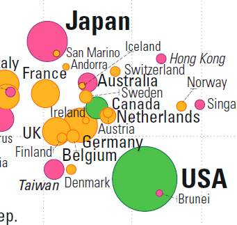
Figure 15.12: Comparisons in the Gapminder chart: country-to-country.
It is possible for two countries to have roughly the same health and the same wealth: consider Indonesia and Fiji, or India and Tuvalu, for instance (see Figure 15.13).
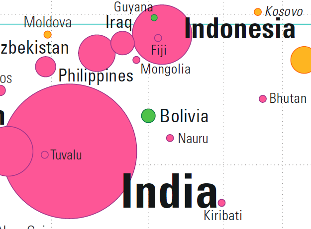
Figure 15.13: Comparisons in the Gapminder chart: country-to-country overlap.
In each pair, the centres of both bubbles (nearly) overlap: any difference in the data must be found in the bubbles’ area or in their colour.
Countries can also be compared against world values for life expectancy and GDP per capita (a shade under 70 years and in the neighbourhood of \(\$11K\), respectively). The world’s mean life expectancy and income per person are traced in light blue (see last two images in Figure 15.14).
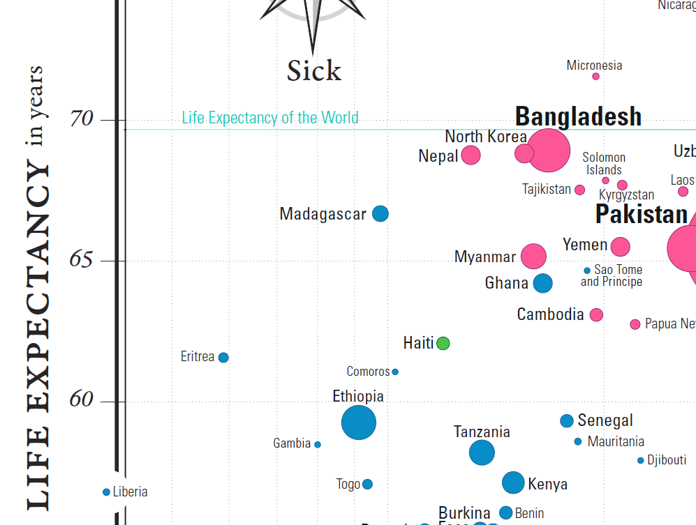
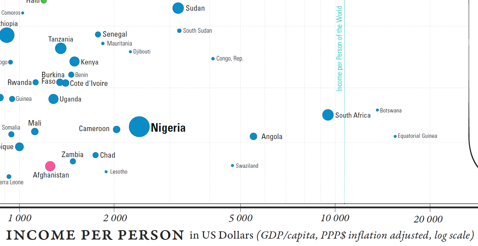
Figure 15.14: Comparisons in the Gapminder chart country-to-world-life-expectancy and country-to-world-income-per-person.
Wealthier, healthier, poorer, and sicker are relative terms, but we can also use them to classify the world’s nations with respect to these mean values, “wealthier” meaning “wealthier than the average country”, and so on.
15.3.2 Causality, Mechanism, Structure, Explanation
Show causality, mechanism, explanation, systematicstructure. [104, p. 128]
In essence, this is the core principle behind data visualization: the display needs to explain something, it needs to provide (potential) links between cause and effect. As Tufte points out,
[…] often the reason that we examine evidence is to understand causality, mechanism, dynamics, process, or systematic structure [emphasis added]. Scientific research involves causal thinking, for Nature’s laws are causal laws. […] Reasoning about reforms and making decisions also demands causal logic. To produce the desired effects, we need to know about and govern the causes; thus “policy-thinking is and must be causality-thinking” [104, p. 128], [113].
Note also that
simply collecting data may provoke thoughts about cause and effect: measurements are inherently comparative, and comparisons promptly lead to reasoning about various sources of differences and variability [104, p. 128].
Finally, if the visualization can be removed without diminishing the narrative, then that chart should in all probability be excluded from the final product, no matter how pretty and modern it looks, or how costly it was to produce.
15.3.2.1 Causality, Mechanism, Structure, Explanation - Health and Wealth of Nations
At a glance, the relation between life expectancy and the logarithm of the income per person seems to be increasing more or less linearly. Without access to the data, the exact parameter values cannot be estimated analytically, but an approximate line-of-best-fit has been added to the chart (see Figure 15.15).
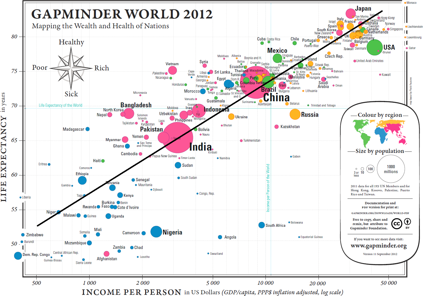
Figure 15.15: Approximate line of best fit for the Gapminder chart.
Using the points \((10K,73.5)\) and \((50K,84.5)\) yields a line with equation \[\mbox{Life Expectancy} \approx 6.83 \times \ln (\mbox{Income Per Capita})+10.55\] The exact form of the relationship and the numerical values of the parameters are of little significance at this stage – the key insight is that wealthier countries appear to be healthier, generally, and vice-versa (although whether wealth drives health, health drives wealth, or some other factor(s) [education?] drive both wealth and health cannot be answered without further analysis and access to knowledge external to the chart).
The chart also highlights an interesting feature in the data, namely that the four quadrants created by separating the data along the Earth’s average life expectancy and the GDP per capita for the entire planet do not host the same patterns.
Naïvely, it might have been expected that each of the quadrants would contain about 25% of the world’s countries (although the large population of China and India muddle the picture somewhat). However, one quadrant is substantially under-represented in the visualization. Should it come as a surprise that there are so few “wealthier” yet “sicker” countries? (see Figure 15.16).
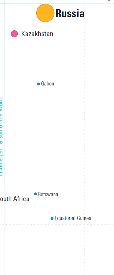
Figure 15.16: Close-up, bottom right quadrant.
It could even be argued that Russia and Kazakhstan are in fact too near the separators to really be considered clear-cut members of the quadrant, so that the overwhelming majority of the planet’s countries are found in one of only three quadrants.
In the same vein, when we consider the data visualization as a whole, there seems to be one group of outliers below the main trend, to the right, and to a lesser extent, one group above the main trend, to the left (see Figure @ref{fig:Gapminderoutliers}).
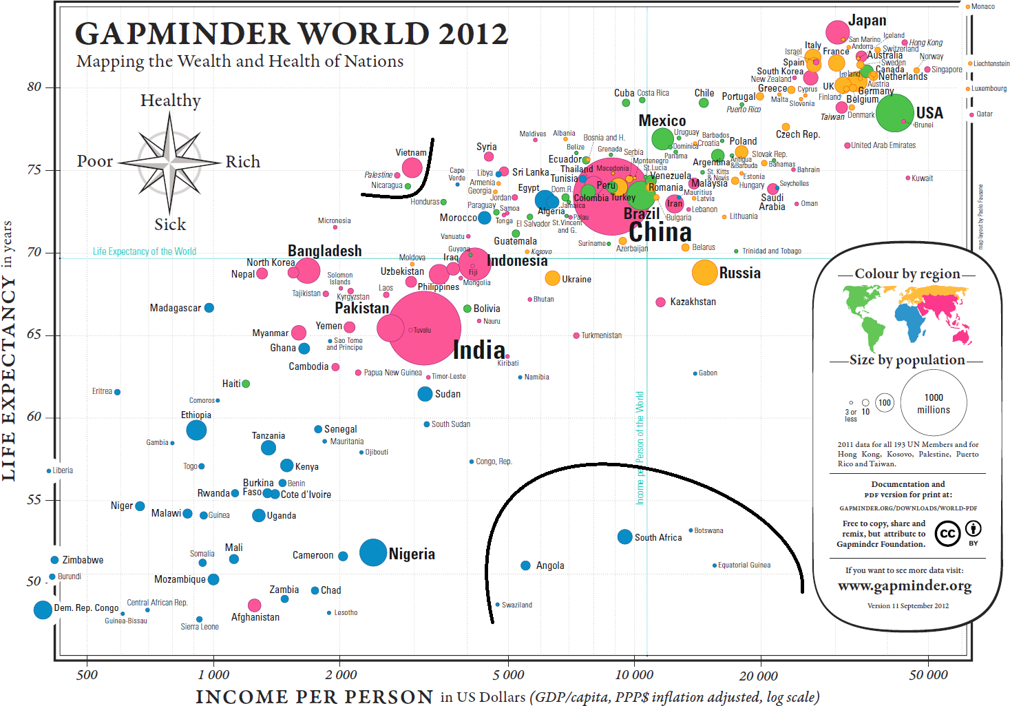
Figure 15.17: Potential outliers in the Gapminder chart.
These cry out for an explanation: South Africa, for instance, has a relatively high GDP per capita but a low life expectancy (potentially, income disparity between a poorer majority and a substantially wealthier minority might help push the bubble to the right, while the lower life expectancy of the majority drives the overall life expectancy to the bottom).
This brings up a crucial point about data visualization: it seems virtually certain that the racial politics of apartheid played a major role in the position of the South African outlier, but the chart emphatically DOES NOT provide a proof of that assertion. Charts suggest, but proof comes from deeper domain-specific analyses.
15.3.3 Multivariate Analysis
Show multivariate data; that is, show more than 1 or 2 variables. [104, p. 130]
In an age where data collection is becoming easier by the minute, this seems like a no-brainer: why waste time on uninformative univariate plots? Indeed,
nearly all the interesting worlds (physical, biological, imaginary, human) we seek to understand are inevitably multivariate in nature. [104, p. 129]
Furthermore, as Tufte suggest,
the analysis of cause and effect, initially bivariate, quickly becomes multivariate through such necessary elaborations as the conditions under which the causal relation holds, interaction effects, multiple causes, multiple effects, causal sequences, sources of bias, spurious correlation, sources of measurement error, competing variables, and whether the alleged cause is merely a proxy or a marker variable (see for instance, [114]). [104, p. 129]
While we should not dismiss low-dimensional evidence simply because it is low-dimensional, Tufte cautions that
reasoning about evidence should not be stuck in 2 dimensions, for the world we seek to understand is profoundly multivariate [emphasis added]. [104, p. 130]
Consultants and analysts may question the ultimate validity of this principle: after all, doesn’t Occam’s Razor warn us that “it is futile to do with more things that which can be done with fewer”? This would seem to be a fairly strong admonition to not reject low-dimensional visualizations out of hand. This interpretation depends, of course, on what it means to “do with fewer”: are we attempting to “do with fewer”, or to “do with fewer”?
If it is the former, then we can produce simple charts to represent the data (which quickly balloons into a multivariate meta-display), but any significant link between 3 and more variables is unlikely to be shown, which drastically reduces the explanatory power of the charts.
If it is the latter, the difficulty evaporates: we simply retain as many features as are necessary to maintain the desired explanatory power.
15.3.3.1 Multivariate Analysis - Health and Wealth of Nations
Only 4 variables are represented in the display, which we could argue just barely qualifies the data as multivariate. The population size seems uncorrelated with both of the axes’ variates, unlike continental membership: there is a clear divide between the West, most of Asia, and Africa (see Figure @re(fig:Gapclusters). This “clustering” of the world’s nations certainly fits with common wisdom about the state of the planet, which provides some level of validation for the display (is it the only way to cluster the observations?).
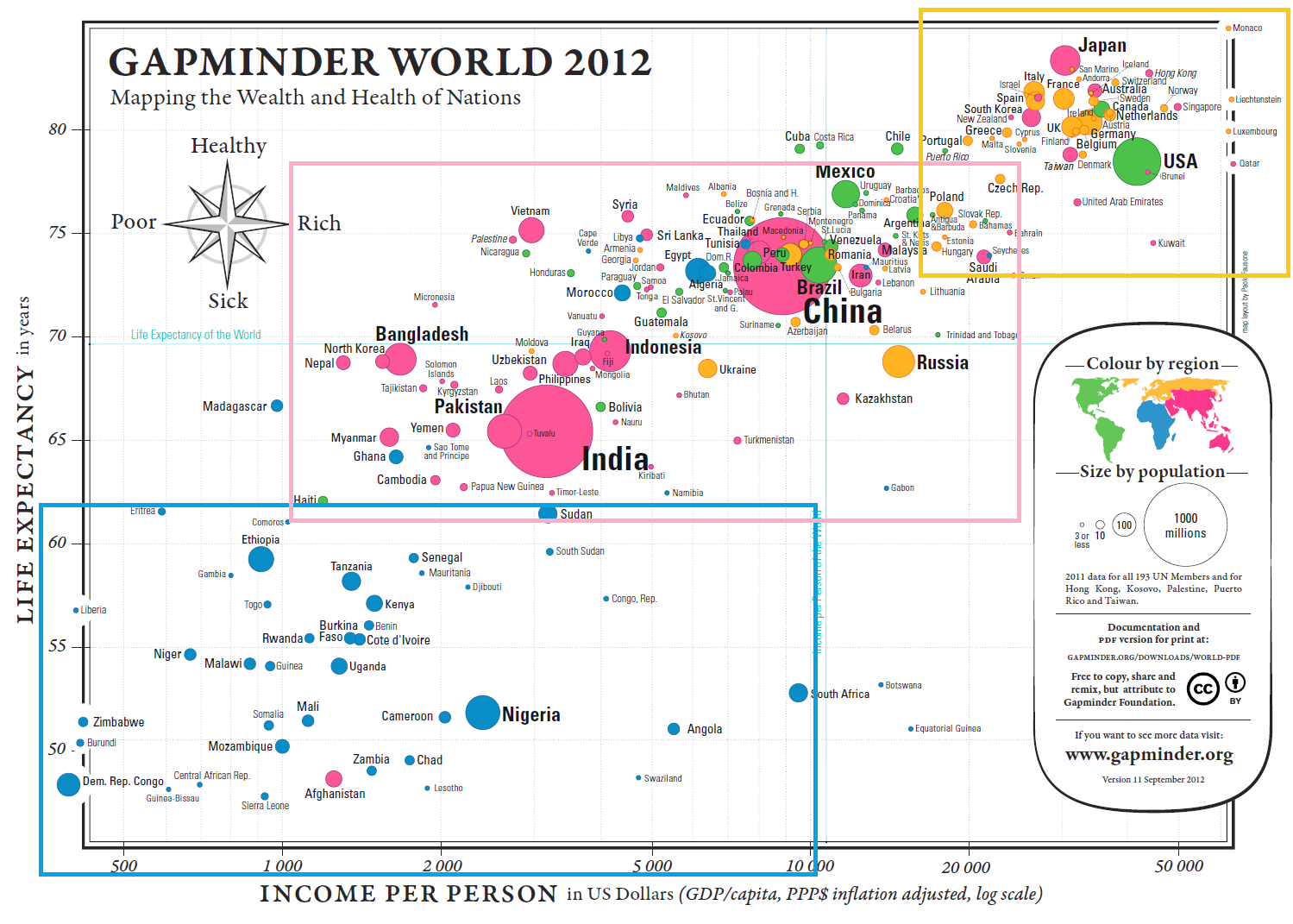
Figure 15.18: Potential clusters in the Gapminder chart.
Other variables could also be considered or added, notably the year, allowing for bubble movement: one would expect that life expectancy and GDP per capita have both been increasing over time. The Gapminder Foundation’s online tool can build charts with other variates, leading to interesting inferences and suggestions. Give it a try!
15.3.4 Integration of Evidence
Completely integrate words, numbers, images, diagrams. [104, p. 131]
Data does not live in a vacuum. Tufte’s approach is clear:
the evidence doesn’t care what it is – whether word, number, image. In reasoning about substantive problems, what matters entirely is the evidence, not particular modes of evidence [emphasis added]. [104, p. 130]
The main argument is that evidence from data is better understood when it is presented with context and accompanying meta-data.
Indeed,
words, numbers, pictures, diagrams, graphics, charts, tables belong together [emphasis added]. Excellent maps, which are the heart and soul of good practices in analytical graphics, routinely integrate words, numbers, line-art, grids, measurement scales. [104, p. 131]
Finally, Tufte makes the point that we should think of data visualizations and data tables as elements that provide vital evidence, and as such they should be integrated in the body of the text:
tables of data might be thought of as paragraphs of numbers, tightly integrated with the text for convenience of reading rather than segregated at the back of a report. […] Perhaps the number of data points may stand alone for a while, so we can get a clean look at the data, although techniques of layering and separation may simultaneously allow a clean look as well as bringing other information into the scene. [104, p. 131]
There is a flip side to this, of course, and it is that charts and displays should be annotated with as much text as is required to make the context clear.
When authors and researchers select a single specific method or mode of information during the inquiries, the focus switches from “can we explain what is happening?” to “can the method we selected explain what is happening?”
There is an art to method selection, and experience can often suggest relevant methods, but remember that “when all one has is a hammer, everything looks like a nail”: the goal should be to use whatever (and all) necessary evidence to shed light on “what is happening”.
If that goal is met, it makes no difference which modes of evidence were used.
15.3.4.1 Integration of Evidence - Health and Wealth of Nations
The various details attached to the chart (such as country names, font sizes, axes scale, grid, and world landmarks) provide substantial benefits when it comes to consuming the display. They may become lost in the background, with the consequence of being taken for granted.
Compare the display obtained from (nearly) the same data, but without integration of evidence (see Figure 15.19).
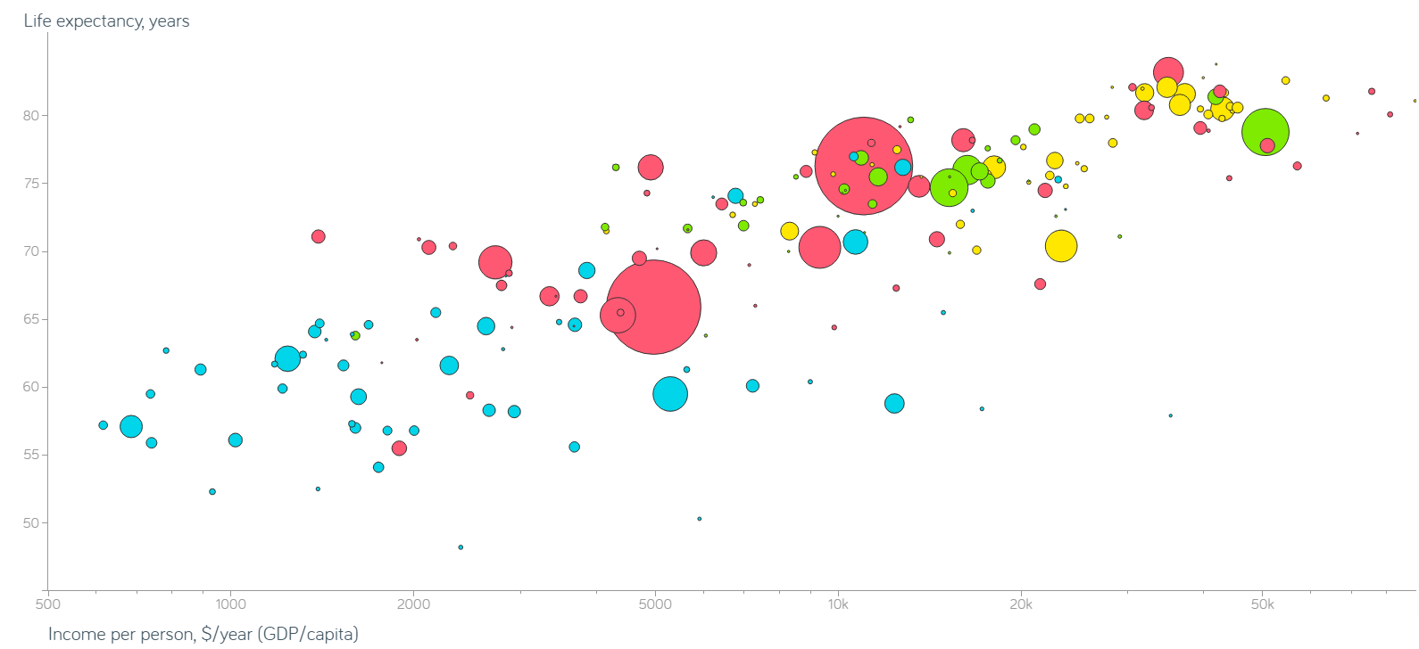
Figure 15.19: Non-integrated Gapminder chart.
15.3.5 Documentation
Thoroughly describe the evidence. Provide a detailed title, indicate the authors and sponsors, document the data sources, show complete measurement scales, point out relevant issues. [104, p. 133]
We cannot always tell at a glance whether a pretty graphic speaks the truth or presents a relevant piece of information. Documented charts may provide a hint, as
the credibility of an evidence presentation depends significantly on the quality and integrity of the authors and their data sources. Documentation is an essential mechanism of quality control for displays of evidence. Thus authors must be named, sponsors revealed, their interests and agenda unveiled, sources described, scales labeled, details enumerated [emphasis added]. [104, p. 132]
Depending on the context, questions and items to address could include:
What is the title/subject of the visualization?
Who did the analysis? Who created the visualization? (if distinct from the analyst(s))
When was the visualization published? Which version of the visualization is rendered here?
Where did the underlying data come from? Who sponsored the display?
What assumptions were made during data processing and clean-up?
What colour schemes, legends, scales are in use in the chart?
It is not obvious whether all this information can fit inside a single chart in some cases. But, keeping in mind the principle of Integration of Evidence, charts should not be presented in isolation in the first place, and some of the relevant information can be provided in the text, on a webpage, or in an accompanying document.
This is especially important when it comes to discussing the methodological assumptions used for data collection, processing, and analysis. An honest assessment may require sizable amounts of text, and it may not be reasonable to include that information with the display (in that case, a link to the accompanying documentation should be provided):
publicly attributed authorship indicates to readers that someone is taking responsibility for the analysis; conversely, the absence of names signals an evasion of responsibility. […] People do things, not agencies, bureaus, departments, divisions [emphasis added]. [104, pp. 132–133]
15.3.5.1 Documentation - Health and Wealth of Nations
The Gapminder map might just be one of the best-documented charts in the data visualization ecosystem. Let us see if we can answer the questions suggested above.
What is the title/subject of the visualization? The health and wealth of nations in 2012, using the latest available data (2011).
Who did the analysis? Who sponsored the display? Who created the visualization? The analysis was conducted by the Gapminder Foundation; the map layout was created by Paulo Fausone. No data regarding the sponsor is found on the chart or in the documentation. It seems plausible that there is no external sponsor, but that is no certainty.
When was the visualization published? Which version is rendered here? The 11th version of the chart was published in September 2012.
Where did the underlying data come from? What assumptions were made during data processing and clean-up? Typically, the work that goes into preparing the data is swept under the carpet in favour of the visualization itself; there are no explicit source of data on this chart, for instance. However, there is a URL in the legend box that leads to detailed information. For most countries, life expectancy data was collected from:
the Human Mortality database;
the UN Population Division World Population Prospects;
files from historian James C. Riley;
the Human Life Table database;
data from diverse national statistical agencies;
the CIA World Fact book;
the World Bank, and
the South Sudan National Bureau of Statistics.
Benchmark 2005 GDP data was derived via regression analysis from International Comparison Program data for 144 countries, and extended to other jurisdictions using another regression against data from:
the UN Statistical Division;
Maddison Online;
the CIA World Fact book, and
estimates from the World Bank.
The 2012 values were then derived from the 2005 benchmarks using long-term growth rates estimate from:
Maddison Online;
Barro & Ursua;
the United Nations Statistical Division;
the Penn World Table (mark 6.2);
the International Monetary Fund’s World Economic Outlook database;
the World Development Indicators;
Eurostat, and
national statistical offices or some other specific publications.
Population estimates were collated from:
the United Nations Population Division World Population Prospects;
Maddison Online;
Mitchell’s International Historical Statistics;
the United Nations Statistical Division;
the US Census Bureau;
national sources;
undocumented sources, and
“guesstimates”.
Exact figures for countries with a population below 3 million inhabitants were not needed as this marked the lower end of the chart resolution.
What colour schemes, legends, scales are in use in the chart? The Legend Inset is fairly comprehensive (see Figure 15.20):
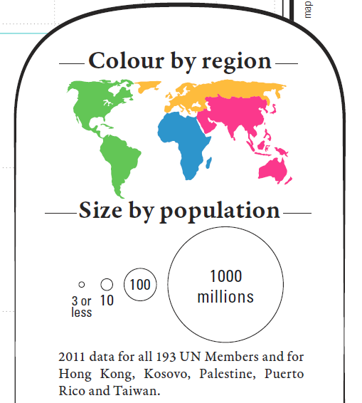
Figure 15.20: Legend inset for the Gapminder chart.
Perhaps the last item of note is that the scale of the axes differs: life expectancy is measured linearly, whereas GDP per capita is measured on a logarithmic scale.
15.3.6 Content Counts Most of All
Analytical presentations ultimately stand of fall depending on the quality, relevance, and integrity of their content. [104, p. 136]
Any amount of time and money can be spent on graphic designers and focus groups, but
the most effective way to improve a presentation is to get better content [emphasis added] […] design devices and gimmicks cannot salvage failed content. […] The first questions in constructing analytical displays are not “How can this presentation use the color purple?” Not “How large must the logotype be?” Not “How can the presentation use the Interactive Virtual Cyberspace Protocol Display Technology?” Not decoration, not production technology. The first question is “What are the content-reasoning tasks that this display is supposed to help with?” [104, p. 136]
The main objective is to produce a compelling narrative, which may not necessarily be the one that was initially expected to emerge from a solid analysis of sound data. Simply speaking, the visual display should assist in explaining the situation at hand and in answering the original questions that were asked of the data.
15.3.6.1 Contents Counts Most of All - Health and Wealth of Nations
How would we answer the following questions:
Do we observe similar patterns every year?
Does the shape of the relationship between life expectancy and log-GDP per capita vary continuously over time?
Do countries ever migrate large distances in the display over short periods?
Do exceptional events affect all countries similarly?
What are the effects of secession or annexation?
The 2012 Health and Wealth of Nations data represent a single datum in the general space of data visualizations; in this context, getting better content means getting data for other years, as well as for 2012.
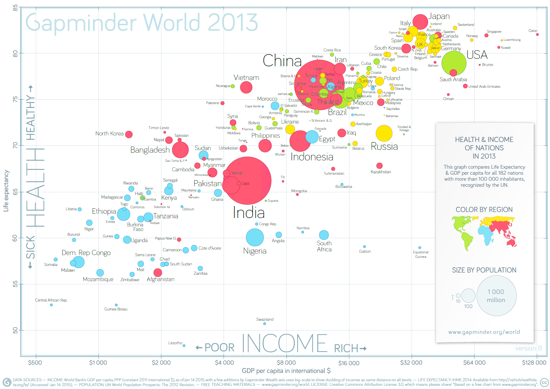
Figure 15.21: Life expectancy and income per capita in 2013, by nation (Gapminder Foundation).
15.4 Basic Visualizations in R
Whenever we analyze data, the first thing we should do is look at it:
for each variable, what are the most common values?
How much variability is present?
Are there any unusual observations?
Producing graphics for data analysis is relatively simple. Producing graphics for publication is relatively more complex and typically
requires a great deal of tweaking to achieve the desired appearance.
Base R provides a number of functions for visualizing data. In this section, we will provide sufficient guidance so that most desired effects can be achieved, but further investigation of the documentation and experimentation will doubtless be necessary for specific needs (advanced visualization functionality is provided by ggplot2).
For now, let’s discuss some of the most common basic methods.
15.4.1 Scatterplots
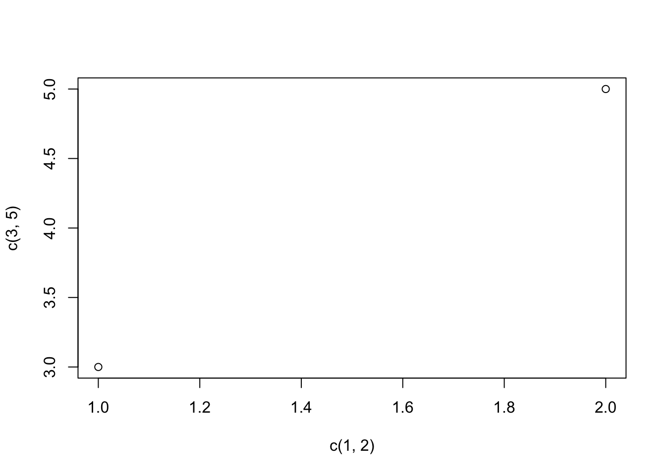
The most common plotting function in R is the plot() function. It is a generic function, meaning, it calls various methods according to the type of the object passed which is passed to it. In the simplest case, we can pass in a vector and we get a scatter plot of magnitude vs index.
More generally, we can pass in two vectors and a scatter plot of the points formed by matching coordinates is displayed.
For example, the command plot(c(1,2),c(3,5)) would plot the points \((1,3)\) and \((2,5)\).
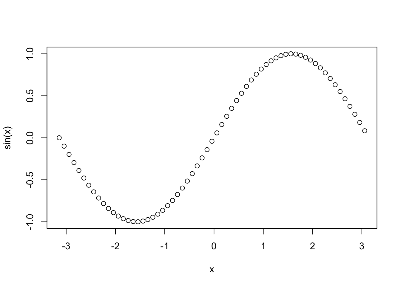
Here is a more concrete example showing how to plot the graph of the sine function in the range from \(-\pi\) to \(\pi\).
We can add a title to our plot with the parameter main. Similarly,
xlab and ylab can be used to label the x-axis and y-axis
respectively.
The curve is made up of circular black points. This is the default setting for shape and colour. This can be changed by using the argument type.
It accepts the following strings (with given effect)
p– pointsl– linesb– both points and linesc– empty points joined by lineso– overplotted points and liness– stair stepsh– histogram-like vertical linesn– does not produce any points or lines
Similarly, we can specify the colour using the argument col.
plot(x, sin(x),
 main=expression("Graph of the sine function, over [-" * pi * "," * pi * "]"),
 ylab="sin(x)",
 type="l",
 col="blue")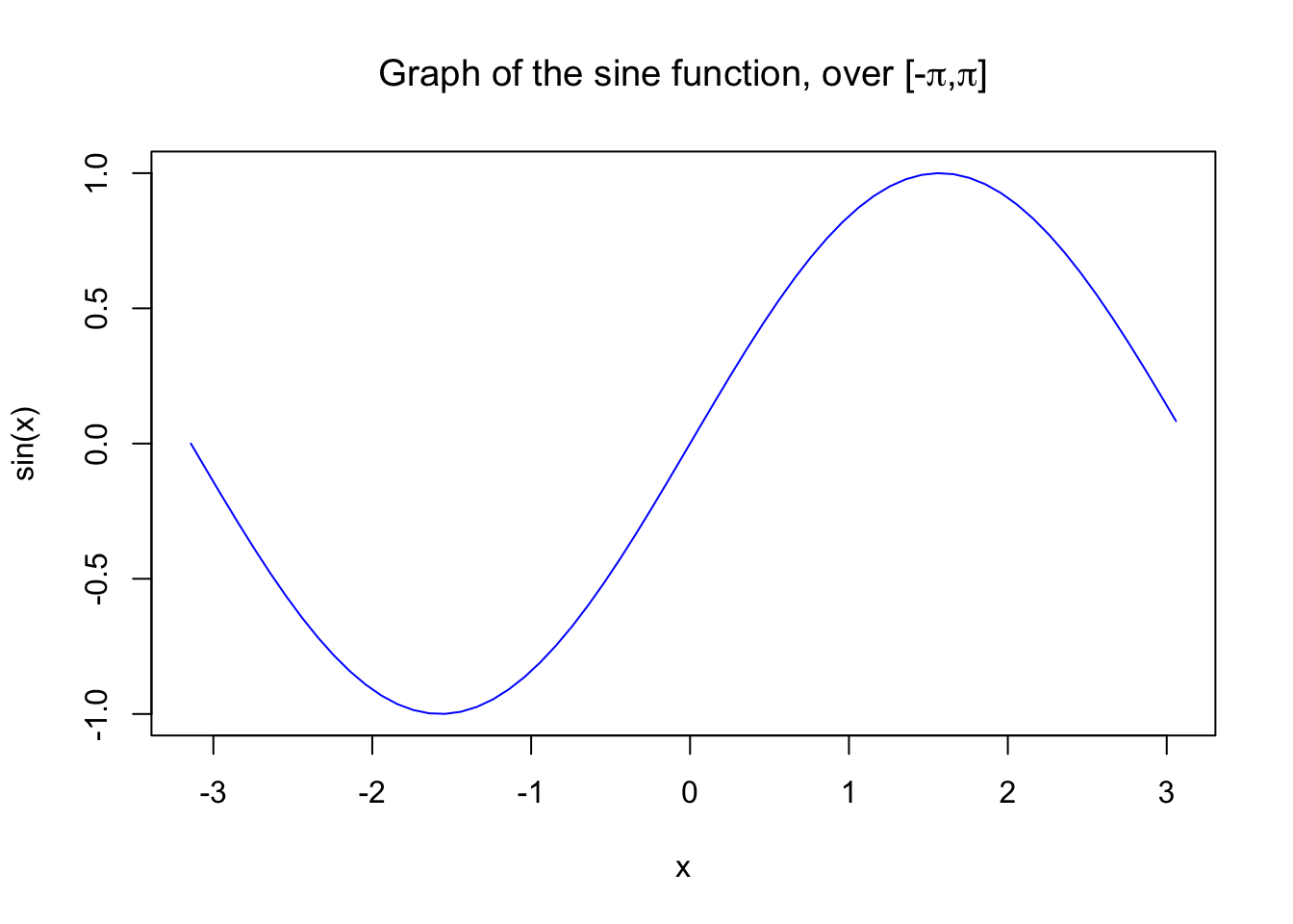
Calling plot() multiple times will have the effect of plotting the current graph on the same window, replacing the previous one.
However, we may sometimes wish to overlay the plots in order to compare the results. This is made possible by the functions lines() and points(), which add lines and points respectively, to the existing plot.
plot(x, sin(x),
 main="Overlaying Graphs",
 ylab="",
 type="l",
 col="blue")
lines(x,cos(x), col="red")
legend("topleft",
      c("sin(x)","cos(x)"),
      fill=c("blue","red")
)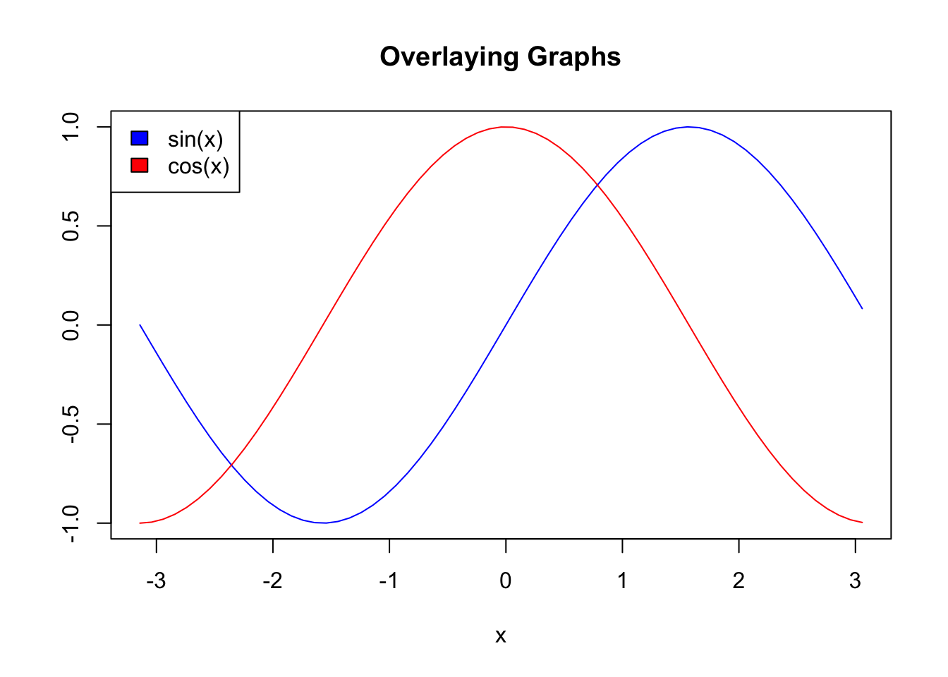
The legend() function allows for the appropriate display in the plot.
15.4.2 Barplots
Barplots can be created in R using the barplot() function.
We can supply a vector or matrix to this function, and it will display a bar chart with bar heights equal to the magnitude of the elements in the vector.
Let us suppose that we have a vector of maximum temperatures for seven days, as follows.
We can make a bar chart out of this data using a simple command.
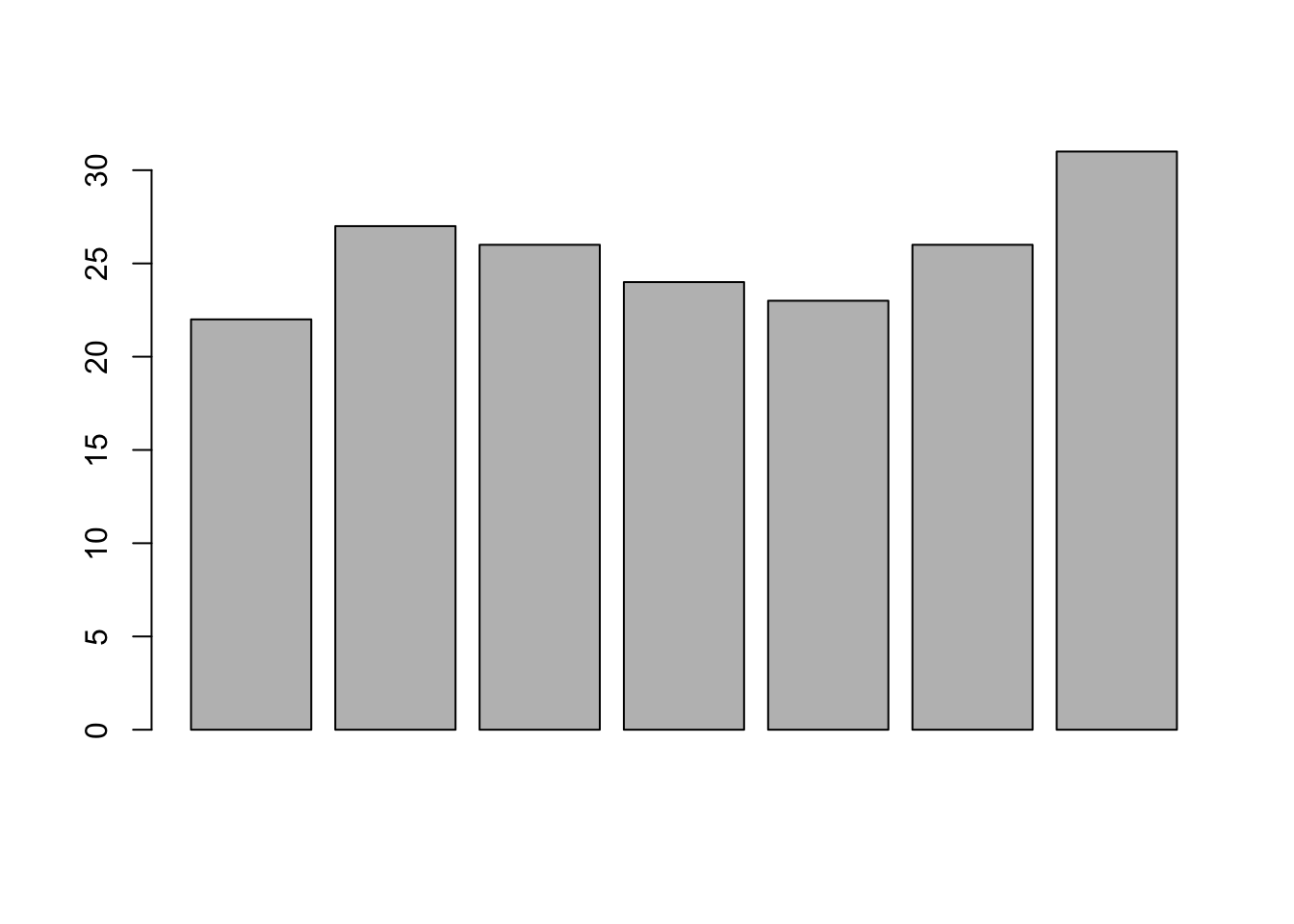
This function can take on a number of arguments (details are available in the help file, which can be queried by entering ?barplot in the console).
Frequently-used arguments include:
mainto specify the titlexlabandylabto provide labels for the axesnames.argto provide a name for each barcolto define colour, etc.
We can also transpose the plot to have horizontal bars by providing the argument horiz = TRUE, such as in the following:
barplot(max.temp,
  main = "Maximum Temperatures in a Week",
  xlab = "Degree Celsius",
  ylab = "Day",
  names.arg = c("Sun", "Mon", "Tue", "Wed", "Thu", "Fri", "Sat"),
  col = "darkred",
  horiz = TRUE)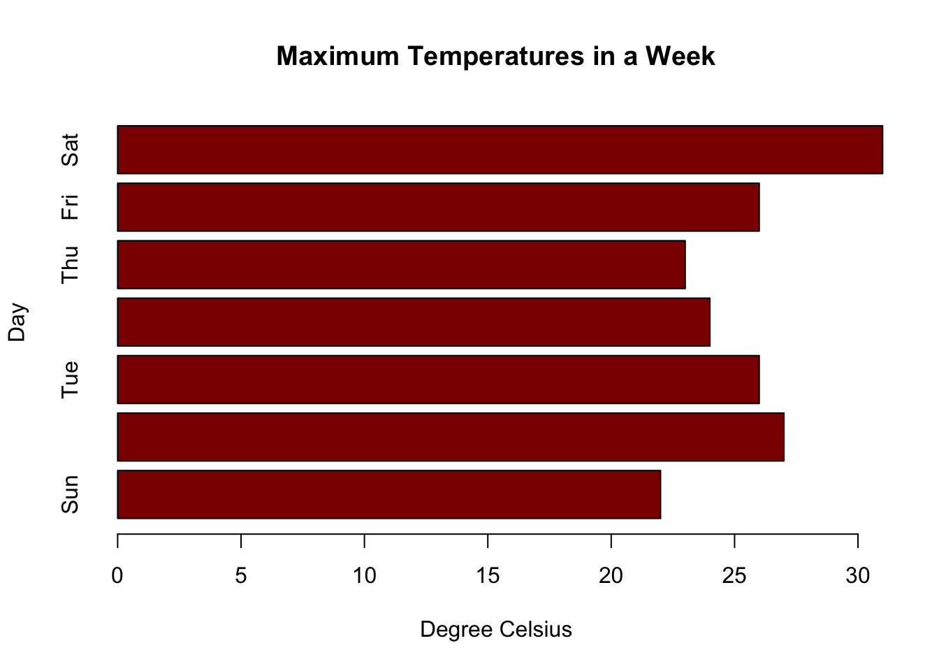
At times, we may be interested in displaying the count or magnitude for categories in the data. For instance, consider the following vector of age measurements for 21 first-year college students.
Calling barplot(age) does not provide the required plot.
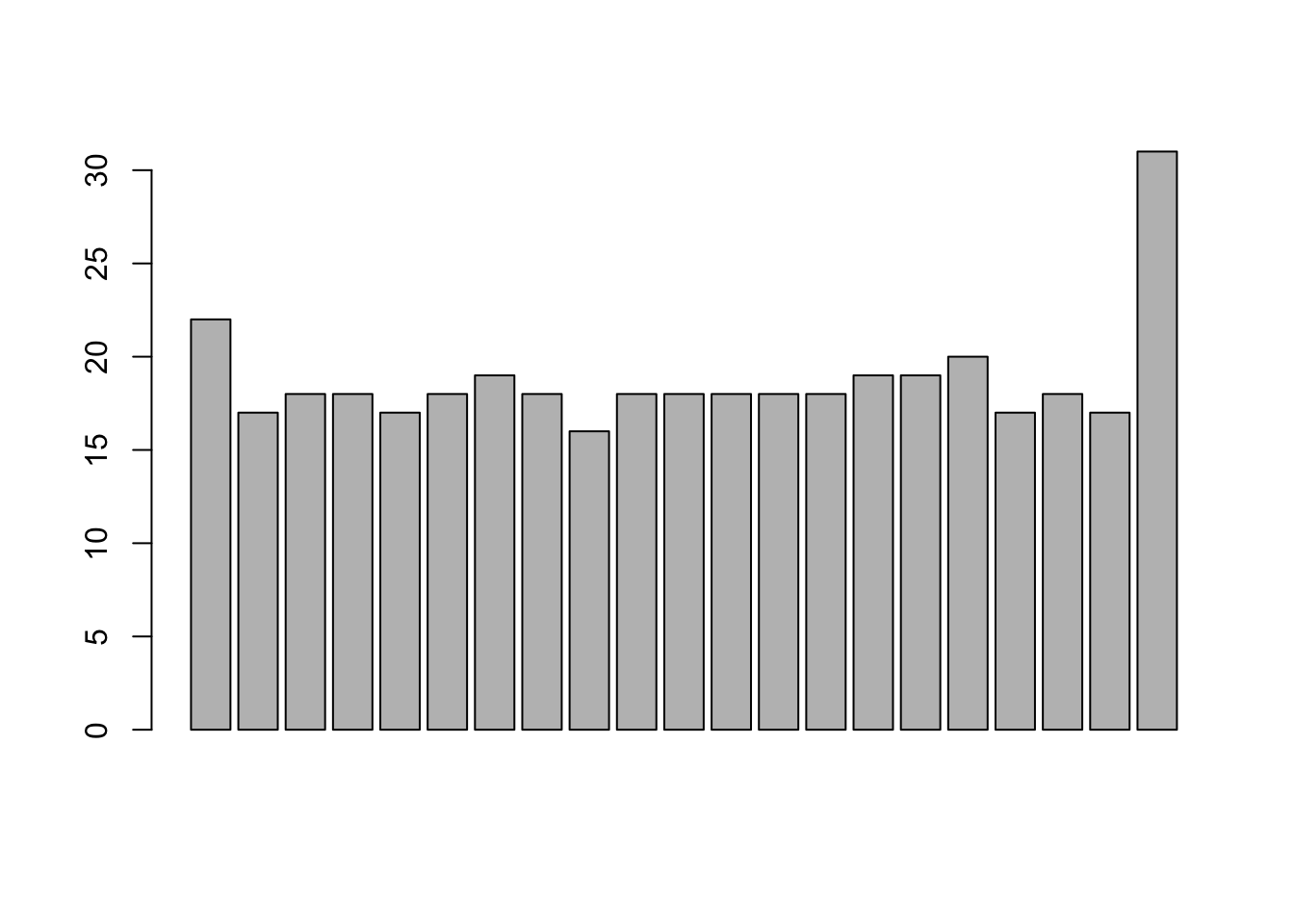
Indeed, this call plots 21 bars with heights corresponding to students’ age – the display does not provide the frequency count for each age.
The values can be quickly found using the table() function, as shown below.
age
16 17 18 19 20 22 31
 1  4 10  3  1  1  1
Plotting this data will produce the required barplot (in the code, the argument densityis used to determine the texture of the fill).
barplot(table(age),
  main="Age Count of 21 Students",
  xlab="Age",
  ylab="Count",
  border="red",
  col="blue",
  density=10
)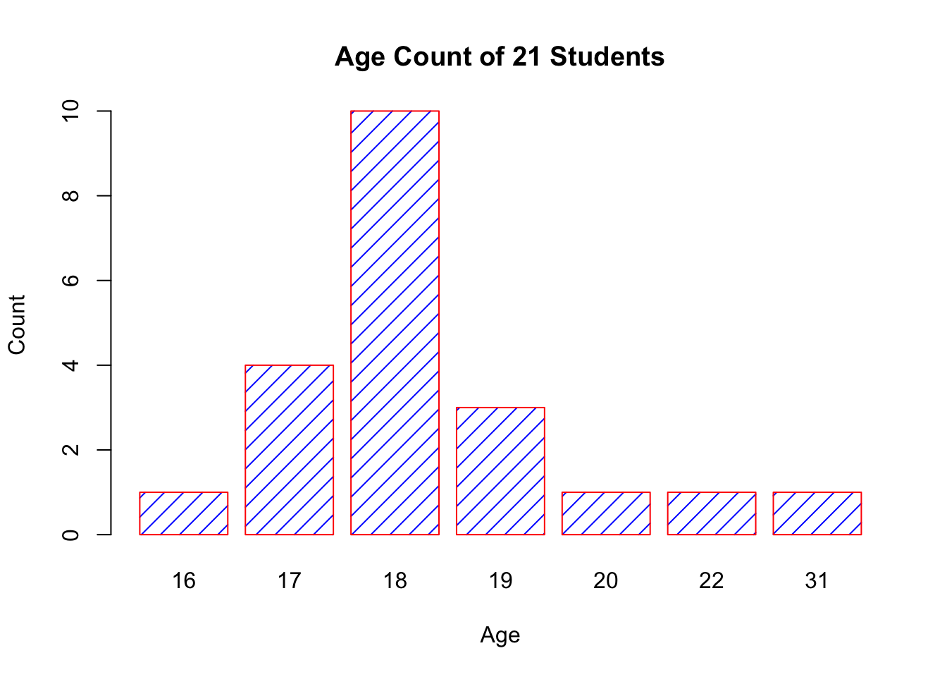
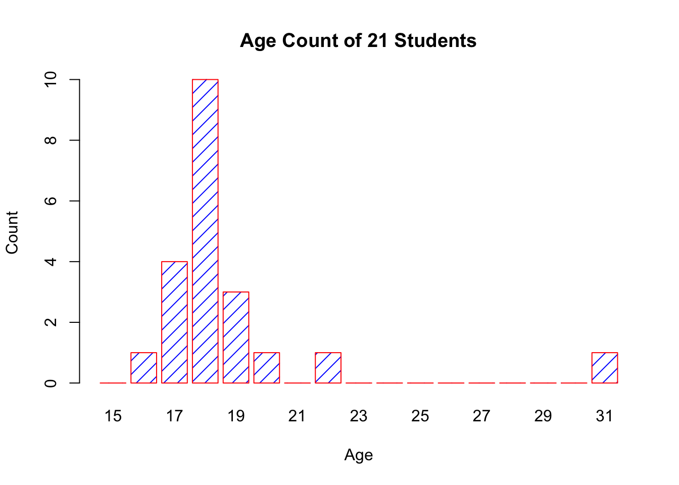
The chart respects the relative proportions, but R cannot tell that there should be (empty) categories for age=21 and between 22 and 31.
This can be remedied by first setting new factor levels for the age measurements, and re-running the code.
age=factor(age,levels=c(15:31))
barplot(table(age),
  main="Age Count of 21 Students",
  xlab="Age",
  ylab="Count",
  border="red",
  col="blue",
  density=10
)
15.4.3 Histograms
Histograms display the distribution of a continuous variable by dividing the range of scores into a specified number of bins on the \(x\)-axis and displaying the frequency of scores in each bin on the \(y\)-axis.
We can create histograms in R with hist():
the option
freq=FALSEcreates a plot based on probability densities rather than frequencies;the
breaksoption controls the number of bins: the default produces equally spaced breaks when defining the cells of the histogram.
For illustrative purposes, we will use several of the
variables from the Motor Trend Car Road Tests (mtcars) dataset
provided in the base R installation.
Here are four variations on a histogram.
par(mfrow=c(2,2))
hist(mtcars$mpg)
hist(mtcars$mpg,
     breaks=12,
     col="red",
     xlab="Miles Per Gallon",
     main="Colored histogram with 12 bins")
hist(mtcars$mpg,
     freq=FALSE,
     breaks=12,
     col="red",
     xlab="Miles Per Gallon",
main="Histogram, rug plot, density curve")
rug(jitter(mtcars$mpg))
lines(density(mtcars$mpg), col="blue", lwd=2)
x <- mtcars$mpg
h<-hist(x,
        breaks=12,
        col="red",
        xlab="Miles Per Gallon",
        main="Histogram with normal curve and box")
xfit<-seq(min(x), max(x), length=40)
yfit<-dnorm(xfit, mean=mean(x), sd=sd(x))
yfit <- yfit*diff(h$mids[1:2])*length(x)
lines(xfit, yfit, col="blue", lwd=2)
box()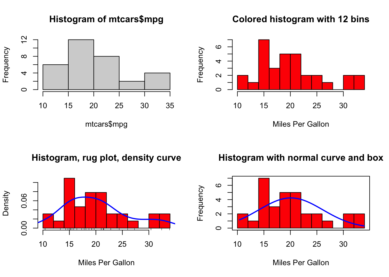
The first histogram demonstrates the default plot with no specified options: five bins are created, and the default axis labels and titles are printed.
In the second histogram, 12 bins have been specified, as well as a red fill for the bars, and more attractive (enticing?) and informative labels and title.
The third histogram uses the same colours, number of bins, labels, and titles as the previous plot but adds a density curve and rug-plot overlay. The density curve is a kernel density estimate and is described in the next section. It provides a smoother description of the distribution of scores. The call to function lines() overlays this curve in blue (and a width twice the default line thickness); a rug plot is a one-dimensional representation of the actual data values.
The fourth histogram is similar to the second but with a superposed normal curve and a box around the figure. The code for superposing the normal curve comes from a suggestion posted to the R-help mailing list by Peter Dalgaard. The surrounding box is produced by the box() function.
15.4.4 Curves
Given an expression for a function \(y(x)\), we can plot the values of \(y\) for various values of \(x\) in a given range.
This can be accomplished using the R function curve().
We can plot the simple polynomial function \(y=3x^{2}+x\) in the range \(x=[1,10]\) as follows:
curve(3*x^2 + x, from=1, to=10, n=300, xlab="xvalue",
      ylab="yvalue", col="blue", lwd=2,
      main="Plot of (3x^2 + x)")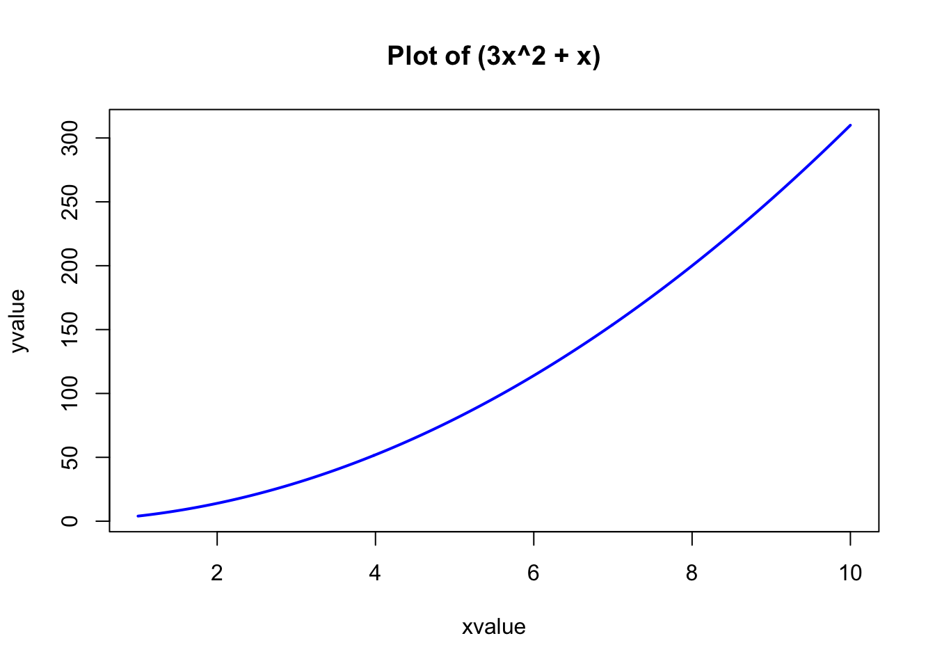
The important parameters of the curve() function are:
the first parameter is the mathematical expression of the function to plot, written in the format for writing mathematical operations in or LaTeX;
two numeric parameters (
fromandto) that represent the endpoints of the range of \(x\);the integer
nthat represents the number of equally-spaced values of \(x\) between thefromandtopoints;the other parameters (
xlab,ylab,col,lwd,main) have their usual meaning.
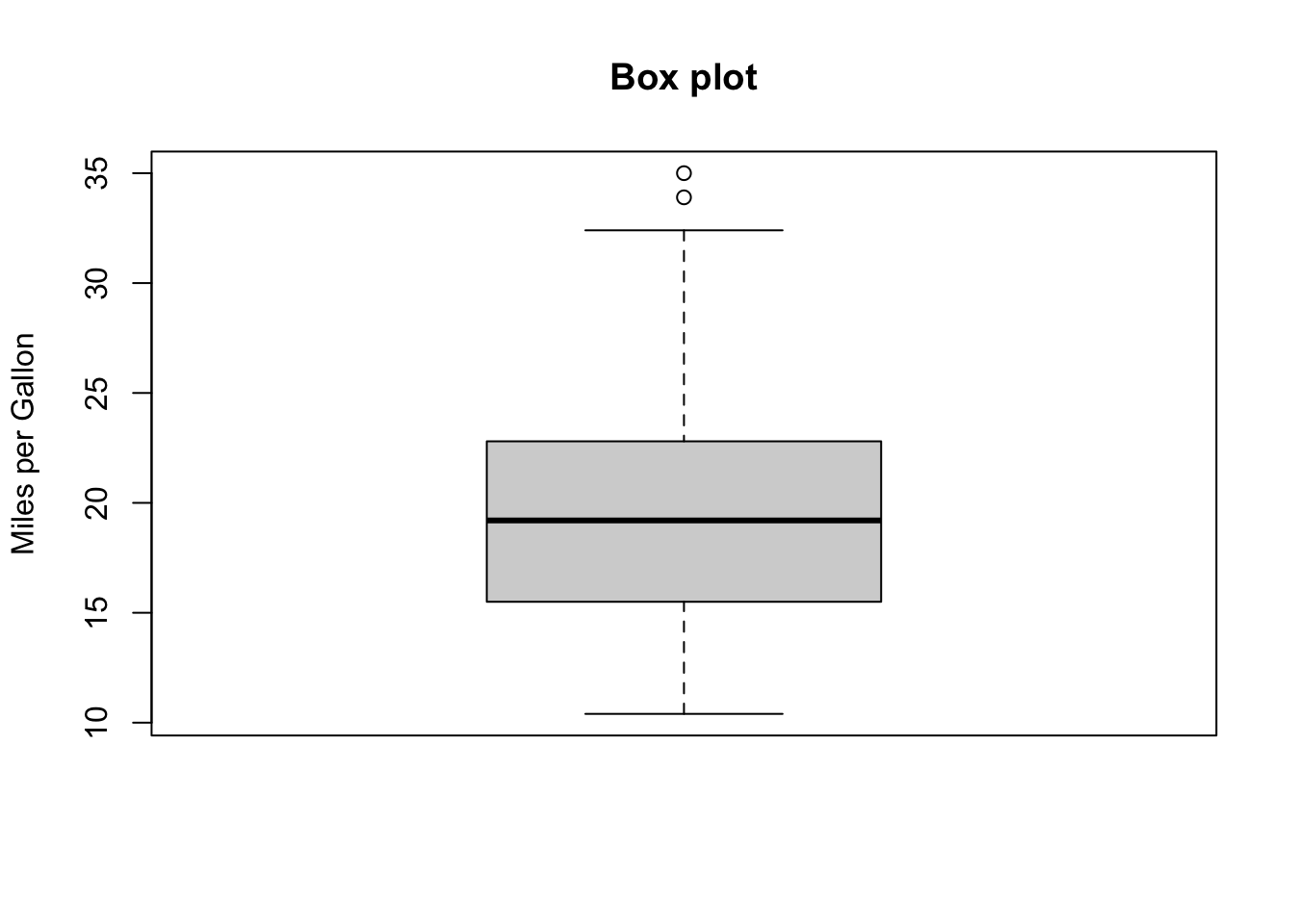
15.4.5 Boxplots
A box-and-whiskers plot describes the distribution of a continuous variable by plotting its five-number summary:
the minimum \(Q_0\);
the lower quartile \(Q_1\) (25th percentile);
the median \(Q_2\) (50th percentile);
the upper quartile \(Q_3\) (75th percentile), and
the maximum \(Q_4\).
The belt of the boxplot is found at \(Q_2\), its box boundaries at \(Q_1\) and \(Q_3\), and its whiskers at \(5/2Q_1-3/2Q_3\) and \(5/2Q_3-3/2Q_1\).
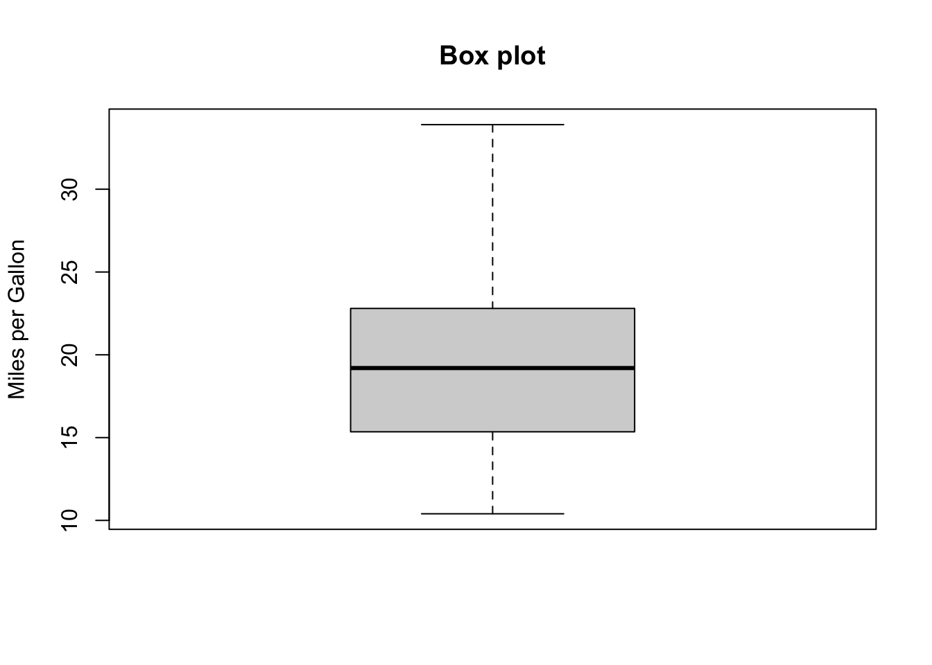 For normally distributed variables, it also displays observations which may be identified as potential outliers (which it to say, values outside the box-and-whiskers range \([5/2Q_1-3/2Q_3,5/2Q_3-3/2Q_1]\)).
15.4.6 Other Examples
Let’s take a look at some other basic R plots.
15.4.6.1 Scatterplots
On a scatter plot, the features to study depend on the scale of interest:
- for “big” patterns, look at:
- form and direction
- strength
- for “small” patterns, look at:
- deviations from the pattern
- outliers
We start with the swiss built-in R dataset.
str(swiss) # structure of the swiss dataset
pairs(swiss) # scatter plot matrix for the swiss dataset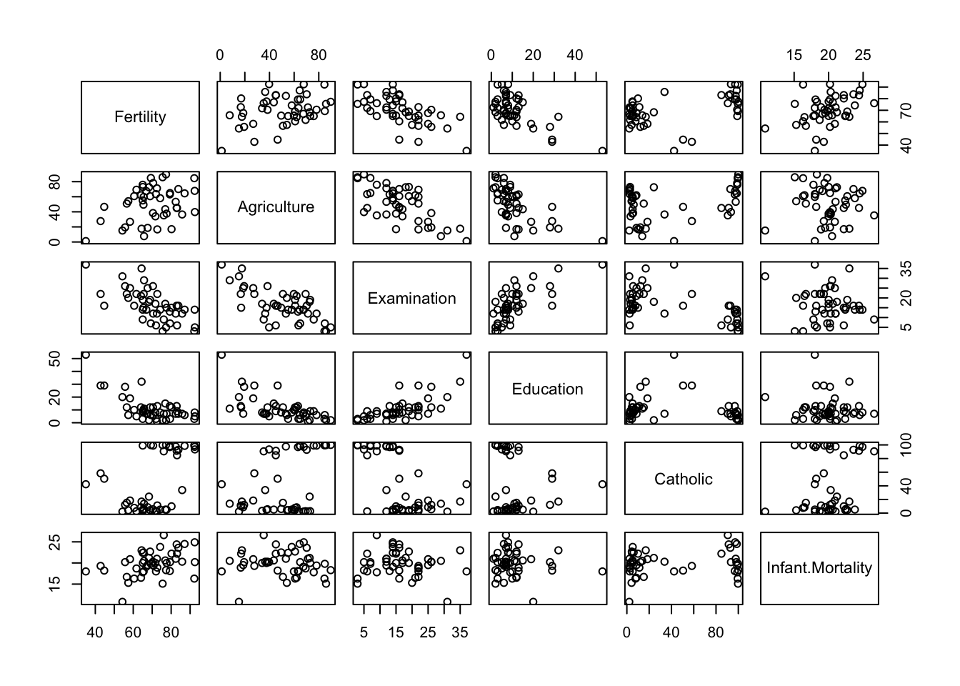
'data.frame':   47 obs. of  6 variables:
 $ Fertility       : num  80.2 83.1 92.5 85.8 76.9 76.1 83.8 92.4 82.4 82.9 ...
 $ Agriculture     : num  17 45.1 39.7 36.5 43.5 35.3 70.2 67.8 53.3 45.2 ...
 $ Examination     : int  15 6 5 12 17 9 16 14 12 16 ...
 $ Education       : int  12 9 5 7 15 7 7 8 7 13 ...
 $ Catholic        : num  9.96 84.84 93.4 33.77 5.16 ...
 $ Infant.Mortality: num  22.2 22.2 20.2 20.3 20.6 26.6 23.6 24.9 21 24.4 ...
Let’s focus on one specific pair: Fertility vs. Education.
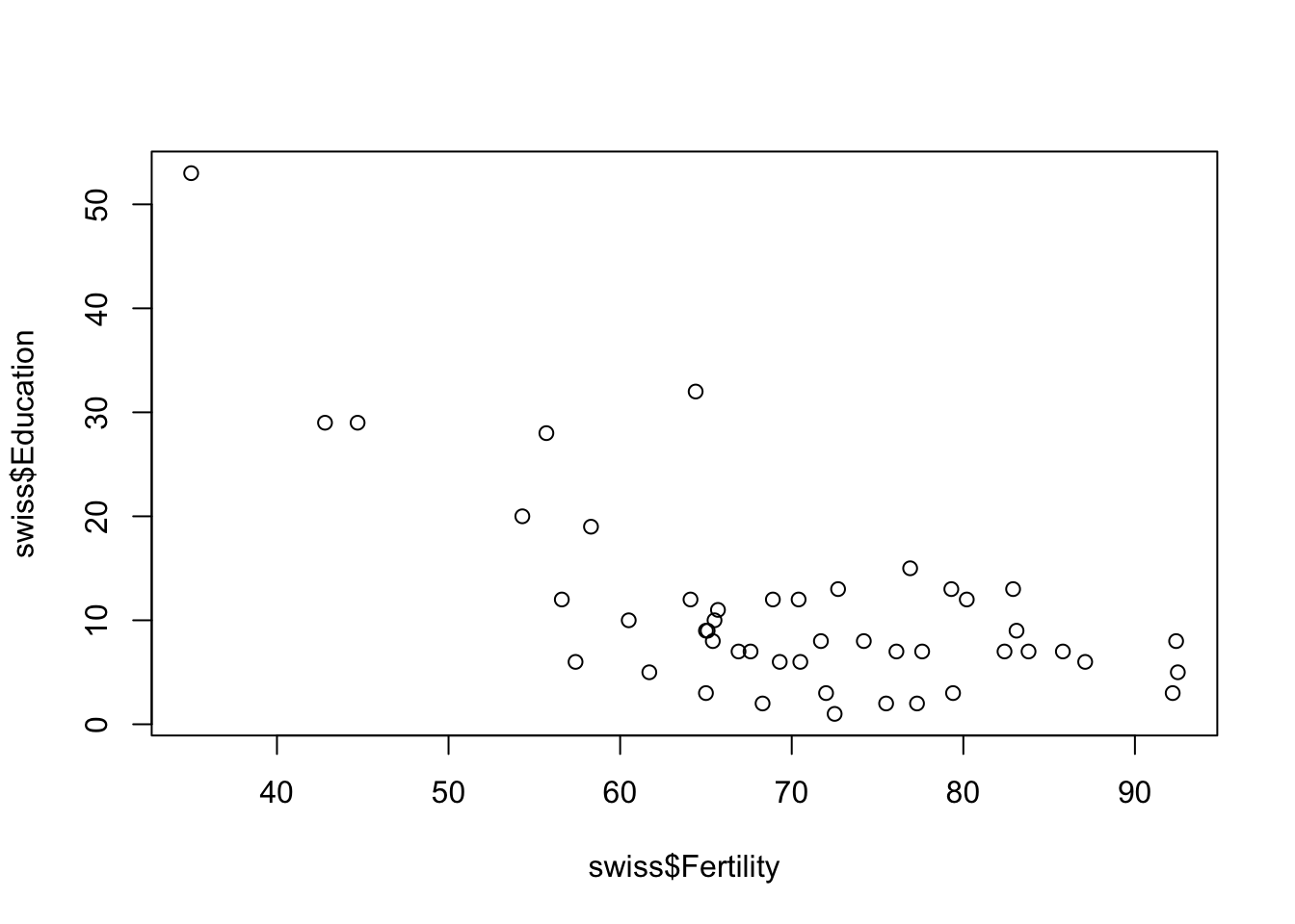
The same plot can be prettified and made more informative:
# add a title and axis labels
plot(swiss$Fertility, swiss$Education, xlab="Fertility", ylab="Education",
     main="Education vs Fertility (by province), Switzerland, 1888",
     las=1)

# add the line of best fit (in red)
abline(lm(swiss$Education~swiss$Fertility), col="red", lwd=2.5)

# add the smoothing lowess curve (in blue)
lines(lowess(swiss$Fertility,swiss$Education), col="blue", lwd=2.5)

# add a legend
legend(75,50, c("Best Fit","Lowess"), lty=c(1,1),
lwd=c(2.5,2.5),col=c("red","blue")) 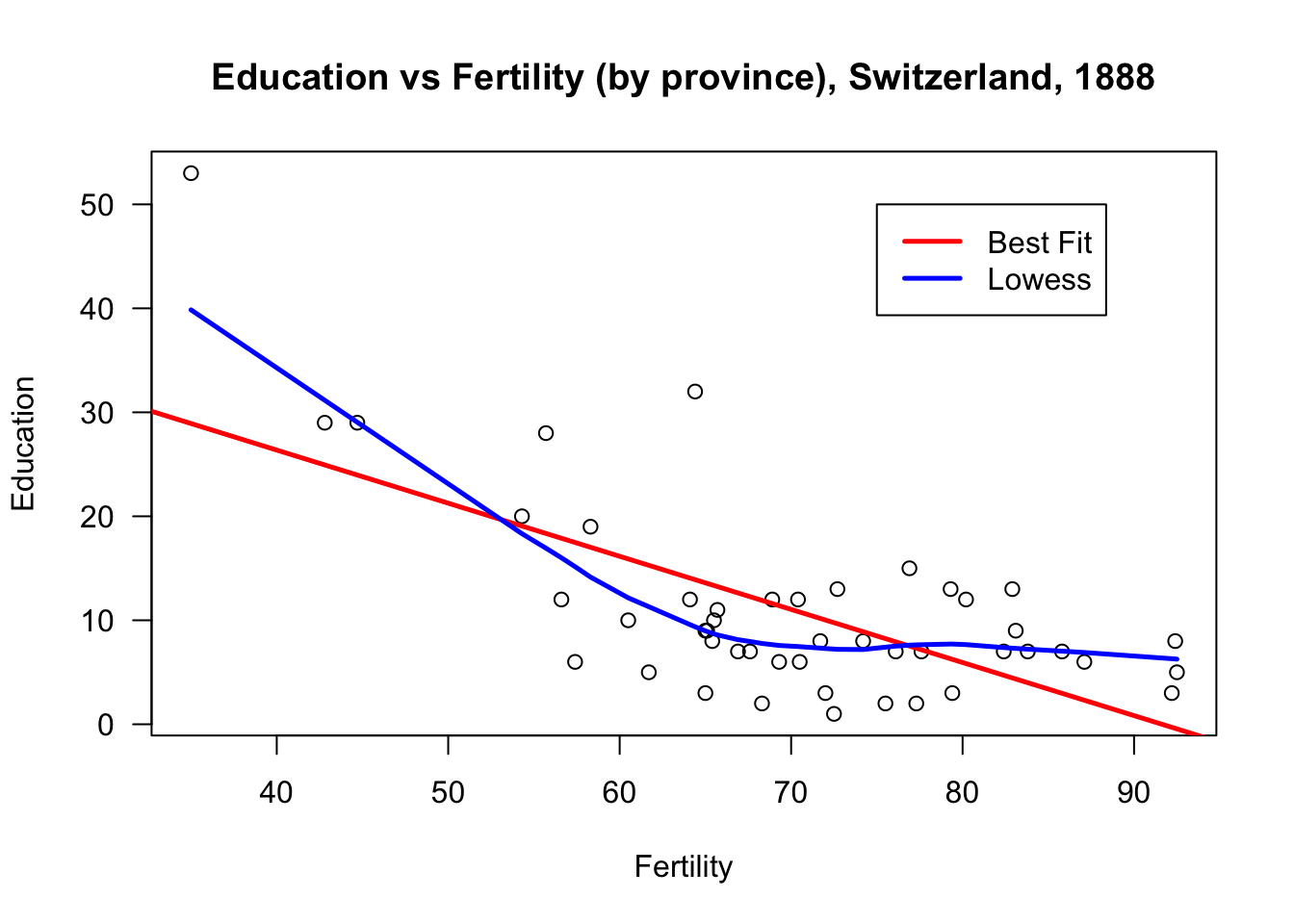
Compare that graph with the one found below:
plot(swiss$Education, xlab="Province", ylab="Education",
     main="Education by Province, Switzerland, 1888", las=1)
abline(lm(swiss$Education~row(swiss)[,1]), col="red", lwd=2.5)
lines(swiss$Education)
lines(lowess(row(swiss)[,1],swiss$Education), col="blue", lwd=2.5)
legend(5,52, c("Best Fit","Lowess"), lty=c(1,1),
lwd=c(2.5,2.5),col=c("red","blue")) 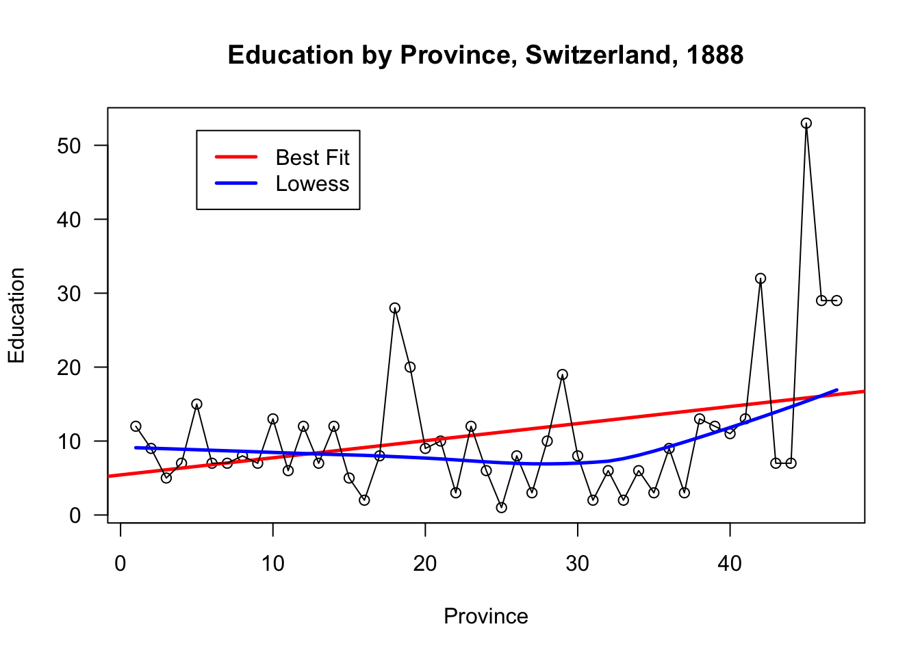
Even though R will not balk at producing this graph, it is a nonsense graph. Why, exactly?
The main take-away of this example is that being able to produce a graph doesn’t guarantee that it will be useful or meaningful in any way.
Let’s do some thing similar for the infamous built-in iris dataset.
str(iris) # structure of the dataset
summary(iris) # information on the distributions for each feature
# ?iris # information on the dataset itself
'data.frame': 150 obs. of 5 variables:
$ Sepal.Length: num 5.1 4.9 4.7 4.6 5 5.4 4.6 5 4.4 4.9 ...
$ Sepal.Width : num 3.5 3 3.2 3.1 3.6 3.9 3.4 3.4 2.9 3.1 ...
$ Petal.Length: num 1.4 1.4 1.3 1.5 1.4 1.7 1.4 1.5 1.4 1.5 ...
$ Petal.Width : num 0.2 0.2 0.2 0.2 0.2 0.4 0.3 0.2 0.2 0.1 ...
$ Species : Factor w/ 3 levels "setosa","versicolor",..: 1 1 1 1 1 1 1 1 1 1 ...
Sepal.Length Sepal.Width Petal.Length Petal.Width
Min. :4.300 Min. :2.000 Min. :1.000 Min. :0.100
1st Qu.:5.100 1st Qu.:2.800 1st Qu.:1.600 1st Qu.:0.300
Median :5.800 Median :3.000 Median :4.350 Median :1.300
Mean :5.843 Mean :3.057 Mean :3.758 Mean :1.199
3rd Qu.:6.400 3rd Qu.:3.300 3rd Qu.:5.100 3rd Qu.:1.800
Max. :7.900 Max. :4.400 Max. :6.900 Max. :2.500
Species
setosa :50
versicolor:50
virginica :50
The function pairs provides a scatter plot matrix of the dataset; the option lower.panel=NULL removes the lower panels (due to redundancy).
pairs(iris[1:4], main = "Anderson's Iris Data", pch = 21,
      lower.panel=NULL, labels=c("SL","SW","PL","PW"),
font.labels=2, cex.labels=4.5) 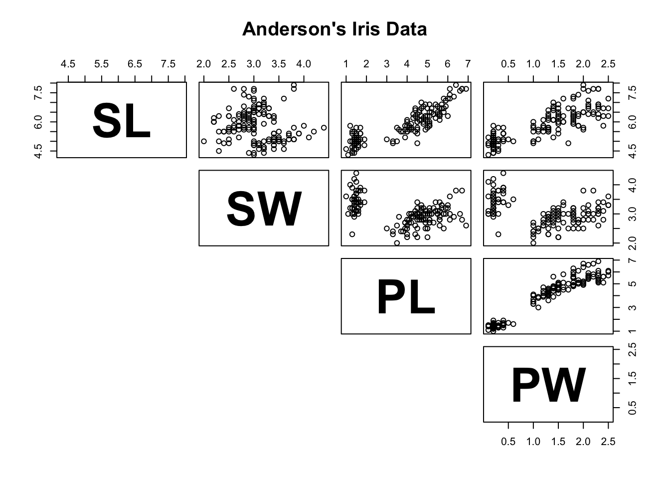
We can compare the sepal width and length variables in a manner similar to what we did with the swiss dataset.
## Iris 1
plot(iris$Sepal.Length, iris$Sepal.Width, xlab="Sepal Length",
     ylab="Sepal Width", main="Sepal Width vs Sepal Length,
     Anderson's Iris Dataset", las=1,
     bg=c("yellow","black","green")[unclass(iris$Species)])
abline(lm(iris$Sepal.Width~iris$Sepal.Length), col="red", lwd=2.5)
lines(lowess(iris$Sepal.Length,iris$Sepal.Width), col="blue", lwd=2.5)
legend(7,4.35, c("Best Fit","Lowess"), lty=c(1,1),
lwd=c(2.5,2.5),col=c("red","blue")) 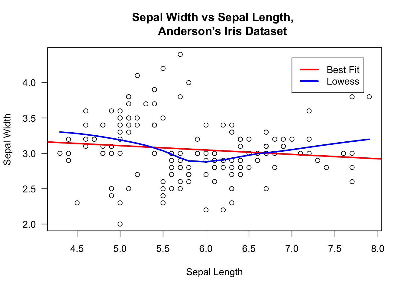
There does not seem to be a very strong relationship between these variables. What can we say about sepal length and petal length?
## Iris 2
plot(iris$Sepal.Length, iris$Petal.Length, xlab="Sepal Length",
     ylab="Petal Length", main="Sepal Width vs Petal Length,
     Anderson's Iris Dataset", las=1)
abline(lm(iris$Petal.Length~iris$Sepal.Length), col="red", lwd=2.5)
lines(lowess(iris$Sepal.Length,iris$Petal.Length), col="blue", lwd=2.5)
legend(7,4.35, c("Best Fit","Lowess"), lty=c(1,1),
lwd=c(2.5,2.5),col=c("red","blue")) 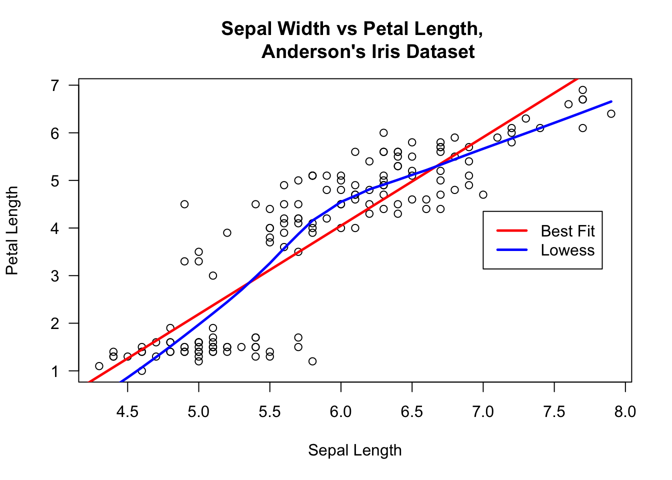
Visually, the relationship is striking: the line seems to have a slope of 1! But notice that the axes are unevenly scaled, and have been cutoff away from the origin. The following graph gives a better idea of the situation.
## Iris 3
plot(iris$Sepal.Length, iris$Petal.Length, xlab="Sepal Length",
     ylab="Petal Length", main="Sepal Width vs Petal Length,
     Anderson's Iris Dataset", xlim=c(0,8), ylim=c(0,8), las=1)
abline(lm(iris$Petal.Length~iris$Sepal.Length), col="red", lwd=2.5)
lines(lowess(iris$Sepal.Length,iris$Petal.Length), col="blue", lwd=2.5)
legend(2,7, c("Best Fit","Lowess"), lty=c(1,1),
lwd=c(2.5,2.5),col=c("red","blue")) 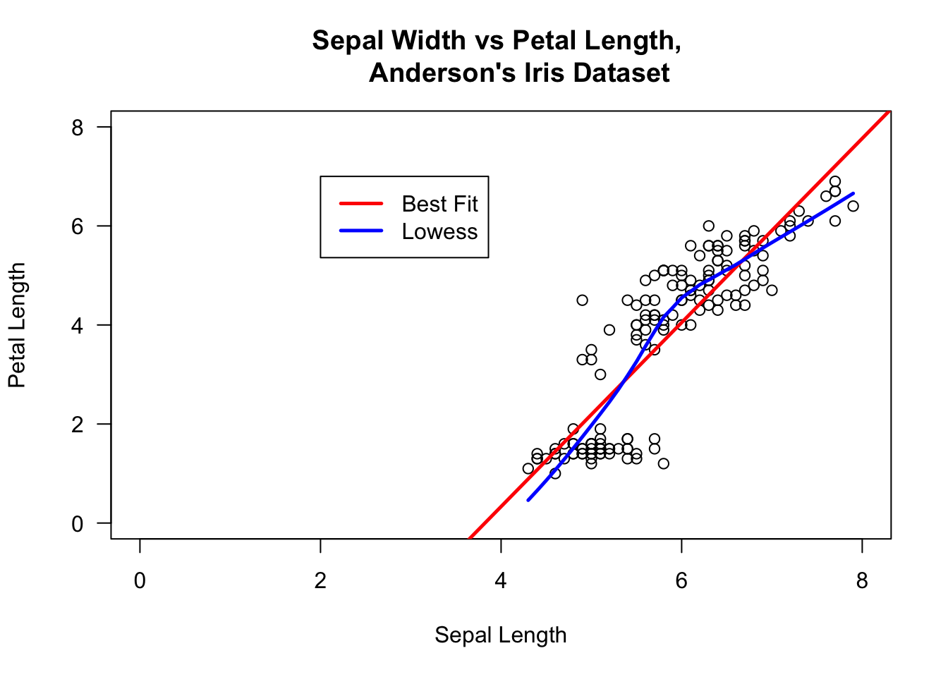
A relationship is still present, but it is affine, not linear as could have been guessed by naively looking at the original graph.
Colour can also be used to highlight various data elements.
# colour each observation differently according to its species
plot(iris$Sepal.Length, iris$Sepal.Width, pch=21,
     bg=c("red","green3","blue")[unclass(iris$Species)],
     main="Anderson's Iris Data -- Sepal Length vs. Sepal Width", xlim=)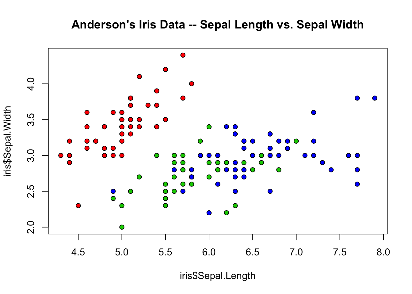
This can be done on all scatterplots concurrently using pairs.
# scatterplot matrix with species membership
pairs(iris[1:4], main = "Anderson's Iris Data", pch = 21,
      bg = c("red", "green3", "blue")[unclass(iris$Species)],
      lower.panel=NULL, labels=c("SL","SW","PL","PW"),
      font.labels=2, cex.labels=4.5)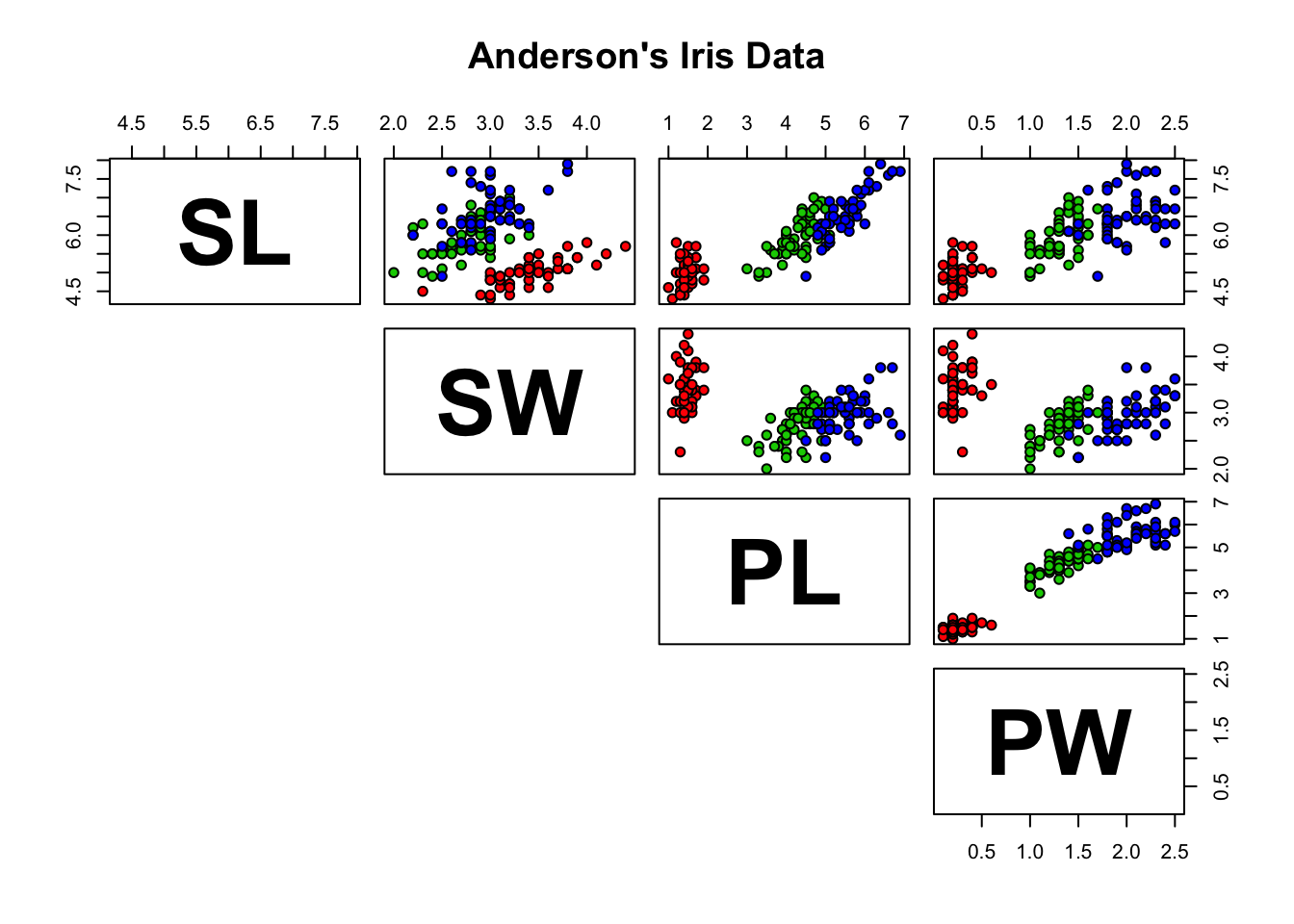
15.4.6.2 Histograms and Bar Charts
In histograms or frequency charts, users should stay on the lookout for bin size effects. For instance, what does the distribution of the Education variable in the swiss dataset look like?
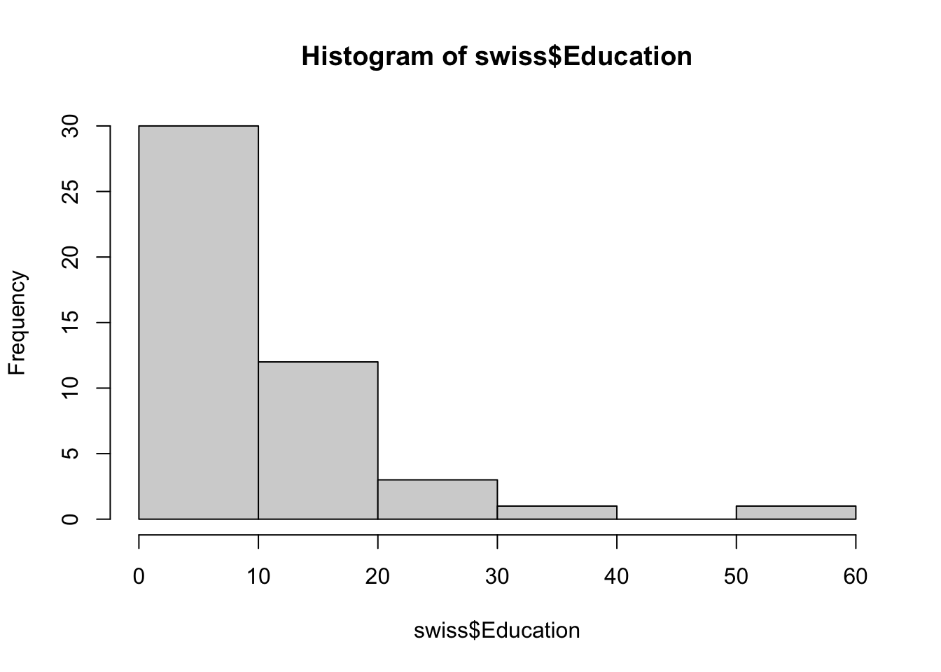
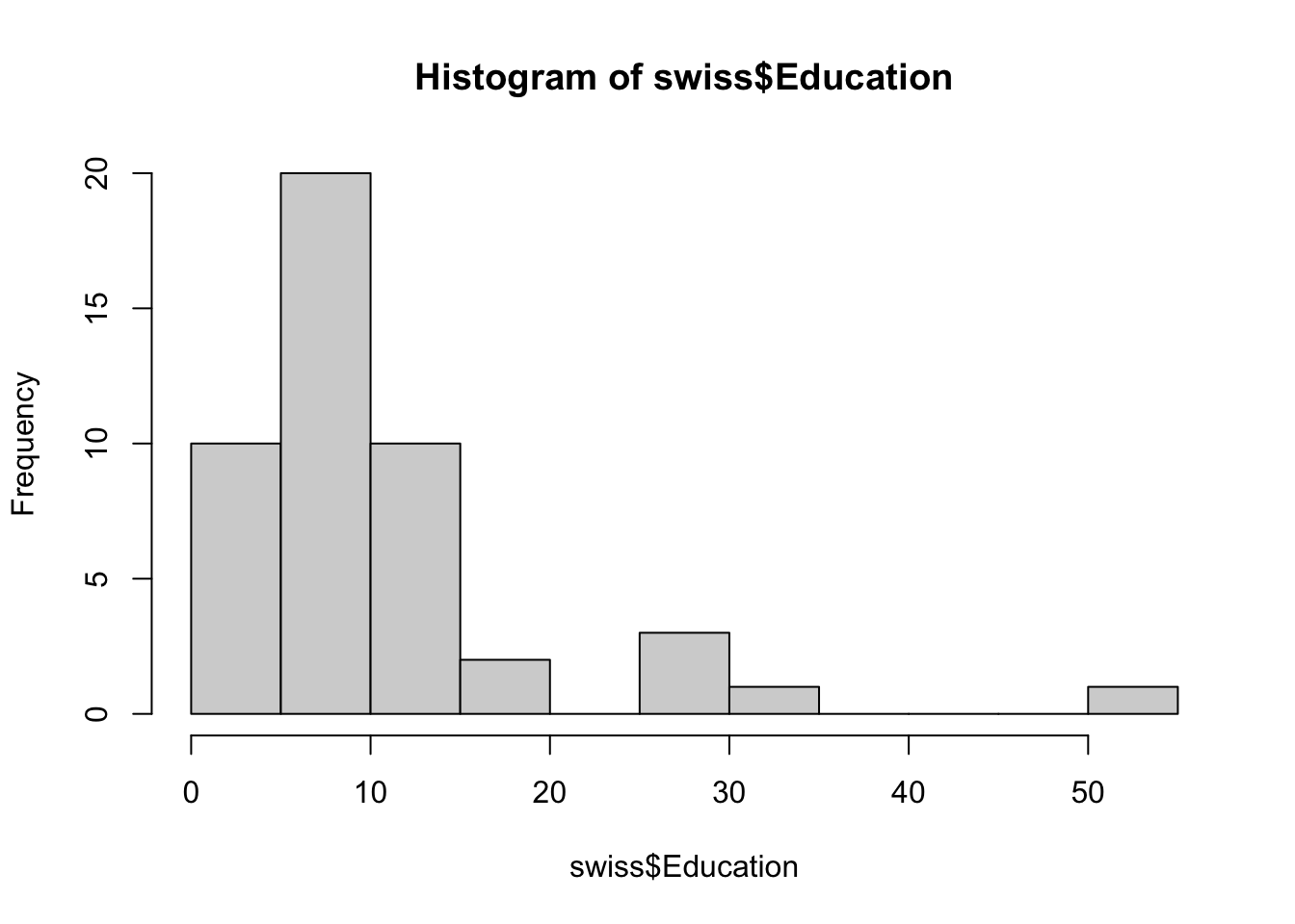
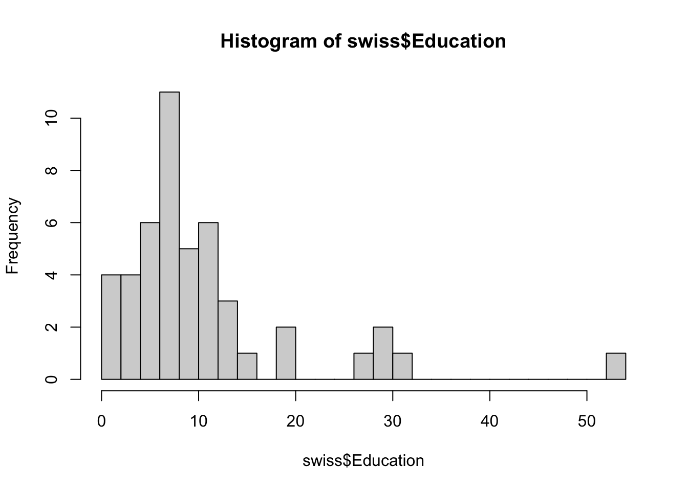
The distribution pattern is distintcly different with 10 and 20 bins. Don’t get too carried away, however: too many bins may end up masking trends if the dataset isn’t large enough.
We can also look for best fits for various parametric distributions:
#Swiss 1 - default number of bine
hist(swiss$Education, freq=FALSE, xlab="Education",
     main="Education Distribution, by Province, Switzerland, 1888",
     col="firebrick1", ylim=c(0,0.15))
curve(dgamma(x,shape=mean(swiss$Education)),add=TRUE, col="darkblue",
      lwd=4) # fit a gamma distribution
curve(dexp(x,rate=1/mean(swiss$Education)),add=TRUE, col="black",
      lwd=4) # fit an exponential distribution
curve(dnorm(x,mean=mean(swiss$Education),sd=sd(swiss$Education)),
      add=TRUE, col="green3", lwd=4) # fit a normal distribution
legend(40,0.05, c("Gamma","Exponential","Normal"), lty=c(1,1),
lwd=c(4,4),col=c("darkblue","black", "green3")) 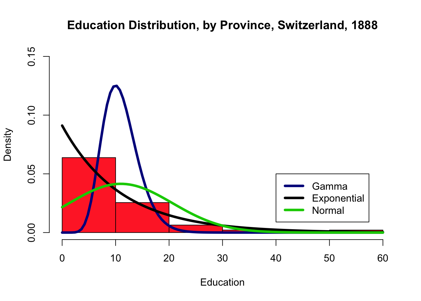
# Swiss 2 - 10 bins
hist(swiss$Education, breaks=10, freq=FALSE,xlab="Education",main="Education
     Distribution, by Province, Switzerland, 1888", col="firebrick1",
     ylim=c(0,0.15))
curve(dgamma(x,shape=mean(swiss$Education)),add=TRUE,
      col="darkblue", lwd=4)
curve(dexp(x,rate=1/mean(swiss$Education)),add=TRUE,
      col="black", lwd=4)
curve(dnorm(x,mean=mean(swiss$Education),sd=sd(swiss$Education)),
      add=TRUE, col="green3", lwd=4)
legend(40,0.05, c("Gamma","Exponential","Normal"), lty=c(1,1),
lwd=c(4,4),col=c("darkblue","black", "green3")) 
# Swiss 3 - 20 bins
hist(swiss$Education, breaks=20, freq=FALSE, xlab="Education",
     main="Education Distribution, by Province, Switzerland, 1888",
     col="firebrick1", ylim=c(0,0.15))
curve(dgamma(x,shape=mean(swiss$Education)),add=TRUE,
      col="darkblue", lwd=4)
curve(dexp(x,rate=1/mean(swiss$Education)),add=TRUE,
      col="black", lwd=4)
curve(dnorm(x,mean=mean(swiss$Education),sd=sd(swiss$Education)), add=TRUE,
      col="green3", lwd=4)
legend(40,0.05, c("Gamma","Exponential","Normal"), lty=c(1,1),
lwd=c(4,4),col=c("darkblue","black", "green3")) 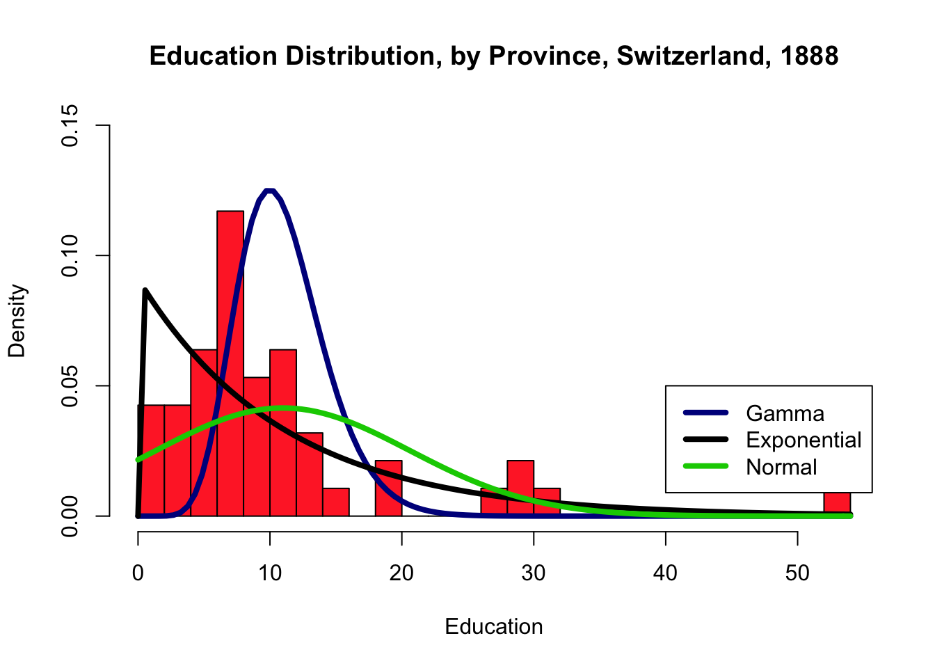
With a small number of bins, the exponential distribution seems like a good fit, visually. With a larger number of bins, neither of the three families seems particularly well-advised.
And now, can you figure out what is happening with these visualizations of the iris dataset?
hist(iris$Sepal.Length, freq=FALSE, xlab="Sepal.Length",
     main="Sepal.Length Distribution", col="firebrick1", ylim=c(0,0.15))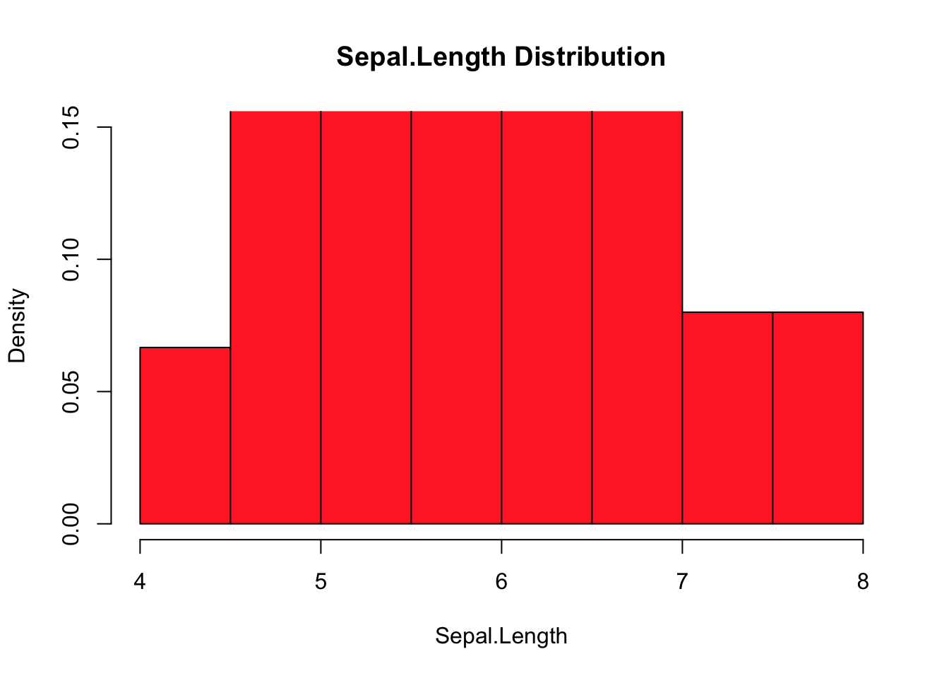
# Another feature
hist(iris$Sepal.Width, freq=FALSE, xlab="Sepal.Width",
     main="Sepal.Width Distribution", col="firebrick1", ylim=c(0,0.15))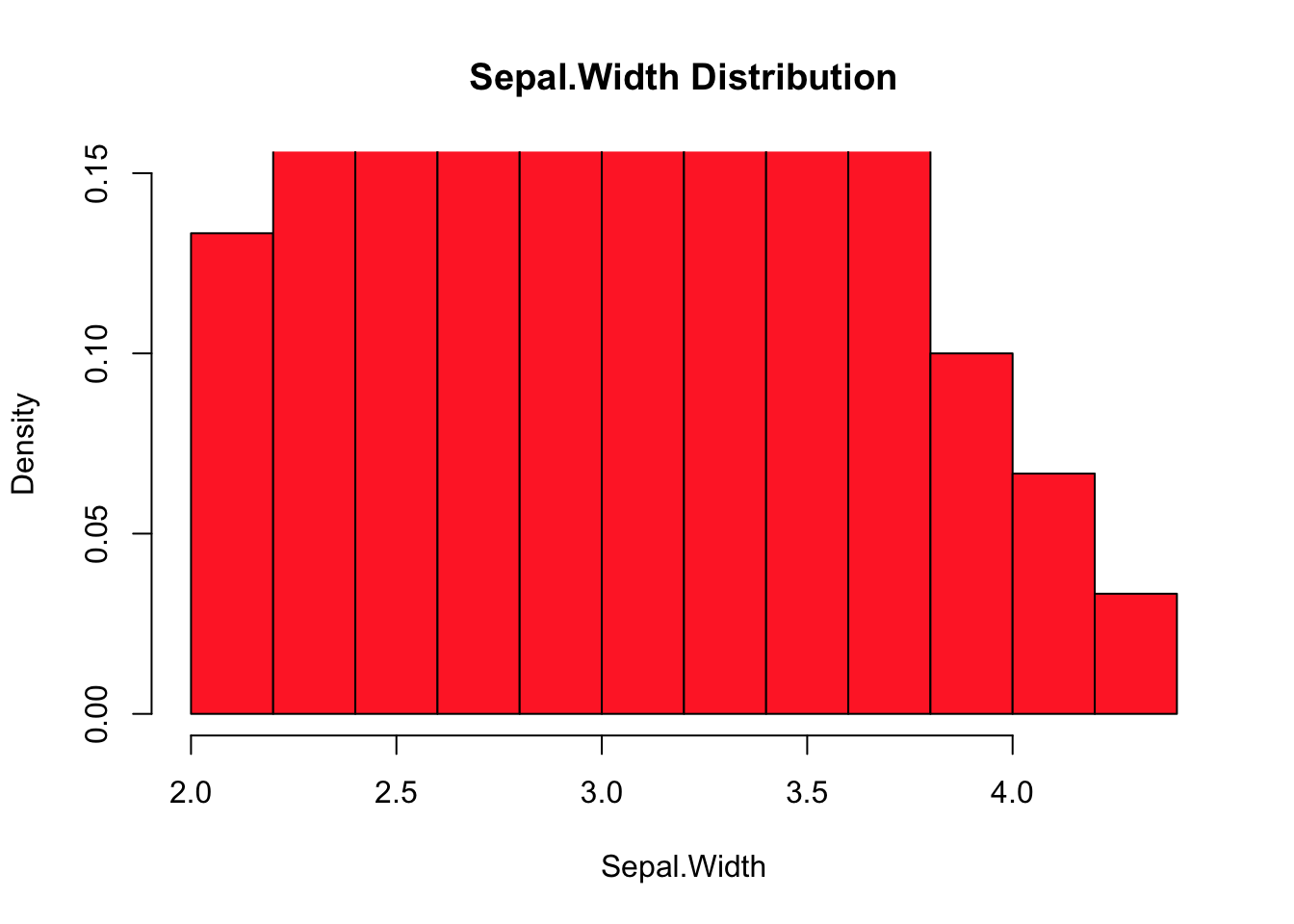
Histograms (1D data representations) can be combined with scatterplots (2D data representations) to provide marginal information.
# create our own function (see R-blogger's scatterhist function)
scatterhist = function(x, y, xlab="", ylab=""){
  zones=matrix(c(2,0,1,3), ncol=2, byrow=TRUE)
  layout(zones, widths=c(4/5,1/5), heights=c(1/5,4/5))
  xhist = hist(x, plot=FALSE)
  yhist = hist(y, plot=FALSE)
  top = max(c(xhist$counts, yhist$counts))
  par(mar=c(3,3,1,1))
  plot(x,y)
  par(mar=c(0,3,1,1))
  barplot(xhist$counts, axes=FALSE, ylim=c(0, top), space=0)
  par(mar=c(3,0,1,1))
  barplot(yhist$counts, axes=FALSE, xlim=c(0, top), space=0, horiz=TRUE)
  par(oma=c(3,3,0,0))
  mtext(xlab, side=1, line=1, outer=TRUE, adj=0,
    at=.8 * (mean(x) - min(x))/(max(x)-min(x)))
  mtext(ylab, side=2, line=1, outer=TRUE, adj=0,
    at=(.8 * (mean(y) - min(y))/(max(y) - min(y))))
}

ds = iris
with(ds, scatterhist(iris$Sepal.Length, iris$Sepal.Width,
                     xlab="Sepal.Length", ylab="Sepal.Width"))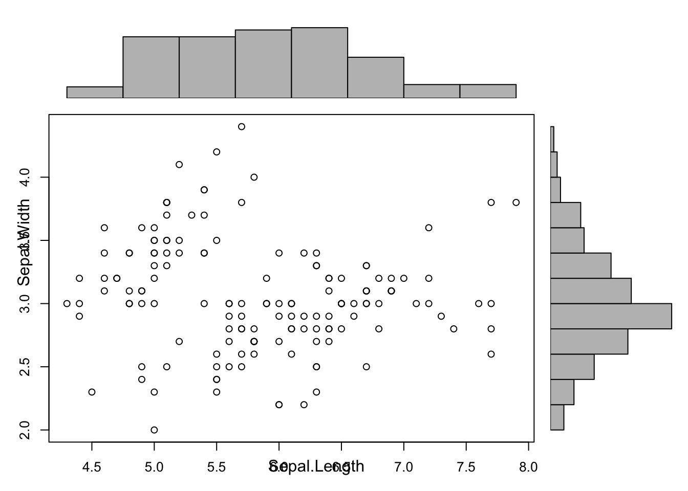
15.4.6.3 Bubble Charts
Bubble charts are a neat way to show at least 3 variables on the same 2D display. The location of the bubbles’ centre takes care of 2 variables: the size, colour, and shape of the bubbles can also be used to represent different data elements.
For this first example, we’ll take a look at some Statistics Canada 2011 demographic data regarding Canada’s census metropolitan areas (CMA) and census agglomerations (CA).
can.2011=read.csv("data/Canada2011.csv", head=TRUE) # import the data
head(can.2011) # take a look at the first 6 entries
str(can.2011) # take a look at the structure of the data
summary(can.2011[,3:12], maxsum=13) # provide a distribution information
        # for features 3 to 12, allowing for up to 13 factors in the categorical
        # distributions
Geographic.code Geographic.name Province Region Type pop_2011
1 1 St. John's NL Atlantic CMA 196966
2 5 Bay Roberts NL Atlantic CA 10871
3 10 Grand Falls-Windsor NL Atlantic CA 13725
4 15 Corner Brook NL Atlantic CA 27202
5 105 Charlottetown PE Atlantic CA 64487
6 110 Summerside PE Atlantic CA 16488
log_pop_2011 pop_rank_2011 priv_dwell_2011 occ_private_dwell_2011
1 5.294391 20 84542 78960
2 4.036269 147 4601 4218
3 4.137512 128 6134 5723
4 4.434601 94 11697 11110
5 4.809472 52 28864 26192
6 4.217168 120 7323 6941
occ_rate_2011 med_total_income_2011
1 0.9339736 33420
2 0.9167572 24700
3 0.9329964 26920
4 0.9498162 27430
5 0.9074279 30110
6 0.9478356 27250
'data.frame': 147 obs. of 12 variables:
$ Geographic.code : int 1 5 10 15 105 110 205 210 215 220 ...
$ Geographic.name : chr "St. John's" "Bay Roberts" "Grand Falls-Windsor" "Corner Brook" ...
$ Province : chr "NL" "NL" "NL" "NL" ...
$ Region : chr "Atlantic" "Atlantic" "Atlantic" "Atlantic" ...
$ Type : chr "CMA" "CA" "CA" "CA" ...
$ pop_2011 : int 196966 10871 13725 27202 64487 16488 390328 26359 45888 35809 ...
$ log_pop_2011 : num 5.29 4.04 4.14 4.43 4.81 ...
$ pop_rank_2011 : int 20 147 128 94 52 120 13 97 67 78 ...
$ priv_dwell_2011 : int 84542 4601 6134 11697 28864 7323 177295 11941 21708 16788 ...
$ occ_private_dwell_2011: int 78960 4218 5723 11110 26192 6941 165153 11123 19492 15256 ...
$ occ_rate_2011 : num 0.934 0.917 0.933 0.95 0.907 ...
$ med_total_income_2011 : int 33420 24700 26920 27430 30110 27250 33400 25500 26710 26540 ...
Province Region Type pop_2011
Length:147 Length:147 Length:147 Min. : 10871
Class :character Class :character Class :character 1st Qu.: 18429
Mode :character Mode :character Mode :character Median : 40077
Mean : 186632
3rd Qu.: 98388
Max. :5583064
log_pop_2011 pop_rank_2011 priv_dwell_2011 occ_private_dwell_2011
Min. :4.036 Min. : 1.0 Min. : 4601 Min. : 4218
1st Qu.:4.265 1st Qu.: 37.5 1st Qu.: 8292 1st Qu.: 7701
Median :4.603 Median : 74.0 Median : 17428 Median : 16709
Mean :4.720 Mean : 74.0 Mean : 78691 Mean : 74130
3rd Qu.:4.993 3rd Qu.:110.5 3rd Qu.: 44674 3rd Qu.: 41142
Max. :6.747 Max. :147.0 Max. :2079459 Max. :1989705
occ_rate_2011 med_total_income_2011
Min. :0.6492 Min. :22980
1st Qu.:0.9173 1st Qu.:27630
Median :0.9348 Median :29910
Mean :0.9276 Mean :31311
3rd Qu.:0.9475 3rd Qu.:33255
Max. :0.9723 Max. :73030
NA's :5 Before jumping aboard the bubble chart train, let’s see what the dataset looks like in the scatterplot framework for 5 of the variables, grouped along regions.
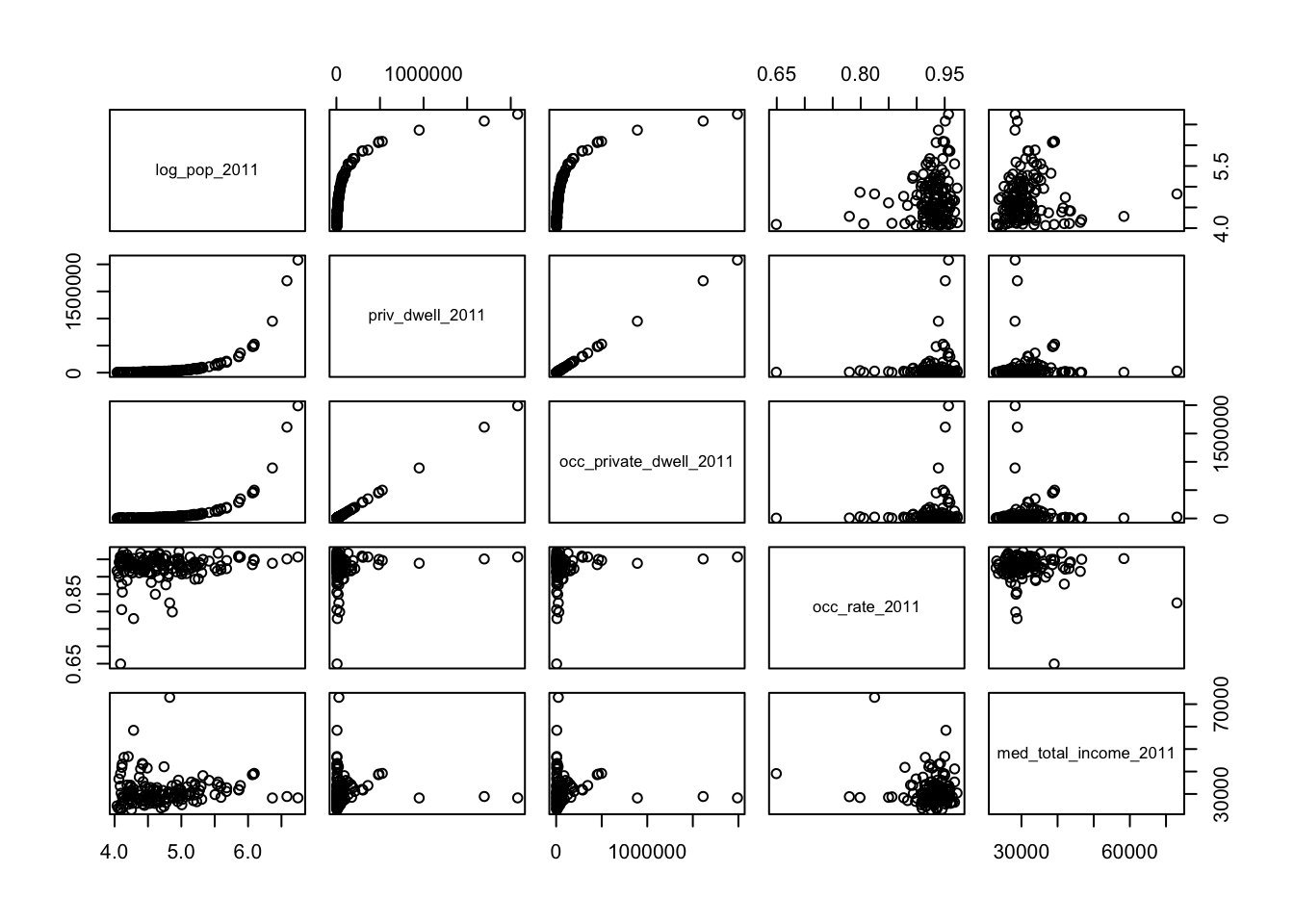
It’s … underwhelming, if that’s a word.49. There are some interesting tidbits, but nothing jumps as being meaningful beyond a first pass.
Can anything else be derived using bubble charts? We use median income as the radius for the bubbles, and focus on occupancy rates and population.
radius.med.income.2011<-sqrt(can.2011$med_total_income_2011/pi)
symbols(can.2011$log_pop_2011, can.2011$occ_rate_2011,
        circles=radius.med.income.2011, inches=0.45,
        fg="white", bg="red", xlab="Population (log)",
        ylab="Occupancy Rate")
title("Total Median Income, by CMA and CA (2011)")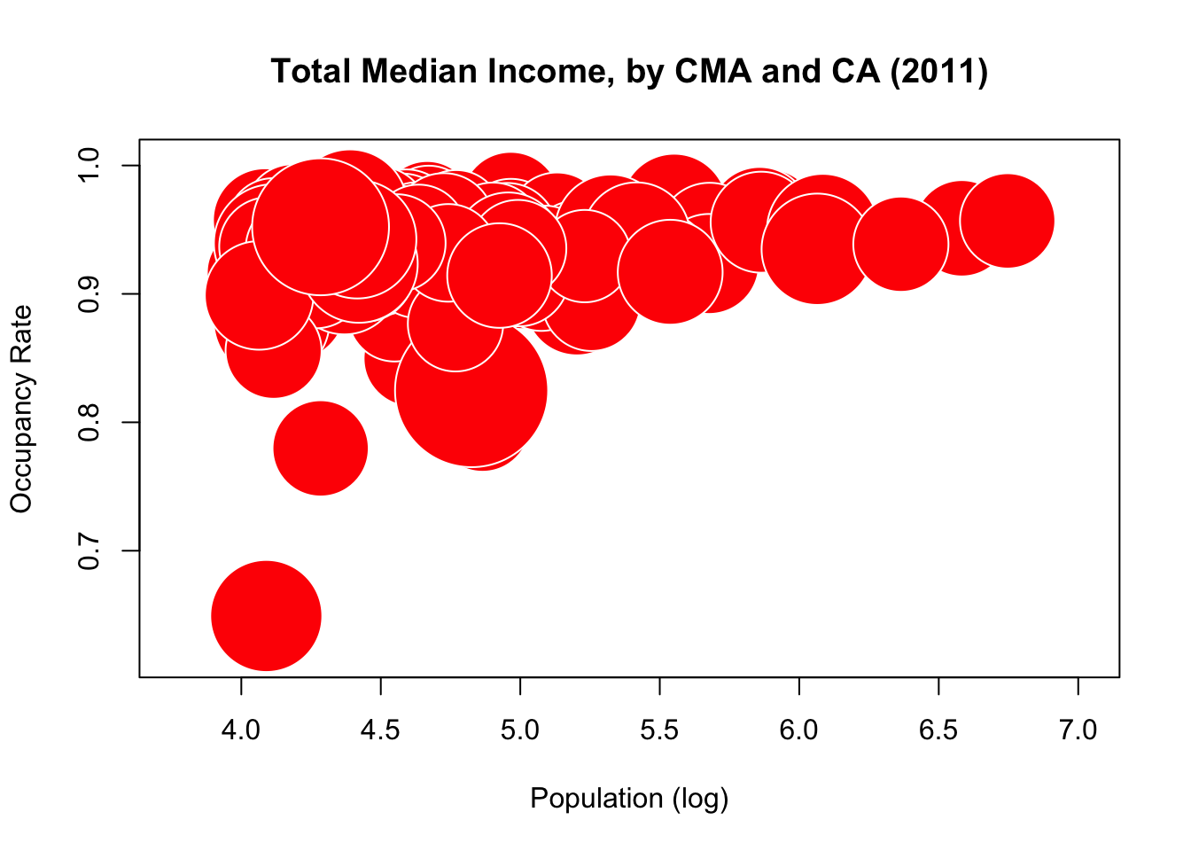
Clearly, an increase in population seems to be associated with (and not necessarily a cause of) a rise in occupancy rates. But the median income seems to have very little correlation with either of the other two variables. Perhaps such a correlation is hidden by the default unit used to draw the bubbles? Let’s shrink it from 0.45 to 0.25 and see if anything pops out.
symbols(can.2011$log_pop_2011, can.2011$occ_rate_2011, circles=radius.med.income.2011,
        inches=0.25, fg="white", bg="red",
        xlab="Population (log)", ylab="Occupancy Rate")
title("Total Median Income, by CMA and CA (2011)")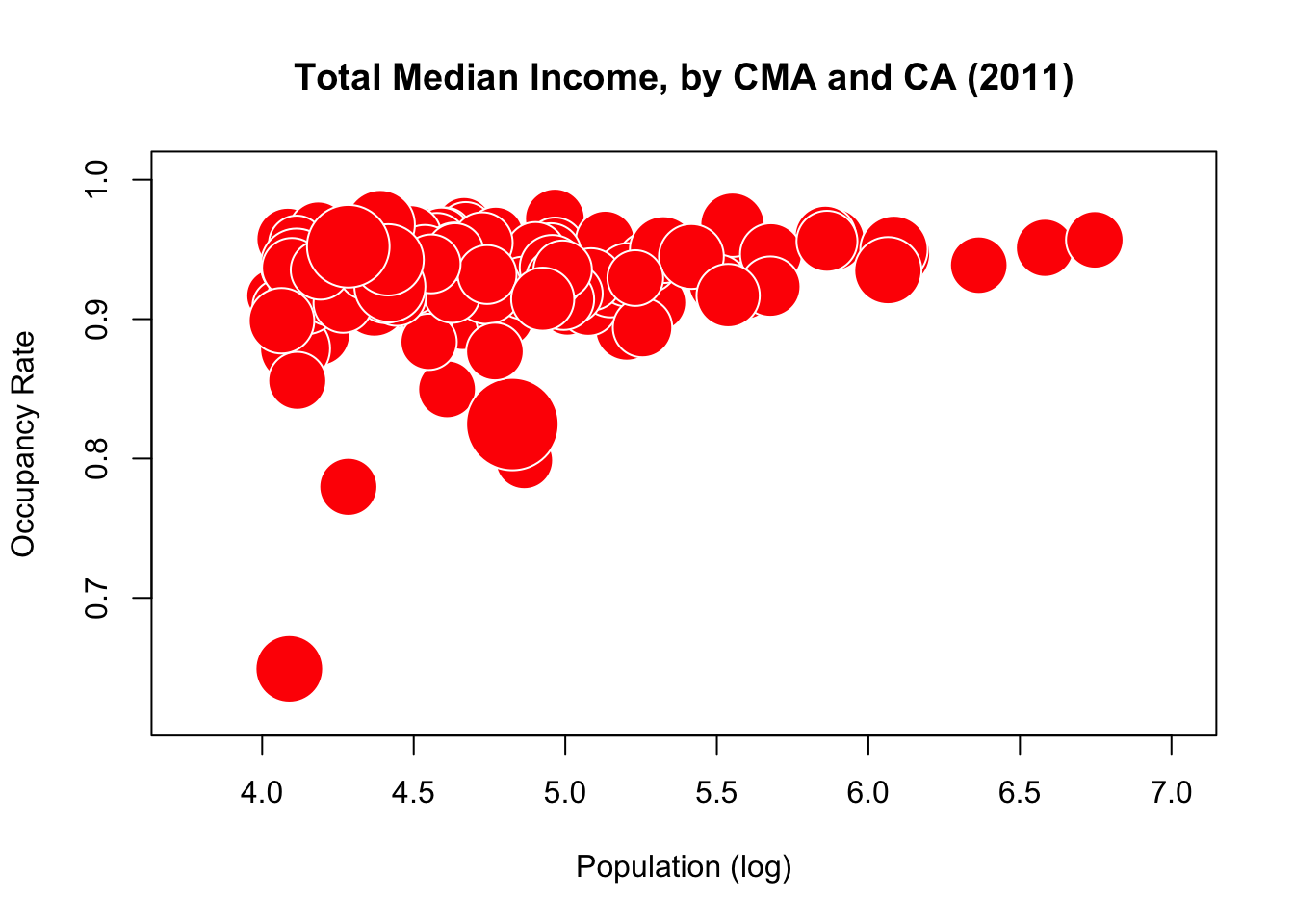
Not much to it. But surely there would be a relationship in these quantities if we included the CMA/CA’s region?
symbols(can.2011$log_pop_2011, can.2011$occ_rate_2011, circles=radius.med.income.2011,
        inches=0.15, fg="white",
        bg=c("red","blue","black","green","yellow","violet")[factor(
          can.2011$Region)],
        xlab="Population (log)", ylab="Occupancy Rate")
title("Total Median Income, by CMA and CA (2011) - colours represent
      oeographical regions.")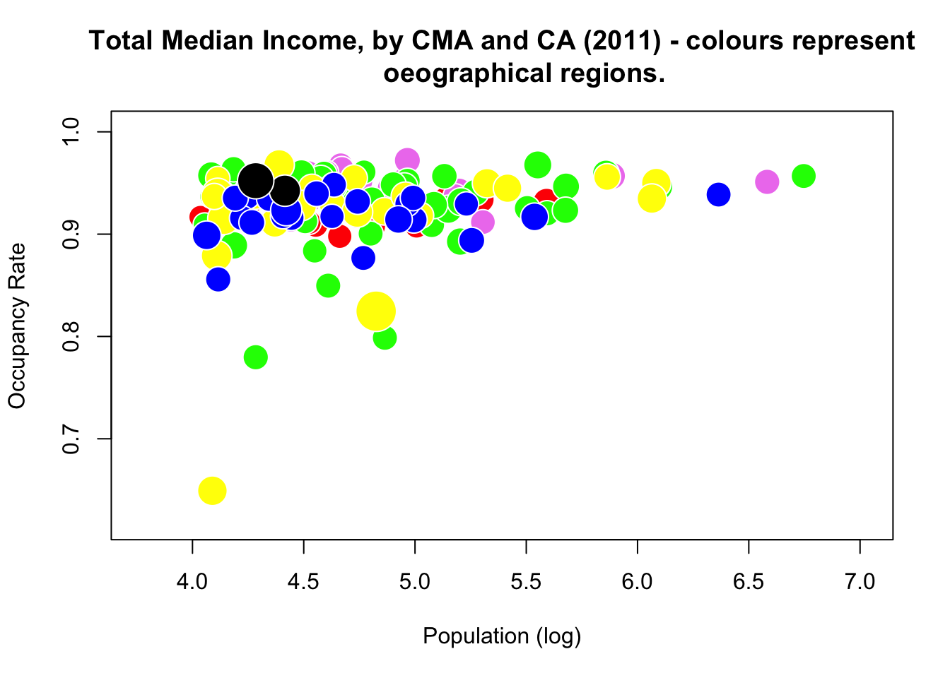
What do you think?
Perhaps the CA distort the full picture (given that they are small and more numerous).
Let’s analyze the subset of CMAs instead.
can.2011.CMA=read.csv("data/Canada2011_CMA.csv", head=TRUE) # import the data
str(can.2011.CMA) #dataset structure (notice the number of observations)
summary(can.2011.CMA[,3:12], maxsum=13) # feature by feature distribution
'data.frame': 33 obs. of 15 variables:
$ Geographic.code : int 1 205 305 310 408 421 433 442 462 505 ...
$ Geographic.name : chr "St. John's" "Halifax" "Moncton" "Saint John" ...
$ Province : chr "NL" "NS" "NB" "NB" ...
$ Region : chr "Atlantic" "Atlantic" "Atlantic" "Atlantic" ...
$ Type : chr "CMA" "CMA" "CMA" "CMA" ...
$ pop_2011 : int 196966 390328 138644 127761 157790 765706 201890 151773 3824221 1236324 ...
$ log_pop_2011 : num 5.29 5.59 5.14 5.11 5.2 ...
$ fem_pop_2011 : int 103587 204579 70901 65834 79770 394935 104026 78105 1971520 647083 ...
$ prop_fem_2011 : num 52.6 52.4 51.1 51.5 50.6 ...
$ pop_rank_2011 : int 20 13 29 31 26 7 19 27 2 4 ...
$ priv_dwell_2011 : int 84542 177295 62403 56775 73766 361447 99913 74837 1696210 526627 ...
$ occ_private_dwell_2011: int 78960 165153 58294 52281 69507 345892 91099 70138 1613260 498636 ...
$ occ_rate_2011 : num 0.934 0.932 0.934 0.921 0.942 ...
$ med_unemployment_2011 : num 6.6 6.2 7.45 6.75 7.8 5.15 6.4 8.9 8.1 6.3 ...
$ med_total_income_2011 : int 33420 33400 30690 29910 29560 33760 27620 27050 28870 39170 ...
Province Region Type pop_2011
Length:33 Length:33 Length:33 Min. : 118975
Class :character Class :character Class :character 1st Qu.: 159561
Mode :character Mode :character Mode :character Median : 260600
Mean : 700710
3rd Qu.: 721053
Max. :5583064
log_pop_2011 fem_pop_2011 prop_fem_2011 pop_rank_2011
Min. :5.075 Min. : 63260 Min. :50.55 Min. : 1
1st Qu.:5.203 1st Qu.: 83243 1st Qu.:51.55 1st Qu.: 9
Median :5.416 Median : 135561 Median :52.17 Median :17
Mean :5.553 Mean : 365093 Mean :52.05 Mean :17
3rd Qu.:5.858 3rd Qu.: 378690 3rd Qu.:52.41 3rd Qu.:25
Max. :6.747 Max. :2947971 Max. :53.17 Max. :33
priv_dwell_2011 occ_private_dwell_2011
Min. : 53730 Min. : 48848
1st Qu.: 72817 1st Qu.: 67767
Median : 110314 Median : 104237
Mean : 291519 Mean : 275587
3rd Qu.: 294150 3rd Qu.: 282186
Max. :2079459 Max. :1989705 We can use the median income for the bubbles radius again, but this time we’ll look at population and unemployment.
radius.med.income.2011.CMA<-sqrt(can.2011.CMA$med_total_income_2011/pi)
symbols(can.2011.CMA$log_pop_2011, can.2011.CMA$med_unemployment_2011,
        circles=radius.med.income.2011.CMA, inches=0.25, fg="white",
        bg=c("red","blue","gray","green","yellow")[factor(can.2011.CMA$Region)],
        ylab="Population (log)", xlab="Unemployment Rate")
title("Total Median Income, by CMA (2011)")
text(can.2011.CMA$log_pop_2011, can.2011.CMA$med_unemployment_2011,
     can.2011.CMA$Geographic.code, cex=0.5)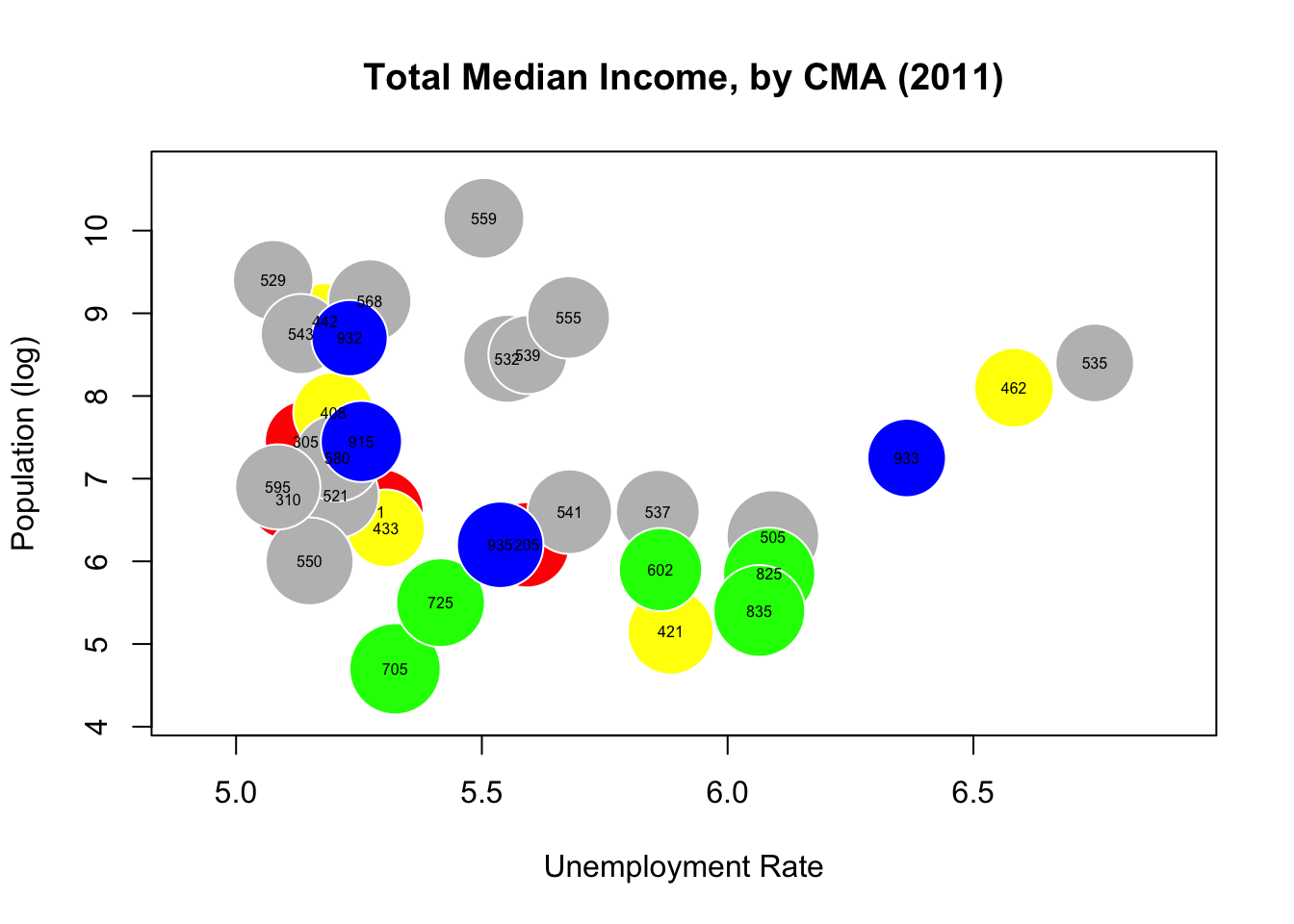
Part of the problem is that median income seems to be roughly uniform among CMAs. What if we used rank statistics instead? Switch the radius to population rank, say?
radius.pop.rank.2011.CMA<-sqrt(can.2011.CMA$pop_rank_2011/pi)
symbols(can.2011.CMA$med_total_income_2011, can.2011.CMA$med_unemployment_2011,
        circles=radius.pop.rank.2011.CMA, inches=0.25, fg="white",
        bg=c("red","blue","gray","green","yellow")[factor(can.2011.CMA$Region)],
        ylab="Median Income", xlab="Unemployment Rate")
title("Population Rank, by CMA and CA (2011)")
text(can.2011.CMA$med_total_income_2011, can.2011.CMA$med_unemployment_2011,
     can.2011.CMA$Geographic.code, cex=0.5)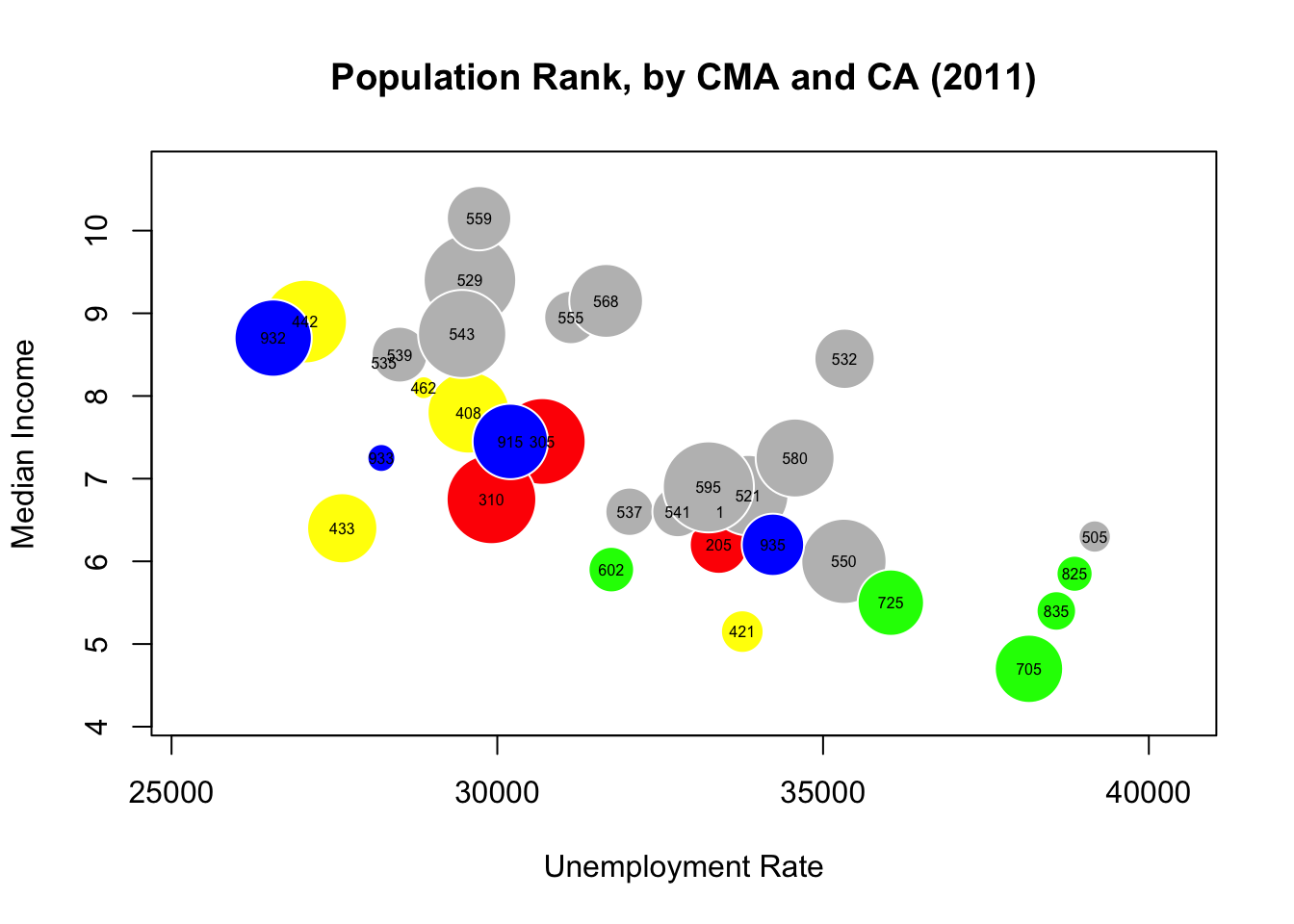
There’s a bit more structure in there, isn’t there? Can you figure out to what regions the colours correspond? (Hint: look at the first digit of the bubble labels, and the frequency of the colours).
15.4.7 Exercises
Consider the following Australian population figures, by state (in 1000s):
| Year | NSW | Vic. | Qld | SA | WA | Tas. | NT | ACT | Aust. |
| 1917 | 1904 | 1409 | 683 | 440 | 306 | 193 | 5 | 3 | 4941 |
| 1927 | 2402 | 1727 | 873 | 565 | 392 | 211 | 4 | 8 | 6182 |
| 1937 | 2693 | 1853 | 993 | 589 | 457 | 233 | 6 | 11 | 6836 |
| 1947 | 2985 | 2055 | 1106 | 646 | 502 | 257 | 11 | 17 | 7579 |
| 1957 | 3625 | 2656 | 1413 | 873 | 688 | 326 | 21 | 38 | 9640 |
| 1967 | 4295 | 3274 | 1700 | 1110 | 879 | 375 | 62 | 103 | 11799 |
| 1977 | 5002 | 3837 | 2130 | 1286 | 1204 | 415 | 104 | 214 | 14192 |
| 1987 | 5617 | 4210 | 2675 | 1393 | 1496 | 449 | 158 | 265 | 16264 |
| 1997 | 6274 | 4605 | 3401 | 1480 | 1798 | 474 | 187 | 310 | 18532 |
| 2007 | 6889 | 5205 | 4182 | 1585 | 2106 | 493 | 215 | 340 | 21017 |
| 2017 | 7861 | 6324 | 4928 | 1723 | 2580 | 521 | 246 | 410 | 24599 |
Graph the New South Wales (NSW) population with all defaults using
plot(). Redo the graph by adding a title, a line to connect the points, and some colour.Compare the population of New South Wales (NSW) and the Australian Capital Territory (ACT) by using the functions
plot()andlines(), then add a legend to appropriately display your graph.Use a bar chart to graph the population of Queensland (QLD), add an appropriate title to your graph, and display the years from 1917 to 2017 on the appropriate bars.
Create a light blue histogram for the population of South Australia (SA).
15.5 Introduction to Dashboards
Dashboards are a helpful way to communicate and report data. They are versatile in that they support multiple types of reporting. Dashboards are predominantly used in business intelligence contexts, but they are being used more frequently to communicate data and visualize analysis for non-business services also. Popular dashboarding platforms include Tableau, and Power BI, although there are other options, such as Excel, R + Shiny, Geckoboard, Matillion, JavaScript, etc.
These technologies aim to make creating data reports as simple and user-friendly as possible. They are intuitive and powerful; creating a dashboard with these programs is quite easy, and there are tons of how-to guides available online [115]–[117].
In spite of their ease of use, however, dashboards suffer from the same limitations as other forms of data communication, to wit: how can results be conveyed effectively and how can an insightful data story be relayed to the desired audience? Putting together a “good” dashboard is more complicated then simply learning to use a dashboarding application [118].
15.5.1 Dashboard Fundamentals
Effective dashboarding requires that the designers answer questions about the planned-for display:
who is the target audience?
what value does the dashboard bring?
what type of dashboard is being created?
Answering these questions can guide and inform the visualization choices that go into creating dashboards.
Selecting the target audience helps inform data decisions that meet the needs and abilities of the audience. When thinking of an audience, consider their role (what decisions do they make?), their workflow (will they use the dashboard on a daily basis or only once?), and data expertise level (what is their level of data understanding?).
When creating a dashboard, its important to understand (and keep in mind) why one is needed in the first place – does it find value in:
helping managers make decisions?
educating people?
setting goals/expectations?
evaluating and communicating progress?
Dashboards can be used to communicate numerous concepts, but not all of them can necessarily be displayed in the same space and at the same time so it becomes important to know where to direct the focus to meet individual dashboards goals. Dashboard decisions should also be informed by the scope, the time horizon, the required level of detail, and the dashboard’s point-of-view.In general,
the scope of the dashboard could be either broad or specific – an example of a broad score would be displaying information about an entire organization, whereas a specific scope could focus on a specific product or process;
the time horizon is important for data decisions – it could be either historical, real-time, snapshot, or predictive:
historical dashboards look at past data to evaluate previous trends;
real-time dashboards refresh and monitor activity as it happens;
snapshot dashboards show data from a single time point, and
predictive dashboards use analytical results and trend-tracking to predict future performances;
the level of detail in a dashboard can either be high level or drill-able – high level dashboards provide only the most critical numbers and data; drill-able dashboards provide the ability to “drill down” into the data in order to gain more context.
the dashboard point of view can be prescriptive or exploratory – a prescriptive dashboard prescribes a solution to an identified problem by using the data as proof; an exploratory dashboard uses data to explore the data and find possible issues to be tackled.
The foundation of good dashboards comes down to deciding what information is most important to the audience in the context of interest; such dashboards should have a core theme based on either a problem to solve or a data story to tell, while removing extraneous information from the process.
15.5.2 Dashboard Structure
The dashboard structure is informed by four main considerations:
form – format in which the dashboard is delivered;
layout – physical look of the dashboard
design principles – fundamental objectives to guide design
functionality – capabilities of the dashboard
Dashboards can be presented on paper, in a slide deck, in an online application, over email (messaging), on a large screen, on a mobile phone screen, etc.
Selecting a format that suits the dashboard needs is a necessity; various formats might need to be tried before arriving at a final format decision.
The structure of the dashboard itself is important because visuals that tell similar stories (or different aspects of the same story) should be kept close together, as physical proximity of interacting components is expected from the viewers and consumers. Poor structural choices can lead to important dashboard elements being undervalued.
The dashboard shown in Figure 15.22 provides an example of group visuals that tell similar stories (the corresponding Power BI file can be found at ???).
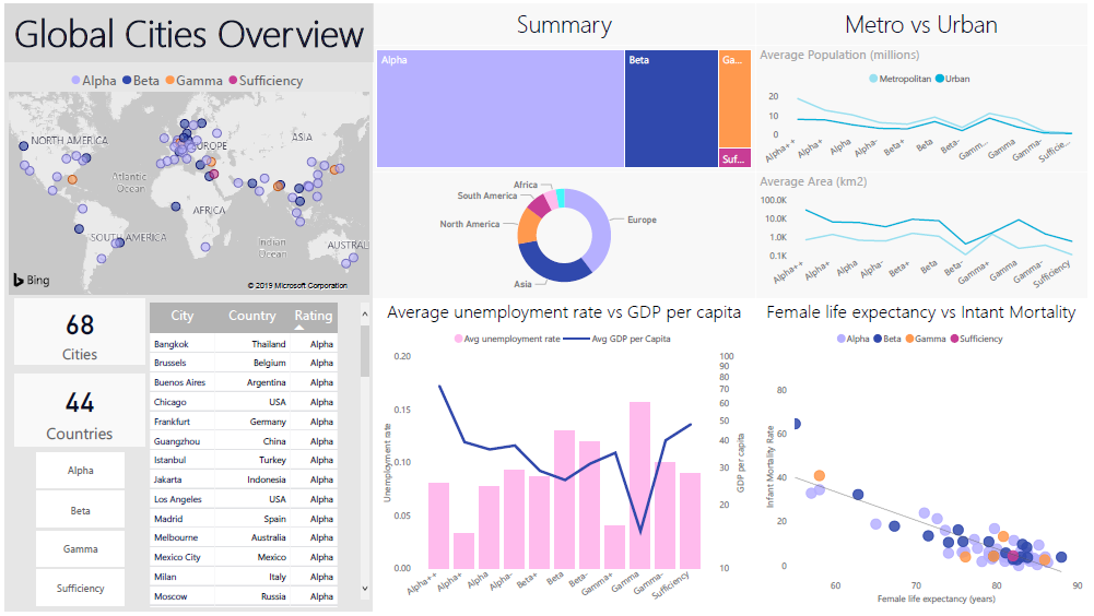
Figure 15.22: An exploratory dashboard showing metrics about various cities ranked on the Global Cities Index. The dashboard goal is to allow a general audience to compare and contrast the various globally ranked cities – statistics that contribute to a ‘higher’ ranking immediately pop out. Viewers can also very easily make comparisons between high- and low-ranking cities. The background is kept neutral with a fair amount of blank space in order to keep the dashboard open and easy to read. The colours complement each other (via the use of a colour theme picker in Power BI) and are clearly indicative of ratings rather than comparative statistics (personal file).
Knowing which visual displays to use with the “right” data helps dashboards achieve structural integrity:
distributions can be displayed with bar charts and scatter plots;
compositions with pie charts, bar charts, and tree maps;
comparisons use bubble charts and bullet plots, and
trends are presented with line charts and area plots.
An interesting feature of dashboard structure is that it can be used to guide viewer attention; critical dashboard elements can be highlighted with the help of visual cues such as use of icons, colours, and fonts. Using filters is a good way to allow dashboard viewers of a dashboard to customize the dashboard scope (to some extent) and to investigate specific data categories more closely.
The dashboard shown in Figure 15.23 provides an example of a dashboard that makes use of an interactive filter to analyze data from specific categories.
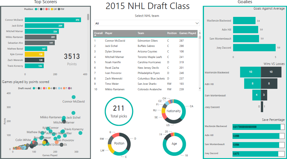
Figure 15.23: An exploratory dashboard showing information about the National Hockey League draft class of 2015. The dashboard displays professional statistics (as of August 2019) of hockey players drafted into the NHL in 2015, as well as their overall draft position. This dashboard allows casual hockey fans to evaluate the performance of players drafted in 2015. It provides demographic information to give context to possible market deficiencies during this draft year (i.e. defence players were drafted more frequently than any other position). This dashboard is designed to be interactive; the filter tool at the top allows dashboard viewers to drill-down on specific teams (personal file).
15.5.3 Dashboard Design
An understanding of design improves dashboards; dissonant designs typically make for poor data communication. Design principles are discussed in [83], [104], [106], [109], [119], [120]. For dashboards, the crucial principles relate to the use of grids, white space, colour, and visuals.
When laying out a dashboard, gridding helps direct viewer attention and makes the space easier to parse; note, in Figure 15.22, how the various visuals are aligned in a grid format to lay the data out in a clean, readable manner.
In order to help viewers avoid becoming overwhelmed by clutter or information overload, consider leaving a enough blank space around and within the various charts; note, in Figure 15.23, that while the dashboard displays a lot of information, there is a lot of blank/white space between the various visuals, which provides viewers with space to breathe, so to speak. In general, clutter shuts down the communication process (see Figure 15.24 for two impressive examples of data communication breakdown).
Colour provides meaning to data visualizations – bright colours, for instance, should be used as alarm indicators as they immediately draw the viewer’s attention. Colour themes create cohesiveness, which improves the overall readability of a dashboard. There are no perfect dashboards – no collection of charts will ever suit everyone who encounters it.
That being said, dashboards that are elegant (as well as truthful and functional) will deliver a bigger bang for their buck [106], [107]. In the same vein, keep in mind that all dashboards are by necessity incomplete. A good dashboards may still lead to dead ends, but it should allow its users to ask: “Why? What is the root cause of the problem?”
Finally, designers and viewers alike must remember that a dashboard can only be as good as the data it uses; a dashboard with badly processed or unrepresentative data, or which is showing the results of poor analyses, cannot be an effective communication tool, independently of design.
15.5.4 Examples
Dashboards are used in varied contexts, such as:
interactive displays that allows people to explore motor insurance claims by city, province, driver age, etc.;
a PDF file showing key audit metrics that gets e-mailed to a Department’s DG on a weekly basis;
a wall-mounted screen that shows call centre statistics in real-time;
a mobile app that allows hospital administrators to review wait times on an hourly- and daily-basis for the current year and the previous year; etc.
15.5.4.1 The Ugly
While the previous dashboards all have some strong elements, it is a little bit harder to be generous for the two examples provided in Figure 15.24. Is it easy to figure out, at a glance, who their audience is meant to be? What are their strengths (do they have any)? What are their limitations? How could they be improved?
The first of these is simply “un-glanceable” and the overuse of colour makes it unpleasant to look at; the second one features 3D visualizations (rarely a good idea), distracting borders and background, lack of filtered data, insufficient labels and context, among others.
15.5.4.2 Golden Rules
In a (since-deleted) blog article, N. Smith posted his 6 Golden Rules:
consider the audience (who are you trying to inform?does the DG really need to know that the servers are operating at 88% capacity?);
select the right type of dashboard (operational, strategic/executive, analytical);
group data logically, use space wisely (split functional areas: product, sales/marketing, finance, people, etc.);
make the data relevant to the audience (scope and reach of data, different dashboards for different departments, etc.);
avoid cluttering the dashboard (present the most important metrics only), and
refresh your data at the right frequency (real-time, daily, weekly, monthly, etc.).
With dashboards, as with data analysis and data visualization in general, there is no substitute for practice: the best way to become a proficient builder of dashboards is to … well, to go out and build dashboards, try things out, and, frequently, to stumble and learn from the mistakes.
A more complete (and slightly different) take on dashboarding and storytelling with data is provided in [83].
15.6 ggplot2 Visualizations in R
While R has become one of the world’s leading languages for statistical and data analysis, its plots are rarely of high-enough quality for publication. Enter Hadley Wickam’s ggplot2, an aesthetically pleasing and logical approach to data visualization based on the grammar of graphics. In this section, we introduce ggplot2’s basic elements, and present some examples illustrating how it is used in practice.
15.6.1 Basics of ggplot2’s Grammar
Four graphical systems are frequently used with R:
The
basegraphics system, written by Ross Ihaka, is included in everyRinstallation (the graphs produced in the section Basic Visualizations inRrely onbasegraphics functions).The
gridgraphics system, written by Paul Murrell in 2011, is implemented through thegridpackage, which offers a lower-level alternative to the standard graphics system. The user can create arbitrary rectangular regions on graphics devices, define coordinate systems for each region, and use a rich set of drawing primitives to control the arrangement and appearance of graphic elements.This flexibility makes grid a valuable tool for software developers. But the grid package doesn’t provide functions for producing statistical graphics or complete plots. As a result, it is rarely used directly by data analysts and won’t be discussed further (see Dr. Murrell’s Grid website).
The
latticepackage, written by Deepayan Sarkar in 2008, implements trellis graphs, as outlined by Cleveland (1985, 1993). Basically, trellis graphs display the distribution of a variable or the relationship between variables, separately for each level of one or more other variables. Built using thegridpackage, thelatticepackage has grown beyond Cleveland’s original approach to visualizing multivariate data and now provides a comprehensive alternative system for creating statistical graphics inR.Finally, the
ggplot2package, written by Hadley Wickham [123], provides a system for creating graphs based on the grammar of graphics described by Wilkinson (2005) and expanded by Wickham [124]. The intention of theggplot2package is to provide a comprehensive, grammar-based system for generating graphs in a unified and coherent manner, allowing users to create new and innovative data visualizations. The power of this approach has led toggplot2becoming one of the most common R data visualization tool.
Access to the four systems differs: they are all included in the base installation, except for ggplot2, and they must all be explicitly loaded, except for the base graphics system.
As we saw previously, visualization involves representing data using various elements, such as lines, shapes, colours, etc.. There is a structured relationship – a mapping – between the variables in the data and their representation in the displayed plot. We also saw that not all mappings make sense for all types of variables, and (independently), that some representations are harder to interpret than others.
ggplot2 provides a set of tools to map data to visual display elements and to specify the desired type of plot, and subsequently to control the fine details of how it will be displayed. Figure 15.25 shows a schematic outline of the process starting from data, at the top, down to a finished plot at the bottom.
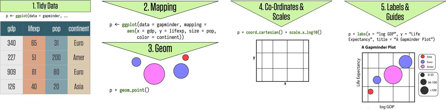
Figure 15.25: Schematics of the grammar of ggplot2 graphics [125]
The most important aspect of ggplot2 is the way it can be used to think about the logical structure of the plot. The code allows the user to explicitly state the connections between the variables and the plot elements that are seen on the screen – items such as points, colors, and shapes.
15.6.1.1 Geometries and Aesthetics
In ggplot2, the logical connections between the data and the plot elements are called aesthetic mappings, or simply aesthetics, referred to as an aes. After installing and loading the package, a plot is created by telling the ggplot() function what the data is, and how the variables in this data logically map onto the plot’s aesthetics.
The next step is to specify what sort of plot is desired (scatterplot, boxplot, bar chart, etc), also known as a geom (short for “plot geometry”). Each geom is created by a specific function:
geom_point()for scatterplotsgeom_bar()for barplotsgeom_boxplot()for boxplots,and so on.
These two components are combined, literally adding them together in an
expression, using the “+” symbol.
With these, ggplot2 has enough information to draw a plot – the
other components (see Figure 15.25) provide additional
design elements.
If no further details are specified, ggplot2 uses a set of sensible
default parameters; usually, however, the user will want to be more
specific about, say, the scales, the labels of legends and axes, and
other guides that can improve the plot readability.
These additional pieces are added to the plot in the same manner as the
geom_function() component, with specific arguments, again using the
“+” symbol. Plots are built systematically in this manner, piece by
piece.
Let’s look at some illustrative ggplot2 code:
library(ggplot2)
theme_set(theme_bw()) # use the black and white theme throughout
# artificial data:
d <- data.frame(x = c(1:8, 1:8), y = runif(16),
  group1 = rep(gl(2, 4, labels = c("a", "b")), 2),
  group2 = gl(2, 8))
head(d)
ggplot(data = d) + geom_point(aes(x, y, colour = group1)) +
  facet_grid(~group2)
  x         y group1 group2
1 1 0.1127019      a      1
2 2 0.2827586      a      1
3 3 0.6584831      a      1
4 4 0.3989820      a      1
5 5 0.4882841      b      1
6 6 0.6983144      b      1
This basic display call contains the following elements:
ggplot(): start an object and specify the datageom_point(): we want a scatter plot; this is called a “geom”aes(): specifies the “aesthetic” elements; a legend is automatically createdfacet_grid(): specifies the “faceting” or panel layout
Other components include statistics, scales, and annotation options. At a bare minimum, charts require a dataset, some aesthetics, and a geom, combined, as above, with “+” symbols.
This non-standard approach has the advantage of allowing ggplot2 plots to be proper R objects, which can modified, inspected, and re-used (and they are compatible with the tidyverse and pipeline operations).
ggplot2’s main plotting functions are qplot() and ggplot(); qplot() is short for “quick plot” and is meant to mimic the format of base R’s plot(); it requires less syntax for many common tasks, but has limitations – it’s essentially a wrapper for ggplot(), which is not itself that complicated to use. We will focus on this latter function.
15.6.1.2 Types of geoms
Whereas ggplot() specifies the data source and variables to be plotted, the various geom functions specify how these variables are to be visually represented (using points, bars, lines, and shaded regions).
There are currently 35+ available geoms. The tables below list the
more common ones, along with frequently used options (most of the graphs
shown in this report can be created using those geoms).
| Function | Adds | Options |
|---|---|---|
geom_bar() |
bar chart | color, fill, alpha |
geom_boxplot() |
boxplot | color, fill, alpha, notch, width |
geom_density() |
density plot | color, fill, alpha, linetype |
geom_histogram() |
histogram | color, fill, alpha, linetype, binwidth |
geom_hline() |
horizontal lines | color, alpha, linetype, size |
geom_line() |
jittered points | color, size, alpha, shape |
geom_jitter() |
line graph | color, alpha, linetype, size |
geom_point() |
scatterplot | color, alpha, shape, size |
geom_rug() |
rug plot | color, side |
geom_smooth() |
fitted line | method, formula, color, fill, linetype, size |
geom_text() |
text annotations | many; see the help for this function |
geom_violin() |
violin plot | color, fill, alpha, linetype |
geom_vline() |
vertical lines | color, alpha, linetype, size |
| Option | Specifies |
|---|---|
| color | colour of points, lines, and borders around filled regions |
| fill | colour of filled areas such as bars and density regions |
| alpha | transparency of colors, ranging from 0 (fully transparent) to 1 (opaque) |
| linetype | pattern for lines (1 = solid, 2 = dashed, 3 = dotted, 4 = dotdash, 5 = longdash, 6 = twodash) |
| size | point size and line width |
| shape | point shapes (same as pch, with 0 = open square, 1 = open circle, 2 = open triangle, and so on) |
| position | position of plotted objects such as bars and points. For bars, dodge'' places grouped bar charts side by side,stacked’’ vertically stacks grouped bar charts, and fill'' vertically stacks grouped bar charts and standardizes their heights to be equal; for points,jitter’’ reduces point overlap |
| binwidth | bin width for histograms |
| notch | indicates whether box plots should be notched (TRUE/FALSE) |
| sides | placement of rug plots on the graph (b'' = bottom,l’’ = left, t'' = top,r’’ = right, ``bl’’ = both bottom and left, and so on) |
| width | width of box plots |
As an example, the next bit of code produces a histogram of the heights of singers in the 1979 edition of the New York Choral Society (Figure and a display of height by voice part for the same data.
`stat_bin()` using `bins = 30`. Pick better value with `binwidth`.
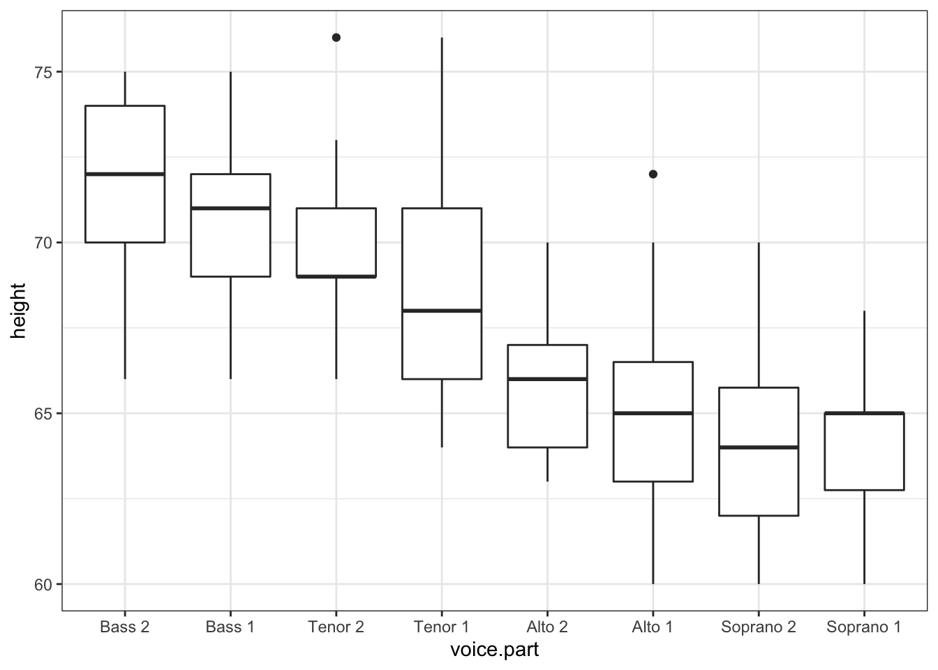
From the second of those (the boxplots), it appears that basses tend to be taller and sopranos tend to be shorter. Although the singers’ gender was not recorded, it probably accounts for much of the variation seen in the diagram.
Note that only the x variable (height) was specified when creating the histogram, but that both the x (voice part) and the y (height) variables were specified for the box plot – indeed, geom_histogram() defaults to counts on the \(y-\)axis when no y variable is specified (each function’s documentation contains details and additional examples, but there’s a lot of value to be found in playing around with data in order to determine the function’s behaviour).
Let’s examine the use of some of these options using the Salaries dataset, which contains information regarding the salaries of university professors collected during the 2008–2009 academic year. Variables include rank (AsstProf, AssocProf, Prof), sex (Female, Male), yrs.since.phd (years since Ph.D.), yrs.service (years of service), and salary (nine-month salary in US dollars).
Salaries=read.csv("data/Salaries.csv", head=TRUE)
library(ggplot2)
ggplot(Salaries, aes(x=rank, y=salary)) +
       geom_boxplot(fill="cornflowerblue",color="black", notch=TRUE) +
       geom_point(position="jitter", color="blue", alpha=.5) +
       geom_rug(sides="l", color="black")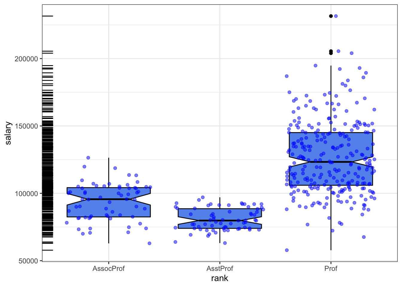
The ranks are out of order (the progression runs from assistant to associate to regular prof); as the salary usually increases with the rank, they can be re-ordered as follows:
Salaries=read.csv("data/Salaries.csv", head=TRUE)
library(ggplot2)
ggplot(Salaries, aes(x=reorder(rank, salary), y=salary)) +
       geom_boxplot(fill="cornflowerblue",color="black", notch=TRUE) +
       geom_point(position="jitter", color="blue", alpha=.5) +
       geom_rug(sides="l", color="black")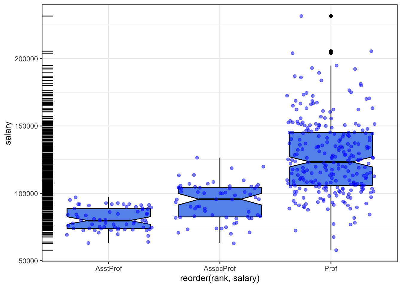
The chart displays notched boxplots of salary by academic rank. The actual observations (teachers) are overlaid and given some transparency so they don’t obscure the box plots. They’re also jittered to reduce their overlap. Finally, a rug plot is provided on the left to indicate the general spread of salaries. We see that the salaries of assistant, associate, and full professors differ significantly from each other (there is no overlap in the boxplot notches).
Additionally, the variance in salaries increases with greater rank, with a larger range of salaries for full professors. In fact, at least one full professor earns less than all assistant professors. There are also three full professors whose salaries are so large as to make them outliers (as indicated by the black dots in the boxplot to the right).
15.6.1.3 More about aes
Aesthetics refer to the displayed attributes of the data. They map the data to an attribute (such as the size or shape of a marker) and generate an appropriate legend. Aesthetics are specified with the aes() function.
The aesthetics available for geom_point(), as an example are:
xyalphacolorfillshapesize
Note that ggplot() tries to accommodate the user who’s never “suffered” through base graphics before by using intuitive arguments like color, size, and linetype, but ggplot() also accepts arguments such as col, cex, and lty. The ggplot2 documentation explains what aesthetic options exist for each geom (they’re generally self-explanatory).
Aesthetics can be specified within the data function or within a geom. If they’re specified within the data function then they apply to all specified geoms. Note the important difference between specifying characteristics like colour and shape inside or outside the aes() function: those inside it are assigned colour or shape automatically based on the data. If characteristics like colour or shape are defined outside the aes() function, then they will not be mapped to data.
The following example, using the mpg dataset, illustrates the difference:
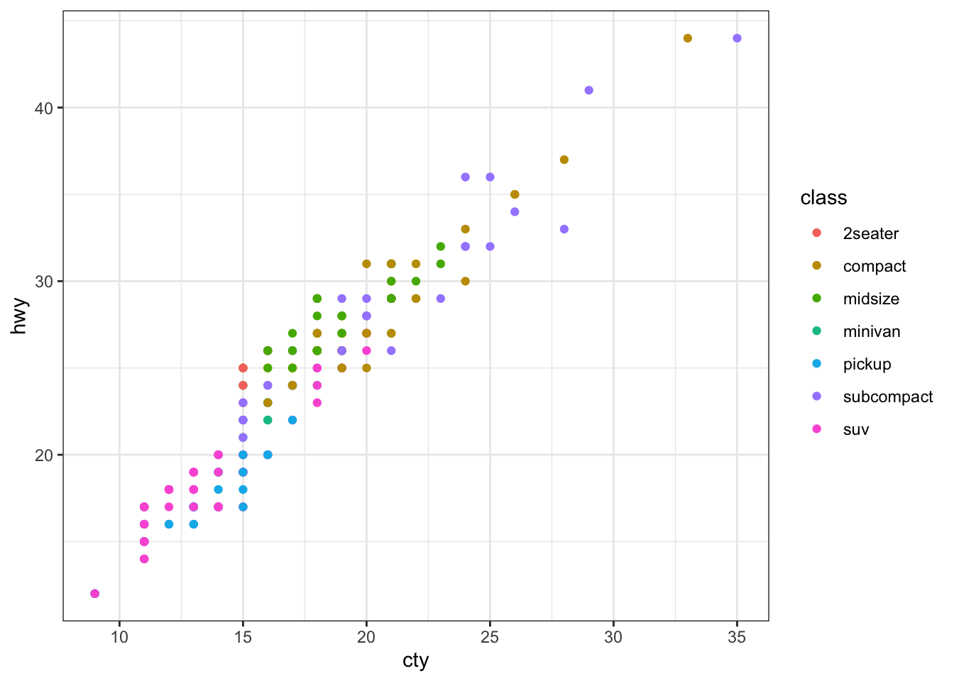
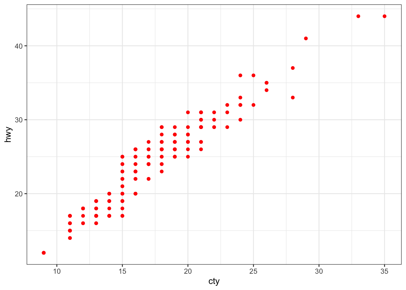
15.6.2 ggplot2 Miscellenea
A few other concepts will help take the basic ggplot2 charts to another level.
15.6.2.1 Facets
In ggplot2 parlance, small multiples (the same chart, but plotted for various subsets of the data) are referred to as facets.
There are two kinds:
facet_wrap()facet_grid()
The former plots the panels in the order of the factor levels – when it gets to the end of a column it wraps to the next column (the number of columns and rows can be specified with nrow and ncol). The grid layout facet_grid() produces a grid with explicit x and y positions; if there are no observations in some of the factor levels, it produces an empty plot.
By default, the panels all share the same \(x\) and \(y\) axes. Note, however, that the various \(y-\)axes are allowed to vary via facet_wrap(scales = "free_y"), and that all axes are allowed to vary via facet_wrap(scales = free).
To specify the data frame columns that are mapped to the rows and columns of the facets, separate them with a tilde. Usually, only a row or a column is fed to facet_wrap() (what happens if both are fed to that component?).
Going back to the choral example, a faceted graph can be produced using the following code:
data(singer, package="lattice")
library(ggplot2)
ggplot(data=singer, aes(x=height)) +
       geom_histogram() +
       facet_wrap(~voice.part, nrow=4)
`stat_bin()` using `bins = 30`. Pick better value with `binwidth`.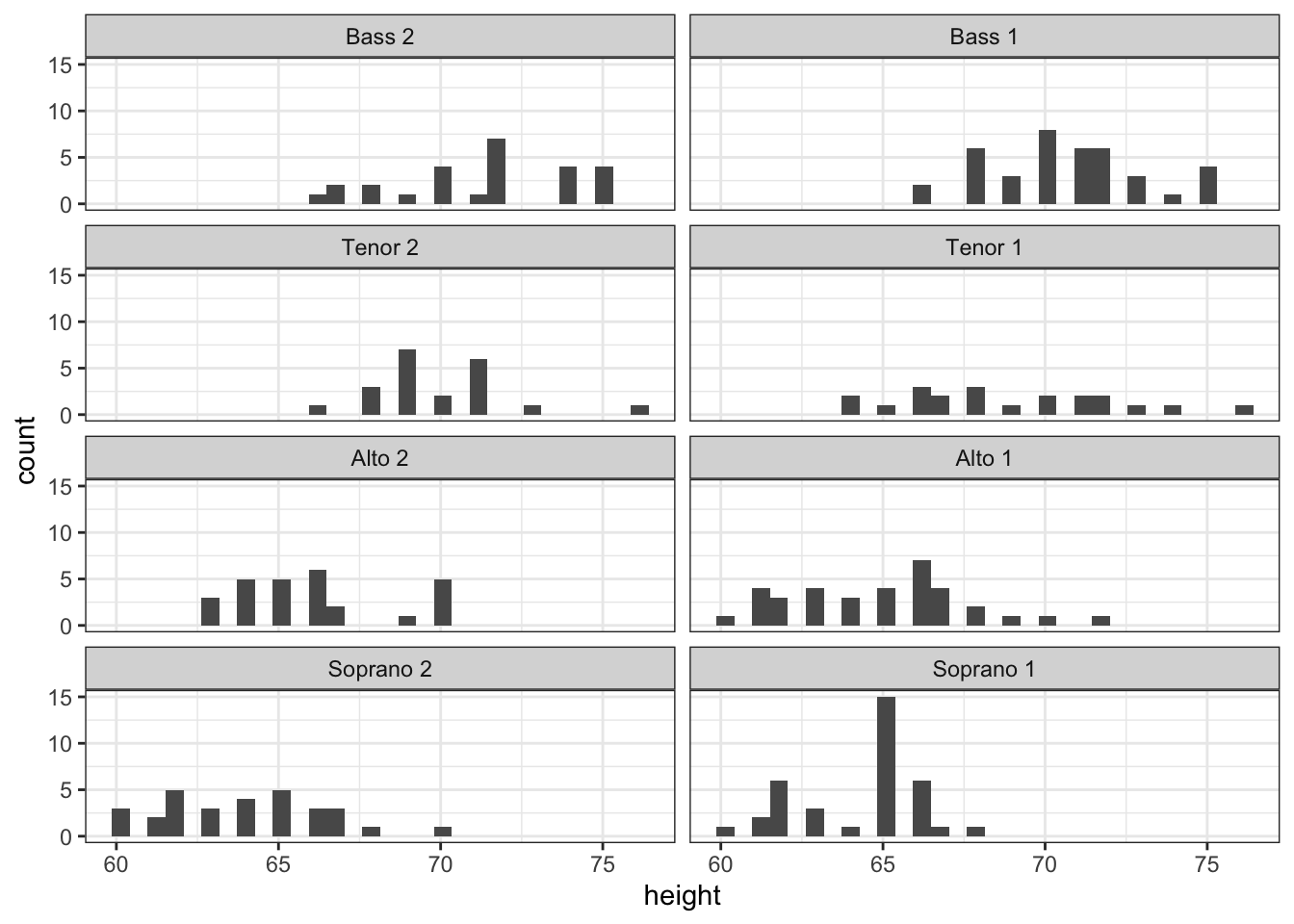
The resulting plot displays the distribution of singer heights by voice part. Separating the height distribution into their own small, side-by-side plots makes them easier to compare.
As a second example, let’s re-visit the Salaries dataset; it contains the same information, but separating the plot into facets makes it somewhat easier to read.
library(ggplot2)
ggplot(Salaries, aes(x=yrs.since.phd, y=salary, color=rank, shape=rank)) +
  geom_point() + facet_grid(.~sex)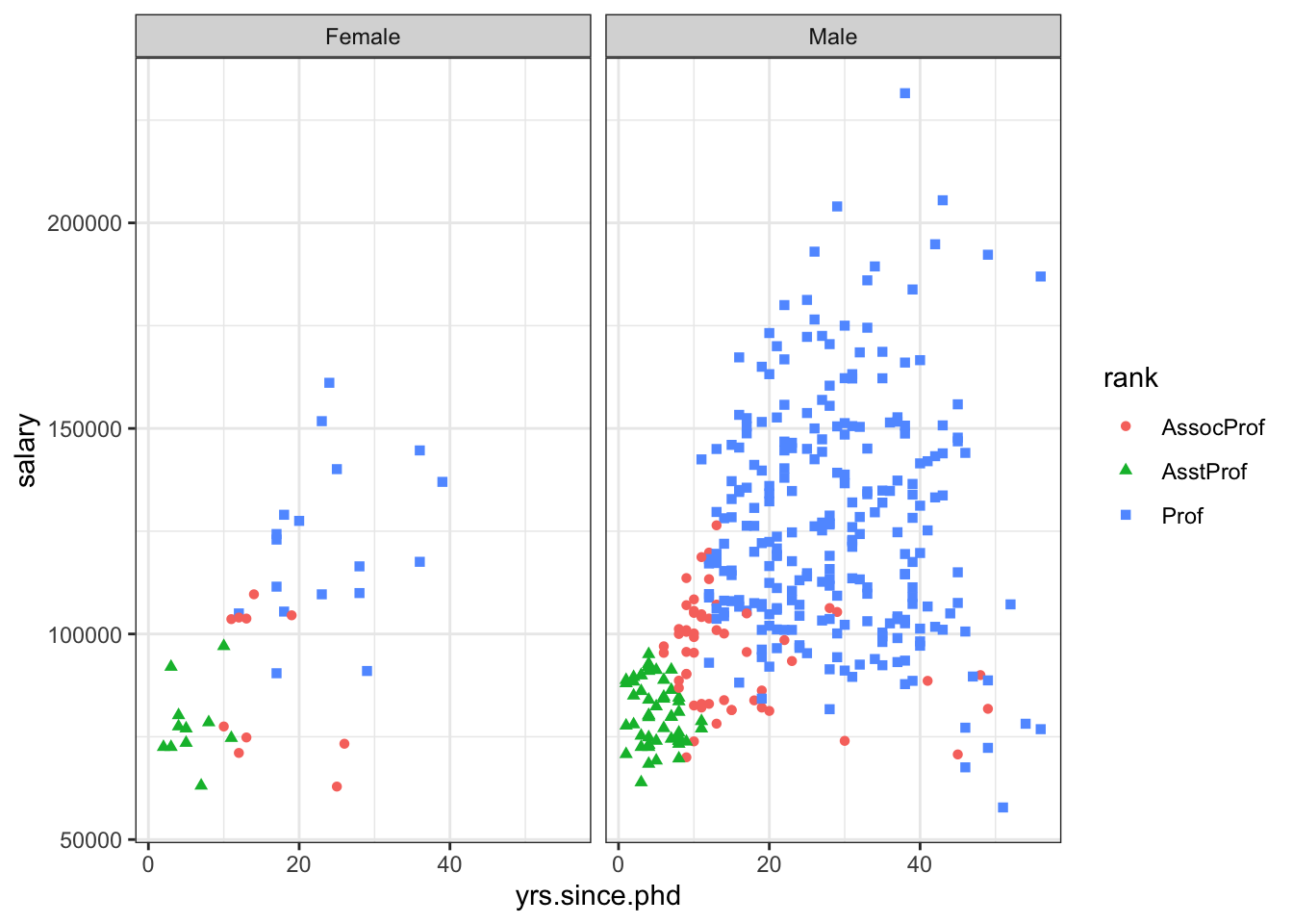
15.6.2.2 Multiple Graphs
In basic R, the graphic parameter mfrow and the base function layout() are used to combine two or more base graphs into a single plot. This approach will not work with plots created with the ggplot2 package, however.
The easiest way to place multiple ggplot2 graphs in a single figure is to use the grid.arrange() function found in the gridExtra package.
The following code places three ggplot2 charts based on the Salaries dataset onto a single graph.
library(ggplot2)
p1 <- ggplot(data=Salaries, aes(x=rank)) + geom_bar()
p2 <- ggplot(data=Salaries, aes(x=sex)) + geom_bar()
p3 <- ggplot(data=Salaries, aes(x=yrs.since.phd, y=salary)) + geom_point()

library(gridExtra)
grid.arrange(p1, p2, p3, ncol=3)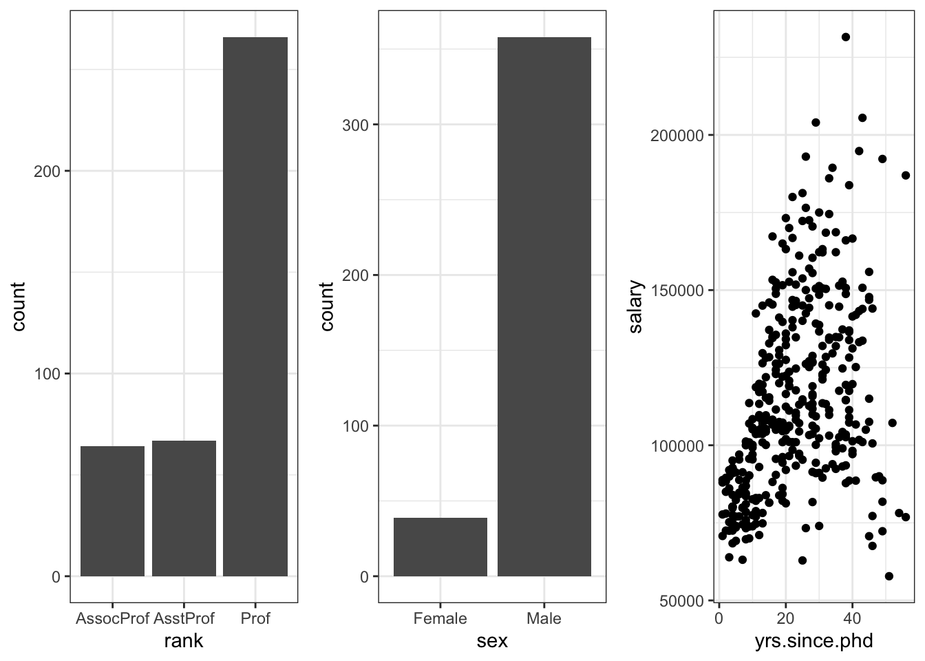
Each graph is saved as an object and then arranged into a single plot via grid.arrange(). Note the difference between faceting and multiple graphs: faceting creates an array of plots based on one or more categorical variables, but the components of a multiple graph could be completely independent plots arranged into a single display.
15.6.2.3 Themes
Themes allow the user to control the overall appearance of ggplot2 charts; theme() options are used to change fonts, backgrounds, colours, gridlines, and more. Themes can be used once or saved and applied to multiple charts.
library(ggplot2)
mytheme <- theme(plot.title=element_text(face="bold", size=14, color="brown"),
                 axis.title=element_text(size=10, color="brown"),
                 axis.text=element_text(size=9, color="black"),
                 panel.background=element_rect(fill="white",color="black"),
                 panel.grid.major.y=element_line(color="grey", linetype=1),
                 panel.grid.minor.y=element_line(color="grey", linetype=2),
                 panel.grid.minor.x=element_blank(),
                 legend.position="top")

ggplot(Salaries, aes(x=reorder(rank,salary), y=salary, fill=sex)) +
       geom_boxplot() +
       labs(title="Salary by Rank and Sex", x="Rank", y="Salary")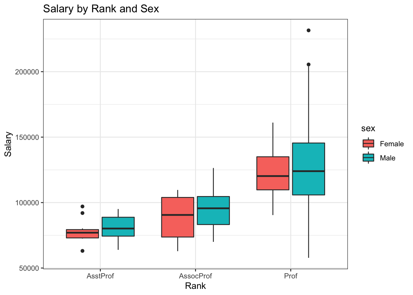
ggplot(Salaries, aes(x=reorder(rank,salary), y=salary, fill=sex)) +
       geom_boxplot() +
       labs(title="Salary by Rank and Sex", x="Rank", y="Salary") +
       mytheme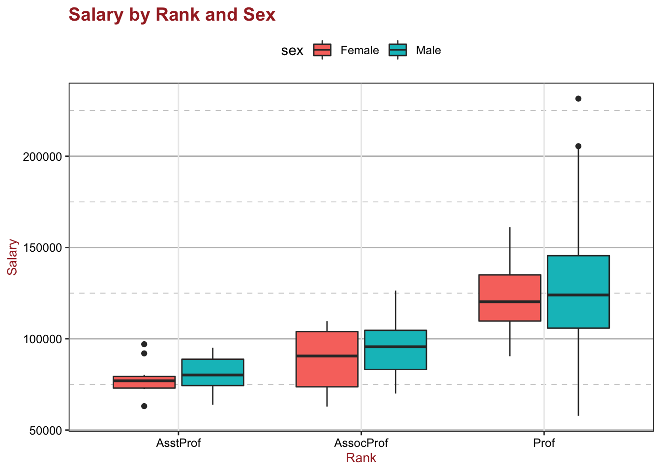
Adding + mytheme to the plotting statement generates the second graph; mytheme specifies that:
plot titles are printed in brown 14-point bold;
axis titles in brown 10-point;
axis labels in black 9-point;
the plot area should have a white fill and black borders;
major horizontal grids should be solid grey lines;
minor horizontal grids should be dashed grey lines;
vertical grids should be suppressed, and
the legend should appear at the top of the graph.
The theme() function allows great control over the look of the finished product (consult help(theme) to learn more about these options).
15.6.2.4 Tidy Data
ggplot2 is compatible with what is generally referred to as the tidyverse [126]. Social scientists will likely be familiar with the distinction between data in wide format and in long format:
in a long format table, every column represents a variables, and every row an observation,
whereas in a wide format table, some variables are spread out across columns, perhaps along some other characteristic such as the year, say.
The plots that have been produced so far were simple to create because the data points were given in the format of one observation per row which we call a “tall” format. But many datasets come in a “wide” format, i.e. there is more than one observation – more than one point on the scatterplot – in each row.
Consider, for instance, the WorldPhones dataset, one of R’s built-in dataset:
| N.Amer | Europe | Asia | S.Amer | Oceania | Africa | Mid.Amer | |
|---|---|---|---|---|---|---|---|
| 1951 | 45939 | 21574 | 2876 | 1815 | 1646 | 89 | 555 |
| 1956 | 60423 | 29990 | 4708 | 2568 | 2366 | 1411 | 733 |
| 1957 | 64721 | 32510 | 5230 | 2695 | 2526 | 1546 | 773 |
| 1958 | 68484 | 35218 | 6662 | 2845 | 2691 | 1663 | 836 |
| 1959 | 71799 | 37598 | 6856 | 3000 | 2868 | 1769 | 911 |
| 1960 | 76036 | 40341 | 8220 | 3145 | 3054 | 1905 | 1008 |
| 1961 | 79831 | 43173 | 9053 | 3338 | 3224 | 2005 | 1076 |
This dataset records the number of telephones, in thousands, on each continent for several years in the 1950s.
Each column represents a different continent, and each row represents a different year. This wide format seems like a reasonable way to store data, but suppose that we want to compare increases in phone usage between continents, with time on the horizontal axis. In that case, each point on the plot is going to represent a continent during one year – there are seven observations in each row, which makes it very difficult to plot using ggplot2.
Fortunately, the tidyverse provides an easy way to convert this wide dataset into a tall dataset, by melting the data. This can be achieved by loading a third-party package called reshape2. The WorldPhones dataset can now be melted from a wide to a tall dataset with the melt() function. Let’s assign the new, melted data to an object called WorldPhones.m (where the m reminds us that the data has been melted).
  Var1   Var2 value
1 1951 N.Amer 45939
2 1956 N.Amer 60423
3 1957 N.Amer 64721
4 1958 N.Amer 68484
5 1959 N.Amer 71799
6 1960 N.Amer 76036
'data.frame':   49 obs. of  3 variables:
 $ Var1 : int  1951 1956 1957 1958 1959 1960 1961 1951 1956 1957 ...
 $ Var2 : Factor w/ 7 levels "N.Amer","Europe",..: 1 1 1 1 1 1 1 2 2 2 ...
 $ value: num  45939 60423 64721 68484 71799 ...
Notice that while there were originally seven columns, there are now only three: Var1, Var2, and value:
Var1represents the year;Var2the continents, andvaluethe number of phones.
Every data cell – every observation – every number of phones per year per continent – in the original dataset now has its own row in the melted dataset.
In 1951, in North America, for instance, there were 45,939,000 phones, which is the same value as in the original unmelted data – the data has not changed, it just got reshaped.
Changing the column names might make the data more intuitive to read:
  Year Continent Phones
1 1951    N.Amer  45939
2 1956    N.Amer  60423
3 1957    N.Amer  64721
4 1958    N.Amer  68484
5 1959    N.Amer  71799
6 1960    N.Amer  76036
Now that the data has been melted into a tall dataset, it is easy to create a plot with ggplot2, with the usual steps of a ggplot() call, but with WorldPhones.m instead of WorldPhones:
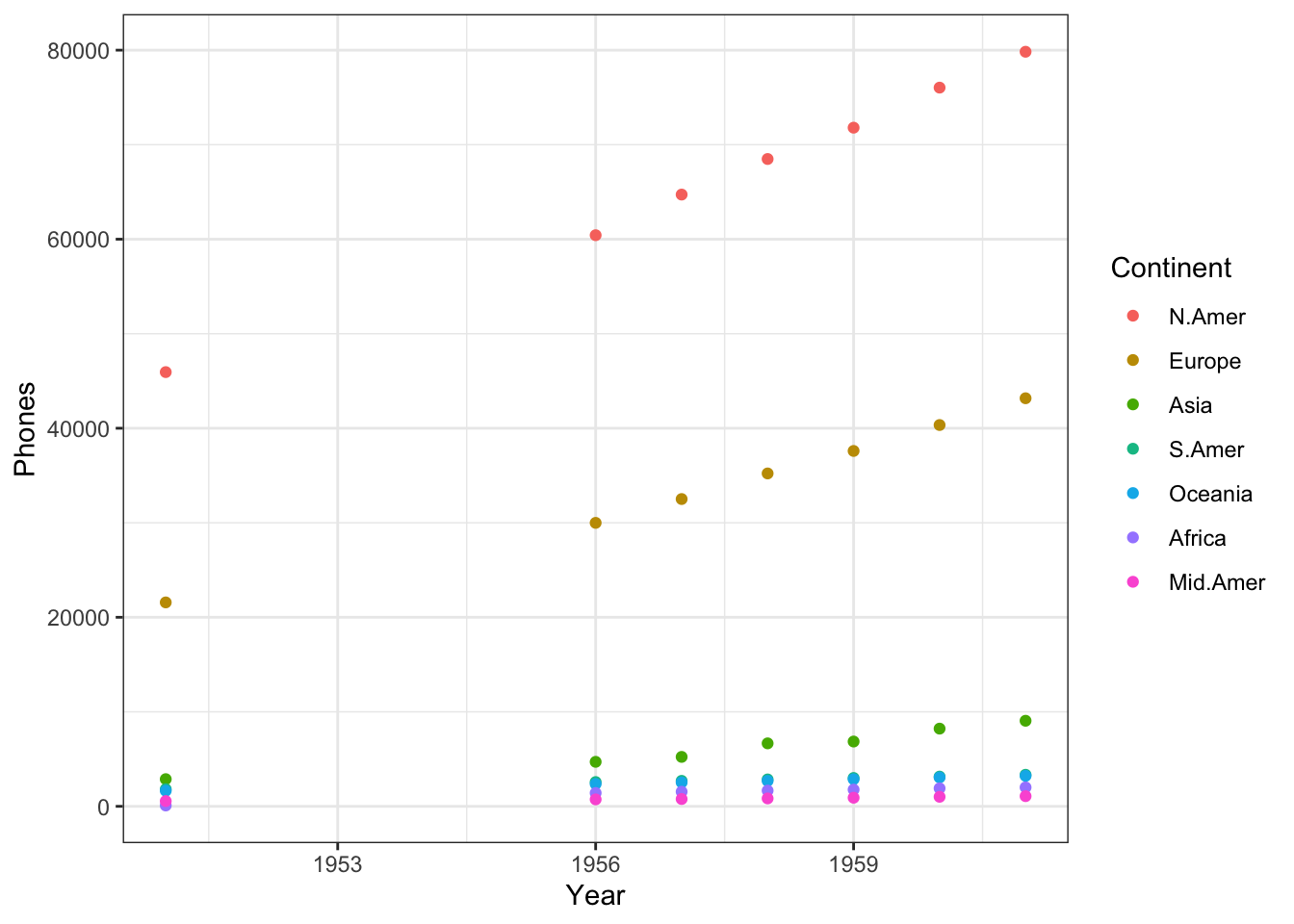
We place the Year on the \(x-\)axis, in order to see how the numbers change over time, while the number of Phones (the variable of interest) is displayed on the \(y-\)axis. The Continent factor will be represented with colour. A scatterplot is obtained by adding a geom_point() layer.
Scatterplots can also be used to show trends over time, by drawing lines between points for each continent. This only require a change to a geom_line() layer.
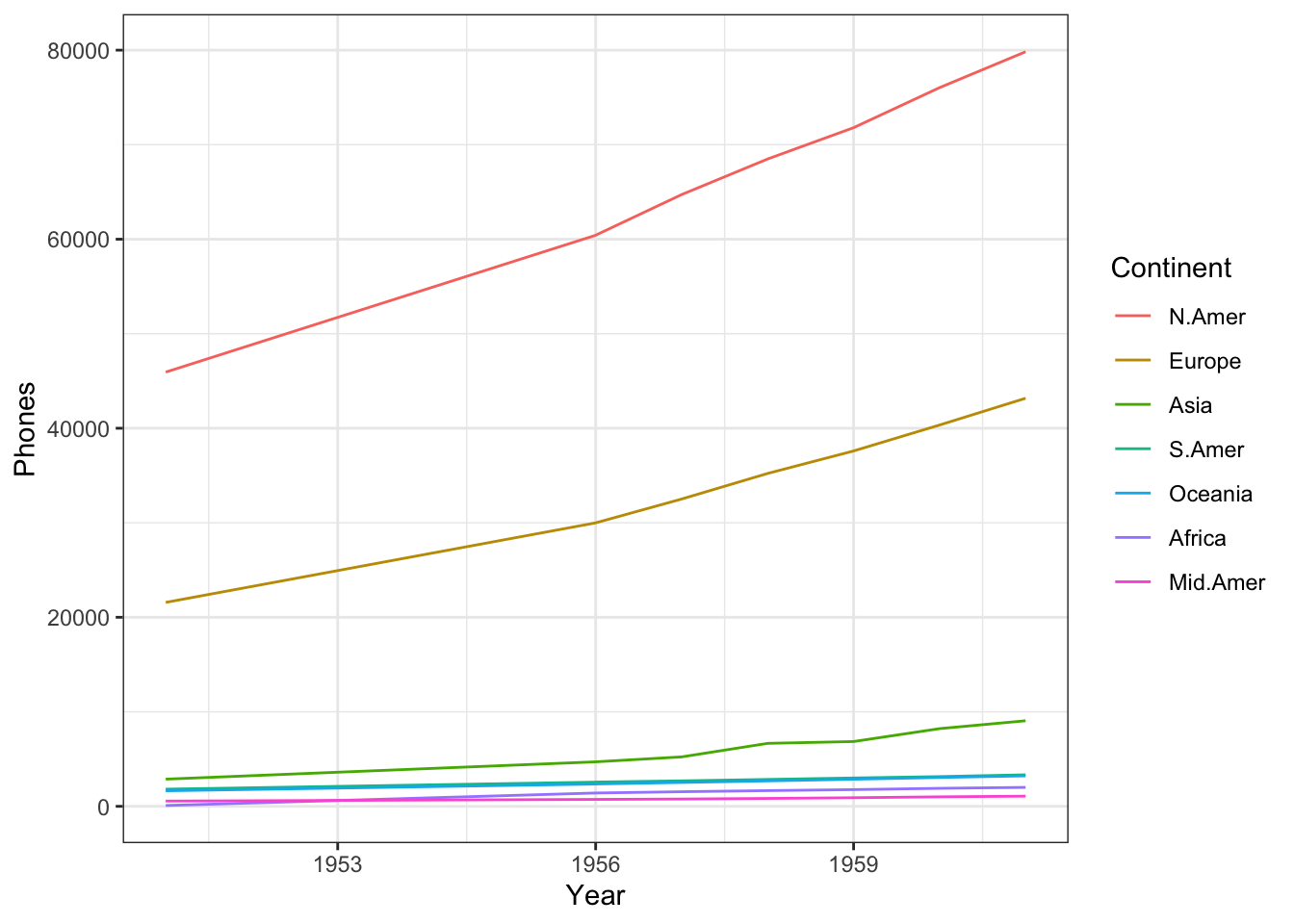
Incidentally, one might expect the number of phones to increase exponentially over time, rather than linearly (a fair number of observations are clustered at the bottom of the chart).
When that’s the case, it’s a good idea to plot the vertical axis on a log scale. This can be done adding a logarithm scale to the chart.
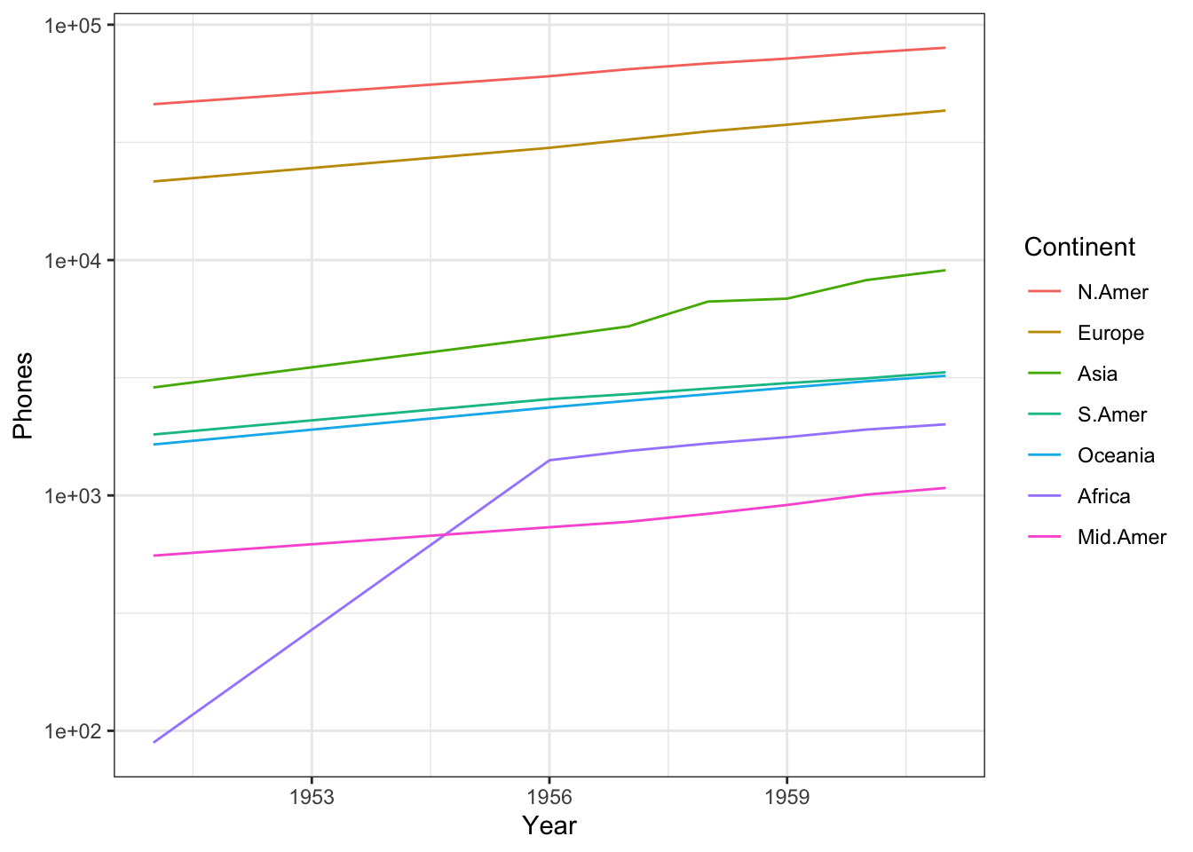
Now each of the phone trends looks linear, and the lower values are spotted more easily; for example, it is now clear that Africa has overtaken Central America by 1956.
Notice how easy it was to build this plot once the data was in the tall format: one row for every point – that’s every combination of year and continent – on the graph.
15.6.2.5 Saving Graphs
Plots might look great on the screen, but they typically have to be embedded in other documents (Markdown, LaTeX, Word, etc.). In order to do so, they must first be saved in an appropriate format, with a specific resolution and size.
Default size settings can be saved within the .Rmd document by declaring them in the first chunk of code. For instance, knitr::opts_chunk$set(fig.width=8, fig.height=5) would tell knitr to produce \(8\text{ in. } \times 5\text{ in. }\) charts.
Saving charts is quite convenient with ggsave(): options include which plot to save, where to save it, and in what format.
For example,
myplot <- ggplot(data=mtcars, aes(x=mpg)) + geom_histogram()
ggsave(file="mygraph.png", plot=myplot, width=5, height=4)
saves the myplot object as a 5-inch by 4-inch .png file named mygraph.png in the current working directory. The available formats include .ps, .tex, .jpeg, .pdf, .jpg, .tiff, .png, .bmp, .svg, or .wmf (the latter only being available on Windows machines).
Without the plot= option, the most recently created graph is saved. The following code, for instance, the following bit of code would also save the mtcars plot (the latest plot) to the current working directory (see the ggsave() helf file for additional details):
Within RStudio, an alternative is to click on Export, then Save Plot As Image to open a GUI.
15.6.2.6 Summary
While ggplot2 and the tidyverse have proven popular and user-friendly, they do come with some drawbacks, however: the ggplot2 and tidyverse design teams have fairly strong opinions about how data should be visualized and processed. As a result, it can sometimes be difficult to produce charts that go against their design ideals. In the same vein, some package updates have been known not to always preserve the functionality of working code, sending the analysts scurrying to figure how the new functions work, which can cause problems with legacy code (although that can prove annoying, it really rests on the analysts to update code regularly). Still, the versatility and overall simplicity of ggplot2 cannot be overstated.
The definitive ggplot2 reference is Wickham, Navarro, and Lin Pedersen’s ggplot2: Elegant Graphics for Data Analysis; it contains explanations and examples (some of which we borrowed from), as well as the underlying theory behind ggplot2.
Other useful examples and starting points can also be found in [125], [127].
The ggplot2 action flow is always the same: start with data in a table, map the display variables to various aesthetics (position, colour, shape, etc.), and select one or more geometries to draw the graph. This is accomplished in the code by first creating an object with the basic data and mappings information, and then by adding or layering additional information as needed.
Once this general way of thinking about plots is understood (especially the aesthetic mapping part), the drawing process is simplified significantly. There is no need to think about how to draw particular shapes or colours in the chart; the many (self-explanatory) geom_ functions do all the heavy lifting.
Similarly, learning how to use new geoms is easier when they are viewed as ways to display specific aesthetic mappings.
15.6.3 Examples
In this section, we provide a copious number of examples, which also highlight various aspects of ggplot2 that we did not touch upon in the explanations.
The vast majority of these examples have been modified from already existing references; we have strived to cite the references when the required information was still extent.50
15.6.3.1 Algae Bloom Data
This example is based off of L. Torgo’s excellent Data Mining with R Learning with Case Studies, Second Edition.
The ability to monitor and perform early forecasts of various river algae blooms is crucial to control the ecological harm they can cause.
The dataset which is used to train the learning model consists of:
chemical properties of various water samples of European rivers
the quantity of seven algae in each of the samples, and
the characteristics of the collection process for each sample.
It is available in the algae_blooms.csv, or from Torgo’s DMwR package.
We can get an idea of the data frame’s structure by calling the str function.
'data.frame':   340 obs. of  18 variables:
 $ season: chr  "winter" "spring" "autumn" "spring" ...
 $ size  : chr  "small" "small" "small" "small" ...
 $ speed : chr  "medium" "medium" "medium" "medium" ...
 $ mxPH  : num  8 8.35 8.1 8.07 8.06 8.25 8.15 8.05 8.7 7.93 ...
 $ mnO2  : num  9.8 8 11.4 4.8 9 13.1 10.3 10.6 3.4 9.9 ...
 $ Cl    : num  60.8 57.8 40 77.4 55.4 ...
 $ NO3   : num  6.24 1.29 5.33 2.3 10.42 ...
 $ NH4   : num  578 370 346.7 98.2 233.7 ...
 $ oPO4  : num  105 428.8 125.7 61.2 58.2 ...
 $ PO4   : num  170 558.8 187.1 138.7 97.6 ...
 $ Chla  : num  50 1.3 15.6 1.4 10.5 ...
 $ a1    : num  0 1.4 3.3 3.1 9.2 15.1 2.4 18.2 25.4 17 ...
 $ a2    : num  0 7.6 53.6 41 2.9 14.6 1.2 1.6 5.4 0 ...
 $ a3    : num  0 4.8 1.9 18.9 7.5 1.4 3.2 0 2.5 0 ...
 $ a4    : num  0 1.9 0 0 0 0 3.9 0 0 2.9 ...
 $ a5    : num  34.2 6.7 0 1.4 7.5 22.5 5.8 5.5 0 0 ...
 $ a6    : num  8.3 0 0 0 4.1 12.6 6.8 8.7 0 0 ...
 $ a7    : num  0 2.1 9.7 1.4 1 2.9 0 0 0 1.7 ...
Evidently, algae_blooms is a data frame with 340 observations of 18 variables each.
We’ve seen that basic histograms can be constructed with the hist function. For instance, the histogram of mnO2 measurements is:
Let’s spruce up this histogram with ggplot2.
library(ggplot2)
ggplot(algae_blooms,aes(x=mnO2)) +        # plotting mnO2 from the algae_blooms dataset ...
    geom_histogram(aes(y=..density..)) +  # as a histogram, where the vertical axis is the density ...
    geom_density(color="blue") +          # on which will be layered a blue density curve ...
    geom_rug() +                          # and a rug (or comb) showing where the observations actually fall...
    ggtitle("Histogram of minimum value of O2 among 340 observations") + # with this title ...
    xlab("") +                                                           # no x axis label ...
    ylab("")                                                             # and no y axis label
`stat_bin()` using `bins = 30`. Pick better value with `binwidth`.
Let’s do the same for a1.
ggplot(algae_blooms,aes(x=a1)) +
    geom_histogram(aes(y=..density..)) +
    geom_density(color="red") +
    geom_rug() +
    ggtitle("Histogram of minimum value of a1 among 340 observations") +
    xlab("") +
    ylab("")
`stat_bin()` using `bins = 30`. Pick better value with `binwidth`.
The normal distribution is not a good fit for eitherof mnO2 or a1.
Now let’s take a look at some plots involving NH4.
ggplot(algae_blooms,aes(x=factor(0),y=NH4)) +   # plotting NH4 from the algae_blooms dataset ...
    geom_boxplot() +                            # as a boxplot ...
    geom_rug() +                                # with a rug on which the true values are shown ...
    geom_hline(aes(yintercept=mean(algae_blooms$NH4, na.rm=TRUE)), linetype=2, colour="pink") + # and a horizontal line showing where the mean NH4 value falls ...
    ylab("Ammonium (NH4+)") +
    xlab("") +
    scale_x_discrete(breaks=NULL)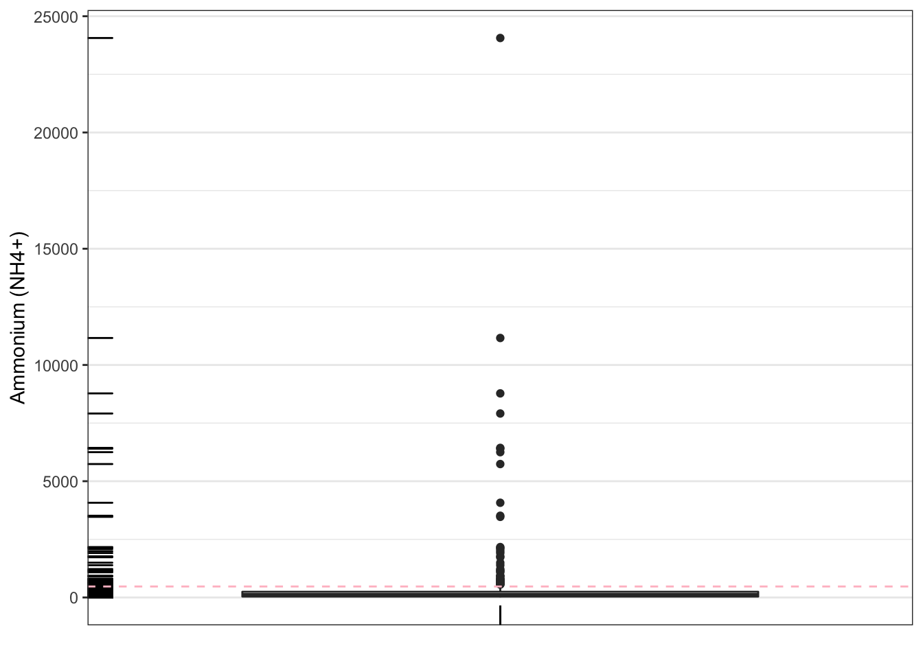
We don’t see much here because of the suspected outliers.
# scatter plot of NH4 against observation number
plot(algae_blooms$NH4, xlab="", ylab="Ammonium (NH4+)")

# mean value of NH4, solid line
abline(h=mean(algae_blooms$NH4, na.rm=TRUE), lty=1)

# mean + sd value of NH4, dashed line
abline(h=mean(algae_blooms$NH4, na.rm=TRUE) + sd(algae_blooms$NH4, na.rm=TRUE), lty=2)

# median value of NH4, tight dashed line
abline(h=median(algae_blooms$NH4, na.rm=TRUE), lty=3) 
We can also look at the data and see which observations have values of NH4 below 3000 (roughly all values below the long dashed line above).
Let’s see what the boxplot above looks like if we remove those.
ggplot(algae_blooms[-which(algae_blooms$NH4>3000),],aes(x=factor(0),y=NH4)) +
    geom_boxplot() +
    geom_rug() +
    geom_hline(aes(yintercept=mean(algae_blooms[-which(algae_blooms$NH4>3000),8],
                                   na.rm=TRUE)), linetype=2, colour="pink") +
    ylab("Ammonium (NH4+)") +
    xlab("") +
    scale_x_discrete(breaks=NULL)
It’s a bit better, to be sure (the box structure has expanded). There still seems to be a few very large values. Perhaps that is to be expected? How could we find out?
Now let’s take a look at some of the algae levels.
ggplot(algae_blooms,aes(x=season,y=a3)) +   # plot a3 by season ...
    geom_boxplot() +                        # in a series of boxplots ...
    xlab("Season") +                        # with x axis as Seasons and y axis as a3
    ylab("Algae Level a3")
We can re-arrange the factors’ order, but it requires a bit of fancy footwork using the forcats’library fct_relevel function, and dplyr’s mutate.
Attaching package: 'dplyr'The following object is masked from 'package:gridExtra':
combineThe following objects are masked from 'package:stats':
filter, lagThe following objects are masked from 'package:base':
intersect, setdiff, setequal, unionalgae_blooms = mutate(algae_blooms,
size=fct_relevel(size,c("small","medium","large")),
# factors should appear in the desired order
speed=fct_relevel(speed,c("low","medium","high")),
# ditto
season=fct_relevel(season,c("spring","summer","autumn","winter"))
# same here
)Notice the difference:
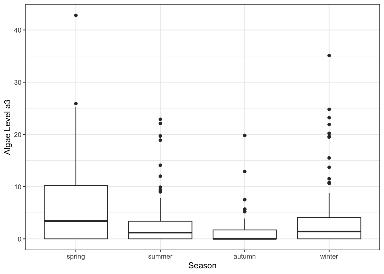
Violin plots are cousins to the boxplots. Can we get a bit more insight on the a3 trend, say?
ggplot(algae_blooms,aes(x=season,y=a3)) +  # plot a3 by season ...
    geom_violin() +                        # in a series of violin plots ...
    geom_jitter() +
    # with some jitter to avoid all the points being on top of one another ...
    xlab("Season") +
    ylab("Algae Level a3")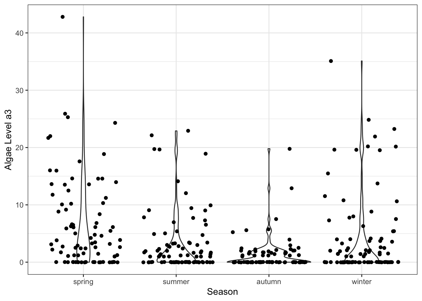
(What happens if the jitter option is turned off?)
Now, let’s take a look at possible interactions for NH4 and season. We only keep the observations for which NH4\(> 3000\), and we bin them with respect to the quartiles.
f.NH4.data <- filter(algae_blooms,!is.na(NH4)) %>%
    filter(NH4<3000) %>%
    mutate(q.NH4=cut(NH4,quantile(NH4,c(0,0.25,0.5,0.75,1)), include.lowest=TRUE))
The faceted chart is shown below – is there anything of interest in the chart? Anything surprising?
ggplot(f.NH4.data,aes(x=a1,y=season,color=season)) +
    geom_point() +
    facet_wrap(~q.NH4) +
    guides(color=FALSE) +
    ggtitle("Algae Level a1 by Season and Ammonium Quartiles NH4")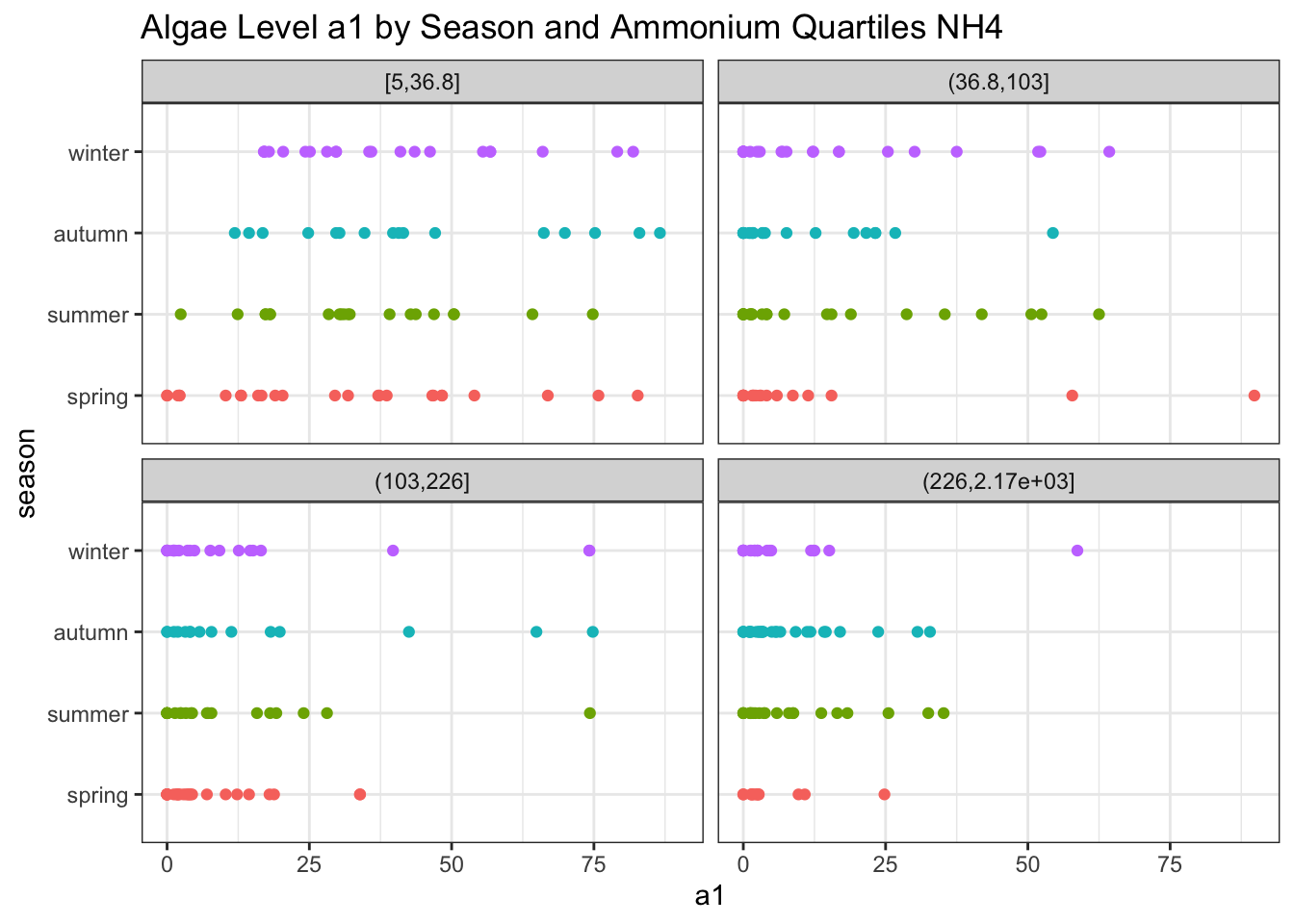
15.6.3.2 Gapminder
The Gapminder dataset is available in R. Irizarry’s dslabs package. We’ll show how to produce a chart such as the one in Figure @(fig:Gapminder12).
── Attaching packages ─────────────────────────────────────── tidyverse 1.3.1 ──✔ tibble 3.1.6 ✔ purrr 0.3.4
✔ tidyr 1.1.4 ✔ stringr 1.4.0
✔ readr 2.1.1 ── Conflicts ────────────────────────────────────────── tidyverse_conflicts() ──
✖ dplyr::combine() masks gridExtra::combine()
✖ dplyr::filter() masks stats::filter()
✖ dplyr::lag() masks stats::lag()gapminder_ds <- dslabs::gapminder # for the dataset
library(wesanderson) # for the colour palette
library(ggrepel) # for country names on chartWe start by getting a summary of the available data in the dslabs package, in particular the available years.
                country           year      infant_mortality life_expectancy
 Albania            :   57   Min.   :1960   Min.   :  1.50   Min.   :13.20
 Algeria            :   57   1st Qu.:1974   1st Qu.: 16.00   1st Qu.:57.50
 Angola             :   57   Median :1988   Median : 41.50   Median :67.54
 Antigua and Barbuda:   57   Mean   :1988   Mean   : 55.31   Mean   :64.81
 Argentina          :   57   3rd Qu.:2002   3rd Qu.: 85.10   3rd Qu.:73.00
 Armenia            :   57   Max.   :2016   Max.   :276.90   Max.   :83.90
 (Other)            :10203                  NA's   :1453
   fertility       population             gdp               continent
 Min.   :0.840   Min.   :3.124e+04   Min.   :4.040e+07   Africa  :2907
 1st Qu.:2.200   1st Qu.:1.333e+06   1st Qu.:1.846e+09   Americas:2052
 Median :3.750   Median :5.009e+06   Median :7.794e+09   Asia    :2679
 Mean   :4.084   Mean   :2.701e+07   Mean   :1.480e+11   Europe  :2223
 3rd Qu.:6.000   3rd Qu.:1.523e+07   3rd Qu.:5.540e+10   Oceania : 684
 Max.   :9.220   Max.   :1.376e+09   Max.   :1.174e+13
 NA's   :187     NA's   :185         NA's   :2972
             region
 Western Asia   :1026
 Eastern Africa : 912
 Western Africa : 912
 Caribbean      : 741
 South America  : 684
 Southern Europe: 684
 (Other)        :5586
Preparing the chart for 2012 would be a nice symmetry, but the version of the data that we have does not contain all the required information for that year, so we will pick 2009 instead, while setting the possibility of changing that year if required.
We will not be able to label all the countries in the chart; instead, we label only 20 of them, with probability of selection proportional to their population.
# sort the countries by inverse population
gapminder_ds <- gapminder_ds |>
  dplyr::arrange(year, dplyr::desc(population))

# select which countries will have their names labelled
num_countries <- 20

# tidyverse + ggplot2
filtered_gapminder <- gapminder_ds %>%
  filter(year==yr) %>%
  mutate(pop_m = population/1e6, gdppc=gdp/population)

weights <- filtered_gapminder$pop_m/sum(filtered_gapminder$pop_m)
p <- sample(nrow(filtered_gapminder), num_countries, prob = weights)

filtered_gapminder$country_display <- ifelse(ifelse(1:185 %in% p, TRUE,FALSE),as.character(filtered_gapminder$country),"")
The chart is then produced by the code below, using the Darjeeling1 colour palette from the wesanderson package.
filtered_gapminder %>%
  ggplot(aes(x = gdppc,
             y=life_expectancy,
             size=pop_m)) +
  geom_point(aes(fill=continent), pch=21) +
  scale_fill_manual(values=wes_palette(n=5, name="Darjeeling1")) +
  scale_x_log10() +
  geom_label_repel(aes(label=country_display, size=sqrt(pop_m/pi)),
                   alpha=0.9,
                   fontface="bold",
                   min.segment.length = unit(0, 'lines'),
                   show.legend=FALSE) +
  ggtitle(chart_title) +
  theme(plot.title = element_text(size=14, face="bold")) +
  xlab('log GDP per capita ($/year)') +
  ylab('Life expectancy (years)') +
  ylim(45,85) +
  scale_size_continuous(range=c(1,40),
                        breaks = c(1,10,100,1000),
                        limits = c(0, 1500),
                        labels = c("1","10","100","1000")) +
  guides(fill = guide_legend(override.aes = list(size = 5))) +
  labs(fill="Continent", size="Population (M)") +
  theme_bw() +
theme(plot.title = element_text(size=16, face="bold")) 
15.6.3.3 Minard’s March to Moscow
We recreate Minard’s famous March to Moscow chart, by following very closely the code provided in M. Friendly’s tutorial.
# from M. Friendly, York University

# getting the data
data(Minard.troops, Minard.cities, Minard.temp, package="HistData")

# required packages
library(ggplot2)
library(scales)        # additional formatting for scales
Attaching package: 'scales'The following object is masked from 'package:purrr':
discardThe following object is masked from 'package:readr':
col_factorlibrary(grid) # combining plots
library(gridExtra) # combining plots
library(dplyr) # tidy data manipulations
# the troops/cities upper chart
breaks <- c(1, 2, 3) * 10^5
plot.troops.cities <- Minard.troops %>%
ggplot(aes(long, lat)) +
geom_path(aes(size = survivors, colour = direction, group = group),
lineend="round") +
scale_size("Survivors", range = c(0,20),
breaks=breaks, labels=scales::comma(breaks)) +
scale_colour_manual("Direction",
values = c("#E80000", "#1F1A1B"),
labels=c("Advance", "Retreat")) +
ylim(53.8,56.0) + coord_cartesian(xlim = c(24, 38)) +
labs(x = NULL, y = NULL) + theme_bw() + guides(color = "none", size = "none") +
geom_point(data = Minard.cities, size=10, pch=22, color = "black", fill="gray") +
geom_label_repel(data = Minard.cities, aes(label = city),
size = 3, vjust = 0.5, alpha=0.8)
# replacing a missing value in the temperature data
Minard.temp$date = factor(Minard.temp$date, levels=c(levels(Minard.temp$date), "Unknown"))
Minard.temp$date[is.na(Minard.temp$date)] <- "Unknown"
# the temperature lower chart
plot.temp <- Minard.temp %>%
mutate(label = paste0(temp, "° ", date)) %>%
ggplot(aes(long, temp)) +
geom_path(color="grey", size=2, group=1) +
geom_point(size=1) +
geom_label_repel(aes(label=label), size=4) +
coord_cartesian(xlim = c(24, 38)) +
labs(x = NULL, y="Temperature") +
theme_bw() +
theme(panel.grid.major.x = element_blank(),
panel.grid.minor.x = element_blank(),
panel.grid.minor.y = element_blank(),
axis.text.x = element_blank(), axis.ticks = element_blank(),
panel.border = element_blank())
# combining both charts
grid.arrange(plot.troops.cities, plot.temp, nrow=2, heights=c(3.5, 1.2))
grid.rect(width = .95, height = .95, gp = gpar(lwd = 0, col = "white", fill = NA))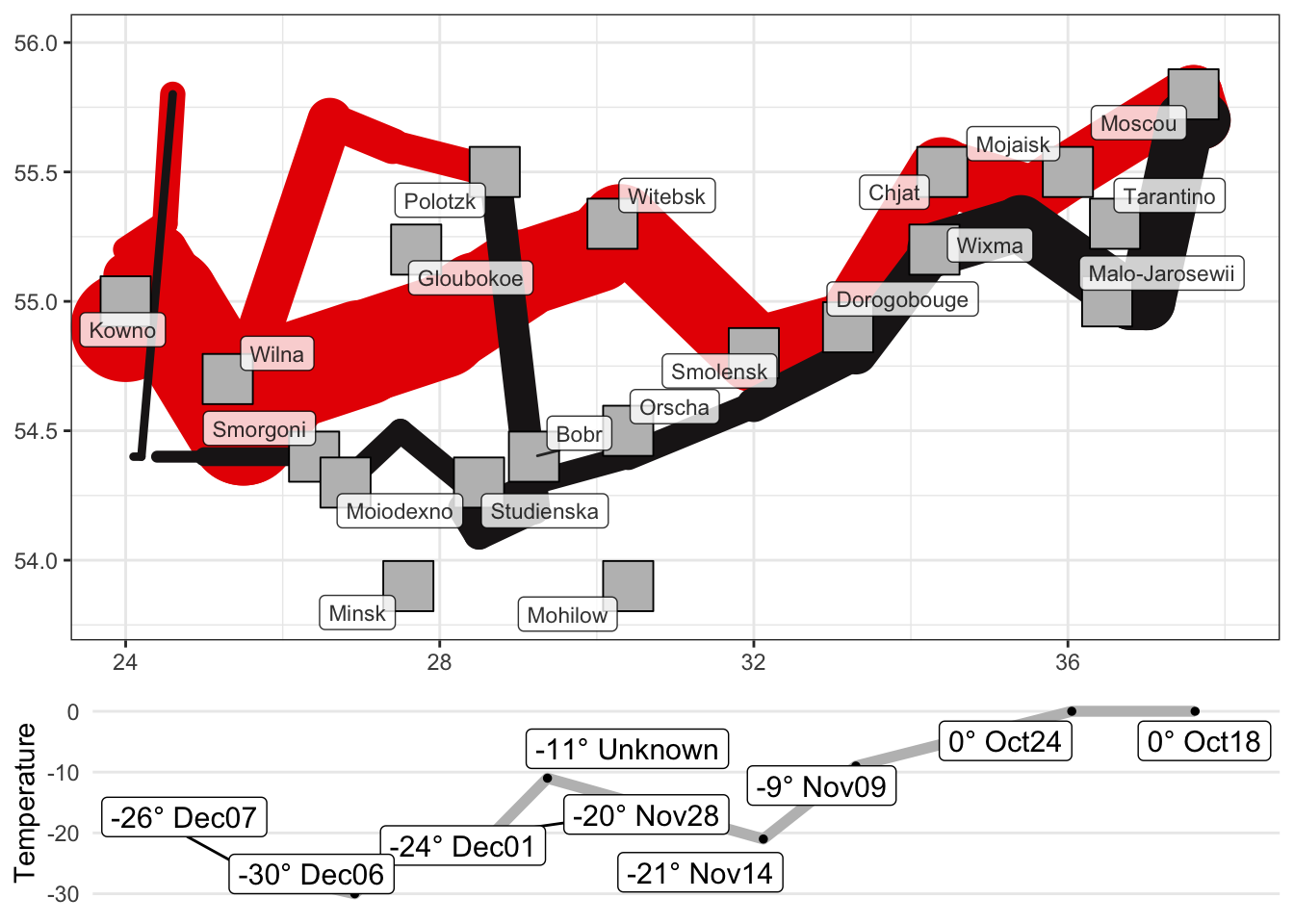 #### John Snow’s Cholera Outbreak Map {#DVJSCOM}
This chunk of code recreates John Snow’s historical map of the 1854 London cholera outbreak (adapted from V.B. Lanzetta’s R Data Visualization Recipes).
# getting the data and required  packages
data(Snow.streets, Snow.deaths, Snow.pumps, package="HistData")
library(ggplot2)
library(ggrepel)

# street map, death locations, water pump locations
ggplot(data = Snow.streets) +
  geom_path(aes(x = x, y = y, group = street)) +
  geom_point(data = Snow.deaths, aes(x = x, y=y, colour="black", shape="15")) +
  geom_point(data = Snow.pumps, aes(x = x, y=y, colour="red", shape="16"), size=4) +
  scale_colour_manual("Locations",
                      values = c("black","red"),
                      labels=c("deaths","water pumps")) +
  scale_shape_manual("Locations",
                      values = c(16,15),
                      labels=c("deaths","water pumps")) +
  geom_label_repel(data = Snow.pumps, aes(x=x, y=y, label=label),
                   colour="black", size=3, vjust=0.5, alpha=0.8) +
  ggtitle("John Snow's London Cholera Outbreak Map (1854)")  + theme_bw() +
  theme(plot.title = element_text(size=16, face="bold"),
        axis.title.x=element_blank(), axis.text.x=element_blank(), axis.ticks.x=element_blank(),
axis.title.y=element_blank(), axis.text.y=element_blank(), axis.ticks.y=element_blank()) 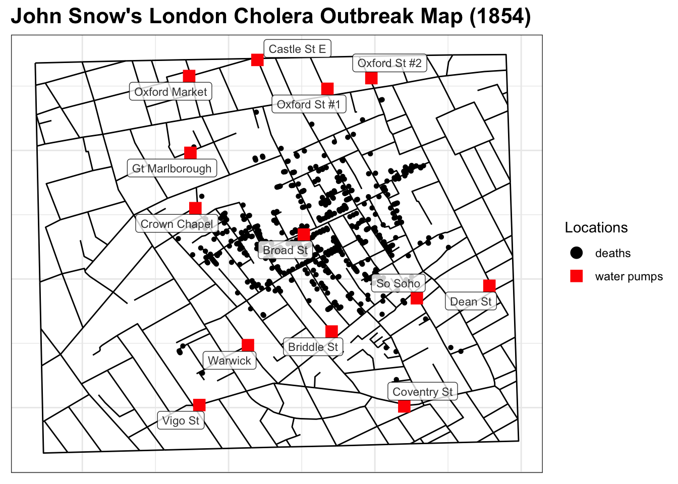
15.6.3.4 Census PUMS Data
The following example is taken from N. Zumel and J. Mount’s Practical Data Science with R.
The custdata.tsv file (in the data folder) is derived from U.S. Census PUMS data.
The business objective is to predict whether a customer has health insurance. This synthetic dataset contains customer information for individuals whose health insurance status is known.
We start by importing the data into a data frame using the read.delim() function (to handle the odd file format).
[1] "data.frame"
[1] 1000   11
  custid sex is.employed income  marital.stat health.ins
1   2068   F          NA  11300       Married       TRUE
2   2073   F          NA      0       Married       TRUE
3   2848   M        TRUE   4500 Never Married      FALSE
4   5641   M        TRUE  20000 Never Married      FALSE
5   6369   F        TRUE  12000 Never Married       TRUE
6   8322   F        TRUE 180000 Never Married       TRUE
                  housing.type recent.move num.vehicles age state.of.res
1     Homeowner free and clear       FALSE            2  49     Michigan
2                       Rented        TRUE            3  40      Florida
3                       Rented        TRUE            3  22      Georgia
4        Occupied with no rent       FALSE            0  22   New Mexico
5                       Rented        TRUE            1  31      Florida
6 Homeowner with mortgage/loan       FALSE            1  40     New York
We see that we have 1000 observations of 11 variables. We obtain a data summary via summary().
     custid            sex            is.employed         income
 Min.   :   2068   Length:1000        Mode :logical   Min.   : -8700
 1st Qu.: 345667   Class :character   FALSE:73        1st Qu.: 14600
 Median : 693403   Mode  :character   TRUE :599       Median : 35000
 Mean   : 698500                      NA's :328       Mean   : 53505
 3rd Qu.:1044606                                      3rd Qu.: 67000
 Max.   :1414286                                      Max.   :615000

 marital.stat       health.ins      housing.type       recent.move
 Length:1000        Mode :logical   Length:1000        Mode :logical
 Class :character   FALSE:159       Class :character   FALSE:820
 Mode  :character   TRUE :841       Mode  :character   TRUE :124
                                                       NA's :56


  num.vehicles        age        state.of.res
 Min.   :0.000   Min.   :  0.0   Length:1000
 1st Qu.:1.000   1st Qu.: 38.0   Class :character
 Median :2.000   Median : 50.0   Mode  :character
 Mean   :1.916   Mean   : 51.7
 3rd Qu.:2.000   3rd Qu.: 64.0
 Max.   :6.000   Max.   :146.7
 NA's   :56
Right off the bat, we see that there are some problems with the data (NAs, impossible ranges, etc.).
We can provide the number of NAs per variable using the following code block:
      custid          sex  is.employed       income marital.stat   health.ins
           0            0          328            0            0            0
housing.type  recent.move num.vehicles          age state.of.res
          56           56           56            0            0
The fact that three of the variables have the same number of missing values means that it is likely that there are 56 observations with no measurement for housing.type, recent.move, and num.vehicles, but that is no guarantee.
We still need to check (try it!).
As per the ranges, something is definitely fishy with income and age:
   Min. 1st Qu.  Median    Mean 3rd Qu.    Max.
  -8700   14600   35000   53505   67000  615000
   Min. 1st Qu.  Median    Mean 3rd Qu.    Max.
    0.0    38.0    50.0    51.7    64.0   146.7
What does it mean for incomes to be negative? For a customer to be 0 years old? Or worse, 146.7?
We use ggplot2 to visually explore the data. Note that:
the
ggplot()function works only on data frames (or tibbles)it does not create a graph, it creates an object
graphs are produced from layers, which are added to the object
aesthetics are the visual elements of the graph, e.g., the \(x\) and \(y\) variables, the size of markers, colors, etc.
We will start by providing a number of univariate visualizations, starting with the age variable.
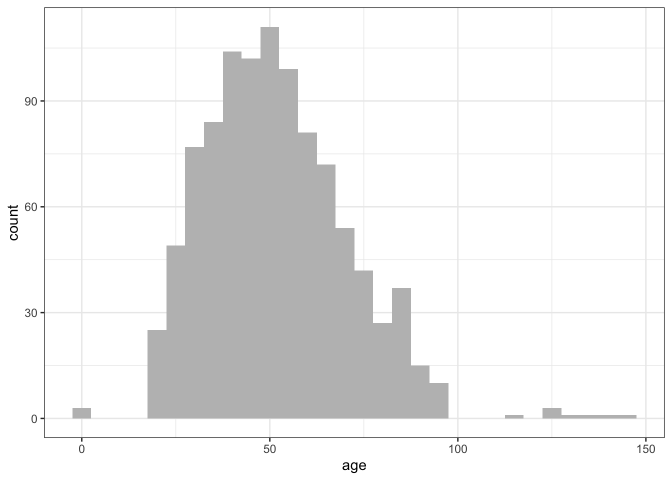
What happens if we use a different bin width?
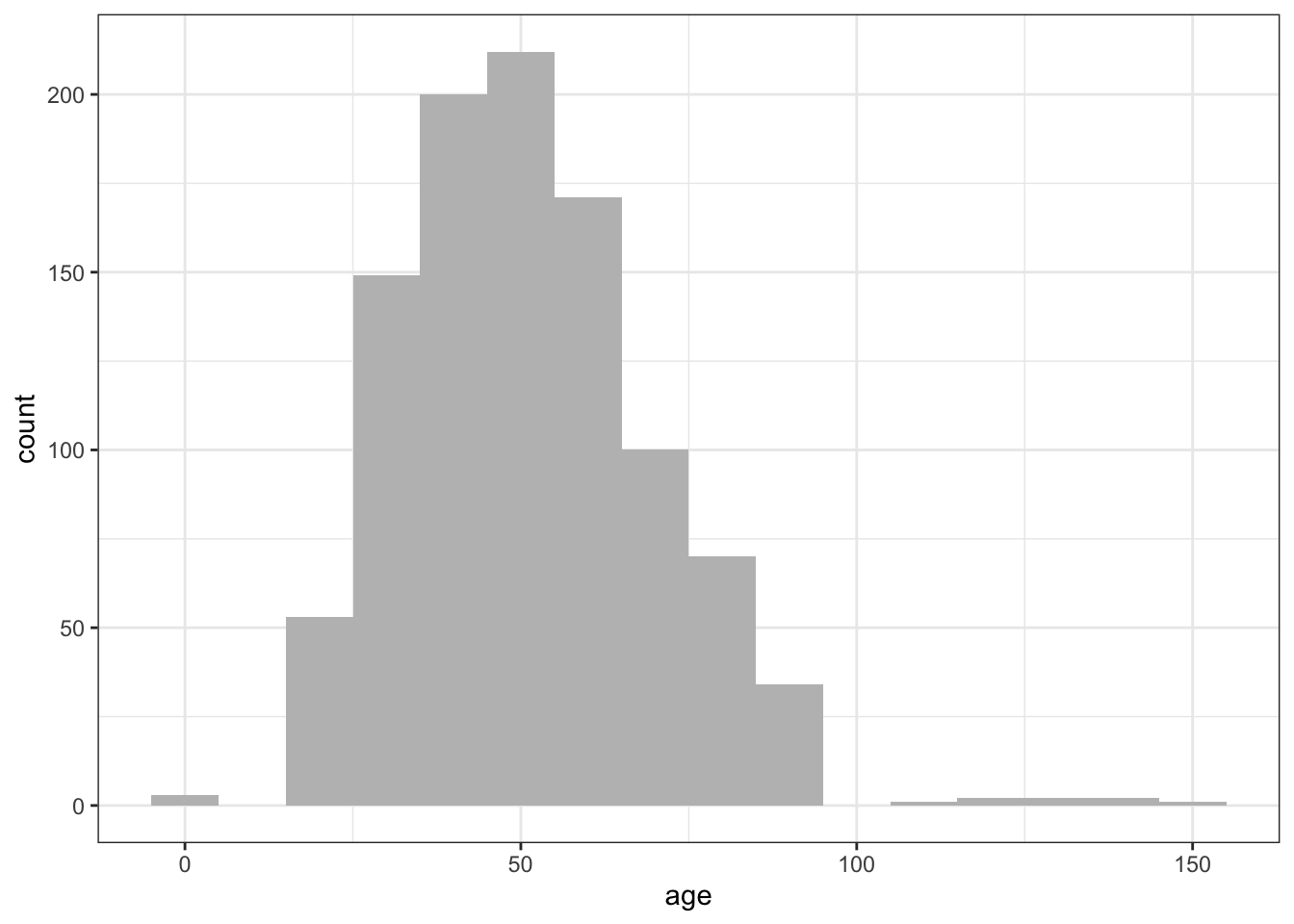
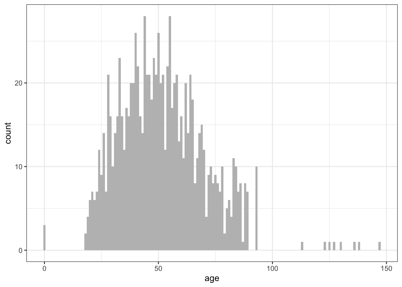
We can also get some (univariate) information about the income variable:
library(scales)
ggplot(df) + geom_histogram(aes(x=income), binwidth = 10000) + scale_x_continuous(labels=dollar)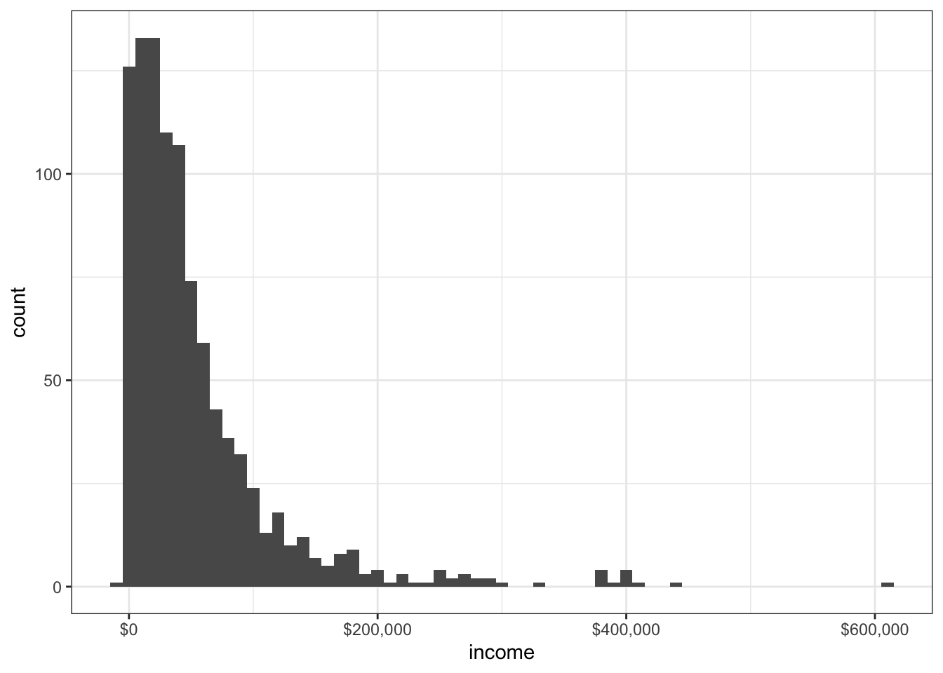
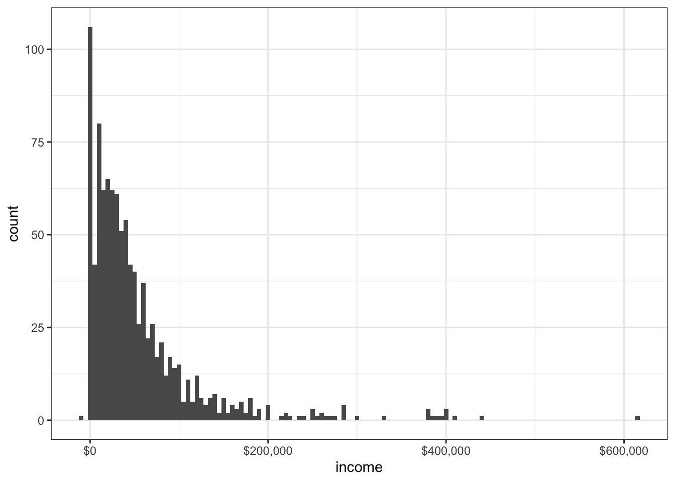
We have already seen that there are negative income values in the dataset. Let’s restrict the data to those customers with positive values, and display using a logarithmic scale.
df.2 <- subset(df, income > 0)
ggplot(df.2) +
    geom_histogram(aes(x=income), binwidth = 5000) +
scale_x_log10(breaks=10^(1:6), labels=dollar) 
Whoa, that’s … entirely useless. The problem here is that the binwidth refers to the powers, not the raw numbers.
ggplot(df.2) +
    geom_histogram(aes(x=income), binwidth = 0.05) +
scale_x_log10(breaks=10^(1:6), labels=dollar) 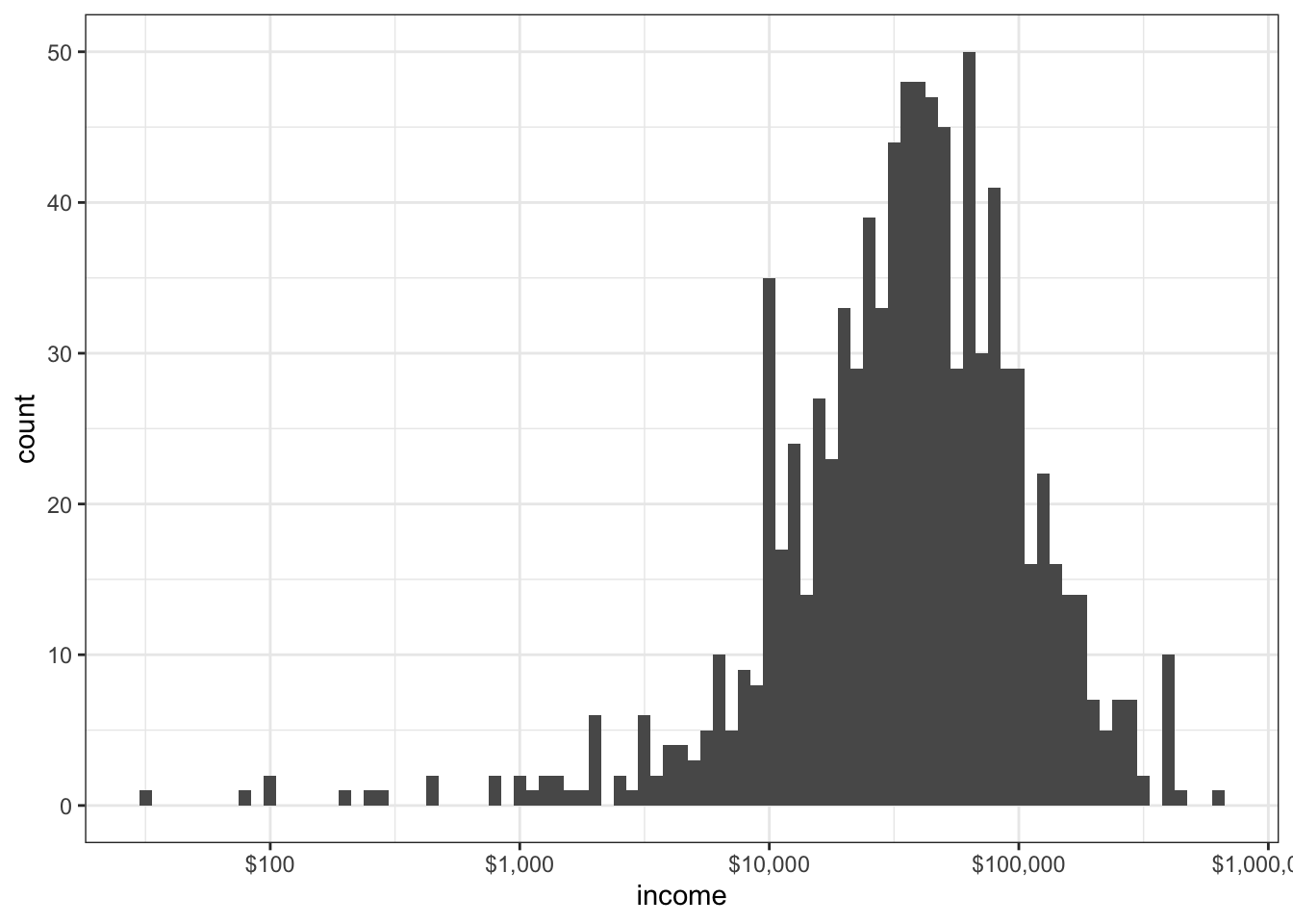
The density plot estimates the probability distribution function.
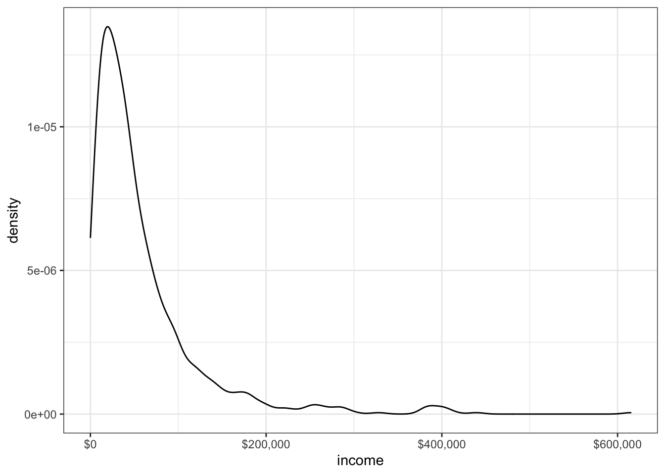
The tail is a bit long/heavy: it might be more useful to use a logarithmic scale.
# try logarithmic scale
ggplot(df.2) + geom_density(aes(x=income)) +
    scale_x_log10(breaks=10^(2:5), labels=dollar) +
    annotation_logticks()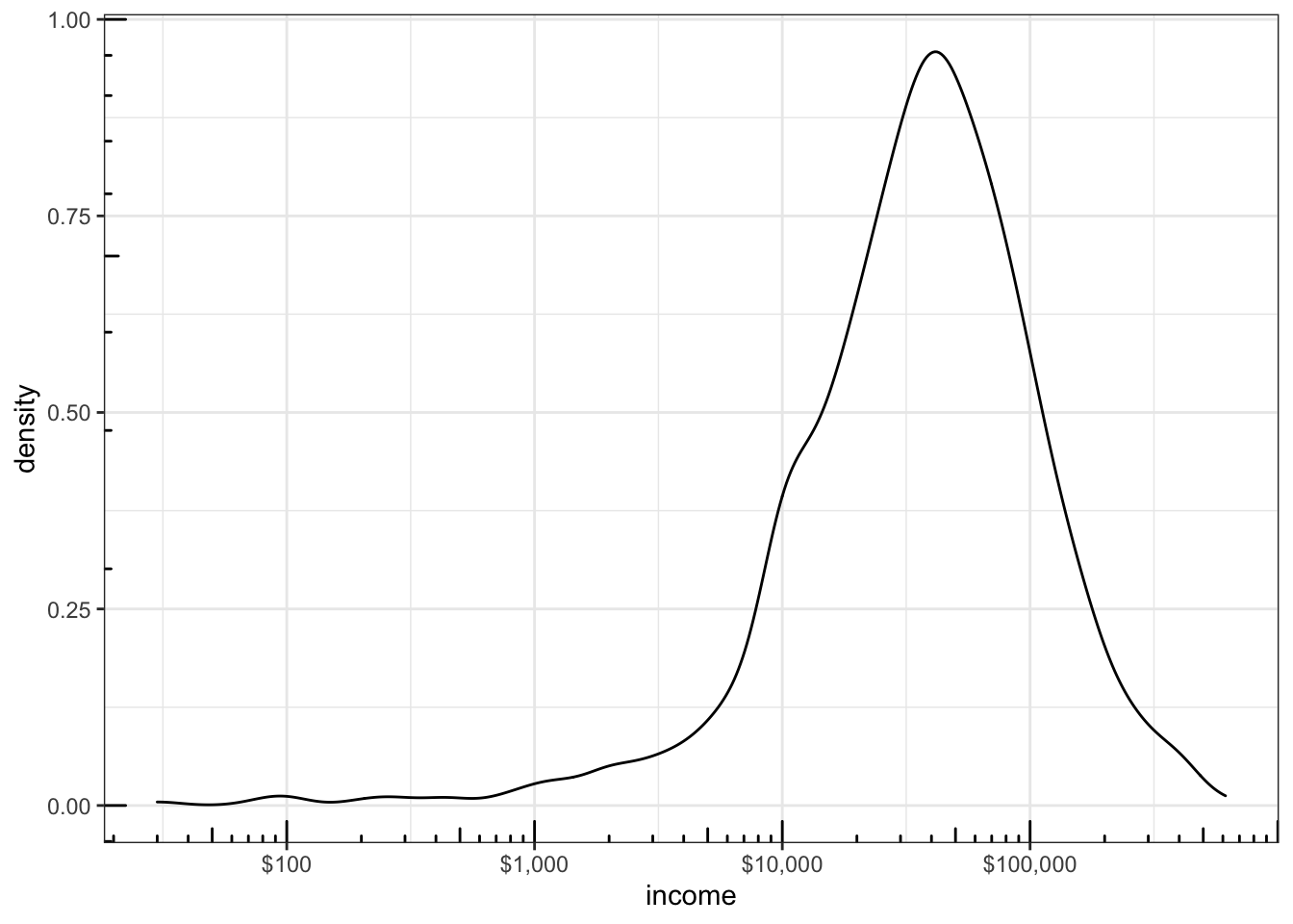
What can we say about the distribution of marital status?
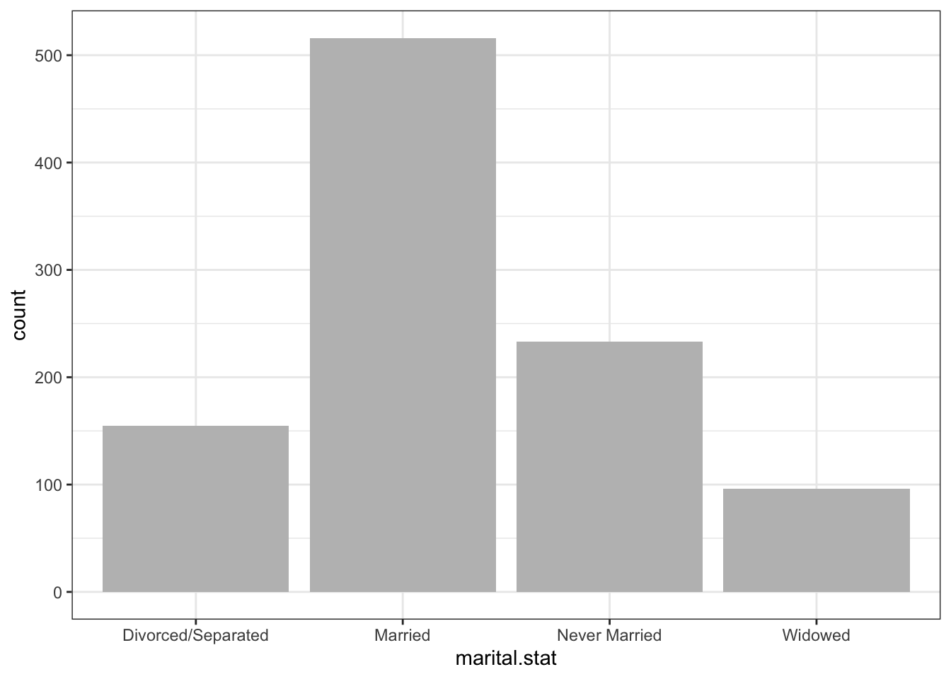
Nothing is too surprising so far (although, as mentionned, something is definitely off with the some age and some income measurements).
If we try to get information about a variable with 10+ levels (state.of.res), we see that the charts can get busy.
# same, but with a coordinate flip
ggplot(df) + geom_bar(aes(x=state.of.res), fill="gray") +
  coord_flip()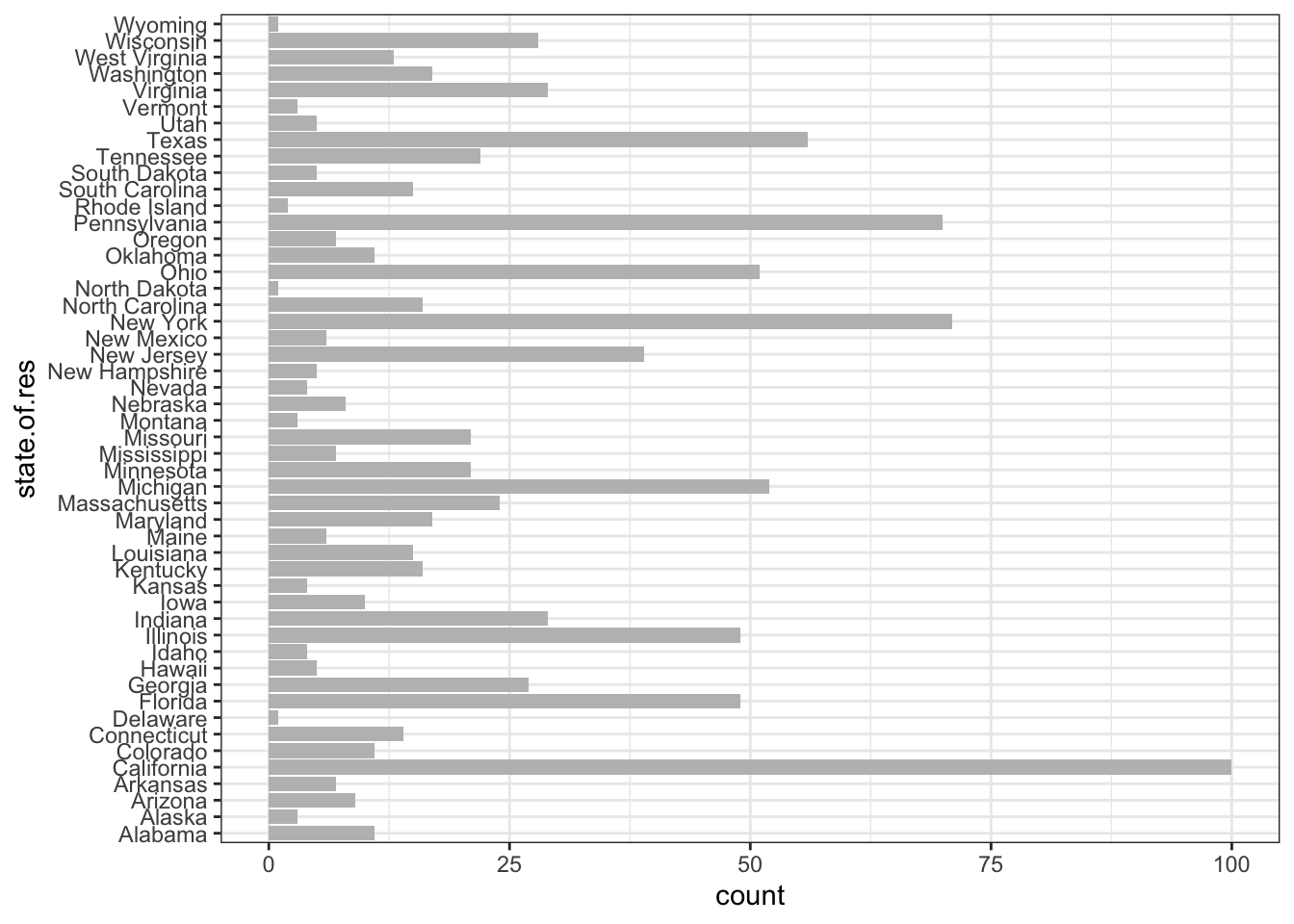
# same, but with text resizing for readibility
ggplot(df) + geom_bar(aes(x=state.of.res), fill="gray") +
  coord_flip() +
  theme(axis.text.y=element_text(size=rel(0.6)))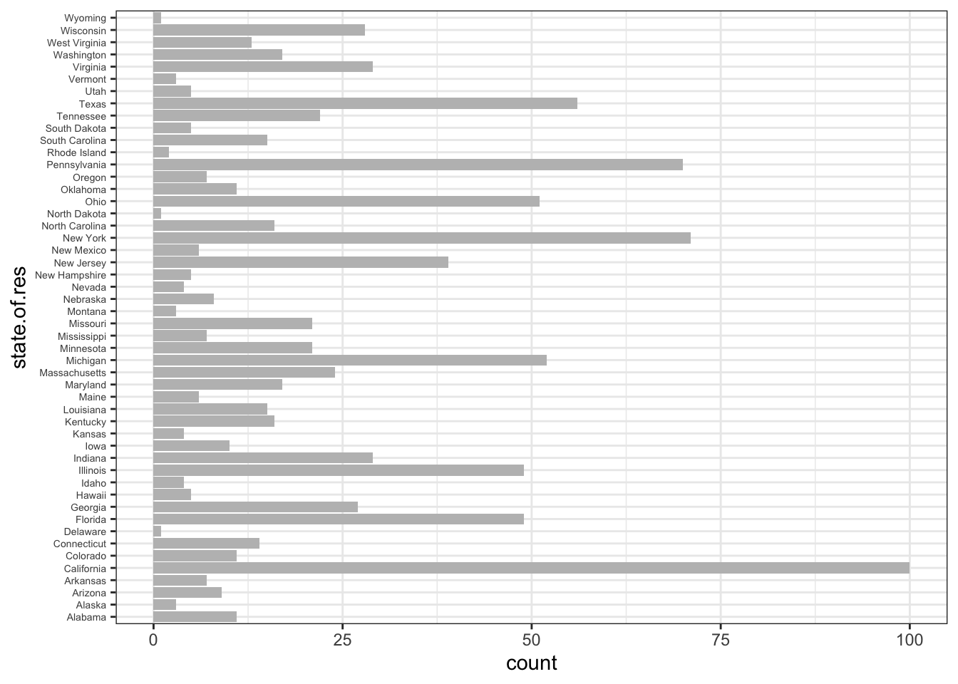
The flipped chart is clearly easier to read.
Currently, the chart displays the states ordered alphabetically; to order according to the number of observations in each state, we first need to modify the data using transform(), which will actually re-order the levels for state.of.res by population in the dataset (presumably the same order as in the US’ population).
tbl <- as.data.frame(table(df$state.of.res))
colnames(tbl) <- c("state.of.res", "count")
tbl <- transform(tbl, state.of.res=reorder(state.of.res, count))
ggplot(tbl) +
    geom_bar(aes(x=state.of.res, y=count), stat="identity") +
    coord_flip() +
theme(axis.text.y=element_text(size=rel(0.6))) 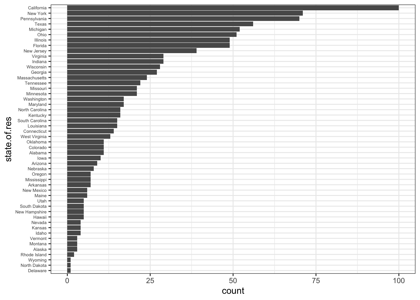
What is the average number of vehicles per customer in each state?
For instance, in Delaware and Alaska, it is:
with(df, mean(num.vehicles[state.of.res=="Delaware"], na.rm=TRUE))
with(df, mean(num.vehicles[state.of.res=="Alaska"], na.rm=TRUE))
[1] 2
[1] 2.333333(Note the na.rm=TRUE to avoid issues with computations involving observations with no measurement)
We could repeat the process 50 times (one for each state), or we could use either a Split/Apply/Combine approach (in Base R) or a a tidyverse approach (using plyr).
# split
pieces <- split(df, df$state.of.res)

# apply
result <- lapply(pieces, function(p) data.frame(
    state.of.res=p$state.of.res[[1]],
    state.avg.vehicles=mean(p$num.vehicles, na.rm=TRUE)
  )
)

result <- do.call("rbind", result)
rownames(result) <- c()
result
state.of.res state.avg.vehicles
1 Alabama 2.100000
2 Alaska 2.333333
3 Arizona 1.888889
4 Arkansas 1.833333
5 California 2.098901
6 Colorado 1.636364
7 Connecticut 2.000000
8 Delaware 2.000000
9 Florida 1.866667
10 Georgia 1.708333
11 Hawaii 1.750000
12 Idaho 1.666667
13 Illinois 2.183673
14 Indiana 2.000000
15 Iowa 2.000000
16 Kansas 1.750000
17 Kentucky 1.933333
18 Louisiana 1.533333
19 Maine 2.200000
20 Maryland 2.750000
21 Massachusetts 1.833333
22 Michigan 1.843137
23 Minnesota 2.350000
24 Mississippi 1.500000
25 Missouri 1.950000
26 Montana 2.500000
27 Nebraska 1.500000
28 Nevada 2.000000
29 New Hampshire 1.800000
30 New Jersey 1.555556
31 New Mexico 2.333333
32 New York 1.928571
33 North Carolina 1.666667
34 North Dakota 3.000000
35 Ohio 1.836735
36 Oklahoma 1.818182
37 Oregon 2.285714
38 Pennsylvania 1.938462
39 Rhode Island 2.000000
40 South Carolina 1.785714
41 South Dakota 1.600000
42 Tennessee 1.571429
43 Texas 1.833333
44 Utah 1.750000
45 Vermont 1.666667
46 Virginia 1.884615
47 Washington 2.235294
48 West Virginia 1.666667
49 Wisconsin 1.692308
50 Wyoming 2.000000The tidyverse-like solution is much more elegant, however:
------------------------------------------------------------------------------You have loaded plyr after dplyr - this is likely to cause problems.
If you need functions from both plyr and dplyr, please load plyr first, then dplyr:
library(plyr); library(dplyr)------------------------------------------------------------------------------
Attaching package: 'plyr'The following object is masked from 'package:purrr':
compactThe following objects are masked from 'package:dplyr':
arrange, count, desc, failwith, id, mutate, rename, summarise,
summarizeresult <- ddply(
df, # dataframe
"state.of.res", # split-by variable
summarize, # function to apply to each piece
# function arguments
state.avg.vehicles=mean(num.vehicles, na.rm=TRUE)
)
result
library(dplyr) # to avoid compatibility issues with plyr state.of.res state.avg.vehicles
1 Alabama 2.100000
2 Alaska 2.333333
3 Arizona 1.888889
4 Arkansas 1.833333
5 California 2.098901
6 Colorado 1.636364
7 Connecticut 2.000000
8 Delaware 2.000000
9 Florida 1.866667
10 Georgia 1.708333
11 Hawaii 1.750000
12 Idaho 1.666667
13 Illinois 2.183673
14 Indiana 2.000000
15 Iowa 2.000000
16 Kansas 1.750000
17 Kentucky 1.933333
18 Louisiana 1.533333
19 Maine 2.200000
20 Maryland 2.750000
21 Massachusetts 1.833333
22 Michigan 1.843137
23 Minnesota 2.350000
24 Mississippi 1.500000
25 Missouri 1.950000
26 Montana 2.500000
27 Nebraska 1.500000
28 Nevada 2.000000
29 New Hampshire 1.800000
30 New Jersey 1.555556
31 New Mexico 2.333333
32 New York 1.928571
33 North Carolina 1.666667
34 North Dakota 3.000000
35 Ohio 1.836735
36 Oklahoma 1.818182
37 Oregon 2.285714
38 Pennsylvania 1.938462
39 Rhode Island 2.000000
40 South Carolina 1.785714
41 South Dakota 1.600000
42 Tennessee 1.571429
43 Texas 1.833333
44 Utah 1.750000
45 Vermont 1.666667
46 Virginia 1.884615
47 Washington 2.235294
48 West Virginia 1.666667
49 Wisconsin 1.692308
50 Wyoming 2.000000When it comes to univariate representations:
use a histogram or density plot to look for outliers, or incorrect values, in numerical variables
which will also give a sense of the distribution – is it symmetric, normal, lognormal, etc.
use a bar chart to compare frequencies for categorical variables
We can also look at bivariate charts, say involving age and income. Let’s start by removing the weird observations.
We can prepare a scatterplot:
ggplot(df.3, aes(x=age, y=income)) +
  geom_point() +                        # scatterplot call
scale_y_continuous(labels=dollar) 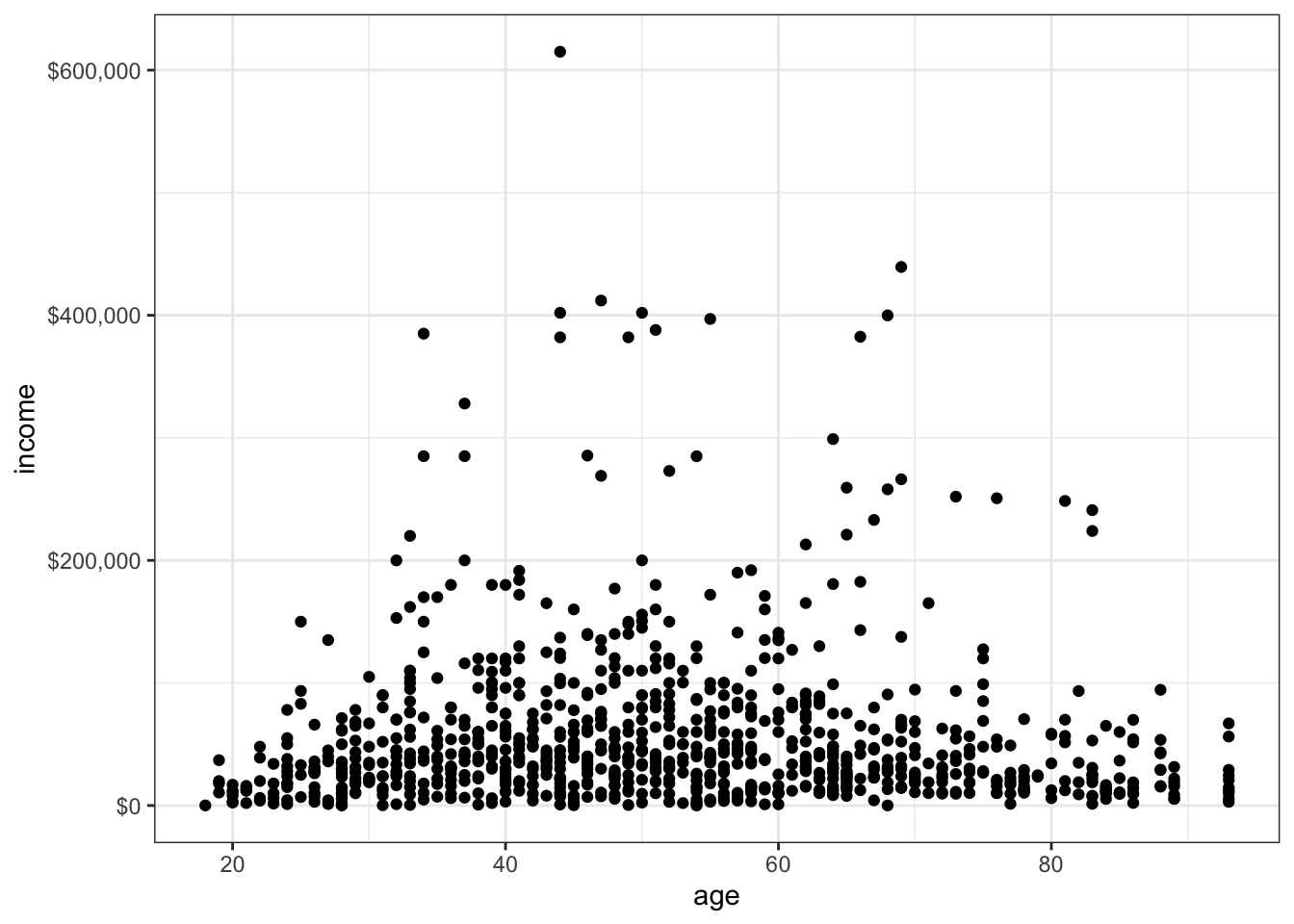
Or colour the dots according to the health insurance status.
ggplot(df.3, aes(x=age, y=income, colour = health.ins)) + # chart elements
  geom_point() +                        # scatterplot call
  scale_y_continuous(labels=dollar)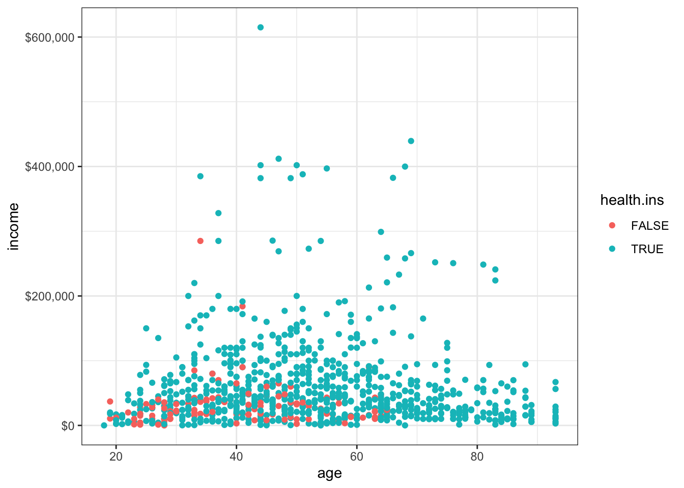
The relationship between age and income is not linear, so adding the line of best-fit might not provide much in the way of insight, but it can be done nonetheless.
ggplot(df, aes(x=age, y=income)) +
  geom_point() +
  geom_smooth(method="lm") +
  scale_y_continuous(labels=dollar)
`geom_smooth()` using formula 'y ~ x'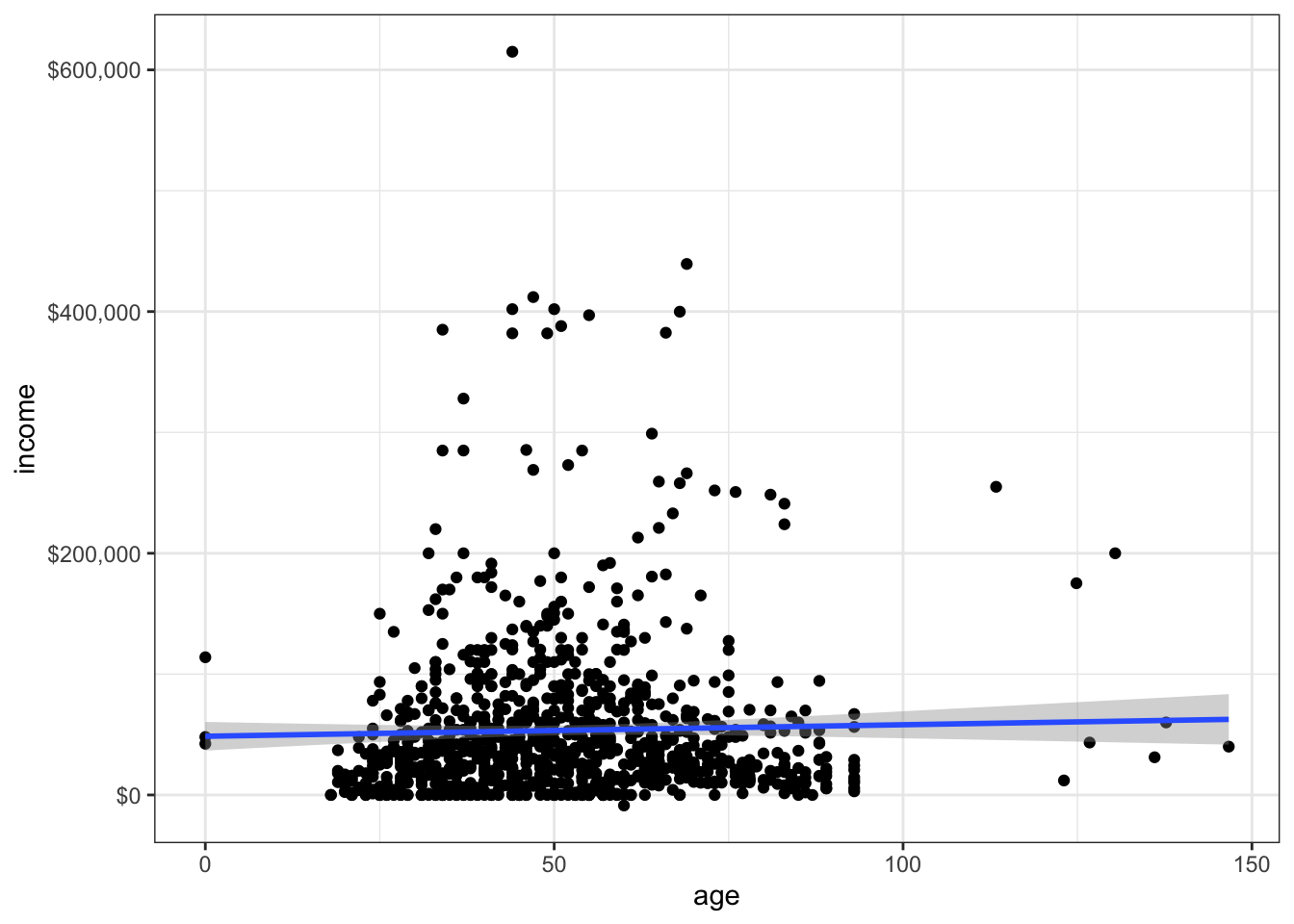
ggplot(df, aes(x=age, y=income, colour = health.ins)) +
  geom_point() +
  geom_smooth(method="lm") +
  scale_y_continuous(labels=dollar)
`geom_smooth()` using formula 'y ~ x'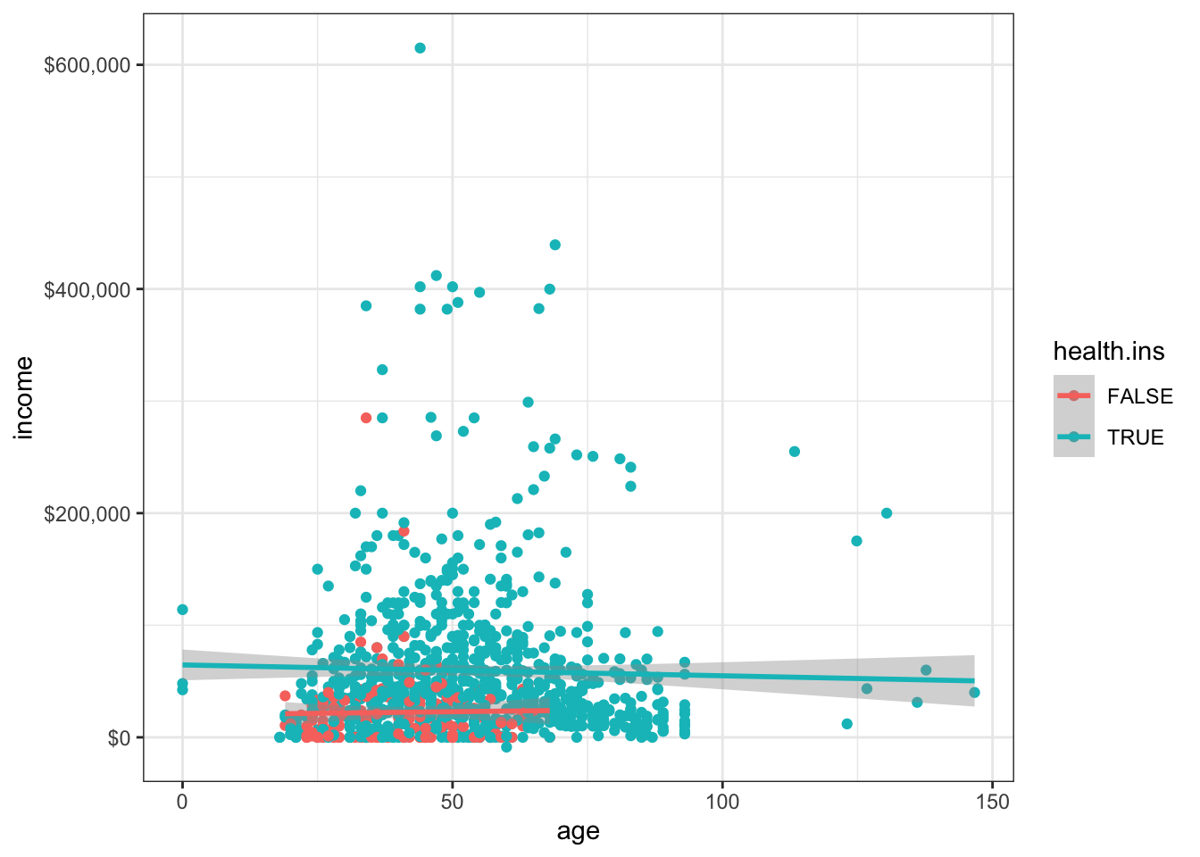
A heat map (where a cell’s colour represents the number of observations in the cell) might be more à propos.
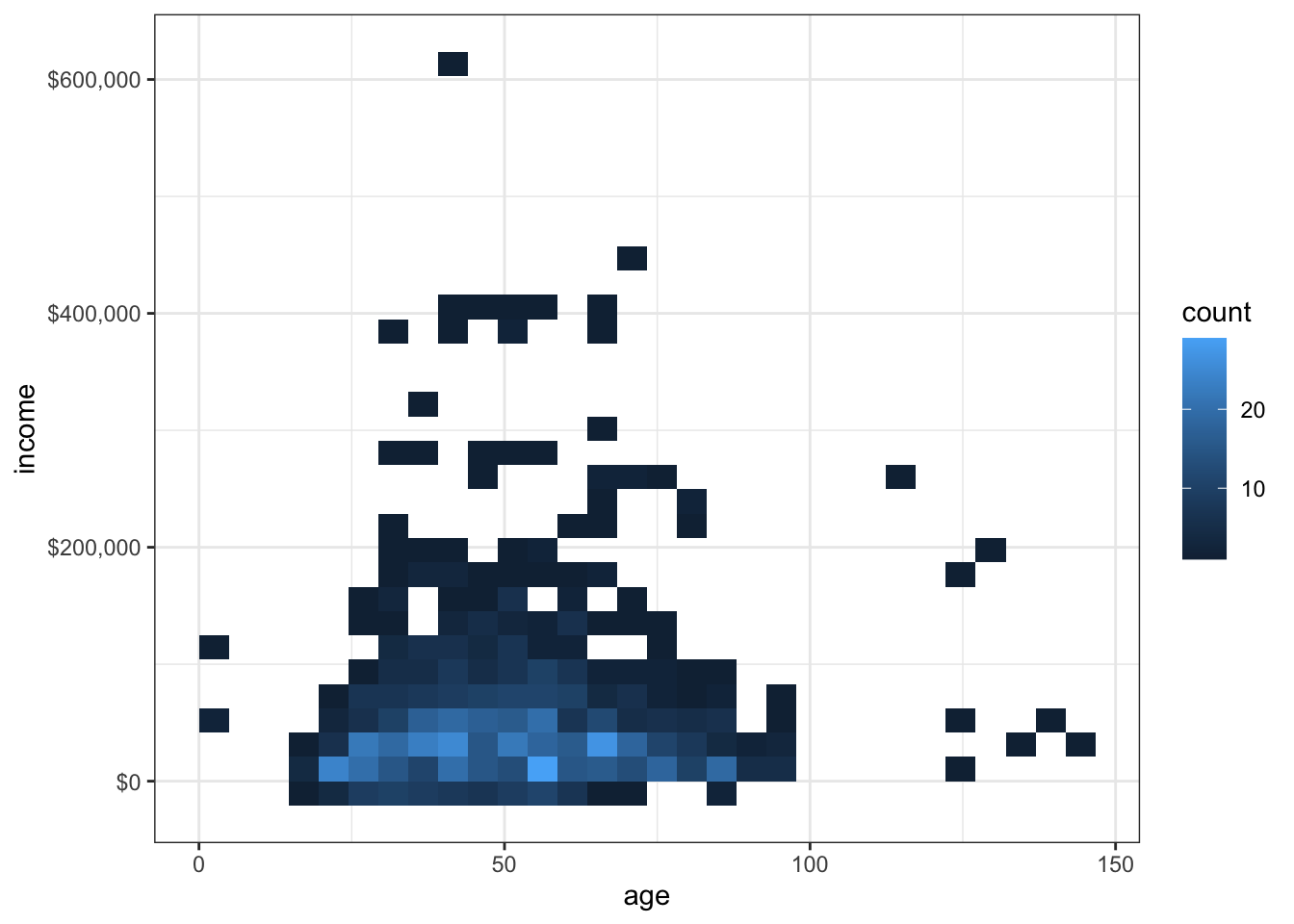
`geom_smooth()` using method = 'gam' and formula 'y ~ s(x, bs = "cs")'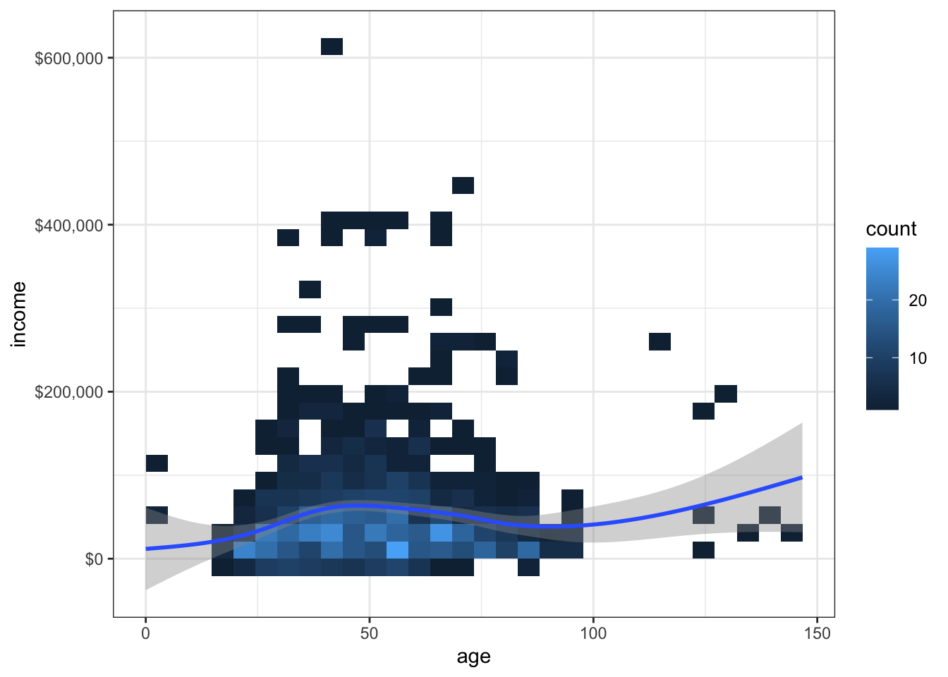
Is the smoothing curve a bit too much, here?
How about a hexbin heat map?
library(hexbin)
ggplot(df, aes(x=age, y=income)) +    # selecting data elements
    geom_hex(binwidth=c(5, 20000)) +  # hexagon heat map
    scale_y_continuous(labels=dollar) +
    geom_smooth()                     # smooth loess curve of best fit
`geom_smooth()` using method = 'gam' and formula 'y ~ s(x, bs = "cs")'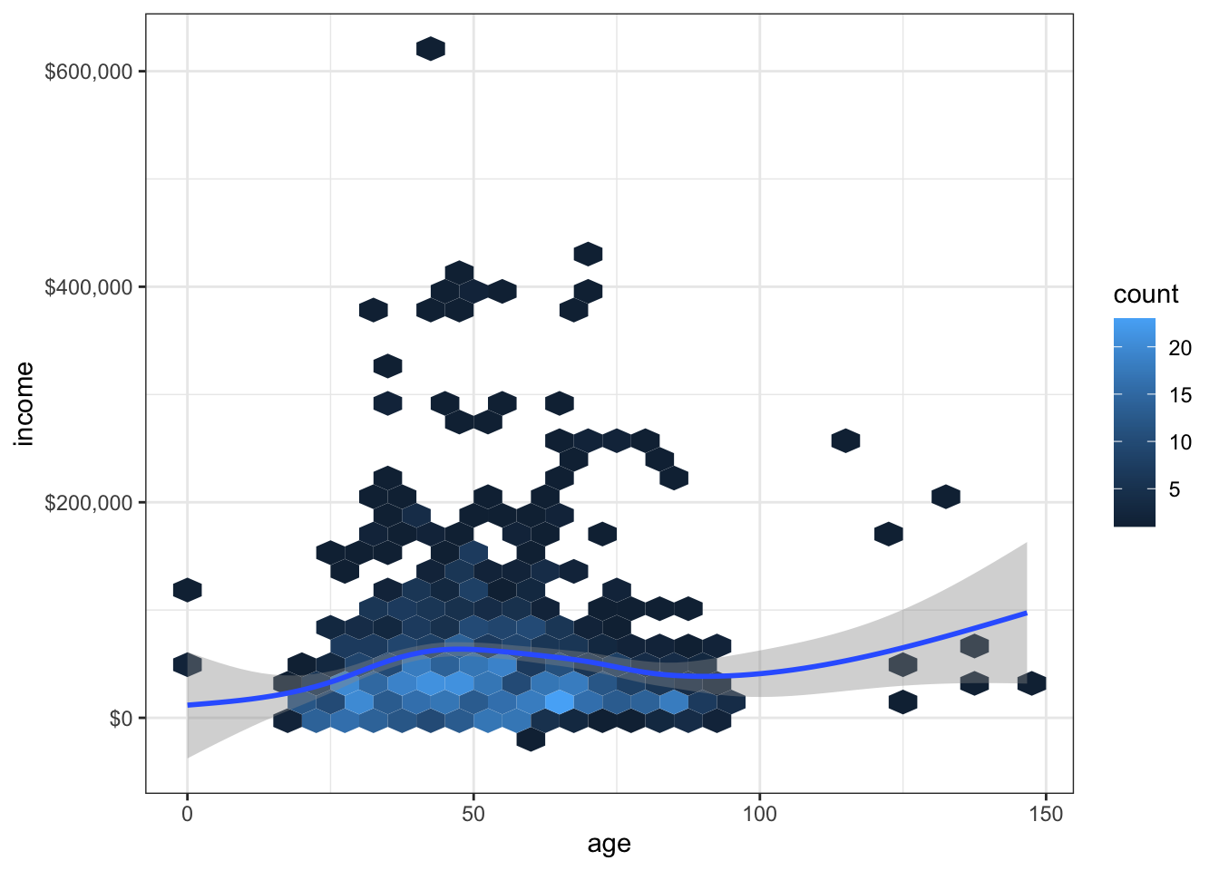
Other plots can be produced: how about a plot of the relationship between age and health.ins?
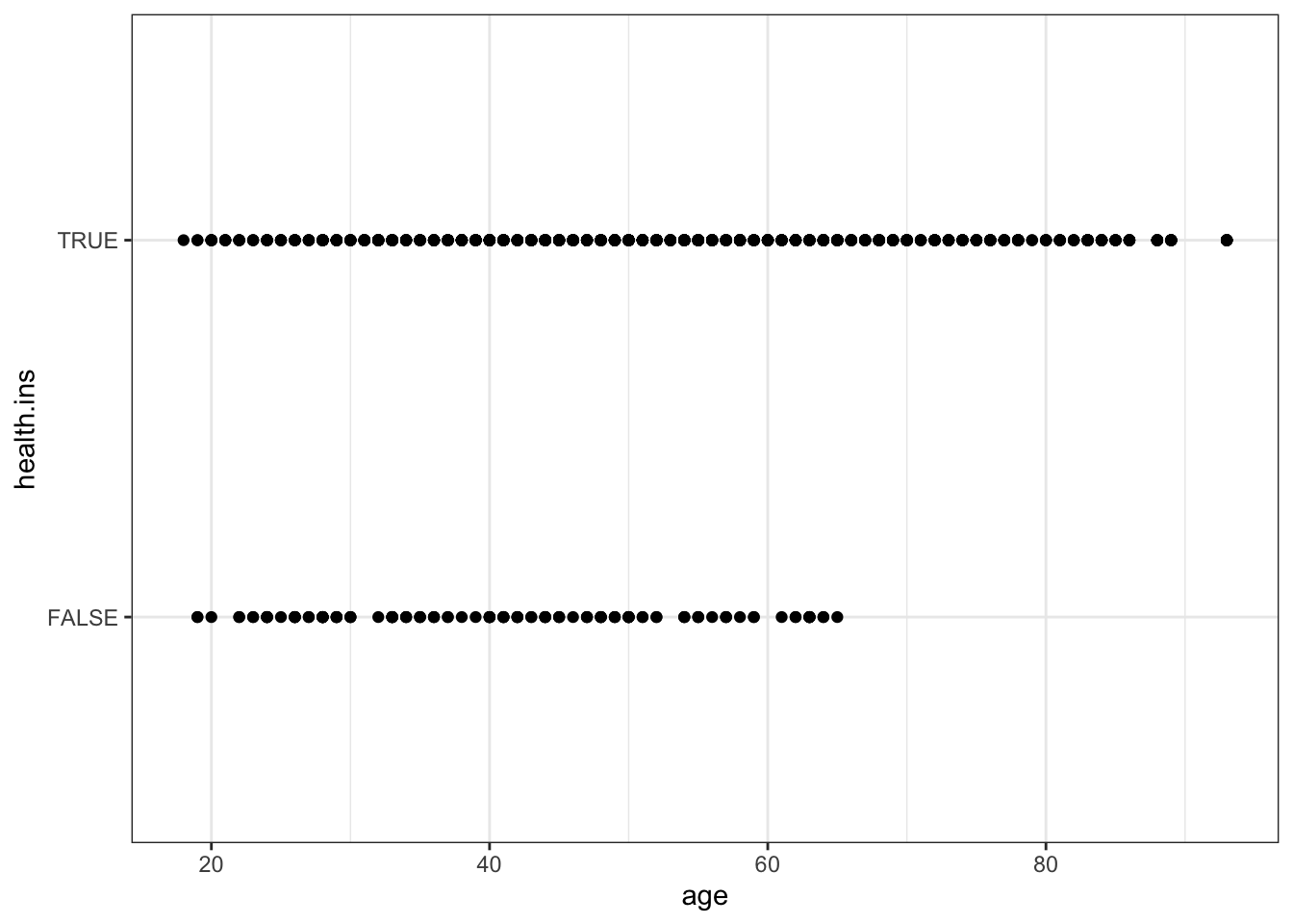
That’s not really surprising, is it: as one gets older, one is more likely to get health insurance?
It doesn’t seem as though there are that many more people with insurance than people without, but that’s an illusion: all the observations that have the same age are represented by a single dot.
A heatmap could incorporate the number of observations into the picture.
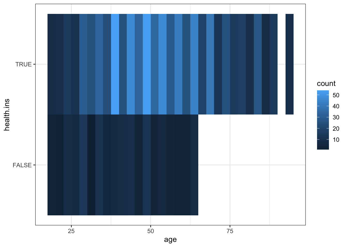
Mmhhh… that’s not nearly as insightful as I was expecting.
One of the geoms can come in handy: geom_jitter.
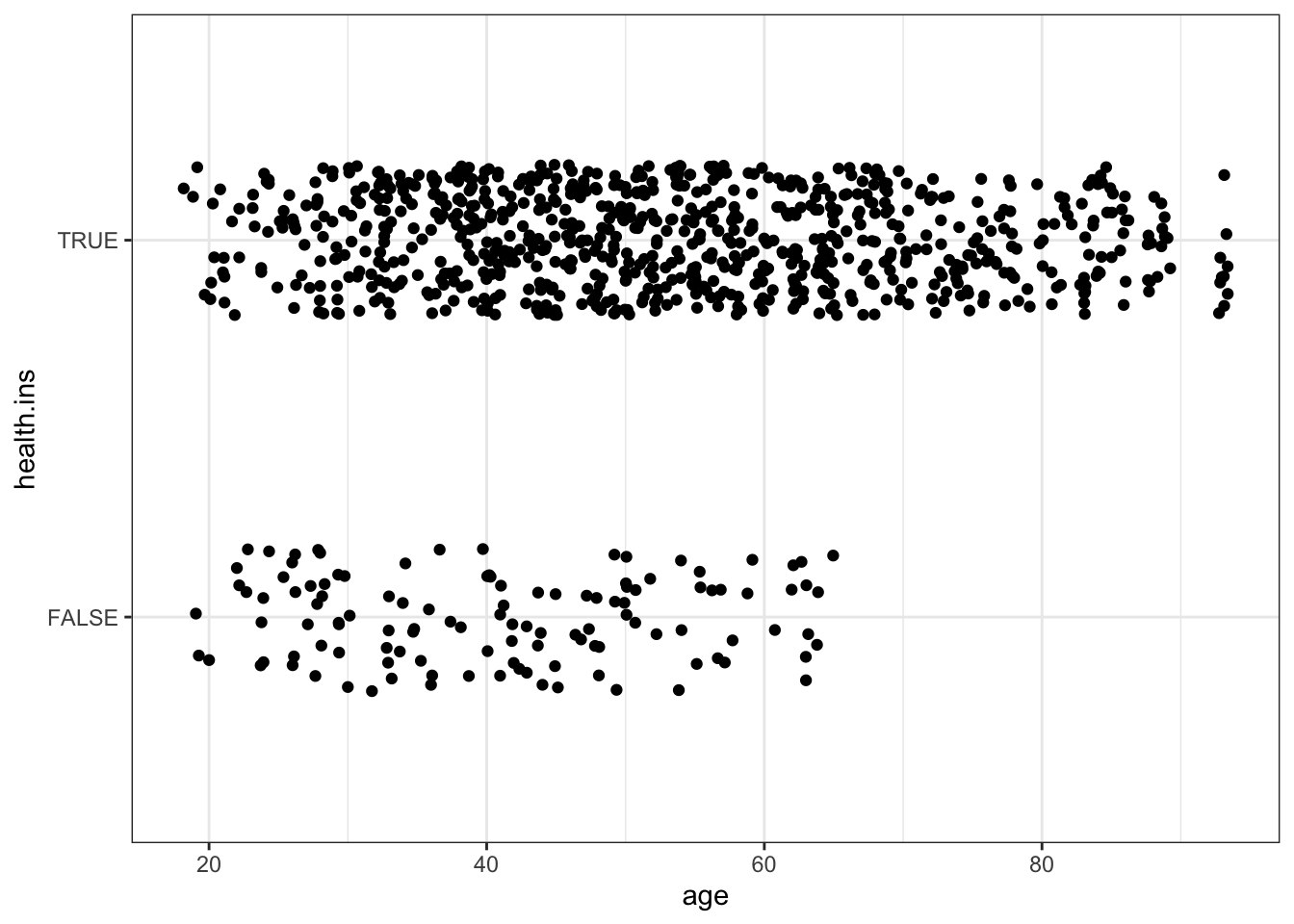
Now we can clearly see that there are substantially fewer customers without life insurance.
Why stop at only 2 variables when we could add income to the picture?
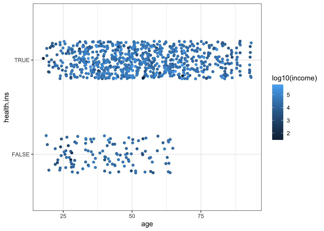
Is there anything insightful in there?
We could also try to link marital status to health insurance status?
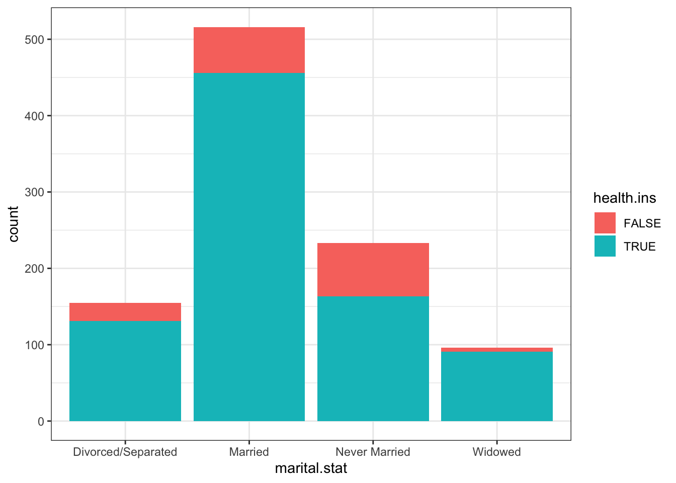
Stacked bar charts are the pie charts of bar charts – much better to put the bars side-by-side.
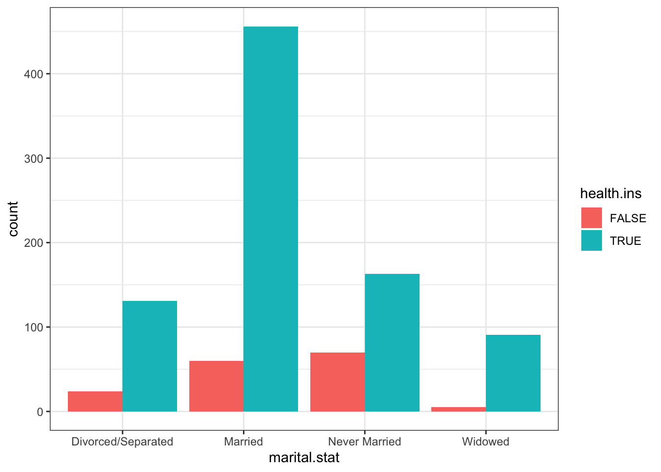
One exception could be made for proportion stacked bar charts:
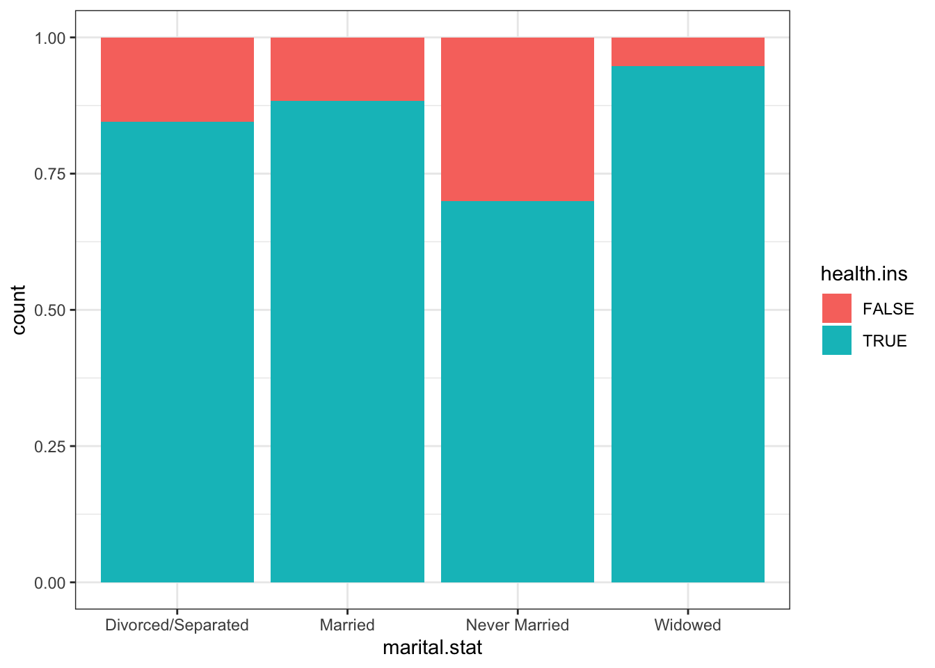
But we do lose the sense of the size of each sub-categories’ population. Some jitter functionality comes to the rescue once again!
last_plot() +
   geom_point(aes(x=marital.stat, y=-0.05), position=position_jitter(h=0.02), size=0.75, alpha=0.75)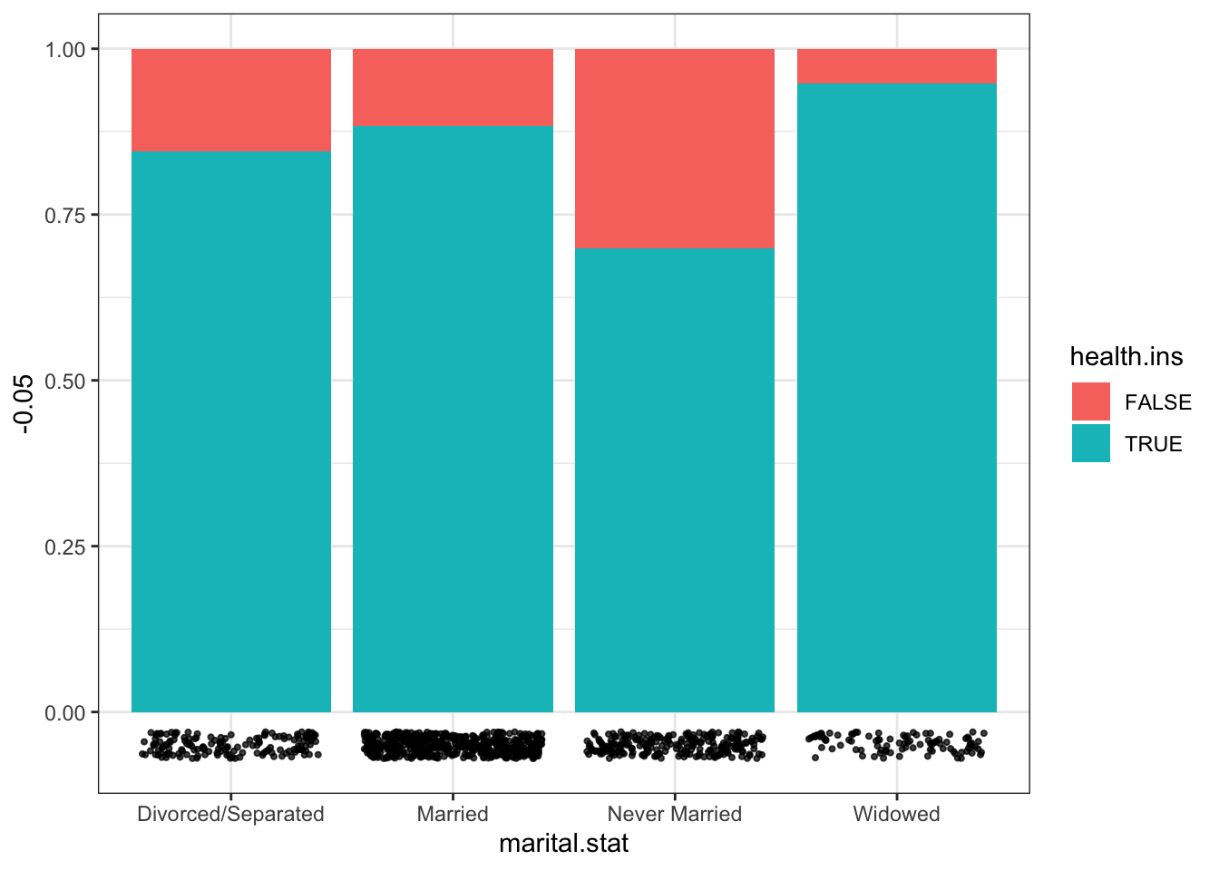
Might there be a link between housing type and marital status?
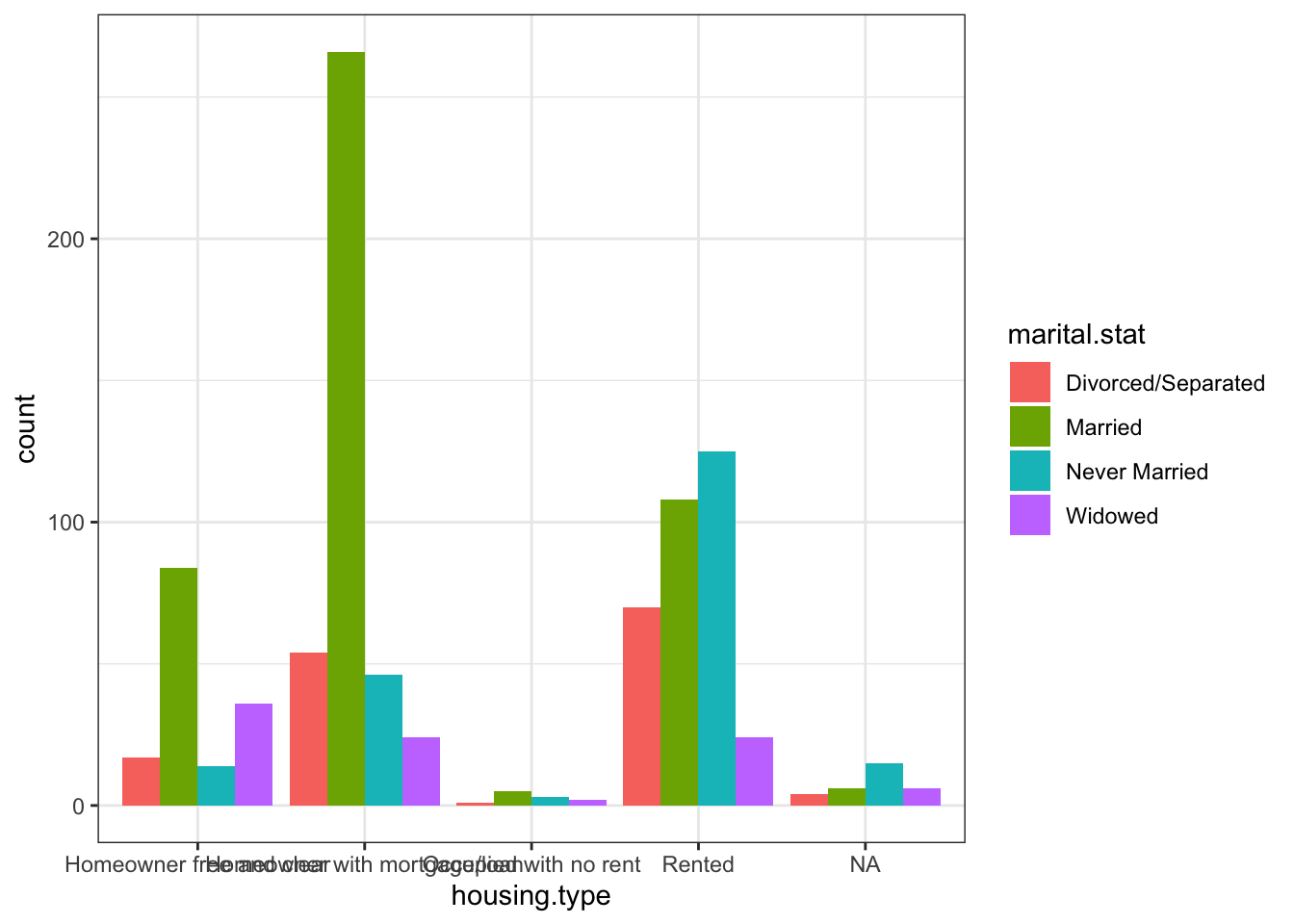
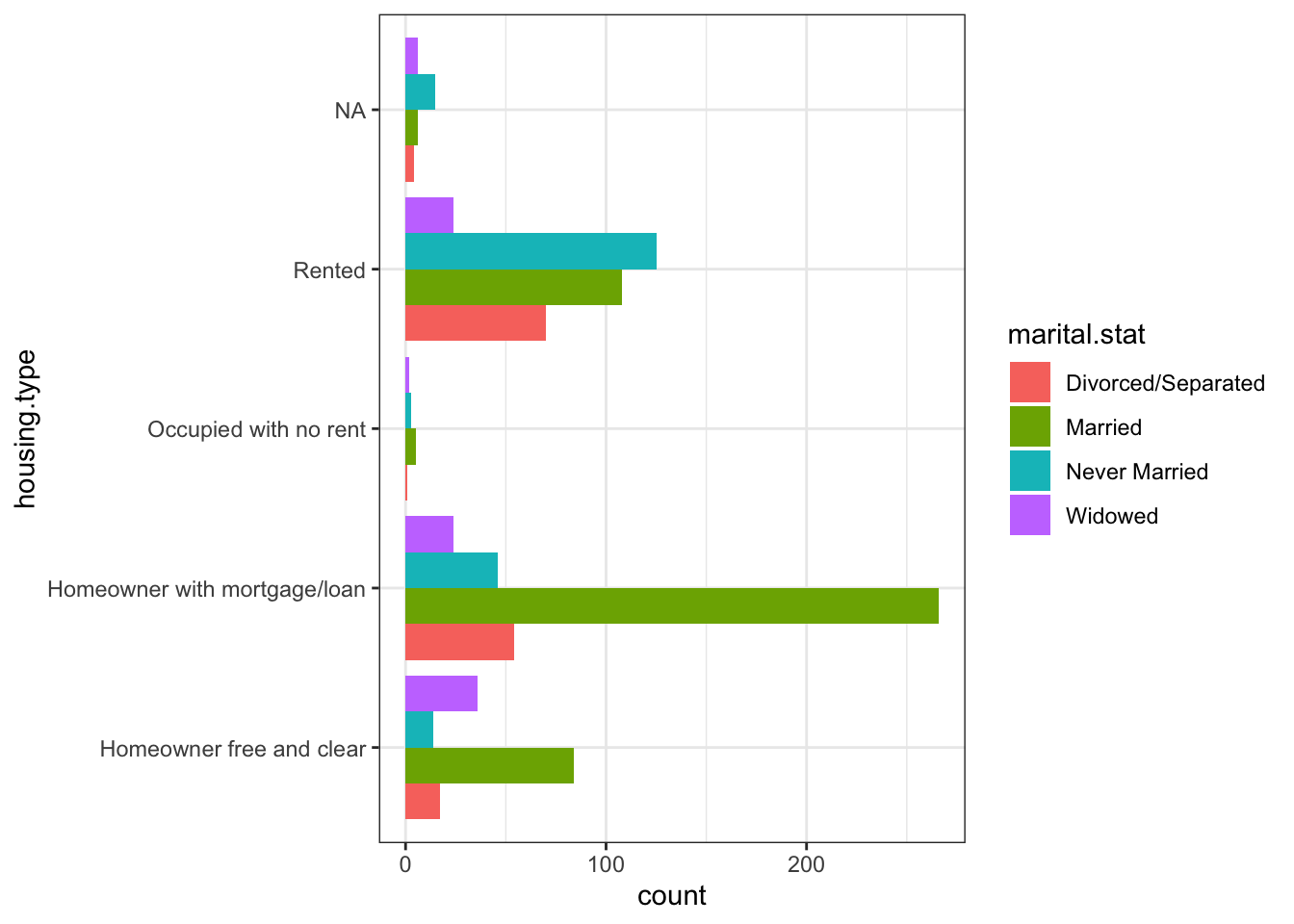
ggplot(subset(df.3, !is.na(housing.type))) +
   geom_bar(aes(housing.type, fill=marital.stat), position="dodge") +
   theme(axis.text.x=element_text(angle=15))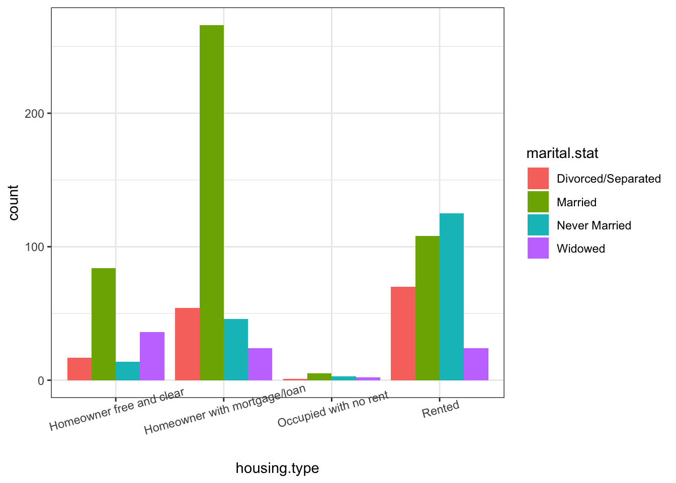
It’s easy to see how some fine-tuning can make the charts easier to read (which can only help when it comes to extracting actionable insights).
We’ll end the exploration of custdata.tsv by showing how to build a small multiple chart:
ggplot(subset(df.3, !is.na(housing.type))) +
    geom_bar(aes(marital.stat)) +
    facet_wrap(~housing.type, scales="free_y") +    # small multiple, by housing.type
    theme(axis.text.x=element_text(size=rel(0.8)))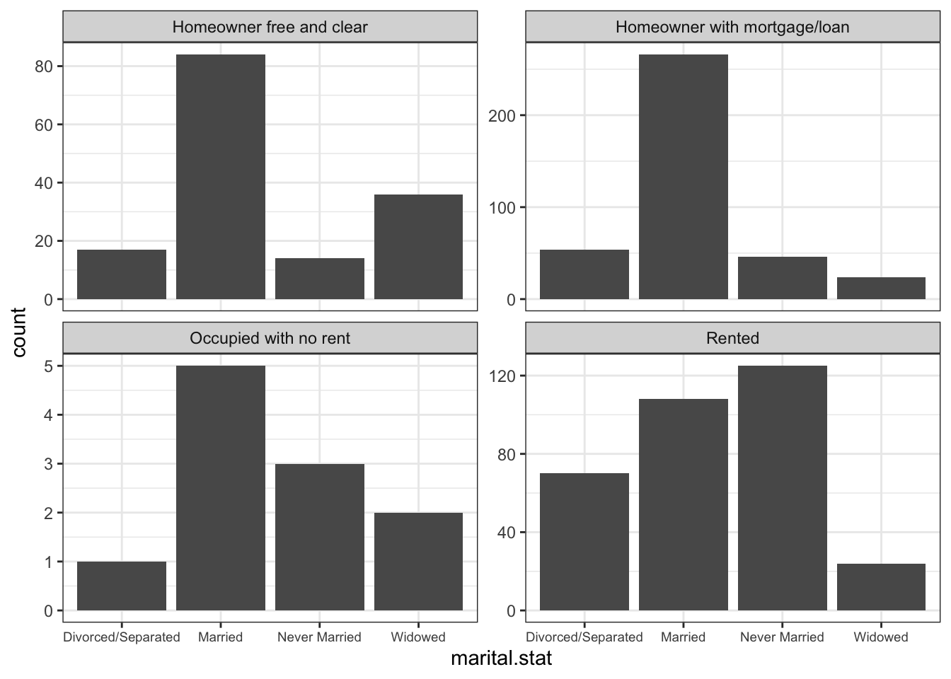
Is there any link with with health insurance status?
ggplot(subset(df.3, !is.na(housing.type))) +
    geom_bar(aes(marital.stat, fill=health.ins), position="dodge") +
    facet_wrap(~housing.type, ncol=2, labeller=label_wrap_gen(width=20, multi_line=TRUE)) +
    theme(axis.text.x=element_text(size=rel(0.6))) + coord_flip()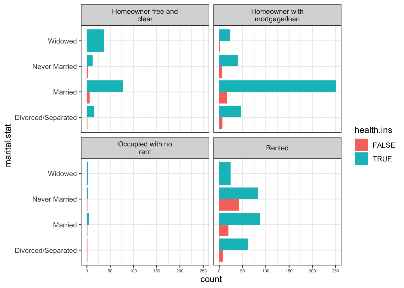
Figure 15.26: CAPTION
15.6.3.5 Other Examples and Methods
We end with a number of exaples showcasing some additional functionality.
15.6.3.5.1 Smoothing Lines
options(scipen=999)  # turn-off scientific notation like 1e+48
library(ggplot2)
theme_set(theme_bw())  # pre-set the bw theme.
data("midwest", package = "ggplot2")

gg <- ggplot(midwest, aes(x=area, y=poptotal)) +
  geom_point(aes(col=state, size=popdensity)) +
  geom_smooth(method="loess", se=F) +
  xlim(c(0, 0.1)) +
  ylim(c(0, 500000)) +
  labs(subtitle="Area Vs Population",
       y="Population",
       x="Area",
       title="Scatterplot",
       caption = "Source: midwest")

plot(gg)
`geom_smooth()` using formula 'y ~ x'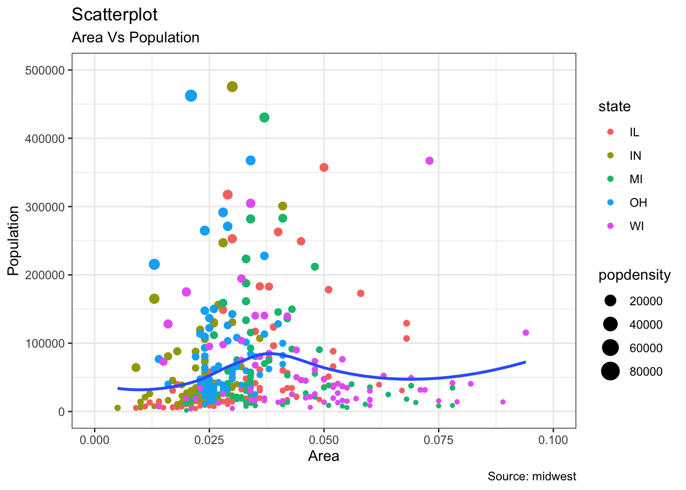
15.6.3.5.2 Scatterplots and Jitter Charts
data(mpg, package="ggplot2")

mpg_select <- mpg[mpg$manufacturer %in% c("audi", "ford", "honda", "hyundai"), ]

theme_set(theme_bw())  # pre-set the bw theme.
g <- ggplot(mpg_select, aes(displ, cty)) +
  labs(subtitle="mpg: Displacement vs City Mileage",
       title="Bubble chart")

g + geom_jitter(aes(col=manufacturer, size=hwy)) +
  geom_smooth(aes(col=manufacturer), method="lm", se=F)
`geom_smooth()` using formula 'y ~ x'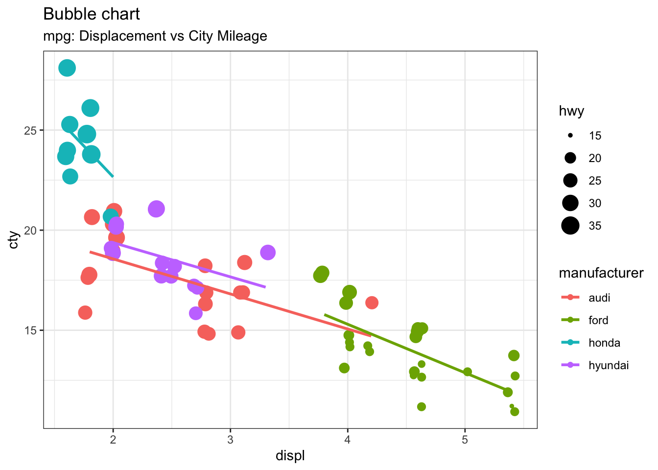
15.6.3.5.3 Marginal Distributions
library(ggplot2)
library(ggExtra)
data(mpg, package="ggplot2")

theme_set(theme_bw())  # pre-set the bw theme.
mpg_select <- mpg[mpg$hwy >= 35 & mpg$cty > 27, ]
g <- ggplot(mpg, aes(cty, hwy)) +
  geom_count() +
  geom_smooth(method="lm", se=F)

plot(g)
`geom_smooth()` using formula 'y ~ x'`geom_smooth()` using formula 'y ~ x'
`geom_smooth()` using formula 'y ~ x'`geom_smooth()` using formula 'y ~ x'
`geom_smooth()` using formula 'y ~ x'`geom_smooth()` using formula 'y ~ x'
`geom_smooth()` using formula 'y ~ x'
15.6.3.5.4 Diverging Bar Charts
library(ggplot2)
theme_set(theme_bw())

mtcars_new <- mtcars |>
  tibble::rownames_to_column(var = "car_name") |> # convert row names to a new column
  dplyr::mutate(car_name = as.factor(car_name),  # convert to factor to retain sorted order in plot
  mpg_z = round(scale(mpg), 2),  # compute normalized mpg
  mpg_type = ifelse(mpg_z < 0, "below", "above")  # above / below avg flag
  ) |>
  dplyr::arrange(mpg_z) # sort


# Diverging Barcharts
ggplot(mtcars_new, aes(x= car_name, y=mpg_z, label=mpg_z)) +
  geom_bar(stat='identity', aes(fill=mpg_type), width=.5)  +
  scale_fill_manual(name="Mileage",
                    labels = c("Above Average", "Below Average"),
                    values = c("above"="#00ba38", "below"="#f8766d")) +
  labs(subtitle="Normalised mileage from 'mtcars'",
       title= "Diverging Bars",
       x = "Car Names") +
  coord_flip()
15.6.3.5.5 Area Charts
Loading required package: xtsLoading required package: zoo
Attaching package: 'zoo'The following objects are masked from 'package:base':
as.Date, as.Date.numeric
Attaching package: 'xts'The following objects are masked from 'package:dplyr':
first, lastLoading required package: TTRRegistered S3 method overwritten by 'quantmod':
method from
as.zoo.data.frame zoo data("economics", package = "ggplot2")
# Compute % Returns
economics$returns_perc <- c(0, diff(economics$psavert)/economics$psavert[-length(economics$psavert)])
# Create break points and labels for axis ticks
brks <- economics$date[seq(1, length(economics$date), 12)]
#install.packages("lubridate")
lbls <- lubridate::year(economics$date[seq(1, length(economics$date), 12)])
# Plot
ggplot(economics[1:100, ], aes(date, returns_perc)) +
geom_area() +
scale_x_date(breaks=brks, labels=lbls) +
theme(axis.text.x = element_text(angle=90)) +
labs(title="Area Chart",
subtitle = "Perc Returns for Personal Savings",
y="% Returns for Personal savings",
caption="Source: economics")
15.6.3.5.6 Funnel Charts
library(ggplot2)
library(ggthemes)
options(scipen = 999)  # turns of scientific notations like 1e+40
# Read data
email_campaign_funnel <- read.csv("https://raw.githubusercontent.com/selva86/datasets/master/email_campaign_funnel.csv")

# X Axis Breaks and Labels
brks <- seq(-15000000, 15000000, 5000000)
lbls = paste0(as.character(c(seq(15, 0, -5), seq(5, 15, 5))), "m")

# Plot
ggplot(email_campaign_funnel, aes(x = Stage, y = Users, fill = Gender)) +   # Fill column
                              geom_bar(stat = "identity", width = .6) +   # draw the bars
                              scale_y_continuous(breaks = brks,   # Breaks
                                                 labels = lbls) + # Labels
                              coord_flip() +  # Flip axes
                              labs(title="Email Campaign Funnel") +
                              theme_tufte() +  # Tufte theme from ggfortify
                              theme(plot.title = element_text(hjust = .5),
                                    axis.ticks = element_blank()) +   # Centre plot title
                              scale_fill_brewer(palette = "Dark2")  # Color palette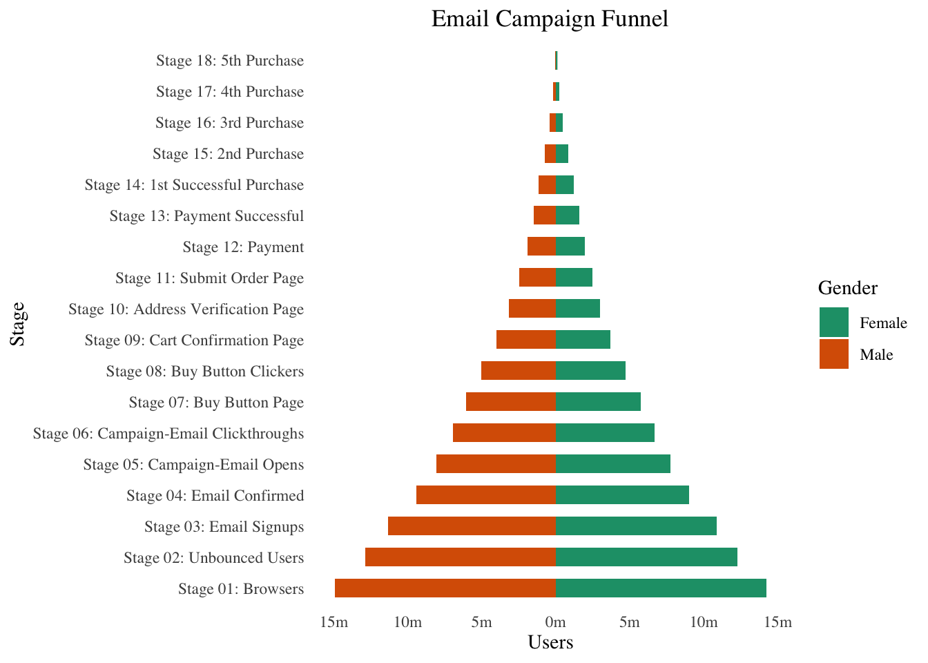
15.6.3.5.7 Calendar Heatmaps
# http://margintale.blogspot.in/2012/04/ggplot2-time-series-heatmaps.html
library(ggplot2)
library(plyr)
library(scales)
library(zoo)

df <- read.csv("https://raw.githubusercontent.com/selva86/datasets/master/yahoo.csv")
df$date <- as.Date(df$date)  # format date
df <- df[df$year >= 2012, ]  # filter reqd years

# Create Month Week
df$yearmonth <- as.yearmon(df$date)
df$yearmonthf <- factor(df$yearmonth)
df <- ddply(df,.(yearmonthf), transform, monthweek=1+week-min(week))  # compute week number of month
df <- df[, c("year", "yearmonthf", "monthf", "week", "monthweek", "weekdayf", "VIX.Close")]
head(df)


# Plot
ggplot(df, aes(monthweek, weekdayf, fill = VIX.Close)) +
  geom_tile(colour = "white") +
  facet_grid(year~monthf) +
  scale_fill_gradient(low="red", high="green") +
  labs(x="Week of Month",
       y="",
       title = "Time-Series Calendar Heatmap",
       subtitle="Yahoo Closing Price",
       fill="Close")
  year yearmonthf monthf week monthweek weekdayf VIX.Close
1 2012   Jan 2012    Jan    1         1      Tue     22.97
2 2012   Jan 2012    Jan    1         1      Wed     22.22
3 2012   Jan 2012    Jan    1         1      Thu     21.48
4 2012   Jan 2012    Jan    1         1      Fri     20.63
5 2012   Jan 2012    Jan    2         2      Mon     21.07
6 2012   Jan 2012    Jan    2         2      Tue     20.69
15.6.3.5.8 Ordered Bar Charts
# Prepare data: group mean city mileage by manufacturer.
cty_mpg <- aggregate(mpg$cty, by=list(mpg$manufacturer), FUN=mean)  # aggregate
colnames(cty_mpg) <- c("make", "mileage")  # change column names
cty_mpg <- cty_mpg[order(cty_mpg$mileage), ]  # sort
cty_mpg$make <- factor(cty_mpg$make, levels = cty_mpg$make)  # to retain the order in plot.
head(cty_mpg, 4)

library(ggplot2)
theme_set(theme_bw())

# Draw plot
ggplot(cty_mpg, aes(x=make, y=mileage)) +
  geom_bar(stat="identity", width=.5, fill="tomato3") +
  labs(title="Ordered Bar Chart",
       subtitle="Make Vs Avg. Mileage",
       caption="source: mpg") +
  theme(axis.text.x = element_text(angle=65, vjust=0.6))
         make  mileage
9     lincoln 11.33333
8  land rover 11.50000
3       dodge 13.13514
10    mercury 13.25000
15.6.3.5.9 Correlograms
#install.packages("ggcorrplot")
library(ggplot2)
library(ggcorrplot)

# Correlation matrix
corr <- round(cor(mtcars), 1)

# Plot
ggcorrplot(corr, hc.order = TRUE,
           type = "lower",
           lab = TRUE,
           lab_size = 3,
           method="circle",
           colors = c("tomato2", "white", "springgreen3"),
           title="Correlogram of mtcars",
           ggtheme=theme_bw)
15.6.3.5.10 Treemaps
Loading required package: usethis#devtools::install_github("wilkox/treemapify")
library(treemapify)
library(ggplot2)
data(G20)
head(G20)
ggplot(G20, aes(area = gdp_mil_usd, fill = region, label = country)) +
geom_treemap() +
geom_treemap_text(grow = T, reflow = T, colour = "black") +
facet_wrap( ~ econ_classification) +
scale_fill_brewer(palette = "Set1") +
theme(legend.position = "bottom") +
labs(
title = "The G-20 major economies",
caption = "The area of each country is proportional to its relative GDP
within the economic group (advanced or developing)",
fill = "Region"
)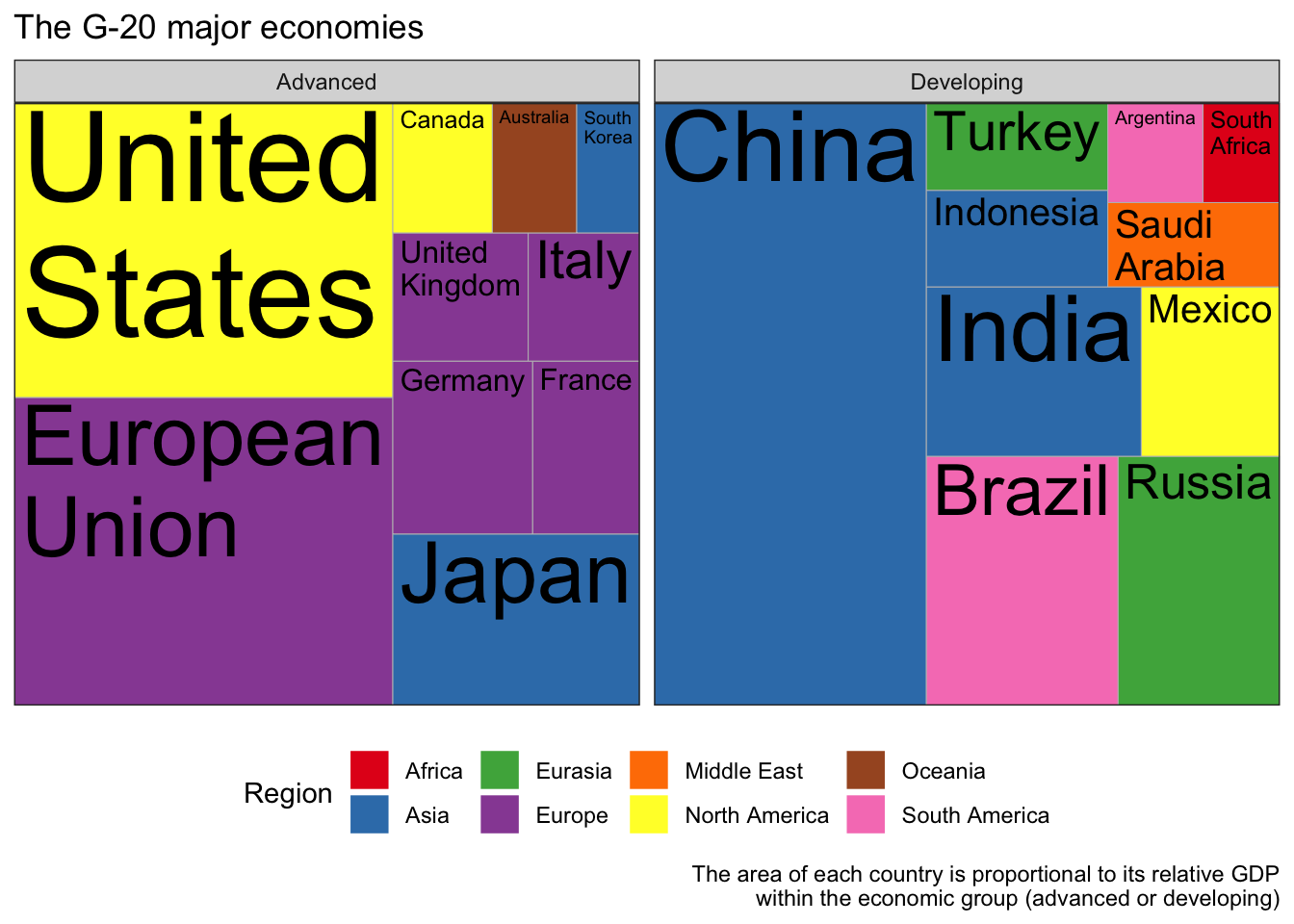
         region       country gdp_mil_usd   hdi econ_classification hemisphere
1        Africa  South Africa      384315 0.629          Developing   Southern
2 North America United States    15684750 0.937            Advanced   Northern
3 North America        Canada     1819081 0.911            Advanced   Northern
4 North America        Mexico     1177116 0.775          Developing   Northern
5 South America        Brazil     2395968 0.730          Developing   Southern
6 South America     Argentina      474954 0.811          Developing   Southern
15.6.3.5.11 Parallel Coordinates
library(triangle)
set.seed(0)

q1_d1 <- round(rtriangle(1000, 1, 7, 5))
q1_d2 <- round(rtriangle(1000, 1, 7, 6))
q1_d3 <- round(rtriangle(1000, 1, 7, 2))
df <- data.frame(q1_d1 = factor(q1_d1), q1_d2 = factor(q1_d2), q1_d3 =  factor(q1_d3))

library(dplyr)

# group by combinations and count
df_grouped <- df %>% group_by(q1_d1, q1_d2, q1_d3) %>% count()

# set an id string that denotes the value combination
df_grouped <- df_grouped %>% mutate(id = factor(paste(q1_d1, q1_d2, q1_d3, sep = '-')))

order.freq <- order(df_grouped[,4],decreasing=TRUE)

# sort by count and select top rows
df_grouped <- df_grouped[order.freq[1:25],]

library(reshape2)
library(ggplot2)
# create long format
df_pcp <- melt(df_grouped, id.vars = c('id', 'freq'))
df_pcp$value <- factor(df_pcp$value)

y_levels <- levels(factor(1:7))
ggplot(df_pcp, aes(x = variable, y = value, group = id)) +   # group = id is important!
  geom_path(aes(size = freq, color = id),
            alpha = 0.5,
            lineend = 'round', linejoin = 'round') +
  scale_y_discrete(limits = y_levels, expand = c(0.5, 0)) +
  scale_size(breaks = NULL, range = c(1, 7))
15.6.3.5.12 Time Series and Variants
## From Timeseries object (ts)
library(ggplot2)
library(ggfortify)
theme_set(theme_classic())

# Plot
autoplot(AirPassengers) +
  labs(title="AirPassengers") +
  theme(plot.title = element_text(hjust=0.5))
library(ggplot2)
theme_set(theme_classic())
# Allow Default X Axis Labels
ggplot(economics, aes(x=date)) +
  geom_line(aes(y=unemploy)) +
  labs(title="Time Series Chart",
       subtitle="Number of unemployed in thousands from 'Economics-US' Dataset",
       caption="Source: Economics",
       y="unemploy")
Attaching package: 'lubridate'The following objects are masked from 'package:base':
date, intersect, setdiff, uniontheme_set(theme_bw())
economics_m <- economics[1:24, ]
# labels and breaks for X axis text
lbls <- paste0(month.abb[month(economics_m$date)], " ", lubridate::year(economics_m$date))
brks <- economics_m$date
# plot
ggplot(economics_m, aes(x=date)) +
geom_line(aes(y=pce)) +
labs(title="Monthly Time Series",
subtitle="Personal consumption expenditures, in billions of dollars",
caption="Source: Economics",
y="pce") + # title and caption
scale_x_date(labels = lbls,
breaks = brks) + # change to monthly ticks and labels
theme(axis.text.x = element_text(angle = 90, vjust=0.5), # rotate x axis text
panel.grid.minor = element_blank()) # turn off minor grid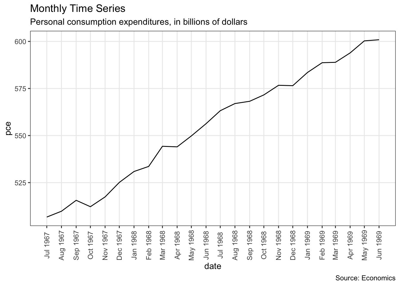
library(ggplot2)
library(lubridate)
theme_set(theme_bw())
economics_y <- economics[1:90, ]
# labels and breaks for X axis text
brks <- economics_y$date[seq(1, length(economics_y$date), 12)]
lbls <- lubridate::year(brks)
# plot
ggplot(economics_y, aes(x=date)) +
geom_line(aes(y=psavert)) +
labs(title="Yearly Time Series",
subtitle="Personal savings rate",
caption="Source: Economics",
y="psavert") + # title and caption
scale_x_date(labels = lbls,
breaks = brks) + # change to monthly ticks and labels
theme(axis.text.x = element_text(angle = 90, vjust=0.5), # rotate x axis text
panel.grid.minor = element_blank()) # turn off minor grid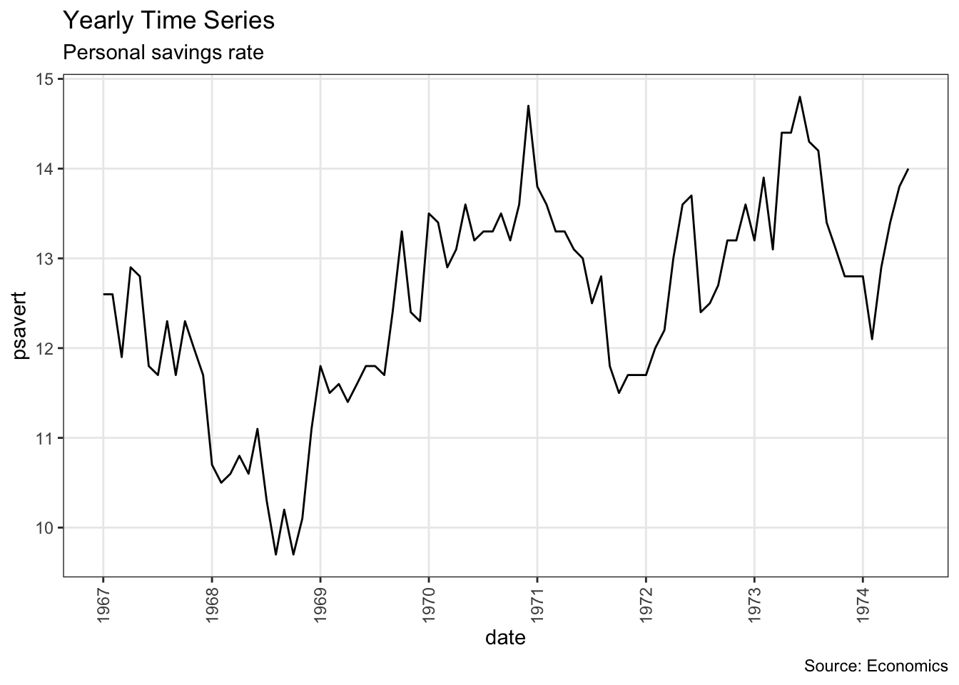
data(economics_long, package = "ggplot2")
head(economics_long)

library(ggplot2)
library(lubridate)
theme_set(theme_bw())
df <- economics_long[economics_long$variable %in% c("psavert", "uempmed"), ]
df <- df[lubridate::year(df$date) %in% c(1967:1981), ]

# labels and breaks for X axis text
brks <- df$date[seq(1, length(df$date), 12)]
lbls <- lubridate::year(brks)

# plot
ggplot(df, aes(x=date)) +
  geom_line(aes(y=value, col=variable)) +
  labs(title="Time Series of Returns Percentage",
       subtitle="Drawn from Long Data format",
       caption="Source: Economics",
       y="Returns %",
       color=NULL) +  # title and caption
  scale_x_date(labels = lbls, breaks = brks) +  # change to monthly ticks and labels
  scale_color_manual(labels = c("psavert", "uempmed"),
                     values = c("psavert"="#00ba38", "uempmed"="#f8766d")) +  # line color
  theme(axis.text.x = element_text(angle = 90, vjust=0.5, size = 8),  # rotate x axis text
        panel.grid.minor = element_blank())  # turn off minor grid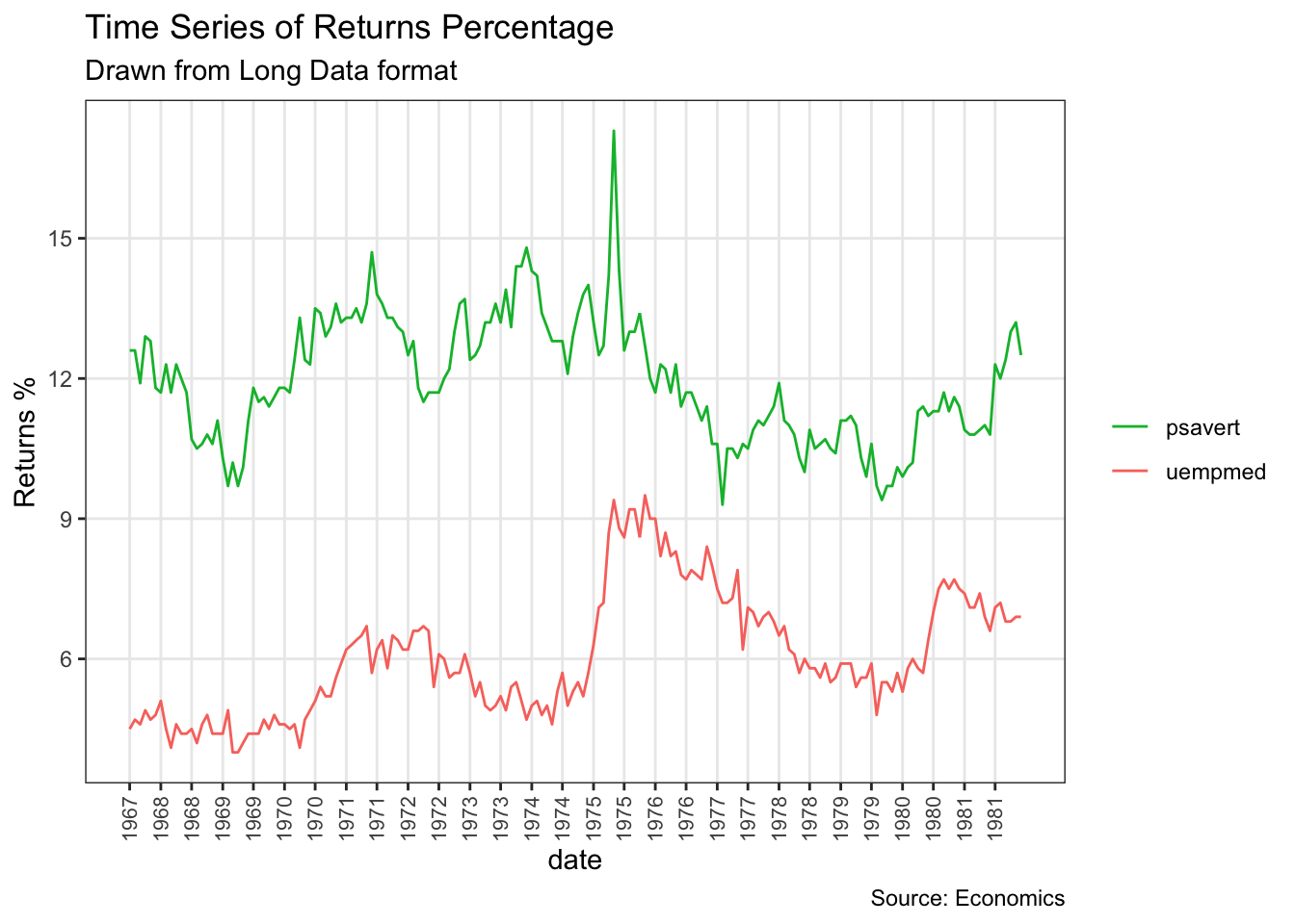
# A tibble: 6 × 4
  date       variable value  value01
  <date>     <chr>    <dbl>    <dbl>
1 1967-07-01 pce       507. 0
2 1967-08-01 pce       510. 0.000265
3 1967-09-01 pce       516. 0.000762
4 1967-10-01 pce       512. 0.000471
5 1967-11-01 pce       517. 0.000916
6 1967-12-01 pce 525. 0.00157 library(ggplot2)
library(lubridate)
theme_set(theme_bw())
df <- economics[, c("date", "psavert", "uempmed")]
df <- df[lubridate::year(df$date) %in% c(1967:1981), ]
# labels and breaks for X axis text
brks <- df$date[seq(1, length(df$date), 12)]
lbls <- lubridate::year(brks)
# plot
ggplot(df, aes(x=date)) +
geom_area(aes(y=psavert+uempmed, fill="psavert")) +
geom_area(aes(y=uempmed, fill="uempmed")) +
labs(title="Area Chart of Returns Percentage",
subtitle="From Wide Data format",
caption="Source: Economics",
y="Returns %") + # title and caption
scale_x_date(labels = lbls, breaks = brks) + # change to monthly ticks and labels
scale_fill_manual(name="",
values = c("psavert"="#00ba38", "uempmed"="#f8766d")) + # line color
theme(panel.grid.minor = element_blank()) # turn off minor grid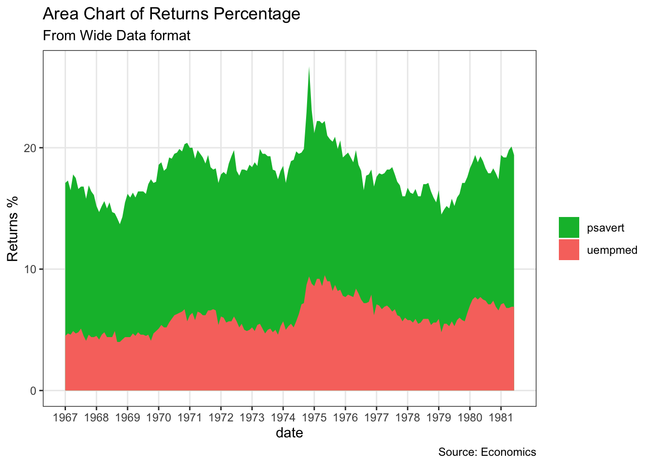
Registered S3 methods overwritten by 'forecast':
  method                 from
  autoplot.Arima         ggfortify
  autoplot.acf           ggfortify
  autoplot.ar            ggfortify
  autoplot.bats          ggfortify
  autoplot.decomposed.ts ggfortify
  autoplot.ets           ggfortify
  autoplot.forecast      ggfortify
  autoplot.stl           ggfortify
  autoplot.ts            ggfortify
  fitted.ar              ggfortify
  fortify.ts             ggfortify
residuals.ar ggfortifytheme_set(theme_classic())
# Subset data
nottem_small <- window(nottem, start=c(1920, 1), end=c(1925, 12)) # subset a smaller timewindow
# Plot
ggseasonplot(AirPassengers) + labs(title="Seasonal plot: International Airline Passengers")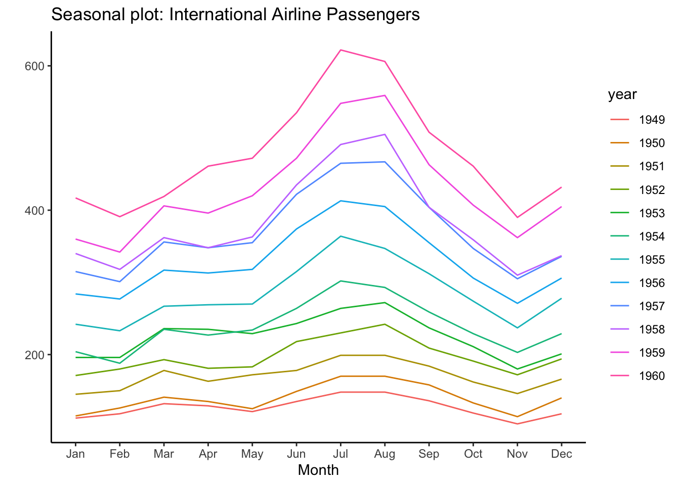
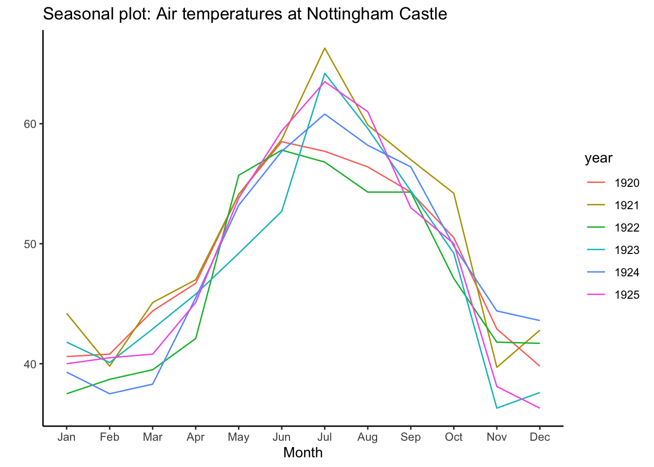
15.6.3.5.13 Clusters
Registered S3 methods overwritten by 'ggalt':
method from
fortify.table ggfortify
grid.draw.absoluteGrob ggplot2
grobHeight.absoluteGrob ggplot2
grobWidth.absoluteGrob ggplot2
grobX.absoluteGrob ggplot2
grobY.absoluteGrob ggplot2 library(ggfortify)
theme_set(theme_classic())
# Compute data with principal components
df <- iris[c(1, 2, 3, 4)]
pca_mod <- prcomp(df) # compute principal components
# Data frame of principal components -
df_pc <- data.frame(pca_mod$x, Species=iris$Species) # dataframe of principal components
df_pc_vir <- df_pc[df_pc$Species == "virginica", ] # df for 'virginica'
df_pc_set <- df_pc[df_pc$Species == "setosa", ] # df for 'setosa'
df_pc_ver <- df_pc[df_pc$Species == "versicolor", ] # df for 'versicolor'
# Plot -
ggplot(df_pc, aes(PC1, PC2, col=Species)) +
geom_point(aes(shape=Species), size=2) + # draw points
labs(title="Iris Clustering",
subtitle="With principal components PC1 and PC2 as X and Y axis",
caption="Source: Iris") +
coord_cartesian(xlim = 1.2 * c(min(df_pc$PC1), max(df_pc$PC1)),
ylim = 1.2 * c(min(df_pc$PC2), max(df_pc$PC2))) + # change axis limits
geom_encircle(data = df_pc_vir, aes(x=PC1, y=PC2)) + # draw circles
geom_encircle(data = df_pc_set, aes(x=PC1, y=PC2)) +
geom_encircle(data = df_pc_ver, aes(x=PC1, y=PC2))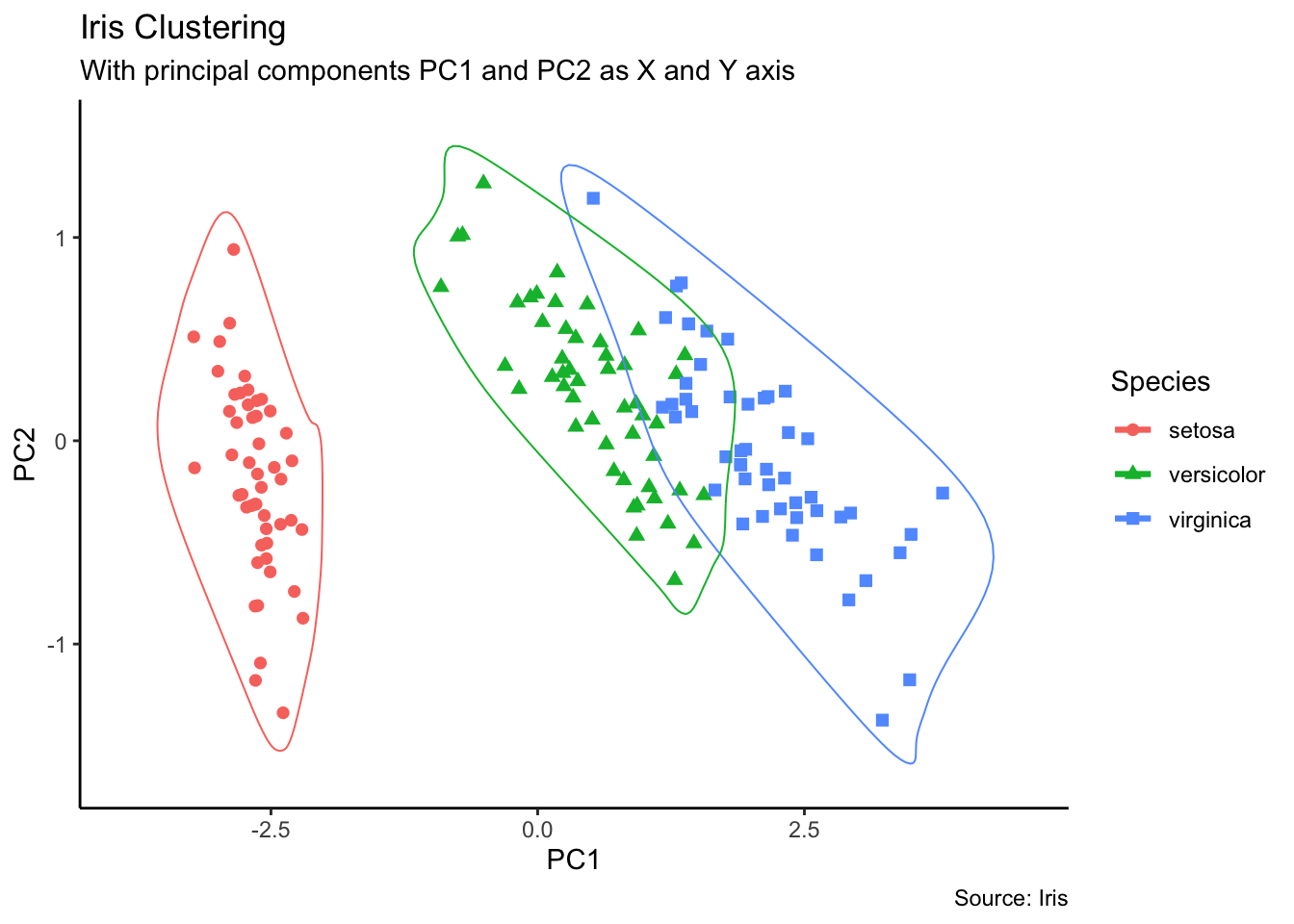
15.6.3.5.14 Dumbbell Charts
# devtools::install_github("hrbrmstr/ggalt")
library(ggplot2)
library(ggalt)
theme_set(theme_classic())
health <- read.csv("https://raw.githubusercontent.com/selva86/datasets/master/health.csv")
# for right ordering of the dumbells
health$Area <- factor(health$Area, levels=as.character(health$Area))
# health$Area <- factor(health$Area)
gg <- ggplot(health, aes(x=pct_2013, xend=pct_2014, y=Area, group=Area)) +
geom_dumbbell(color="#a3c4dc",
size=0.75,
point.colour.l="#0e668b") +
scale_x_continuous(label=waiver()) +
labs(x=NULL,
y=NULL,
title="Dumbbell Chart",
subtitle="Pct Change: 2013 vs 2014",
caption="Source: https://github.com/hrbrmstr/ggalt") +
theme(plot.title = element_text(hjust=0.5, face="bold"),
plot.background=element_rect(fill="#f7f7f7"),
panel.background=element_rect(fill="#f7f7f7"),
panel.grid.minor=element_blank(),
panel.grid.major.y=element_blank(),
panel.grid.major.x=element_line(),
axis.ticks=element_blank(),
legend.position="top",
panel.border=element_blank())
plot(gg)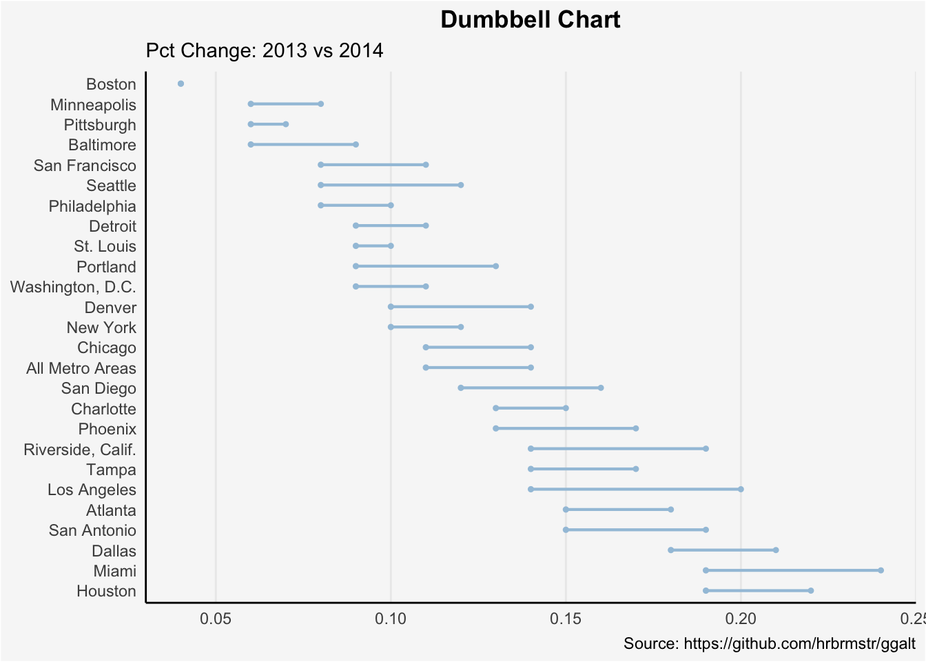
15.6.3.5.15 Slope Charts
library(dplyr)
theme_set(theme_classic())
source_df <- read.csv("https://raw.githubusercontent.com/jkeirstead/r-slopegraph/master/cancer_survival_rates.csv")

# Define functions. Source: https://github.com/jkeirstead/r-slopegraph
tufte_sort <- function(df, x="year", y="value", group="group", method="tufte", min.space=0.05) {
    ## First rename the columns for consistency
    ids <- match(c(x, y, group), names(df))
    df <- df[,ids]
    names(df) <- c("x", "y", "group")

    ## Expand grid to ensure every combination has a defined value
    tmp <- expand.grid(x=unique(df$x), group=unique(df$group))
    tmp <- merge(df, tmp, all.y=TRUE)
    df <- mutate(tmp, y=ifelse(is.na(y), 0, y))

    ## Cast into a matrix shape and arrange by first column
    require(reshape2)
    tmp <- dcast(df, group ~ x, value.var="y")
    ord <- order(tmp[,2])
    tmp <- tmp[ord,]

    min.space <- min.space*diff(range(tmp[,-1]))
    yshift <- numeric(nrow(tmp))
    ## Start at "bottom" row
    ## Repeat for rest of the rows until you hit the top
    for (i in 2:nrow(tmp)) {
        ## Shift subsequent row up by equal space so gap between
        ## two entries is >= minimum
        mat <- as.matrix(tmp[(i-1):i, -1])
        d.min <- min(diff(mat))
        yshift[i] <- ifelse(d.min < min.space, min.space - d.min, 0)
    }


    tmp <- cbind(tmp, yshift=cumsum(yshift))

    scale <- 1
    tmp <- melt(tmp, id=c("group", "yshift"), variable.name="x", value.name="y")
    ## Store these gaps in a separate variable so that they can be scaled ypos = a*yshift + y

    tmp <- transform(tmp, ypos=y + scale*yshift)
    return(tmp)

}
plot_slopegraph <- function(df) {
    ylabs <- subset(df, x==head(x,1))$group
    yvals <- subset(df, x==head(x,1))$ypos
    fontSize <- 3
    gg <- ggplot(df,aes(x=x,y=ypos)) +
        geom_line(aes(group=group),colour="grey80") +
        geom_point(colour="white",size=8) +
        geom_text(aes(label=y), size=fontSize, family="American Typewriter") +
        scale_y_continuous(name="", breaks=yvals, labels=ylabs)
    return(gg)
}

## Prepare data
df <- tufte_sort(source_df,
                 x="year",
                 y="value",
                 group="group",
                 method="tufte",
                 min.space=0.05)

df <- transform(df,
                x=factor(x, levels=c(5,10,15,20),
                            labels=c("5 years","10 years","15 years","20 years")),
                y=round(y))

## Plot
plot_slopegraph(df) + labs(title="Estimates of % survival rates") +
                      theme(axis.title=element_blank(),
                            axis.ticks = element_blank(),
                            plot.title = element_text(hjust=0.5,
                                                      family = "American Typewriter",
                                                      face="bold"),
                            axis.text = element_text(family = "American Typewriter",
                                                     face="bold"))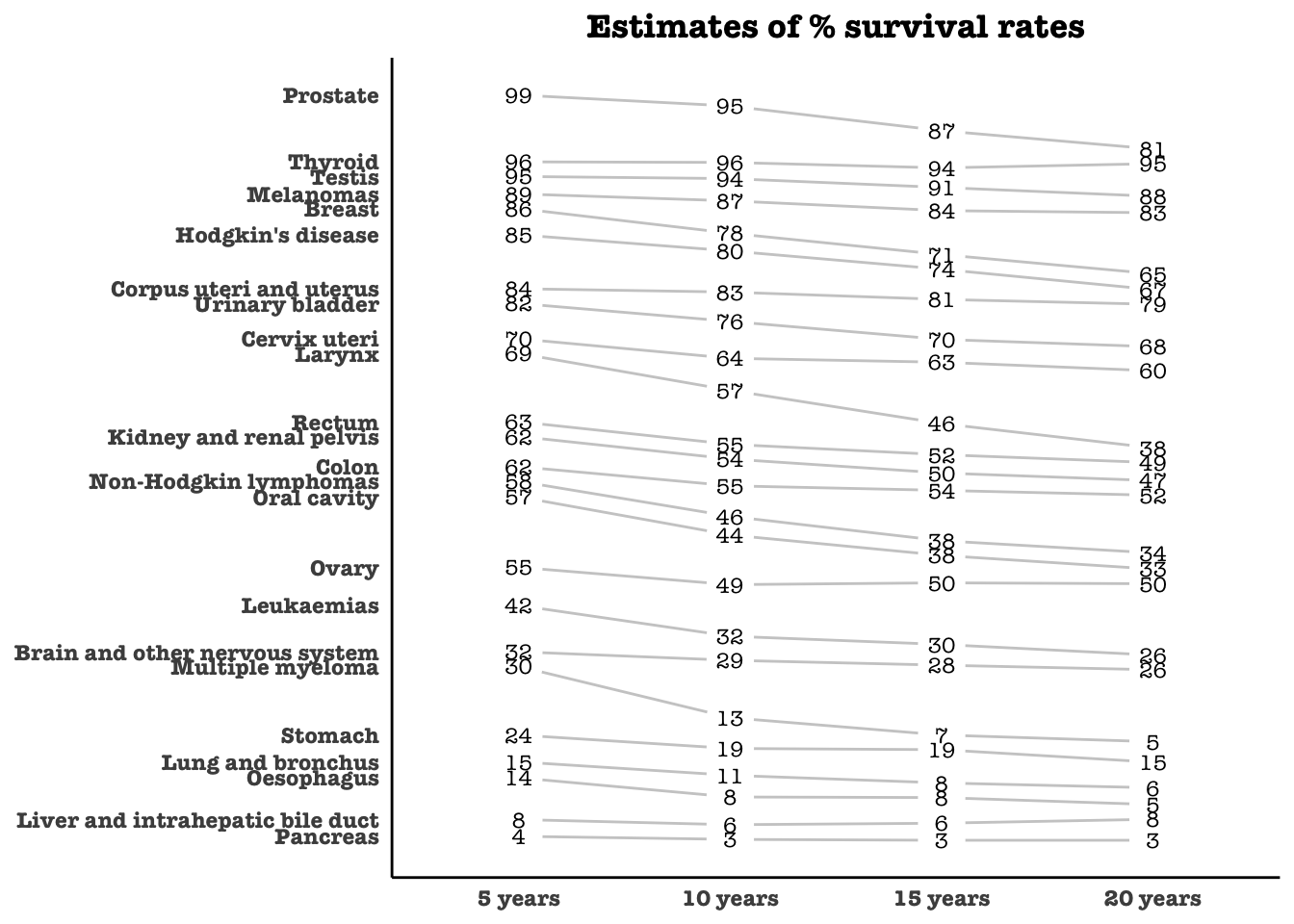
15.6.3.5.16 Dendrograms
#install.packages("ggdendro")
library("ggplot2")
library("ggdendro")
theme_set(theme_bw())
hc <- hclust(dist(USArrests), "ave")  # hierarchical clustering
# plot
ggdendrogram(hc, rotate = TRUE, size = 2)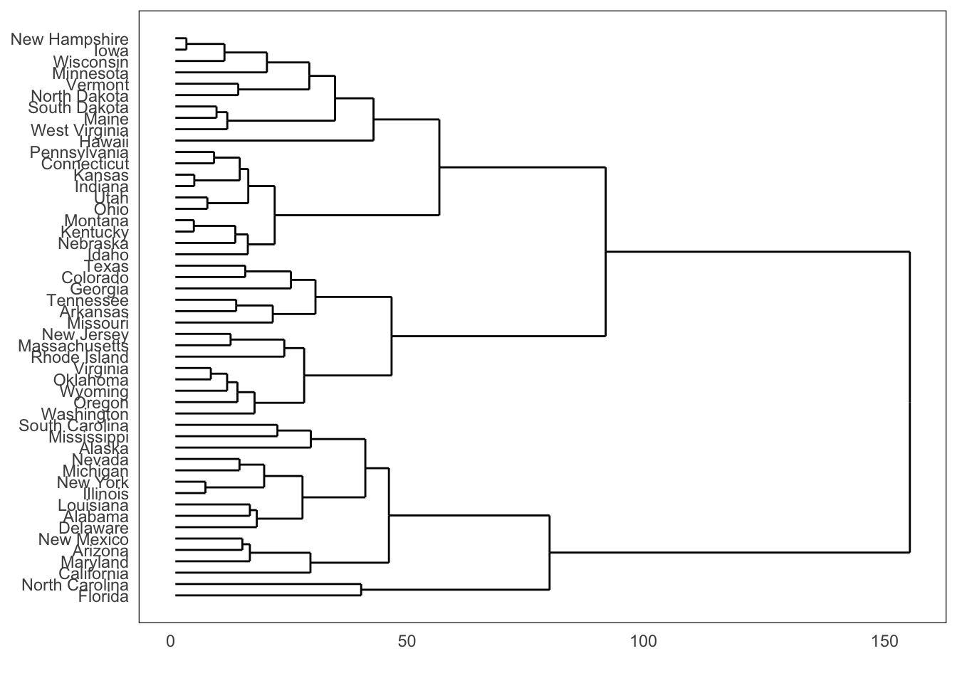
15.6.3.5.17 Density Plots
library(ggplot2)
theme_set(theme_classic())

# Plot
g <- ggplot(mpg, aes(cty))
g + geom_density(aes(fill=factor(cyl)), alpha=0.8) +
    labs(title="Density Plot",
         subtitle="City Mileage Grouped by Number of cylinders",
         caption="Source: mpg",
         x="City Mileage",
         fill="# Cylinders")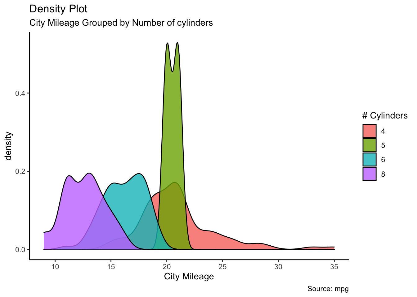
15.6.3.5.18 Boxplots
library(ggplot2)
theme_set(theme_classic())

# Plot
g <- ggplot(mpg, aes(class, cty))
g + geom_boxplot(varwidth=T, fill="plum") +
    labs(title="Boxplot",
         subtitle="City Mileage grouped by Class of vehicle",
         caption="Source: mpg",
         x="Class of Vehicle",
         y="City Mileage")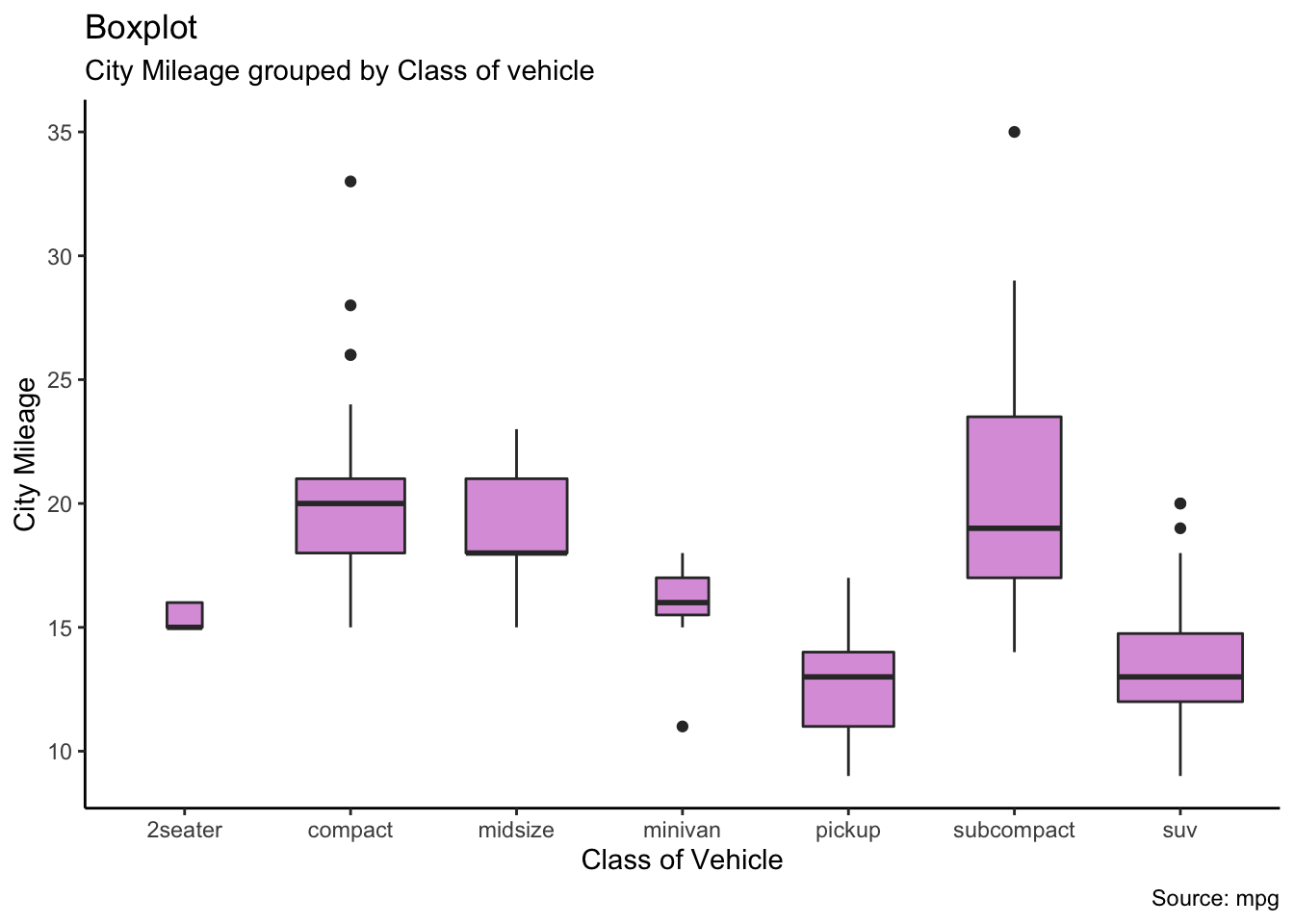
15.6.3.5.19 Boxplots and Dotplots
library(ggplot2)
theme_set(theme_bw())

# plot
g <- ggplot(mpg, aes(manufacturer, cty))
g + geom_boxplot() +
  geom_dotplot(binaxis='y',
               stackdir='center',
               dotsize = .5,
               fill="red") +
  theme(axis.text.x = element_text(angle=65, vjust=0.6)) +
  labs(title="Boxplot + Dotplot",
       subtitle="City Mileage vs Class: Each dot represents 1 row in source data",
       caption="Source: mpg",
       x="Class of Vehicle",
       y="City Mileage")
Bin width defaults to 1/30 of the range of the data. Pick better value with `binwidth`.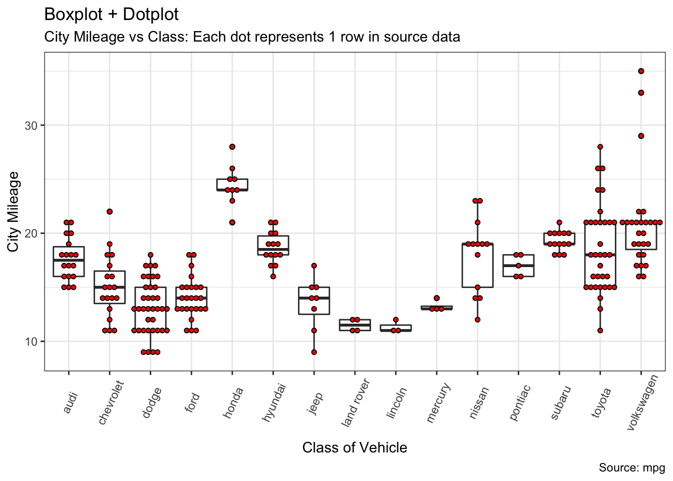
15.6.3.5.20 Waffle Charts
library(ggplot2)
var <- mpg$class  # the categorical data
## Prep data (nothing to change here)
nrows <- 10
df <- expand.grid(y = 1:nrows, x = 1:nrows)
categ_table <- round(table(var) * ((nrows*nrows)/(length(var))))
categ_table
#>   2seater    compact    midsize    minivan     pickup subcompact        suv
#>         2         20         18          5         14         15         26
df$category <- factor(rep(names(categ_table), categ_table))
# NOTE: if sum(categ_table) is not 100 (i.e. nrows^2), it will need adjustment to make the sum to 100.
## Plot
ggplot(df, aes(x = x, y = y, fill = category)) +
        geom_tile(color = "black", size = 0.5) +
        scale_x_continuous(expand = c(0, 0)) +
        scale_y_continuous(expand = c(0, 0), trans = 'reverse') +
        scale_fill_brewer(palette = "Set3") +
        labs(title="Waffle Chart", subtitle="'Class' of vehicles",
             caption="Source: mpg") +
        theme(panel.border = element_rect(size = 2),
              plot.title = element_text(size = rel(1.2)),
              axis.text = element_blank(),
              axis.title = element_blank(),
              axis.ticks = element_blank(),
              legend.title = element_blank(),
              legend.position = "right")
var
   2seater    compact    midsize    minivan     pickup subcompact        suv
         2         20         18          5         14         15         26
References
[62] A. Jensen et al., “Temporal disease trajectories condensed from population-wide registry data covering 6.2 million patients,” Nature Communications, vol. 5, 2014, doi: 10.1038/ncomms5022.
[83] P. Boily, S. Davies, and J. Schellinck, Practical data visualization. Data Action Lab/Quadrangle, 2021.
[103] @DamianMingle,,Available: https://twitter.com/DamianMingle/status/655534652833288192
[104] E. Tufte, Beautiful evidence. Graphics Press, 2008.
[105] T. Elms, Lexical distance of european languages. Etymologikon, 2008.Available: https://elms.wordpress.com/2008/03/04/lexical-distance-among-languages-of-europe/
[106] A. Cairo, The functional art. New Riders, 2013.
[107] A. Cairo, The truthful art. New Riders, 2016.
[109] I. Meireilles, Design for information. Rockport, 2013.
[110] P. Dragicevic and Y. Jansen, List of physical visualizations and related artifacts. Available: http://dataphys.org/list/
[111] Data Action Lab Podcast, Episode 3 - Minard’s March to Moscow, 2020.
[112] Data Action Lab, Data Analysis Short Course, 2020.
[113] R. A. Dahl, “Cause and effect in the study of politics,” in Cause and effect, D. Lerner, Ed. New York: Free Press, 1965, pp. 75–98.
[114] A. B. Hill, “The environment and disease: Association or causation?” Proc R Soc Med, vol. 58, no. 5, pp. 295–300, 1965.
[115] Z. Gemignani and C. Gemignani, Data fluency: Empowering your organization with effective data communication. Wiley, 2014.
[117] S. Wexler, J. Shaffer, and A. Cotgreave, The big book of dashboards. Wiley, 2017.
[118] M. Pelletier and P. Boily, “Dashboard and data visualization, with examples,” Data Science Report Series, 2019.
[119] E. Tufte, The visual display of quantitative information. Graphics Press, 2001.
[120] C. Nussbaumer Knaflic, Storytelling with data. Wiley, 2015.
[121] Matillion.com, “Poor use of dashboard software,”Available: https://www.matillion.com/wp-content/uploads/2014/11/qlikview-poor-use-of-dashboard-software.png
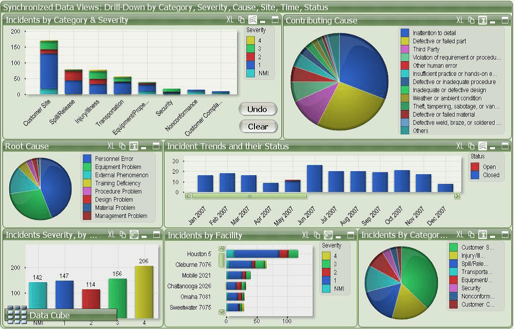
[122] Geckoboard.com, “Two terrible dashboard examples,”Available: https://www.geckoboard.com/assets/2-terrible-dashboard-example-min.png
[123] N. Wickham H., Ggplot2: Elegant graphics for data analysis. Springer, 2021.
[124] H. Wickham, “A layered grammar of graphics,” Journal of Computational and Graphical Statistics, no. 19, pp. 3–28, 2009.
[125] K. Healey, Data Visualization: A Practical Introduction, 2018.
[126] H. Wickham, “Tidy data,” Journal of Statistical Software, vol. 59, no. 10, 2014.
[127] W. Chang, R graphics cookbook. O’Reilly, 2013.