Module 14 Data Preparation
Once raw data has been collected and stored in a database or a dataset, the focus should shift to data cleaning and processing. This requires testing for soundness and fixing errors, designing and implementing strategies to deal with missing values and outlying/influential observations, as well as low-level exploratory data analysis and visualization to determine what data transformations and dimension reduction approaches will be needed in the final analysis.
In this module, we establish the essential elements of data cleaning and data processing.
14.1 Introduction
Martin K: Data is messy, Alison.
Alison M: Even when it’s been cleaned?
Martin K: Especially when it’s been cleaned.
(P. Boily, J. Schellinck, The Great Balancing Act [in progress]).
Data cleaning and data processing are essential aspects of quantitative analysis projects; analysts and consultants should be prepared to spend up to 80% of their time on data preparation, keeping in mind that:
processing should NEVER be done on the original dataset – make copies along the way;
ALL cleaning steps need to be documented;
if too much of the data requires cleaning up, the data collection procedure might need to be revisited, and
records should only be discarded as a last resort.
Another thing to keep in mind is that cleaning and processing may need to take place more than once depending on the type of data collection (one pass, batch, continuously), and that that it is essentially impossible to determine if all data issues have been found and fixed.
Note: for this module, we are assuming that the datasets of interest contain only numerical and/or categorical observations. Additional steps must be taken when dealing with unstructured data, such as text or images (we’ll have more to say on this topic later).
14.2 General Principles
Dilbert: I didn’t have any accurate numbers, so I just made up this one. Studies have shown that accurate numbers aren’t any more useful that the ones you make up.
Pointy-Haired Boss: How many studies showed that?
Dilbert: [beat] Eighty-seven.
(S. Adams, Dilbert, 8 May 2008)
14.2.1 Approaches to Data Cleaning
We recognize two main philosophical approaches to data cleaning and validation:
methodical, and
narrative.
The methodical approach consists in running through a check list of potential issues and flagging those that apply to the data.
The narrative approach, on the other hand, consists in exploring the dataset while searching for unlikely or irregular patterns. Which approach the consultant/analyst opts to follow depends on a number of factors, not least of which is the client’s needs and views on the matter – it is important to discuss this point with the clients.
14.2.2 Pros and Cons
The methodical approach focuses on syntax; the check-list is typically context-independent, which means that it (or a subset) can be reused from one project to another, which makes data analysis pipelines easy to implement and automate. In the same vein, common errors are easily identified.
On the flip side, the check list may be quite extensive and the entire process may prove time-consuming.
The biggest disadvantage of this approach is that it makes it difficult to identify new types of errors. The narrative approach focuses on semantics; even false starts may simultaneously produce data understanding prior to switching to a more mechanical approach.
It is easy, however, to miss important sources of errors and invalid observations when the datasets have a large number of features.
There is an additional downside: domain expertise, coupled with the narrative approach, may bias the process by neglecting “uninteresting” areas of the dataset.
14.2.3 Tools and Methods
A non-exhaustive list of common data issues can be found in the Data Cleaning Bingo Card (see Figure 14.1).
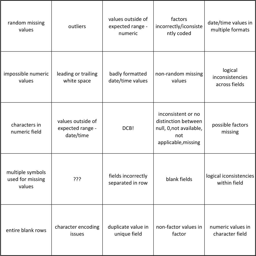
Figure 14.1: Data cleaning bingo card [J. Schellinck].
Other methods include
visualizations – which may help easily identify observations that need to be further examined;
data summaries – # of missing observations; 5-pt summary, mean, standard deviation, skew, kurtosis, for numerical variables; distribution tables for categorical variables;
\(n\)-way tables – counts for joint distributions of categorical variables;
small multiples – tables/visualizations indexed along categorical variables, and
preliminary data analyses – which may provide “huh, that’s odd…” realizations.
It is important to note that there is nothing wrong with running a number of analyses to flush out data issues, but remember to label your initial forays as preliminary analyses. From the client or stakeholder’s perspective, repeated analyses may create a sense of unease and distrust, even if they form a crucial part of the analytical process.
In our (admittedly biased and incomplete) experience,
computer scientists and programmers tend to naturally favour the methodical approach, while
mathematicians (and sometimes statisticians) tend to naturally favour the narrative approach,
although we have met plenty of individuals with unexpected backgrounds in both camps.
This is not the place for identity politics: data scientists, data analysts, and quantitative consultants alike need to be comfortable with both approaches.
As an analogy, the narrative approach is akin to working out a crossword puzzle with a pen and accepting to put down potentially erroneous answers once in a while to try to open up the grid (what artificial intelligence researchers call the “exploration” approach).
The mechanical approach, on the other hand, is similar to working out the puzzle with a pencil and a dictionary, only putting down answers when their correctness is guaranteed (the “exploitation” approach of artificial intelligence).
More puzzles get solved when using the first approach, but missteps tend to be spectacular. Not as many puzzles get solved the second way, but the trade-off is that it leads to fewer mistakes.
14.3 Data Quality
Calvin’s Dad: OK Calvin. Let’s check over your math homework.
Calvin: Let’s not and say we did.
Calvin’s Dad: Your teacher says you need to spend more time on it. Have a seat.
Calvin: More time?! I already spent 10 whole minutes on it! 10 minutes shot! Wasted! Down the drain!
Calvin’s Dad: You’ve written here \(8+4=7\). Now you know that’s not right.
Calvin: So I was off a little bit. Sue me.
Calvin’s Dad: You can’t add things and come with less than you started with!
Calvin: I can do that! It’s a free country! I’ve got my rights!
(B. Watterson, Calvin and Hobbes, 15-09-1990.)
The quality of the data has an important effect on the quality of the results: as the saying goes: “garbage in, garbage out.” Data is said to be sound when it has as few issues as possible with:
validity – are observations sensible, given data type, range, mandatory response, uniqueness, value, regular expressions, etc. (e.g. a value that is expected to be text value is a number, a value that is expected to be positive is negative, etc.)?;
completeness – are there missing observations (more on this in a subsequent section)?;
accuracy and precision – are there measurement and/or data entry errors (e.g. an individual has \(-2\) children, etc., see Figure 14.2, linking accuracy to bias and precision to the standard error)?;
consistency – are there conflicting observations (e.g. an individual has no children, but the age of one kid is recorded, etc.)?, and
uniformity – are units used uniformly throughout (e.g. an individual is 6ft tall, whereas another one is 145cm tall)?
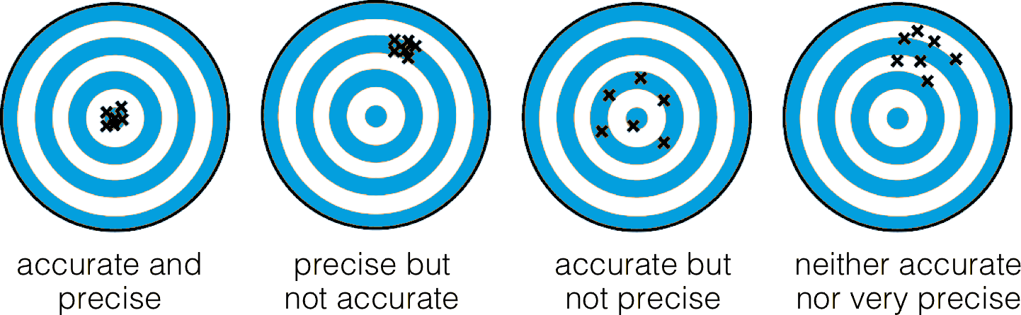
Figure 14.2: Accuracy as bias, precision as standard error [author unknown].
Finding an issue with data quality after the analyses are completed is a sure-fire way of losing the stakeholder’s or client’s trust – check early and often!
14.3.1 Common Error Sources
If the analysts have some control over the data collection and initial processing, regular data validation tests are easier to set-up.
When analysts are dealing with legacy, inherited, or combined datasets, however, it can be difficult to recognize errors that arise from:
missing data being given a code;
NA/blankentries being given a code;data entry errors;
coding errors;
measurement errors;
duplicate entries;
heaping (see Figure 14.3 for an example).
etc.
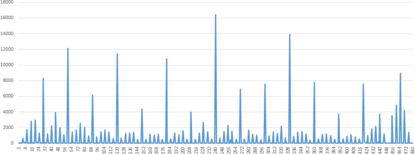
Figure 14.3: An illustration of heaping: self-reported time spent working in a day [personal file]. The entries for 7, 7.5, and 8 hours are omitted. Note the rounding off at various multiples of 5 minutes.
14.3.2 Detecting Invalid Entries
Potentially invalid entries can be detected with the help of a number of methods:
univariate descriptive statistics – \(z-\)score, count, range, mean, median, standard deviation, etc. (see Math & Stats Overview for details);
multivariate descriptive statistics – \(n-\)way tables and logic checks, and
data visualization – scatterplot, histogram, joint histogram, etc. (see Data Visualization for details).
Importantly, we point out that univariate tests do not always tell the whole story.
Example: consider, for instance, an artificial medical dataset consisting of 38 patients’ records, containing, among others, fields for the sex and the pregnancy status of the patients.
A summary of the data of interest is provided in the frequency counts (1-way tables) of the table below:
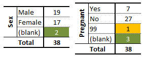
The analyst can quickly notice that some values are missing (in green) and that an entry has been miscoded as 99 (in yellow). Using only these univariate summaries, however, it is impossible to decide what to do with these invalid entries.
The 2-way frequency counts shed some light on the situation, and uncover other potential issues with the data.
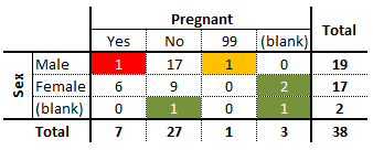
One of the green entries is actually blank along the two variables; depending on the other information, this entry could be a candidate for imputation or outright deletion (more on these concepts in the next section).
Three other observations are missing a value along exactly one variable, but the information provided by the other variables may be complete enough to warrant imputation. Of course, if more information is available about the patients, the analyst may be able to determine why the values were missing in the first place (however privacy concerns at the collection stage might muddy the waters).
The mis-coded information on the pregnancy status (99, in yellow) is linked to a male client, and as such re-coding it as ‘No’ is likely to be a reasonable decision (although not necessarily the correct one… data measurements are rarely as clear cut as we may think upon first reflection).
A similar reasoning process should make the analyst question the validity of the entry shaded in red – the entry might very well be correct, but it is important to at least inquire about this data point, as the answer could lead to an eventual re-framing of the definitions and questions used at the collection stage.
In general, there is no universal or one-size-fits-all approach – a lot depends on the nature of the data. As always, domain expertise can provide valuable help and suggest fruitful exploration avenues.
14.4 Missing Values
Obviously, the best way to treat missing data is not to have any (T. Orchard, M. Woodbury, [92]).
Why does it matter that some values may be missing?
As a start, missing values can potentially introduce bias into the analysis, which is rarely (if at all) a good thing, but, more pragmatically, they may interfere with the functioning of most analytical methods, which can not easily accommodate missing observations without breaking down.39
Consequently, when faced with missing observations, analysts have two options: they can either discard the missing observation (which is not typically recommended, unless the data is missing completely randomly), or they can create a replacement value for the missing observation (the imputation strategy has drawbacks since we can never be certain that the replacement value is the true value, but is often the best available option; information in this section is taken partly from [93]–[96]).
Blank fields come in 4 flavours:
nonresponse – an observation was expected but none was entered;
data entry issues – an observation was recorded but was not entered in the dataset;
invalid entries – an observation was recorded but was considered invalid and has been removed, and
expected blanks – a field has been left blank, but not unexpectedly so.
Too many missing values of the first three types can be indicative of issues with the data collection process, while too many missing values of the fourth type can be indicative of poor questionnaire design (see [97] for a brief discussion on these topics).
Either way, missing values cannot simply be ignored: either the
corresponding record is removed from the dataset (not recommended without justification, as doing so may cause a loss of auxiliary information and may bias the analysis results), or
missing value must be imputed (that is to say, a reasonable replacement value must be found).
14.4.1 Missing Value Mechanisms
The relevance of an imputation method is dependent on the underlying missing value mechanism; values may be:
missing completely at random (MCAR) – the item absence is independent of its value or of the unit’s auxiliary variables (e.g., an electrical surge randomly deletes an observation in the dataset);
missing at random (MAR) – the item absence is not completely random, and could, in theory, be accounted by the unit’s complete auxiliary information, if available (e.g., if women are less likely to tell you their age than men for societal reasons, but not because of the age values themselves), and
not missing at random (NMAR) – the reason for nonresponse is related to the item value itself (e.g., if illicit drug users are less likely to admit to drug use than teetotalers).
The consultant’s main challenge in that regard is that the missing mechanism cannot typically be determined with any degree of certainty.
14.4.2 Imputation Methods
There are numerous statistical imputation methods. They each have their strengths and weaknesses; consequently, consultants and analysts should take care to select a method which is appropriate for the situation at hand.40
In list-wise deletion, all units with at least one missing value are removed from the dataset. This straightforward imputation strategy assumes MCAR, but it can introduce bias if MCAR does not hold, and it leads to a reduction in the sample size and an increase in standard errors.
In mean or most frequent imputation, the missing values are substituted by the average or most frequent value in the unit’s subpopulation group (stratum). This commonly-used approach also assumes MCAR, but it can creates distortions in the underlying distributions (such as a spike at the mean) and create spurious relationships among variables.
In regression or correlation imputation, the missing values are substituted using a regression on the other variables. This model assumes MAR and trains the regression on units with complete information, in order to take full advantage of the auxiliary information when it is available. However, it artificially reduces data variability and produces over-estimates of correlations.
In stochastic regression imputation, the regression estimates are augmented with random error terms added. Just as in regression estimation, the model assumes MAR; an added benefit is that it tends to produce estimates that “look” more realistic than regression imputation, but it comes with an increased risk of type I error (false positives) due to small standard errors.
Last observation carried forward (LOCF) and its cousin next observation carried backward (NOCB) are useful for longitudinal data; a missing value can simply be substituted by the previous or next value. LOCF and NOCB can be used when the values do not vary greatly from one observation to the next, and when values are MCAR. Their main drawback is that they may be too “generous” for studies that are trying to determine the effect of a treatment over time, say.
Finally, in \(k\)-nearest-neighbour imputation, a missing entry in a MAR scenario is substituted by the average (or median, or mode) value from the subgroup of the \(k\) most similar complete respondents. This requires a notion of similarity between units (which is not always easy to define reasonably). The choice of \(k\) is somewhat arbitrary and can affect the imputation, potentially distorting the data structure when it is too large.
What does imputation look like in practice? Consider the following scenario (which is, somewhat embarrassingly, based on a true story).
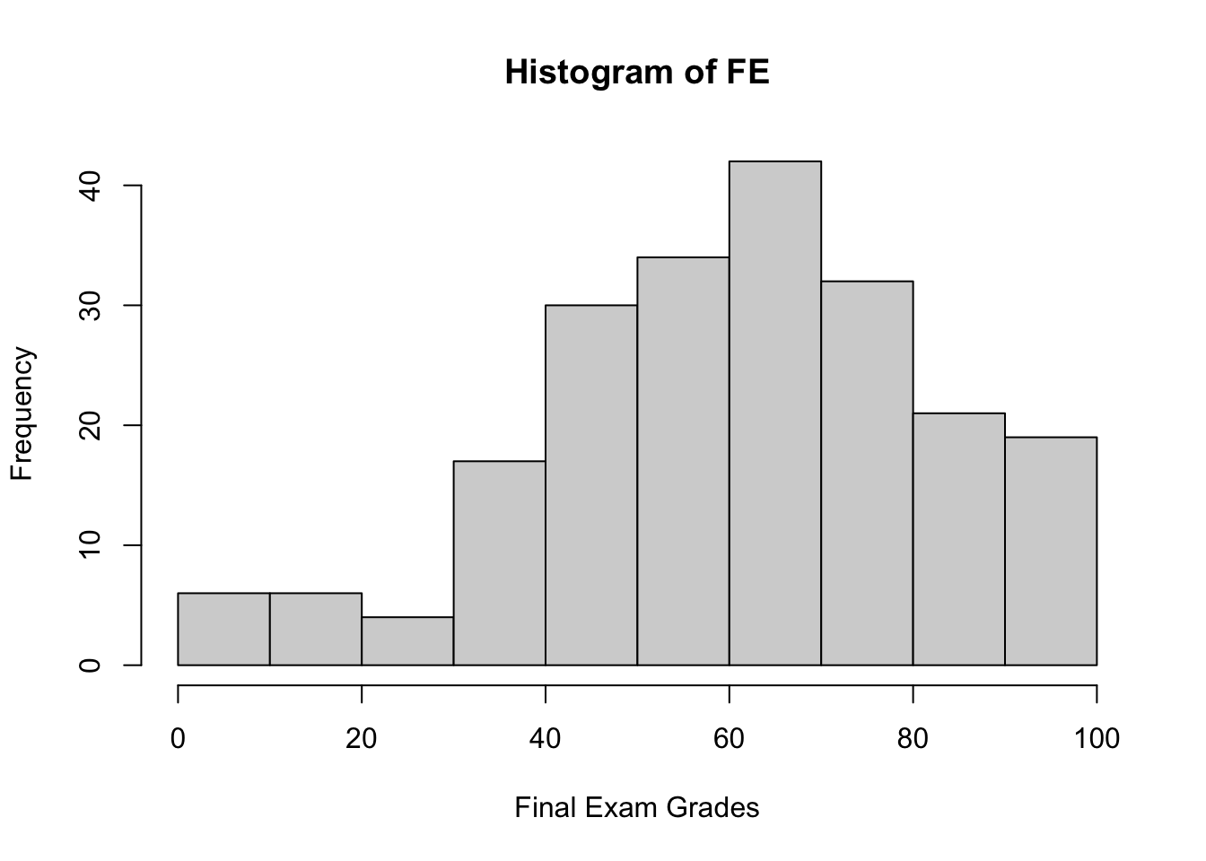
Example: after marking the final exams of the 211 students who did not drop her course in Advanced Retroencabulation at State University, Dr.Helga Vanderwhede plots the final exam grades (\(y\)) against the mid-term exam grades (\(x\)), as seen below.
MT=c(
 80,73,83,60,49,96,87,87,60,53,66,83,32,80,66,90,72,55,76,46,
 48,69,45,48,77,52,59,97,76,89,73,73,48,59,55,76,87,55,80,90,
 83,66,80,97,80,55,94,73,49,32,76,57,42,94,80,90,90,62,85,87,
 97,50,73,77,66,35,66,76,90,73,80,70,73,94,59,52,81,90,55,73,
 76,90,46,66,76,69,76,80,42,66,83,80,46,55,80,76,94,69,57,55,
 66,46,87,83,49,82,93,47,59,68,65,66,69,76,38,99,61,46,73,90,
 66,100,83,48,97,69,62,80,66,55,28,83,59,48,61,87,72,46,94,48,
 59,69,97,83,80,66,76,25,55,69,76,38,21,87,52,90,62,73,73,89,
 25,94,27,66,66,76,90,83,52,52,83,66,48,62,80,35,59,72,97,69,
 62,90,48,83,55,58,66,100,82,78,62,73,55,84,83,66,49,76,73,54,
 55,87,50,73,54,52,62,36,87,80,80
)

FE=c(
41,54,93,49,92,85,37,92,61,42,74,84,61,21,75,49,36,62,92,85,
50,90,52,63,64,85,66,51,41,75,4,46,38,71,42,18,76,42,94,53,
77,65,95,3,74,0,97,62,74,61,80,47,39,92,59,37,59,71,20,67,
69,88,53,52,81,41,81,48,67,65,92,75,68,55,67,51,83,71,58,37,
65,66,51,43,83,34,55,59,20,62,22,70,64,59,73,74,73,53,44,36,
62,45,80,85,41,80,84,44,73,72,60,65,78,60,34,91,40,41,54,91,
49,92,85,37,92,61,42,74,84,61,21,75,49,36,62,92,85,50,92,52,
63,64,85,66,51,41,75,4,46,38,71,42,18,76,42,92,53,77,65,92,
3,74,0,52,62,74,61,80,47,39,92,59,37,59,71,20,67,69,88,53,
52,81,41,81,48,67,65,94,75,68,55,67,51,83,71,58,37,65,66,51,
43,83,34,55,59,20,62,22,70,64,59
)

grades=data.frame(MT,FE)
knitr::kable(summary(grades))
hist(MT, xlim=c(0,100), xlab=c("Midterm Grades"))
plot(grades, xlim=c(0,100), ylim=c(0,100),
     xlab=c("Midterm Grade"), ylab=c("Final Exam grade"),
     main=c("Course Results"))
| MT | FE | |
|---|---|---|
| Min. : 21.00 | Min. : 0.00 | |
| 1st Qu.: 55.00 | 1st Qu.:46.50 | |
| Median : 70.00 | Median :62.00 | |
| Mean : 68.74 | Mean :60.09 | |
| 3rd Qu.: 82.50 | 3rd Qu.:75.00 | |
| Max. :100.00 | Max. :97.00 |
Looking at the data, she sees that final exam grades are weekly correlated with mid-term exam grades: students who performed well on the mid-term tended to perform well on the final, and students who performed poorly on the mid-term tended to perform poorly on the final (as is usually the case), but the link is not that strong.
[1] 0.5481776She also sees that there is a fair amount of variability in the data: the noise is not very tight around the (eye-balled) line of best fit.
# run the linear regression
model <- lm(FE ~ MT, data=grades)

# display the model summary
model
summary(model)

# for line of best fit, residual plots
library(ggplot2)

# line of best fit
ggplot(model) + geom_point(aes(x=MT, y=FE)) +
    geom_line(aes(x=MT, y=.fitted), color="blue" ) +
    theme_bw() + xlab(c("Midterm Grade")) + ylab(c("Final Exam Grade")) +
    ggtitle(c("Line of Best Fit"))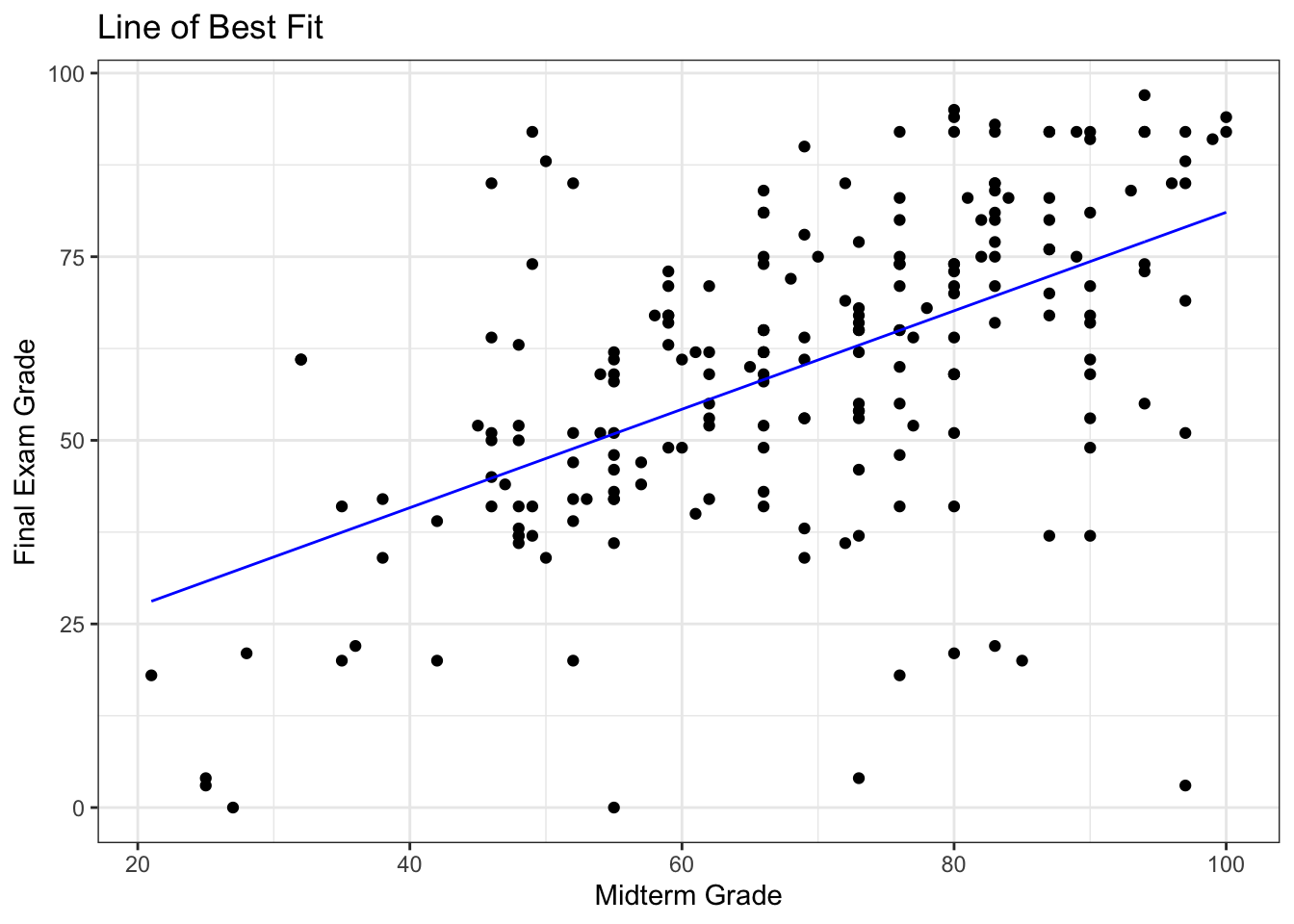
# residuals
ggplot(model) + geom_point(aes(x=MT, y=FE)) +   ### plotting residuals
    geom_line(aes(x=MT, y=.fitted), color="blue" ) +
    geom_linerange(aes(x=MT, ymin=.fitted, ymax=FE), color="red") +
    theme_bw() + xlab(c("Midterm Grade")) + ylab(c("Final Exam Grade")) +
    ggtitle(c("Residuals"))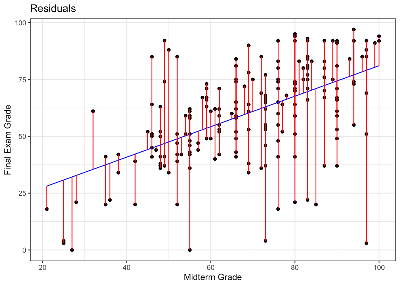
Call:
lm(formula = FE ~ MT, data = grades)

Coefficients:
(Intercept)           MT
    14.0097       0.6704


Call:
lm(formula = FE ~ MT, data = grades)

Residuals:
    Min      1Q  Median      3Q     Max
-76.035  -8.759   2.131  10.987  45.142

Coefficients:
            Estimate Std. Error t value Pr(>|t|)
(Intercept) 14.00968    5.01523   2.793   0.0057 **
MT           0.67036    0.07075   9.475   <2e-16 ***
---
Signif. codes:  0 '***' 0.001 '**' 0.01 '*' 0.05 '.' 0.1 ' ' 1

Residual standard error: 17.81 on 209 degrees of freedom
Multiple R-squared:  0.3005,    Adjusted R-squared:  0.2972
F-statistic: 89.78 on 1 and 209 DF,  p-value: < 2.2e-16
Furthermore, she realizes that the final exam was harder than the students expected (as the slope of the line of best fit is smaller than \(1\), as only 29% of observations lie above the line MT=FE) – she suspects that they simply did not prepare for the exam seriously (and not that she made the exam too difficult, no matter what her ratings on RateMyProfessor.com suggest), as most of them could not match their mid-term exam performance.
sum(grades$MT <= grades$FE)/nrow(grades)

plot(grades, xlim=c(0,100), ylim=c(0,100),
     xlab=c("Midterm Grade"), ylab=c("Final Exam grade"),
     main=c("Course Results"))
abline(a=0, b=1, col="red")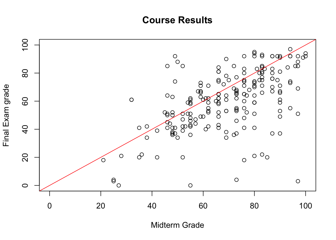
[1] 0.2890995As Dr. Vanderwhede comes to term with her disappointment, she takes a deeper look at the numbers, at some point sorting the dataset according to the mid-term exam grades.
| MT | FE | |
|---|---|---|
| 122 | 100 | 92 |
| 188 | 100 | 94 |
| 116 | 99 | 91 |
| 28 | 97 | 51 |
| 44 | 97 | 3 |
| 61 | 97 | 69 |
| 125 | 97 | 92 |
| 143 | 97 | 85 |
| 179 | 97 | 88 |
| 6 | 96 | 85 |
| 47 | 94 | 97 |
| 54 | 94 | 92 |
| 74 | 94 | 55 |
| 97 | 94 | 73 |
| 139 | 94 | 92 |
| 162 | 94 | 74 |
It looks like good old Mary Sue (row number 47) performed better on the final than on the mid-term (where her performance was already superlative), scoring the highest grade. What a great student Mary Sue is!41
plot(s.grades[,c("MT","FE")], xlim=c(0,100), ylim=c(0,100),
     col=ifelse(row.names(s.grades)=="47",'red','black'),
     pch=ifelse(row.names(s.grades)=="47",22,1), bg='red',
     xlab=c("Midterm Grade"), ylab=c("Final Exam grade"),
     main=c("Mary Sue!"))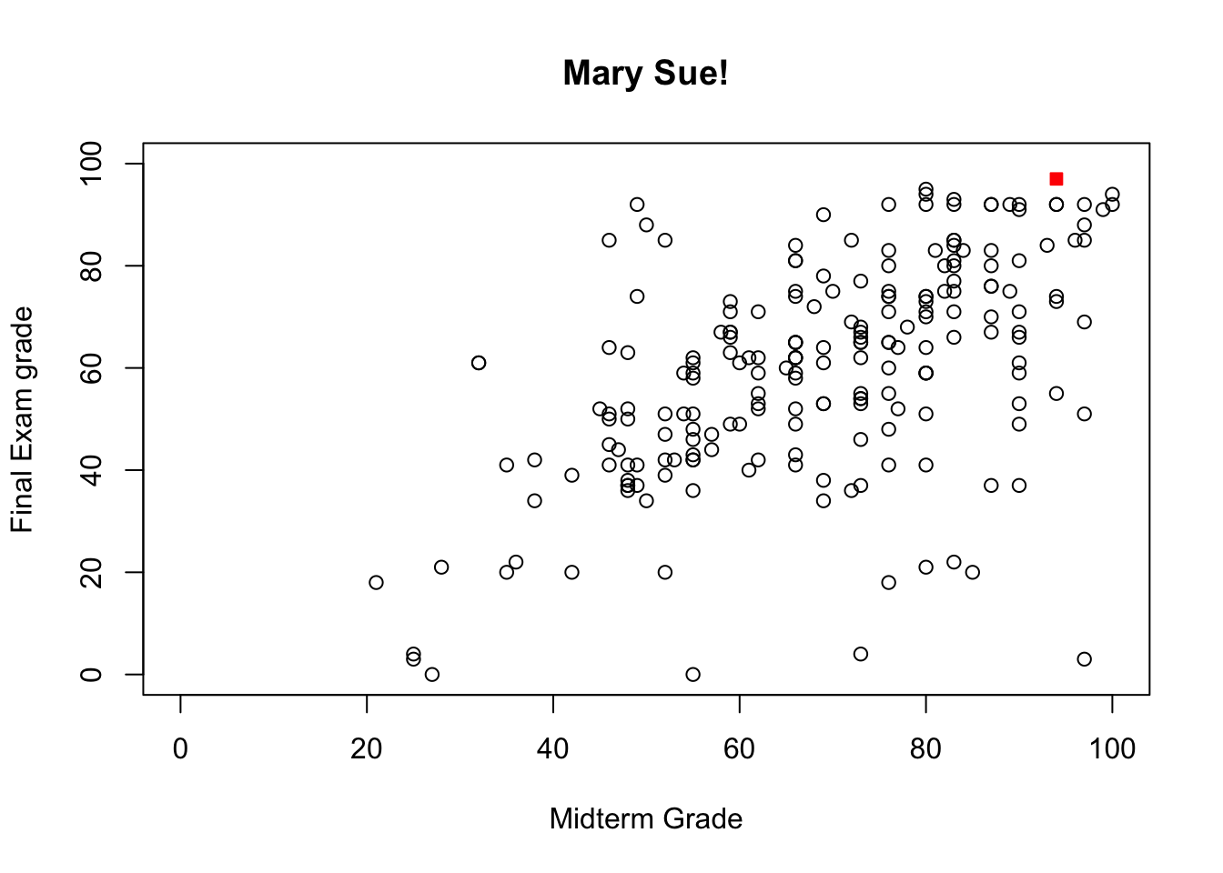
She continues to toy with the spreadsheet until the phone rings. After a long and exhausting conversation with Dean Bitterman about teaching loads and State University’s reputation, Dr. Vanderwhede returns to the spreadsheet and notices in horror that she has accidentally deleted the final exam grades of all students with a mid-term grade greater than 93.
What is she to do? Anyone with a modicum of technical savvy would advise her to either undo her changes or to close the file without saving the changes,42 but in full panic mode, the only solution that comes to mind is to impute the missing values.
She knows that the missing final grades are MAR (and not MCAR since she remembers sorting the data along the MT values); she produces the imputations shown in Figure 14.4.
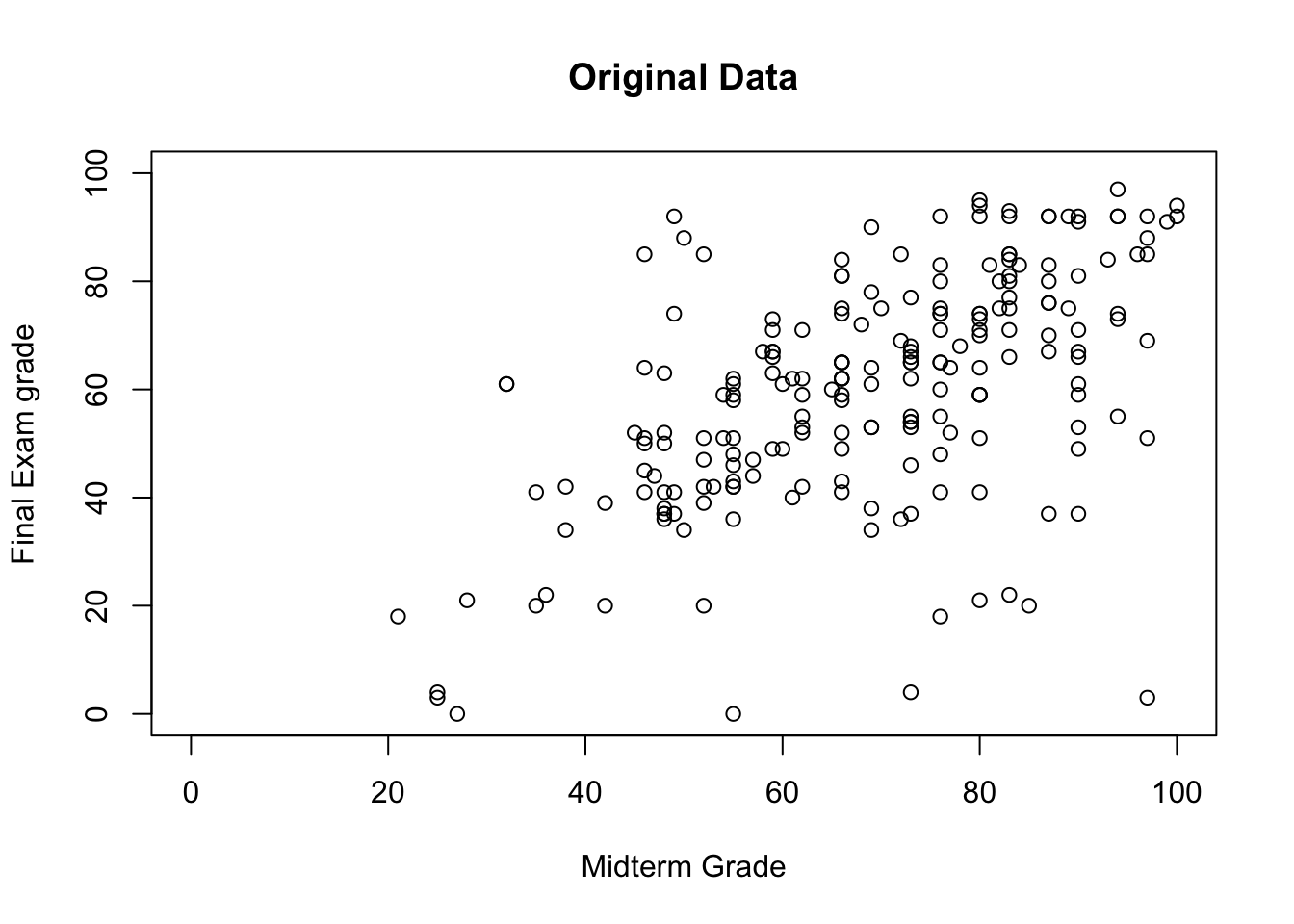
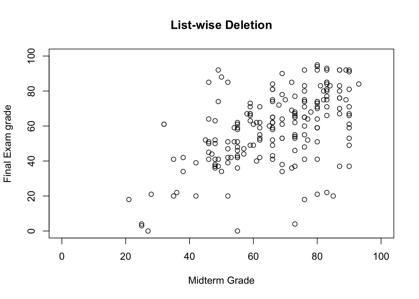
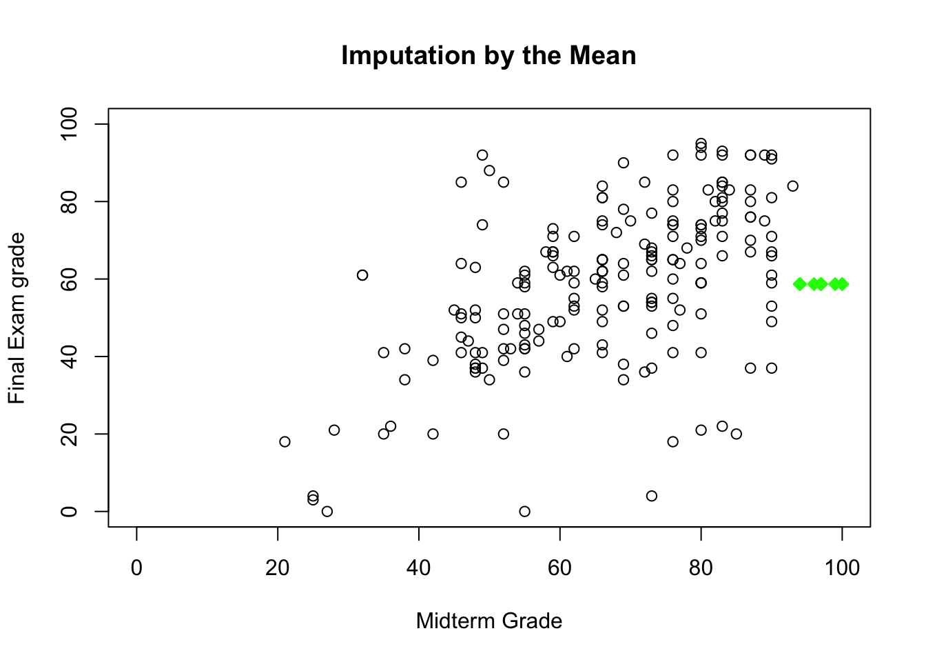
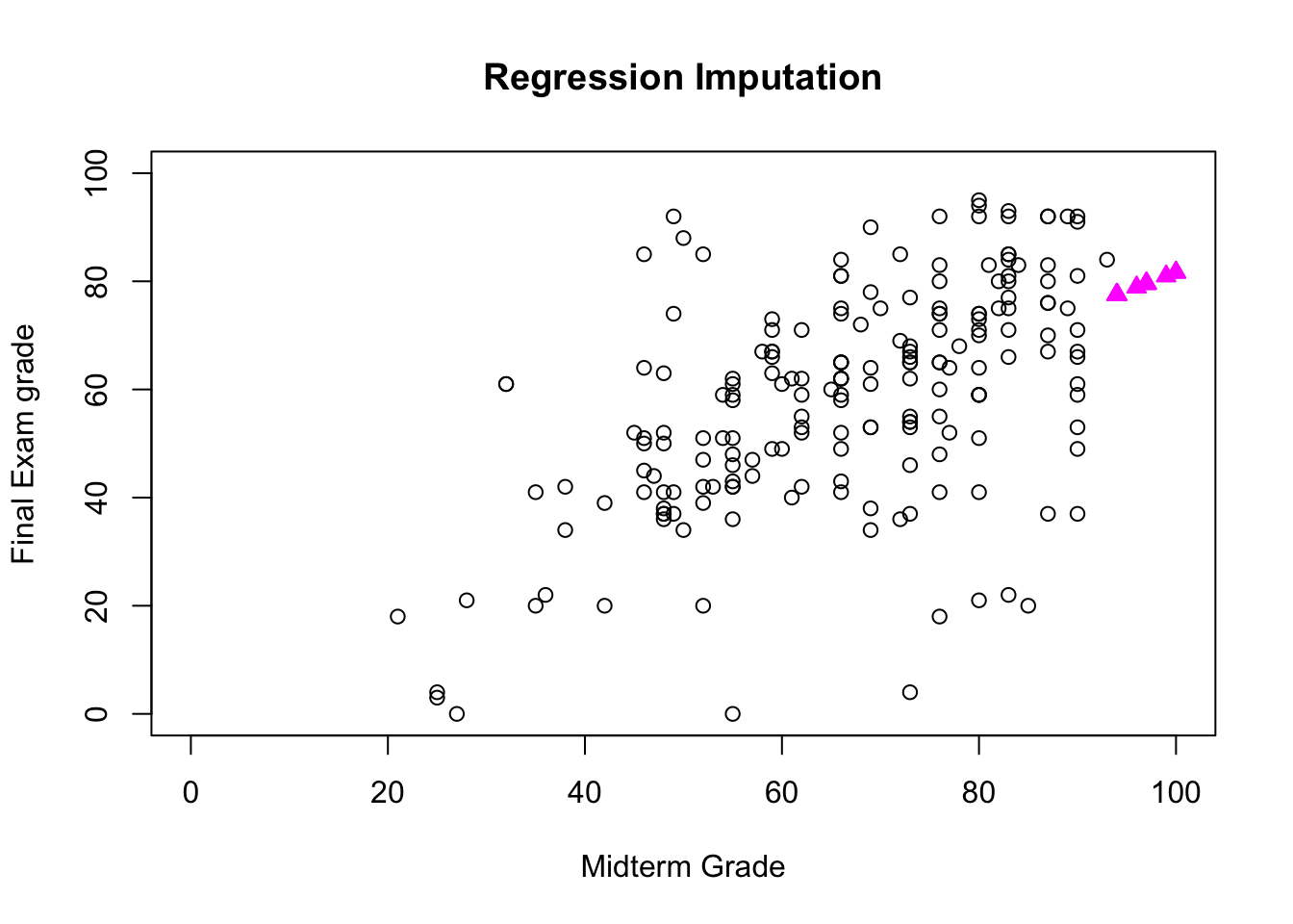
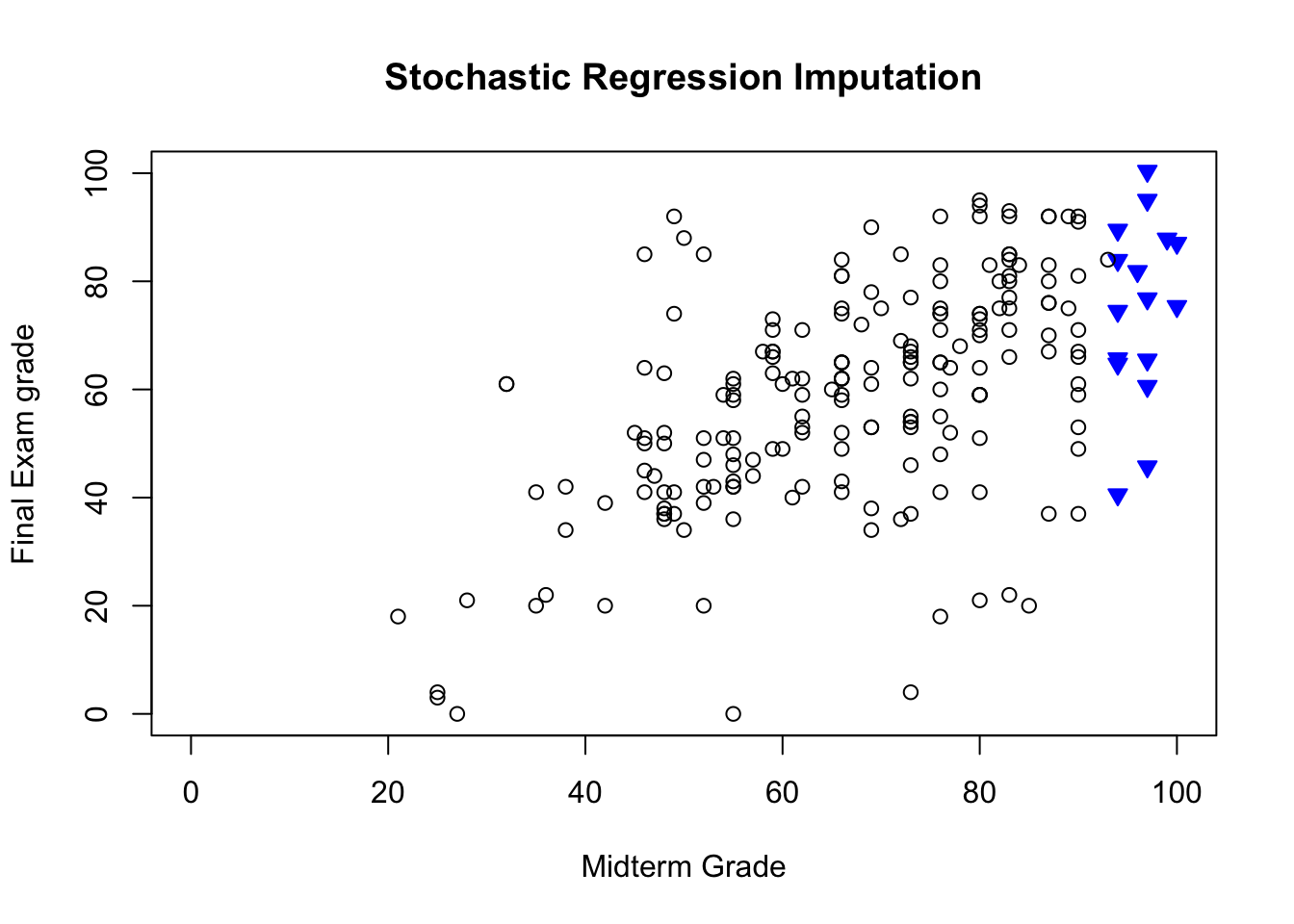
Figure 14.4: Imputed values for Dr. Vanderwhede’s dataset - original data, list-wise deletion, mean imputation, regression imputation, stochastic imputation, 5 nearest neighbour imputation.
She remembers what the data looked like originally, and concludes that the best imputation method is the stochastic regression model.
This conclusion only applies to this specific example, however. In general, that might not be the case due to various No Free Lunch results.43 The main take-away from this example is that various imputation strategies lead to different outcomes, and perhaps more importantly, that even though the imputed data might “look” like the true data, we have no way to measure its departure from reality – any single imputed value is likely to be completely off.
Mathematically, this might not be problematic, as the average departure is likely to be relatively small, but in a business context or a personal one, this might create gigantic problems – how is Mary Sue likely to feel about Dr.Vanderwhede’s solution in the previous example?
| MT | FE | FE.NA.reg | |
|---|---|---|---|
| 47 | 94 | 97 | 40.54084 |
And how would Dean Bitterman react were he finds out about the imputation scenario from irrate students? The solution has to be compatible with the ultimate data science objective: from Dr. Vanderwhede’s perspective, perhaps the only thing that matters is capturing the essence of the students’ performance, but from the student’s perspective…
Even though such questions are not quantitative in nature, their answer will impact any actionable solution.
14.4.3 Multiple Imputation
Another drawback of imputation is that it tends to increase the noise in the data, because the imputed data is treated as the actual data.
In multiple imputation, the impact of that noise can be reduced by consolidating the analysis outcome from multiple imputed datasets. Once an imputation strategy has been selected on the basis of the (assumed) missing value mechanism,
the imputation process is repeated \(m\) times to produce \(m\) versions of the dataset (assuming a stochastic procedure – if the imputed dataset is always the same, this procedure is worthless);
each of these datasets is analyzed, yielding \(m\) outcomes, and
the \(m\) outcomes are pooled into a single result for which the mean, variance, and confidence intervals are known.
On the plus side, multiple imputation is easy to implement, flexible, as it can be used in a most situations (MCAR, MAR, even NMAR in certain cases), and it accounts for uncertainty in the imputed values.
However, \(m\) may need to be quite large when the values are missing in large quantities from many of the dataset’s features, which can substantially slow down the analyses.
There may also be additional technical challenges when the output of the analyses is not a single value but some more complicated object. A generalization of multiple imputation was used by Transport Canada to predict the Blood Alcohol Level (BAC) content level in fatal traffic collisions that involved pedestrians [98].
14.5 Anomalous Observations
The most exciting phrase to hear […], the one that heralds the most discoveries, is not “Eureka!” but “That’s funny…” [I. Asimov (attributed)].
Outlying observations are data points which are atypical in comparison to the unit’s remaining features (within-unit), or in comparison to the measurements for other units (between-units), or as part of a collective subset of observations.Outliers are thus observations which are dissimilar to other cases or which contradict known dependencies or rules.44
Observations could be anomalous in one context, but not in another.
Example: consider, for instance, an adult male who is 6-foot tall. Such a man would fall in the 86th percentile among Canadian males [99], which, while on the tall side, is not unusual; in Bolivia, however, the same man would land in the 99.9th percentile [99], which would mark him as extremely tall and quite dissimilar to the rest of the population.45
A common mistake that analysts make when dealing with outlying observations is to remove them from the dataset without carefully studying whether they are influential data points, that is, observations whose absence leads to markedly different analysis results.
When influential observations are identified, remedial measures (such as data transformation strategies) may need to be applied to minimize any undue effect. Outliers may be influential, and influential data points may be outliers, but the conditions are neither necessary nor sufficient.
14.5.1 Anomaly Detection
By definition, anomalies are infrequent and typically surrounded by uncertainty due to their relatively low numbers, which makes it difficult to differentiate them from banal noise or data collection errors.
Furthermore, the boundary between normal and deviant observations is usually fuzzy; with the advent of e-shops, for instance, a purchase which is recorded at 3AM local time does not necessarily raise a red flag anymore.
When anomalies are actually associated to malicious activities, they are more than often disguised in order to blend in with normal observations, which obviously complicates the detection process.
Numerous methods exist to identify anomalous observations; none of them are foolproof and judgement must be used. Methods that employ graphical aids (such as box-plots, scatterplots, scatterplot matrices, and 2D tours) to identify outliers are particularly easy to implement, but a low-dimensional setting is usually required for ease of interpretation.
Analytical detection methods also exist (using Cooke’s or Mahalanobis’ distances, for instance), but in general some additional level of analysis must be performed, especially when trying to identify influential points (cf. leverage).
With small datasets, anomaly detection can be conducted on a case-by-case basis, but with large datasets, the temptation to use automated detection/removal is strong – care must be exercised before the analyst decides to go down that route.46
In the early stages of anomaly detection, simple data analyses (such as descriptive statistics, 1- and 2-way tables, and traditional visualizations) may be performed to help identify anomalous observations, or to obtain insights about the data, which could eventually lead to modifications of the analysis plan.
14.5.2 Outlier Tests
How are outliers actually detected? Most methods come in one of two flavours: supervised and unsupervised (we will discuss those in detail in later sections).
Supervised methods use a historical record of labeled (that is to say, previously identified) anomalous observations to build a predictive classification or regression model which estimates the probability that a unit is anomalous; domain expertise is required to tag the data.
Since anomalies are typically infrequent, these models often also have to accommodate the rare occurrence problem.47
Unsupervised methods, on the other hand, use no previously labeled information or data, and try to determine if an observation is an outlying one solely by comparing its behaviour to that of the other observations. The following traditional methods and tests of outlier detection fall into this category:48
- Perhaps the most commonly-used test is Tukey’s boxplot test; for normally distributed data, regular observations typically lie between the inner fences \[Q_1-1.5(Q_3-Q_1) \quad\mbox{and}\quad Q_3+1.5(Q_3-Q_1).\] Suspected outliers lie between the inner fences and their respective outer fences \[Q_1-3(Q_3-Q_1) \quad\mbox{and}\quad Q_3+3(Q_3-Q_1).\] Points beyond the outer fences are identified as outliers (\(Q_1\) and \(Q_3\) represent the data’s \(1^{\textrm{st}}\) and \(3^{\textrm{rd}}\) quartile, respectively; see Figure 14.5.
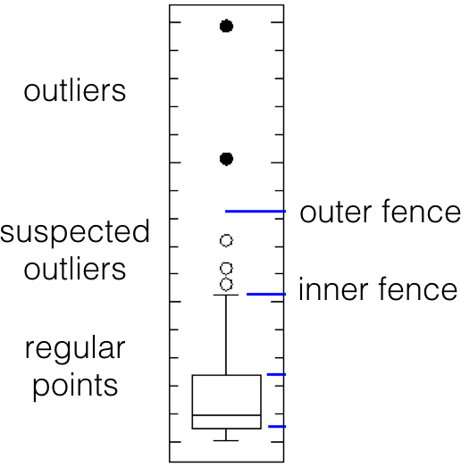
Figure 14.5: Tukey’s boxplot test; suspected outliers are marked by white disks, outliers by black disks.
As an example, let’s find the outliers for the midterm and final exam grades in Dr. Vanderwhede Advanced Retroencabulation course.
There are no boxplot anomalies for midterm grades:
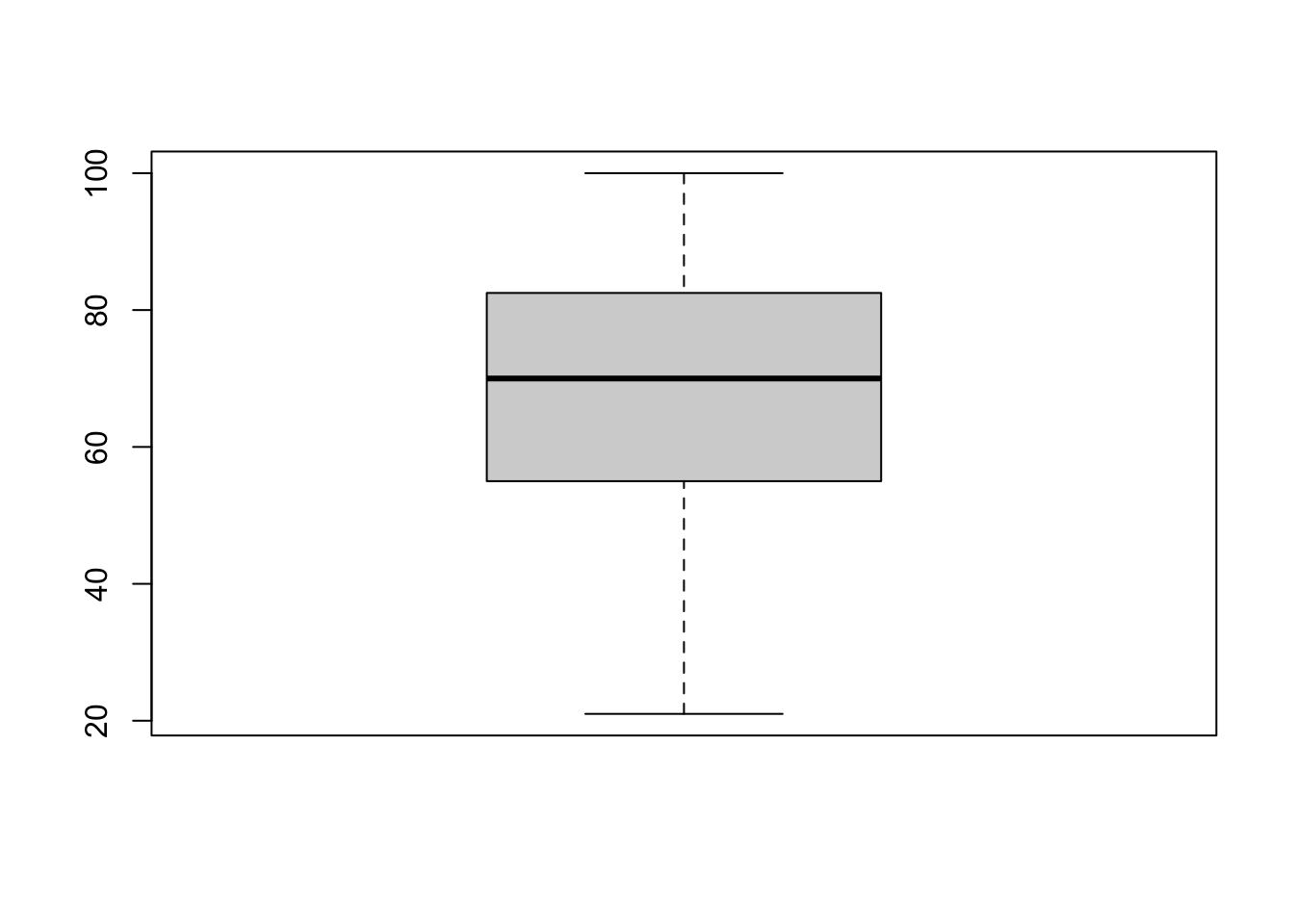
numeric(0)but 4 boxplot anomalies for final exam grades.
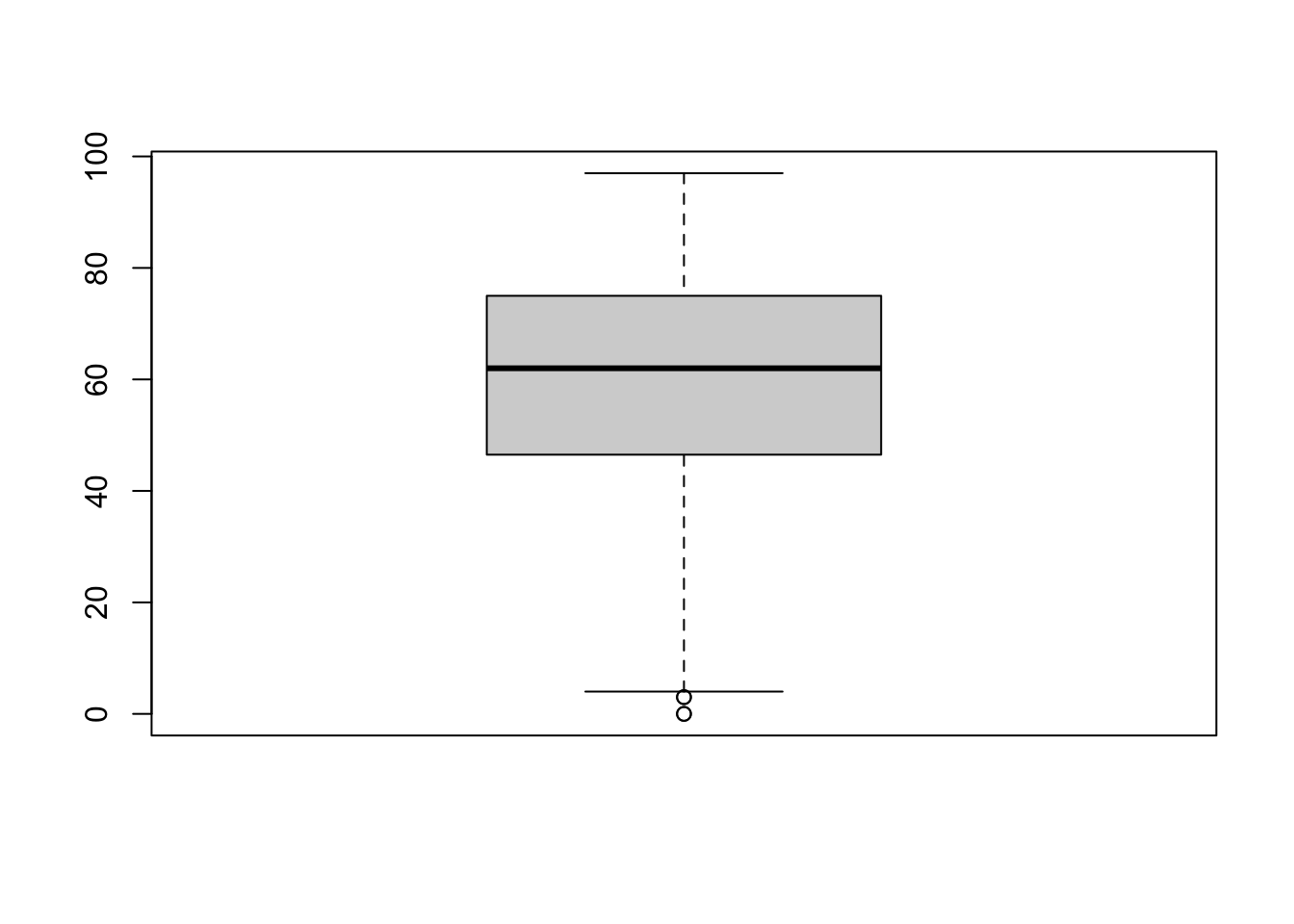
boxplot.stats(grades$FE)$out

# finding outlying observations
out <- boxplot.stats(grades$FE)$out
out_ind <- which(grades$FE %in% c(out))
knitr::kable(grades[out_ind,])
[1] 3 0 3 0| MT | FE | |
|---|---|---|
| 44 | 97 | 3 |
| 46 | 55 | 0 |
| 161 | 25 | 3 |
| 163 | 27 | 0 |
The Grubbs test is another univariate test, which takes into consideration the number of observations in the dataset. Let \(x_i\) be the value of feature \(X\) for the \(i^{\textrm{th}}\) unit, \(1\leq i\leq N\), let \((\overline{x},s_x)\) be the mean and standard deviation of feature \(X\), let \(\alpha\) be the desired significance level, and let \(T(\alpha,N)\) be the critical value of the Student \(t\)-distribution at significance \(\alpha/2N\). Then, the \(i^{\textrm{th}}\) unit is an outlier along feature \(X\) if \[|x_i-\overline{x}| \geq \frac{s_x(N-1)}{\sqrt{N}}\sqrt{\frac{T^2(\alpha,N)}{N-2+T^2(\alpha,N)}}.\]
Other common tests include:
the Mahalanobis distance, which is linked to the leverage of an observation (a measure of influence), can also be used to find multi-dimensional outliers, when all relationships are linear (or nearly linear);
the Tietjen-Moore test, which is used to find a specific number of outliers;
the generalized extreme studentized deviate test, if the number of outliers is unknown;
the chi-square test, when outliers affect the goodness-of-fit, as well as
DBSCAN and other clustering-based outlier detection methods.
Many more such methods can be found in [91]; we will have more to say on the topic.
14.5.3 Visual Outlier Detection
The following three (simple) examples illustrate the principles underlying visual outlier and anomaly detection.
Example: On a specific day, the height of several plants are measured. The records also show each plant’s age (the number of weeks since the seed has been planted).
Histograms of the data are shown in Figure @(fig:plant-data) (age on the left, height in the middle).
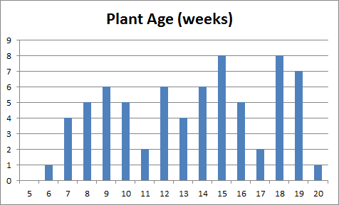
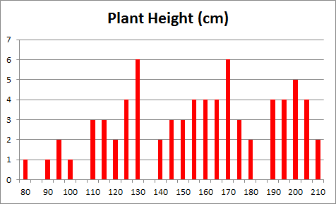
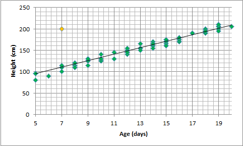
Figure 14.6: Summary visualisations for an (artificial) plant dataset: age distribution (left), height distribution (middle), height vs. age, with linear trend (right).
Very little can be said about the data at that stage: the age of the plants (controlled by the nursery staff) seems to be somewhat haphazard, as does the response variable (height). A scatter plot of the data (rightmost chart in Figure 14.6), however, reveals that growth is strongly correlated with age during the early period of a plant’s life for the observations in the dataset; points clutter around a linear trend. One point (in yellow) is easily identified as an outlier.
There are (at least) two possibilities: either that measurement was botched or mis-entered in the database (representing an invalid entry), or that one specimen has experienced unusual growth (outlier). Either way, the analyst has to investigate further.
Example: a government department has 11 service points in a jurisdiction. Service statistics are recorded: the monthly average arrival rates per teller and monthly average service rates per teller for each service point are available.
A scatter plot of the service rate per teller (\(y\) axis) against the arrival rate per teller (\(x\) axis), with linear regression trend, is shown in the leftmost chart in Figure @(fig:service-data). The trend is seen to inch upwards with increasing \(x\) values.
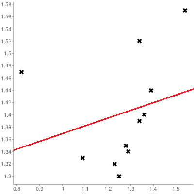
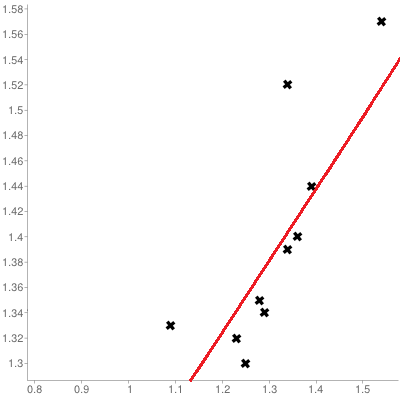
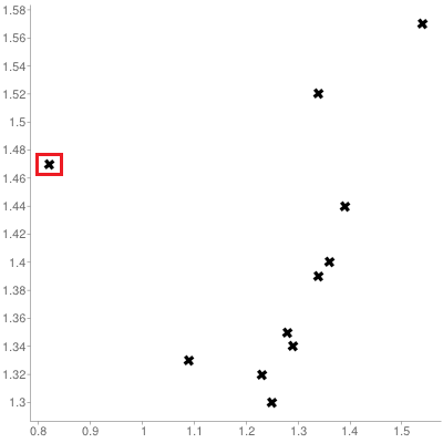
Figure 14.7: Visualisations for an (artificial) service point dataset: trend for 11 service points (left), trend for 10 service points (middle), influential observations (right).
A similar chart, but with the left-most point removed from consideration, is shown in the middle chart of Figure 14.7. The trend still slopes upward, but the fit is significantly improved, suggesting that the removed observation is unduly influential (or anomalous) – a better understanding of the relationship between arrivals and services is afforded if it is set aside.
Any attempt to fit that data point into the model must take this information into consideration. Note, however, that influential observations depend on the analysis that is ultimately being conducted – a point may be influential for one analysis, but not for another.
Example: measurements of the length of the appendage of a certain species of insect have been made on 71 individuals. Descriptive statistics have been computed; the results are shown in Figure 14.8.
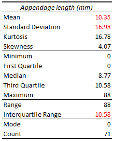
Figure 14.8: Descriptive statistics for an (artificial) appendage length dataset.
Analysts who are well-versed in statistical methods might recognize the tell-tale signs that the distribution of appendage lengths is likely to be asymmetrical (since the skewness is non-negligible) and to have a “fat” tail (due to the kurtosis being commensurate with the mean and the standard deviation, the range being so much larger than the interquartile range, and the maximum value being so much larger than the third quartile).
The mode, minimum, and first quartile values belong to individuals without appendages, so there appears to be at least two sub-groups in the population (perhaps split along the lines of juveniles/adults, or males/females).
The maximum value has already been seen to be quite large compared to the rest of the observations, which at first suggests that it might belong to an outlier.
The histogram of the measurements, however, shows that there are 3 individuals with very long appendages (see right-most chart in Figure 14.9: it now becomes plausible for these anomalous entries to belong to individuals from a different species altogether who were erroneously added to the dataset. This does not, of course, constitute a proof of such an error, but it raises the possibility, which is often the best that an analyst can do in the absence of subject matter expertise.
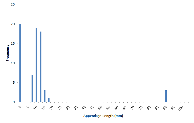
Figure 14.9: Frequency chart of the appendage lengths in the (artificial dataset).
14.6 Data Transformations
History is the transformation of tumultuous conquerors into silent footnotes. [P. Eldridge]
This crucial step is often neglected or omitted altogether. Various transformation methods are available, depending on the analysts’ needs and data types, including:
standardization and unit conversion, which put the dataset’s variables on an equal footing – a requirement for basic comparison tasks and more complicated problems of clustering and similarity matching;
normalization, which attempts to force a variable into a normal distribution – an assumption which must be met in order to use number of traditional analysis methods, such as ANOVA or regression analysis, and
smoothing methods, which help remove unwanted noise from the data, but at a price – perhaps removing natural variance in the data.
Another type of data transformation is pre-occupied with the concept of dimensionality reduction. There are many advantages to working with low-dimensional data [100]:
visualization methods of all kinds are available to extract and present insights out of such data;
high-dimensional datasets are subject to the so-called curse of dimensionality, which asserts (among other things) that multi-dimensional spaces are vast, and when the number of features in a model increases, the number of observations required to maintain predictive power also increases, but at a substantially higher rate (see Figure @(fig:COD));
another consequence of the curse is that in high-dimension sets, all observations are roughly dissimilar to one another – observations tend to be nearer the dataset’s boundaries than they are to one another.
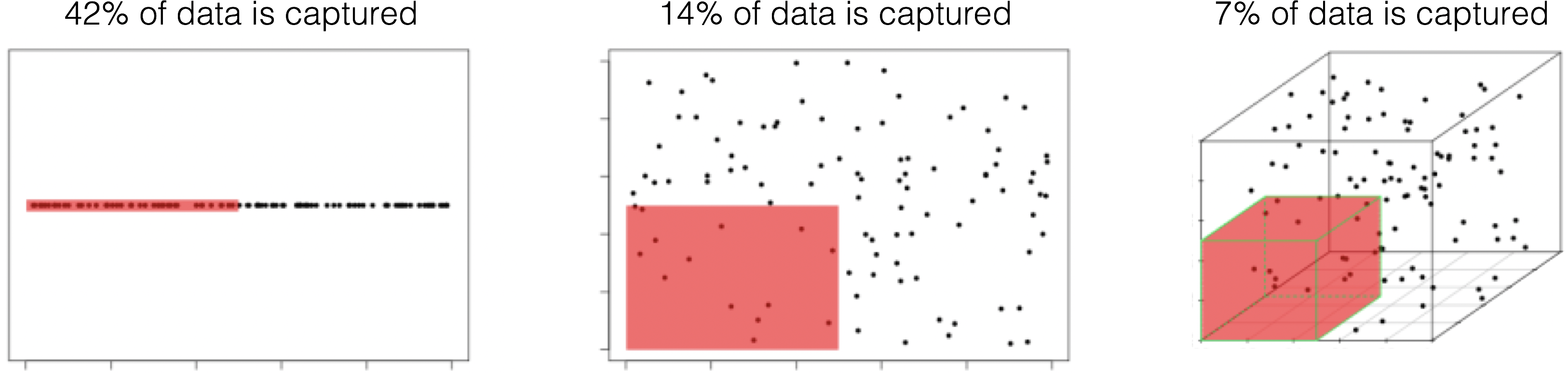
Figure 14.10: Illustration of the curse of dimensionality; \(N=100\) observations are uniformly distributed on the unit hypercube \([0,1]^d\), \(d=1, 2, 3\). The red regions represent the smaller hypercubes \([0,0.5]^d\), \(d=1,2,3\). The percentage of captured datapoints is seen to decrease with an increase in \(d\) [101].
Dimension reduction techniques such as principal component analysis, independent component analysis, and factor analysis (for numerical data), or multiple correspondence analysis (for categorical data) project multi-dimensional datasets onto low-dimensional but high information spaces (the so-called Manifold Hypothesis); feature selection techniques (including the popular family of regularization methods) pick an optimal subset of variables with which to accomplish tasks (according to some criteria).
Some information is necessarily lost in the process, but in many instances the drain can be kept under control and the gains made by working with smaller datasets can offset the losses of completeness [100]. We will have more to say on the topic at a later stage.
14.6.1 Common Transformations
Models often require that certain data assumptions be met. For instance, ordinary least square regression assumes:
that the response variable is a linear combination of the predictors;
constant error variance;
uncorrelated residuals, which may or may not be statistically independent;
etc.
In reality, it is rare that raw data meets all these requirements, but that does not necessarily mean that we need to abandon the model – an invertible sequence of data transformations may produce a derived data set which does meet the requirements, allowing the consultant to draw conclusions about the original data.
In the regression context, invertibility is guaranteed by monotonic transformations: identity, logarithmic, square root, inverse (all members of the power transformations), exponential, etc.
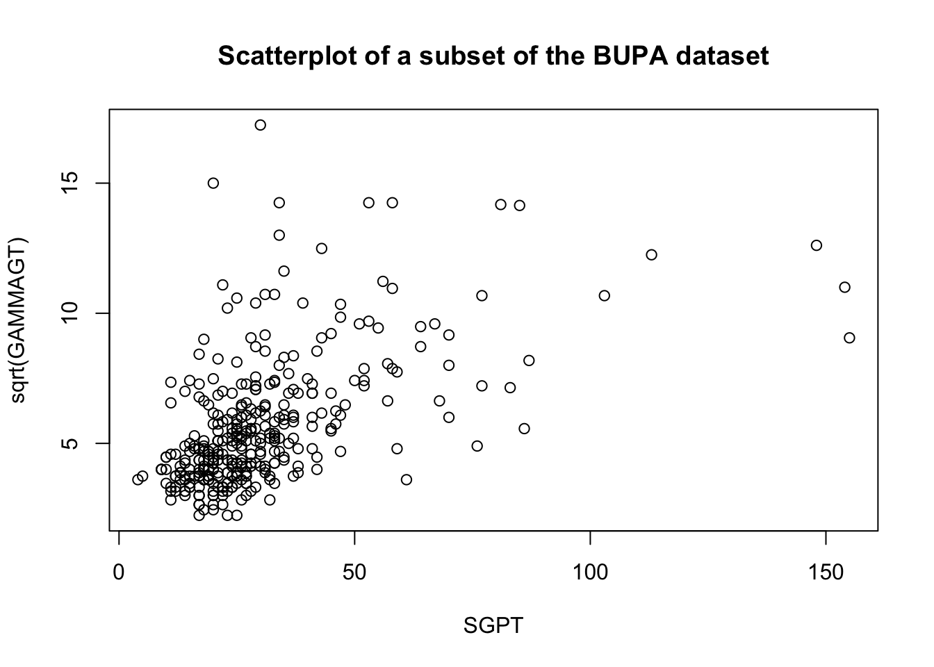
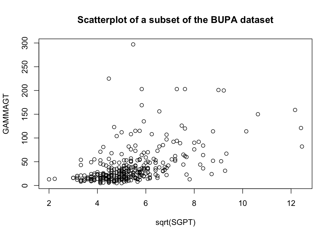
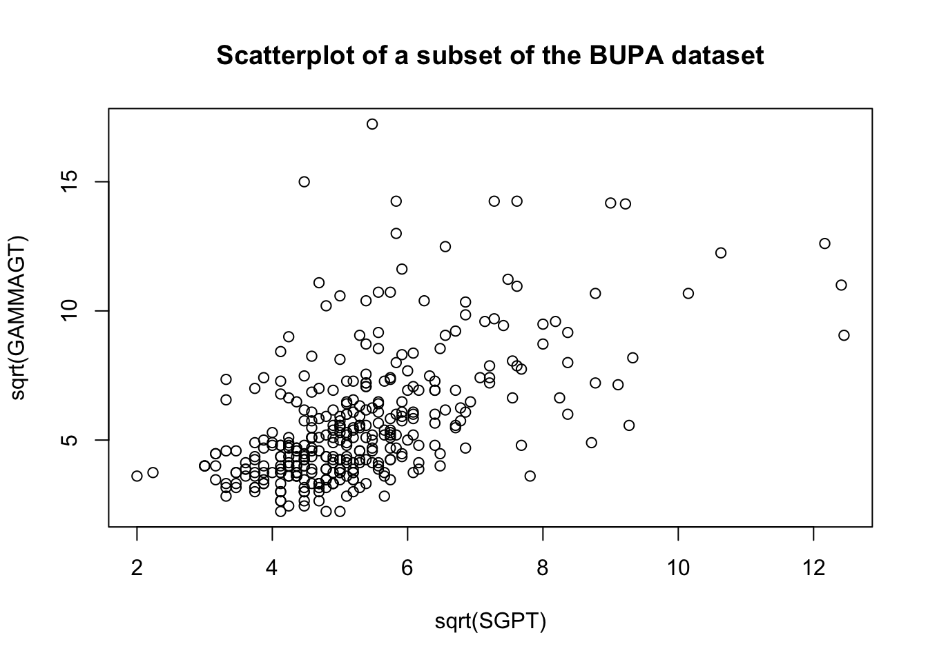
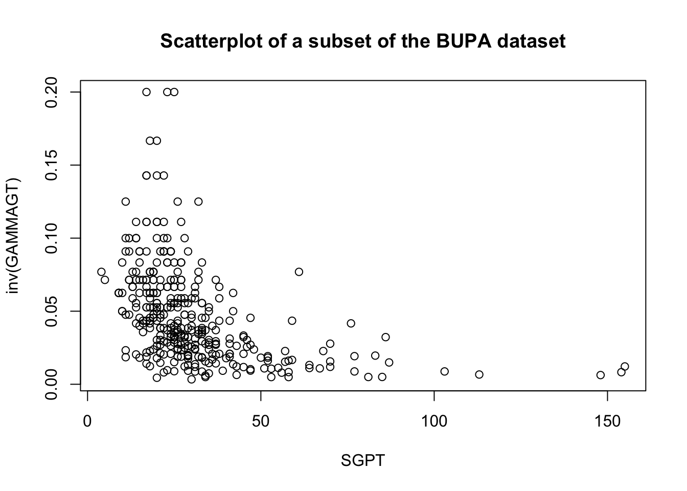
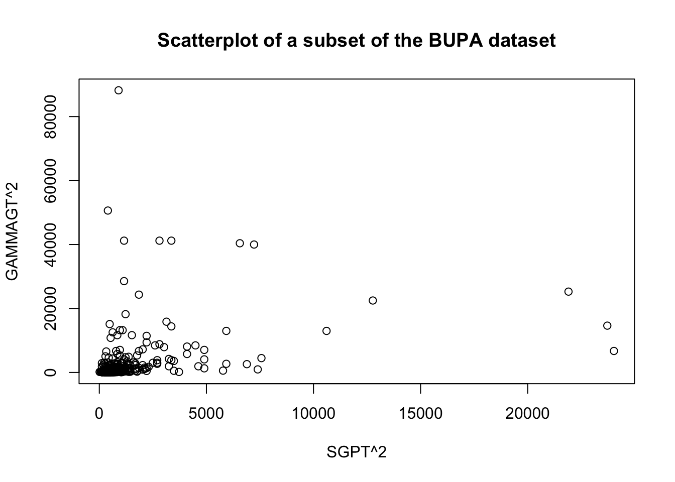
These transformations are illustrated below on a subset of the BUPA liver disease dataset [102].
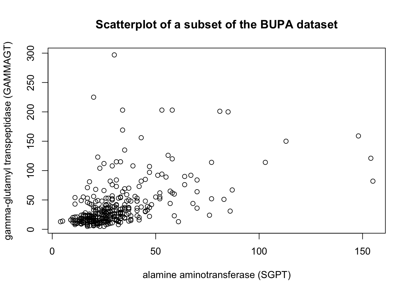
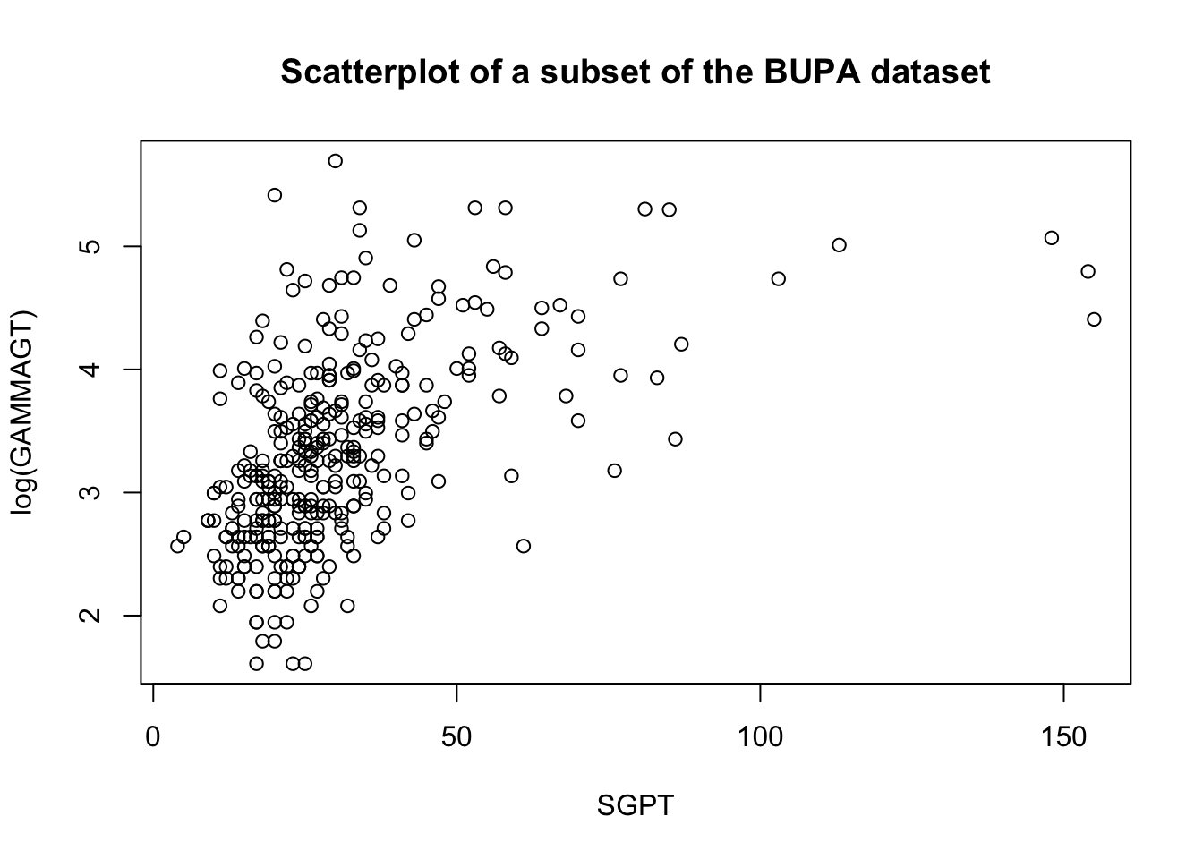
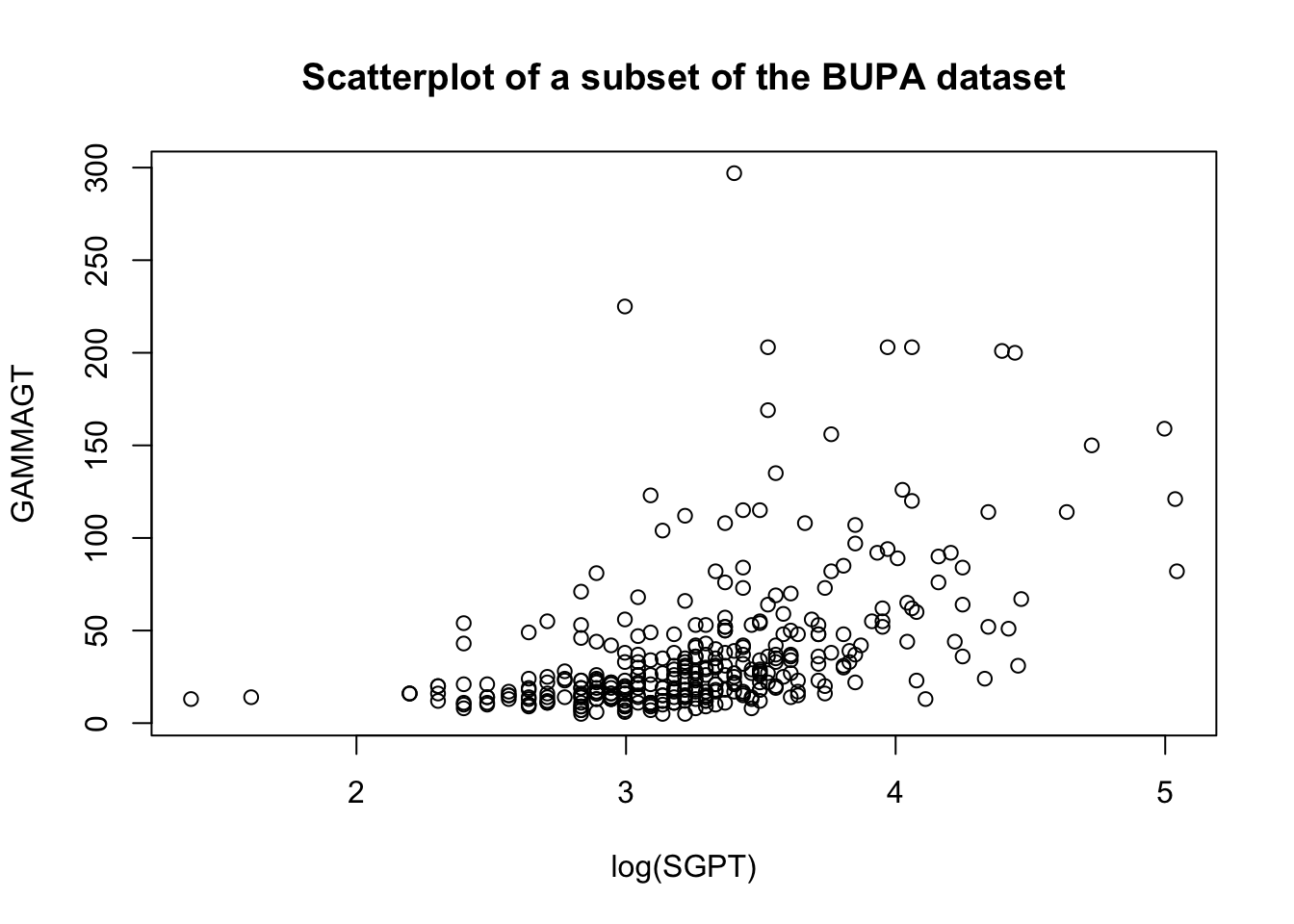
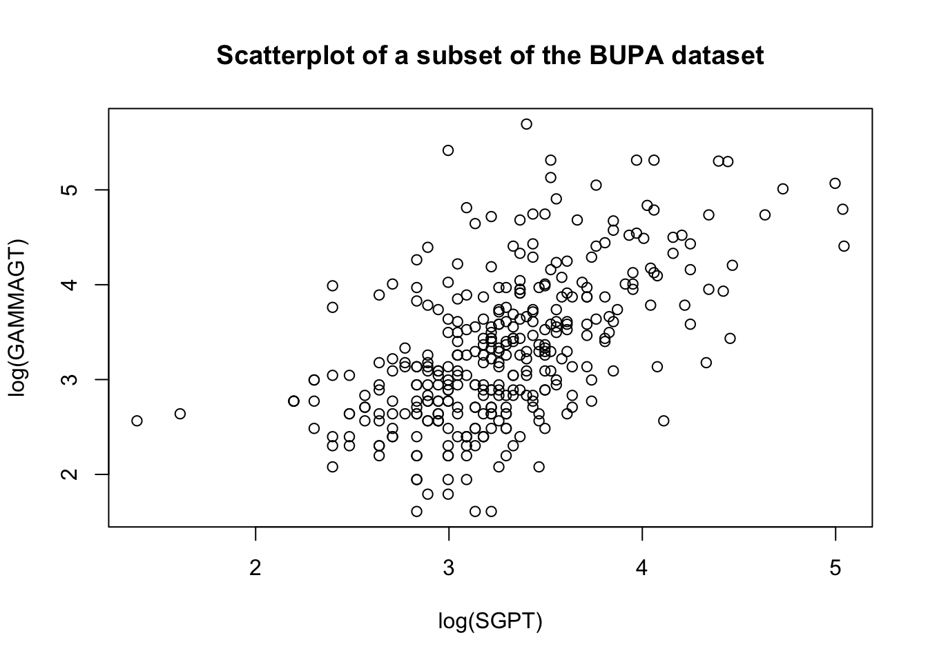
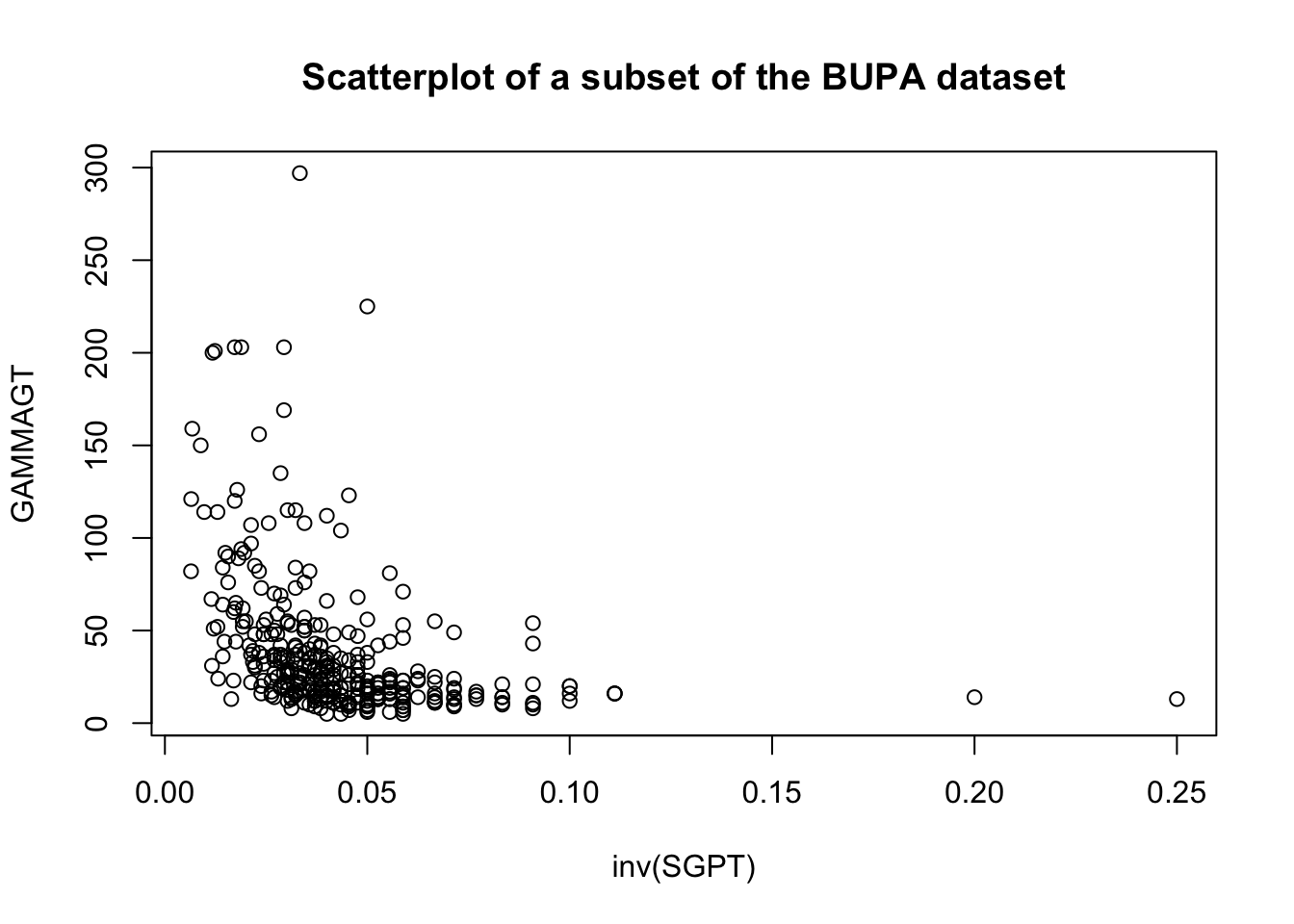
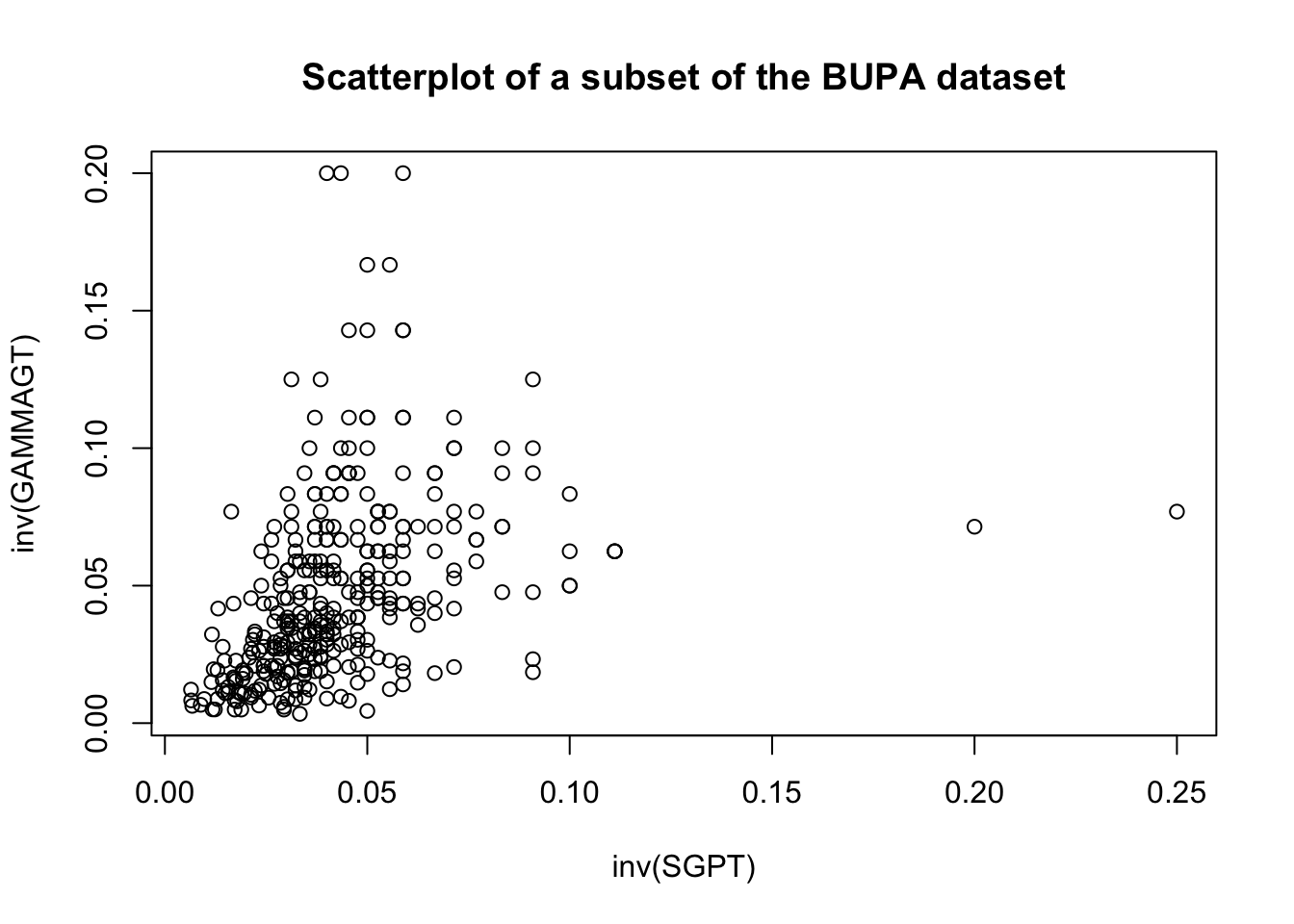
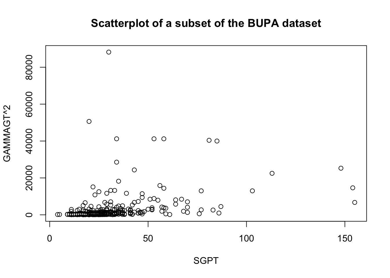
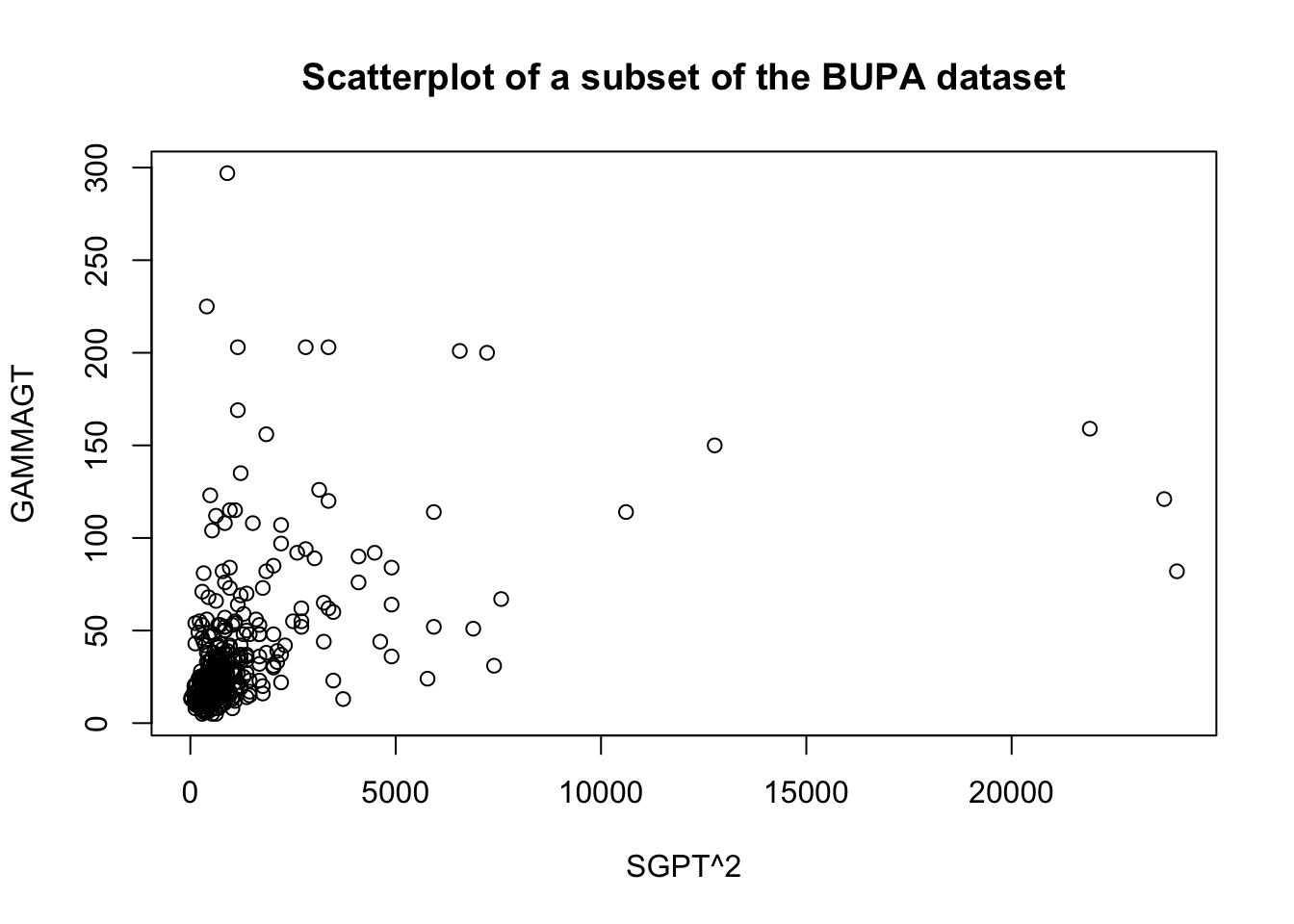
There are rules of thumb and best practices to transform data, but analysts should not discount the importance of exploring the data visually before making a choice.
Transformations on the predictors \(X\) may be used to achieve the linearity assumption, but they usually come at a price – correlations are not preserved by such transformations, for instance (although that may also occur with other transformations too).
Transformations on the target \(Y\) can help with non-normality of residuals and non-constant variance of error terms.
Note that transformations can be applied both to the target variable or the predictors: as an example, if the linear relationship between two variables \(X\) and \(Y\) is expressed as \(Y=a+bX\), then a unit increase in \(X\) is associated with an average of \(b\) units in \(Y\).
But a better fit might be provided by either of \[\log Y = a+bX,\quad Y=a+b\log X,\quad \mbox{or}\quad \log Y = a+b\log X,\] for which:
a unit increase in \(X\) is associated with an average \(b\%\) increase in \(Y\);
a \(1\%\) increase in \(X\) is associated with an average \(0.01b\) unit increase in \(Y\), and
a \(1\%\) increase in \(X\) is associated with a \(b\%\) increase in \(Y\), respectively.
14.6.2 Box-Cox Transformations
The choice of transformation is often as much of an art as it is a science.
There is a common framework, however, that provides the optimal transformation, in a sense. Consider the task of predicting the target \(Y\) with the help of the predictors \(X_j\), \(j=1,\ldots, p\). The usual model takes the form \[y_i=\sum_{j=1}^p\beta_jX_{x,i}+\varepsilon_i,\quad i=1,\ldots, n.\]
If the residuals are skewed, or their variance is not constant, or the trend itself does not appear to be linear, a power transformation might be preferable, but if so, which one? The Box-Cox transformation \(y_i\mapsto y'_i(\lambda)\), \(y_i>0\) is defined by \[y'_i(\lambda)=\begin{cases}(y_1 \ldots y_n)^{1/n}\ln y_i, \text{if }\lambda=0 \\ \frac{y_i^{\lambda}-1}{\lambda}(y_1 \ldots y_n)^{\frac{1-\lambda}{n}}, \text{if }\lambda\neq 0 \end{cases};\] variants allow for the inclusion of a shift parameter \(\alpha>0\), which extends the transformation to \(y_i>-\alpha\).
The suggested choice of \(\lambda\) is the value that maximizes the log-likelihood \[\mathcal{L}=-\frac{n}{2}\log\left(\frac{2\pi\hat{\sigma}^2}{(y_1 \ldots y_n)^{2(\lambda-1)/n}}+1\right).\]
For instance, the following code shows the effect of the Box-Cox transformation on the linear fit of GAMMAGT against SGPT in the BUPA dataset
[1] -0.1818182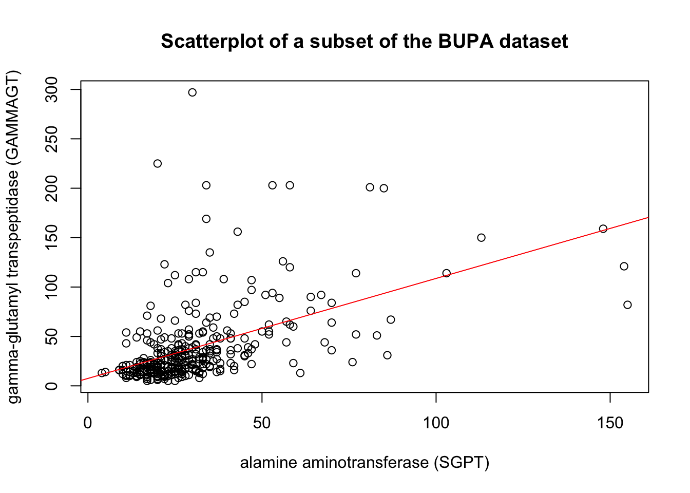
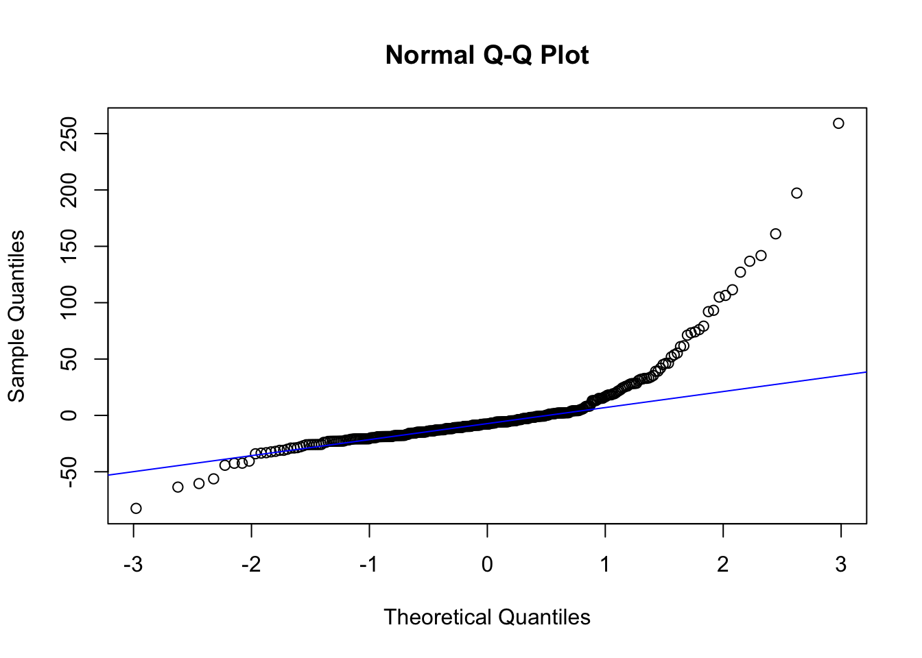
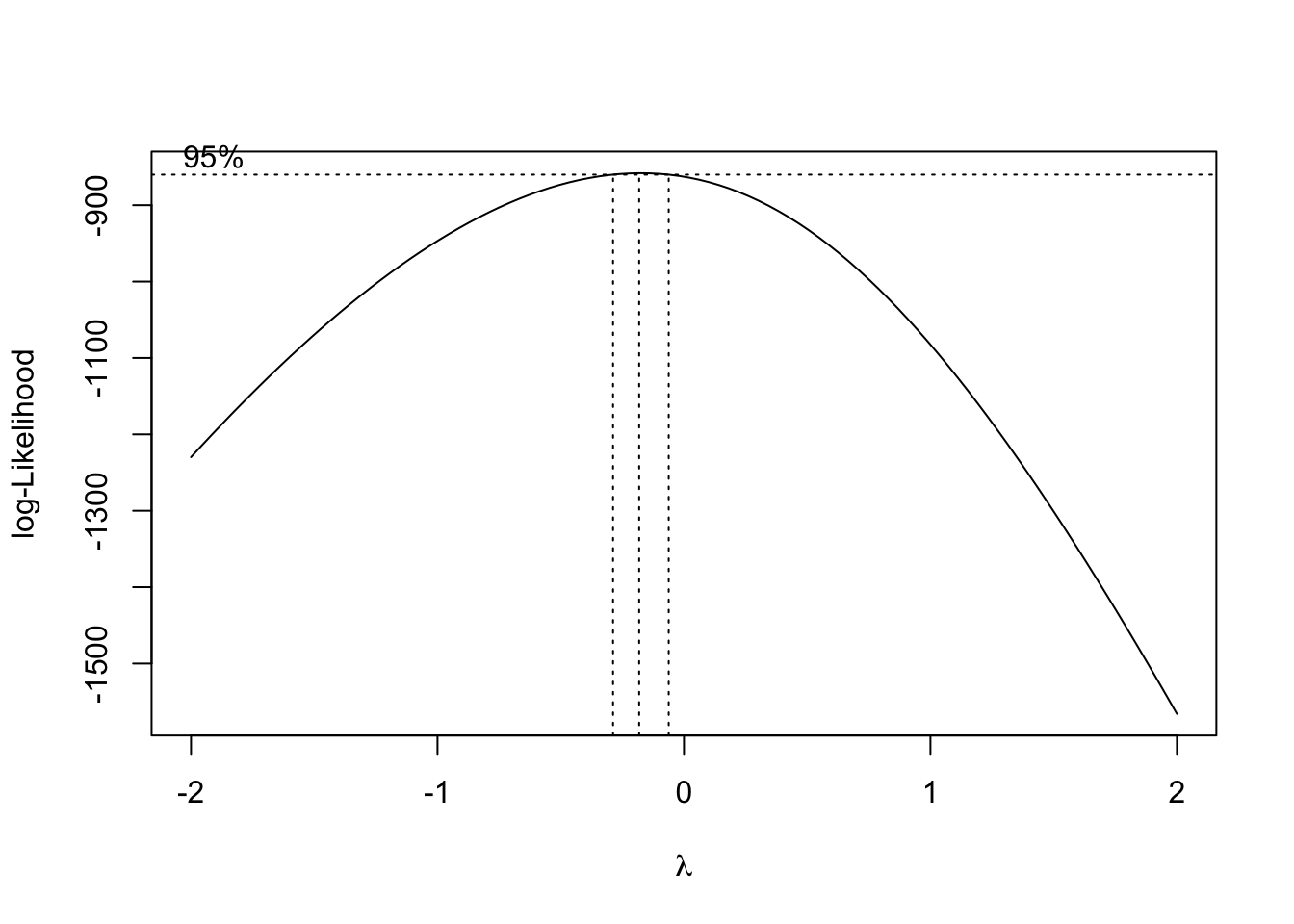
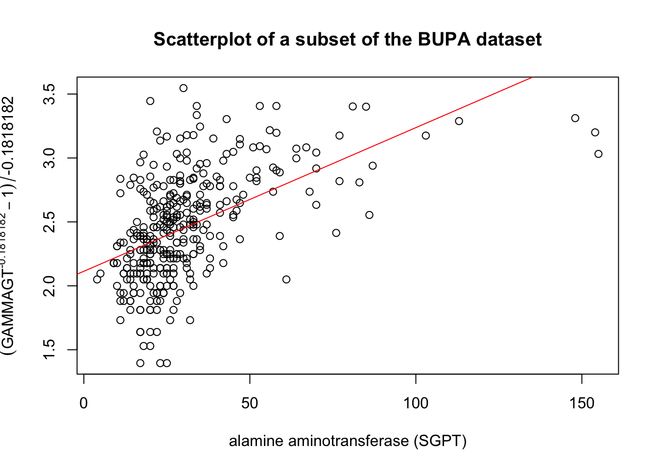
Figure 14.12: Linear fit and Box-Cox transformation in the BUPA dataset.
There might be theoretical rationales which favour a particular choice of \(\lambda\) – these are not to be ignored. It is also important to produce a residual analysis, as the best Box-Cox choice does not necessarily meet all the least squares assumptions.
Finally, it is important to remember that the resulting parameters have the least squares property only with respect to the transformed data points (in other word, the inverse transformation has to be applied to the results before we can make interpretations about the original data).
In the BUPA example, the corresponding curve in the untransformed space is:
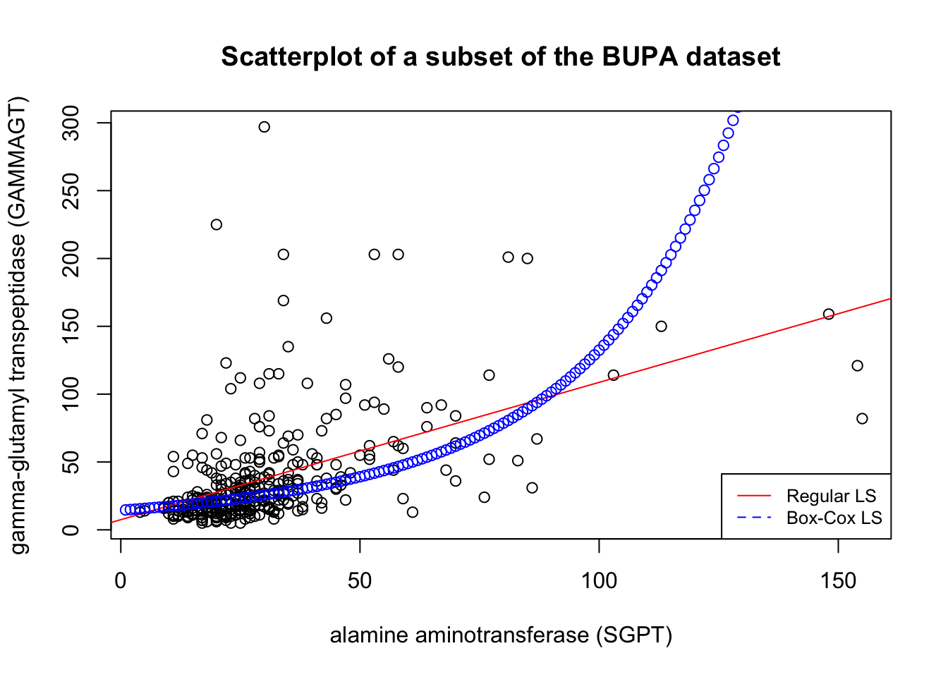
Figure 14.13: Inverted Box-Cox transformation in the BUPA dataset.
14.6.3 Scaling
Numeric variables may have different scales (weights and heights, for instance). Since the variance of a large-range variable is typically greater than that of a small-range variable, leaving the data unscaled may introduce biases, especially when using unsupervised methods (see Machine Learning 101).
It could also be the case that it is the relative positions (or rankings) which is of importance, in which case it could become important to look at relative distances between levels:
standardisation creates a variable with mean 0 and standard deviations 1: \[Y_i=\frac{X_i-\overline{X}}{s_X};\]
normalization creates a variable in the range \[0,1\]: \[Y_i=\frac{X_i-\min\{X_k\}}{\max \{X_k\}- \min \{X_k\}}.\]
These are not the only options. Different schemes can lead to different outputs.
14.6.4 Discretizing
In order to reduce computational complexity, a numeric variable may need to be replaced with an ordinal variable (height values could be replaced by the qualitative “short”, “average”, and “tall”, for instance.
Of course, what these terms represent depend on the context: Canadian short and Bolivian tall may be fairly commensurate, to revisit the example at the start of the preceding section.
It is far from obvious how to determine the bins’ limits – domain expertise can help, but it could introduce unconscious bias to the analyses. In the absence of such expertise, limits can be set so that either the bins each:
contain (roughly) the same number of observations;
have the same width, or
the performance of some modeling tool is maximized.
Again, various choices may lead to different outputs.
14.6.5 Creating Variables
Finally, it is possible that new variables may need to be introduced (in contrast with dimensionality reduction). These new variables may arise
as functional relationships of some subset of available features (introducing powers of a feature, or principal components, say);
because modeling tool may require independence of observations or independence of features (in order to remove multicolinearity, for instance), or
to simplify the analysis by looking at aggregated summaries (often used in text analysis).
There is no limit to the number of new variables that can be added to a dataset – but consultants should strive for relevant additions.
14.7 Data Wrangling
References
[91] Y. Cissokho, S. Fadel, R. Millson, R. Pourhasan, and P. Boily, “Anomaly Detection and Outlier Analysis,” Data Science Report Series, 2020.
[92] T. Orchard and M. Woodbury, A missing information principle: Theory and applications. University of California Press, 1972.
[93] S. Hagiwara, “Nonresponse error in survey sampling: Comparison of different imputation methods.” Honours Thesis; School of Mathematics; Statistics, Carleton University, 2012.
[96] D. B. Rubin, Multiple imputation for nonresponse in surveys. Wiley, 1987.
[97] P. Boily, “Principles of data collection,” Data Science Report Series, 2020,Available: https://www.data-action-lab.com/wp-content/uploads/2021/08/IQC_ch_1.pdf
[98] P. Boily, “An imputation algorithm of blood alcohol content levels for drivers and pedestrians in fatal collisions,” Data Science Report Series, 2007,Available: https://www.data-action-lab.com/wp-content/uploads/2021/08/IQC_ch_2_CS.pdf
[99] “Height percentile calculator, by age and country.” Tall Life.
[100] O. Leduc, A. Macfie, A. Maheshwari, M. Pelletier, and P. Boily, “Feature selection and dimension reduction,” Data Science Report Series, 2020.
[102] D. Dua and C. Graff, “Liver disorders dataset at the UCI machine learning repository.” University of California, Irvine, School of Information; Computer Sciences, 2017.
For instance, The canonical equation \(\mathbf{X}^{\!\top}\mathbf{X}\mathbf{\beta}=\mathbf{X}^{\!\top}\mathbf{Y}\) of linear regression cannot be solved as \(\mathbf{X}^{\!\top}\mathbf{X}\) is not defined if some observations are missing.↩︎
Imputation methods work best under MCAR or MAR, but keep in mind that they all tend to produce biased estimates.↩︎
And such a fantastic person – in spite of her superior intellect, she is adored by all of her classmates, thanks to her sunny disposition and willingness to help at all times. If only all students were like Mary Sue…↩︎
Or to simply re-enter the final grades by comparing with the physical papers…↩︎
“There ain’t no such thing as a free lunch” – there is no guarantee that a method that works best for a dataset even works well for another.↩︎
Outlying observations may be anomalous along any of the individual variables, or in combination.↩︎
Anomaly detection points towards interesting questions for analysts and subject matter experts: in this case, why is there such a large discrepancy in the two populations?↩︎
This stems partly from the fact that once the “anomalous” observations have been removed from the dataset, previously “regular” observations can become anomalous in turn in the smaller dataset; it is not clear when that runaway train will stop.↩︎
Supervised models are built to minimize a cost function; in default settings, it is often the case that the mis-classification cost is assumed to be symmetrical, which can lead to technically correct but useless solutions. For instance, the vast majority (99.999+%) of air passengers emphatically do not bring weapons with them on flights; a model that predicts that no passenger is attempting to smuggle a weapon on board a flight would be 99.999+% accurate, but it would miss the point completely.↩︎
Note that normality of the underlying data is an assumption for most tests; how robust these tests are against departures from this assumption depends on the situation.↩︎